Taking Stock Of Gold Stocks – ANV, NGD, AUY, FCX, NEM, AEX, GDX
Commodities / Gold and Silver Stocks 2014 Feb 16, 2014 - 01:16 PM GMTBy: Michael_Noonan
 [Note: This started as a comparative look at some gold stocks, and it turned into a great
exercise in finding trades, if you take the time and go through the steps we outline in each
chart. You can begin to see differences in the quality of trade selection, based purely on
information the market offers each and every day. Enjoy!]
We often see comments to the effect of interest in gold miner stocks as a play on gold. Ten days ago, we did an analysis of silver-related stocks, Taking Stock of Silver Stocks, looking at SLW, PAAS, CDE, AG, SSRI, and HL. While many view mining companies as a proxy for gold, they are not necessarily so. There are many influences that can affect the performance of a mining stock that are unrelated to the performance of the underlying physical: management, cost of mining, depletion, labor issues, added debt, etc.
What we know about charts is that they do not lie and most accurately depict conditions and character for each time frame and for any given stock or futures activity. You can actually see how markets develop into trading opportunities, as well as when to avoid committing money. Charts capture the essence of timing so lacking in fundamentals.
What is important to understand is that you do not need to be a “technical analyst” to understand how to read a chart. Markets are full of logic. One needs to exercise some patience and follow the logic, as explained, and you will have a greater sense of what to expect in any given situation and at any given point in time. When things are not always clear, that, too, is a message from the market to leave well enough alone, and look for other, clearer opportunities.
Is that not a worthwhile objective to manage risk and increase positive results?
You always want to look for a “story” where the developing market activity is providing information on how, [long or short], and when to enter, and at what price. There are a few stories in some of the charts that may help you better understand.
As a point of clarification, we do not trade in any of these stocks. This is a hindsight analysis, if you will, using the same techniques we apply in our Recommendations section. What each chart analysis captures are the principles we employ and the rules used in execution, based on developing market activity, or repeating patterns.
The kinds of patterns we identify appear over and over in the markets. It then becomes a “simple” matter of searching for the same pattern behavior moving forward. It is called having an “edge,” the expectation of a favorable outcome based upon past history. As in life, in the markets, history [patterns] repeats, not always exactly, but the pattens rhyme very closely.
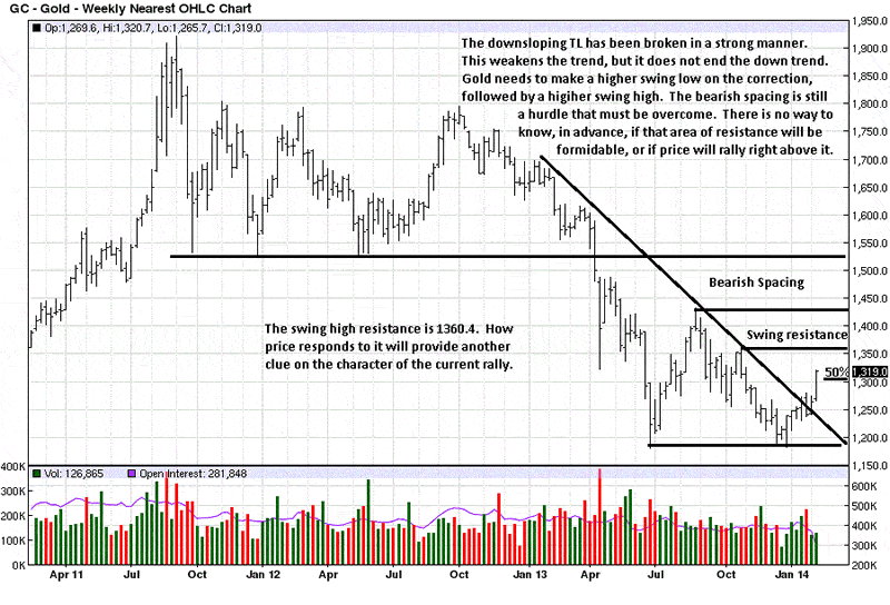
The current weekly and daily gold charts will be posted first, to use as a reference relative to where the following gold stocks are as of last week. They are from our gold article of a few days ago, Bankers Can [Will] Steal Your Cash. The charts are presented in no particular order, but the order in which they developed were interesting in progression.
Weekly for reference:
Daily for reference:
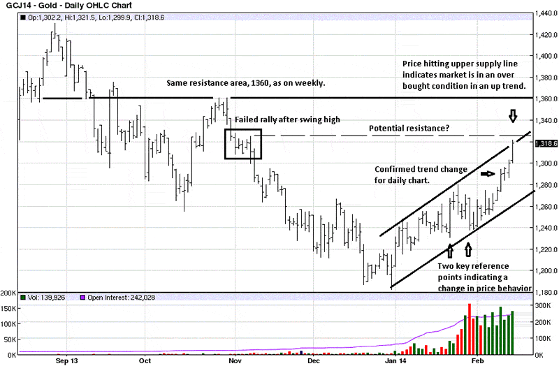
We always start with weekly charts to identify the primary trend and then be able to put the daily chart into a relative context. Higher time frames are more controlling over lower time frames.
The sharp volume spikes were obvious, but we did not know what to make of them throughout a developing TR. [Trading Range]
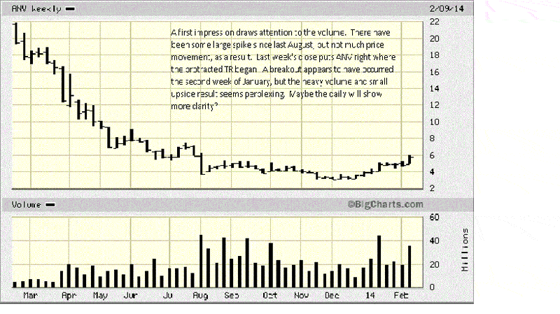
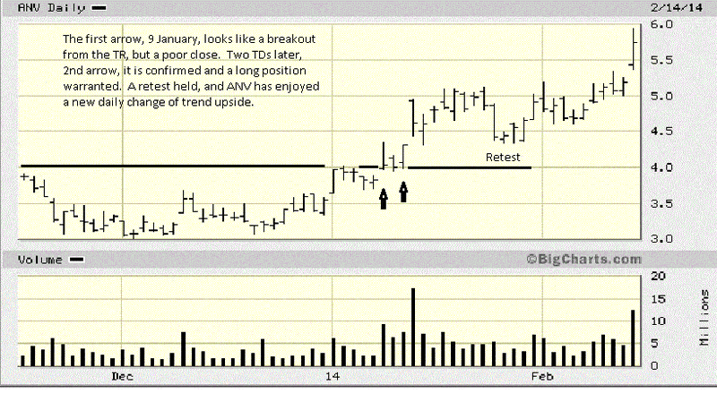
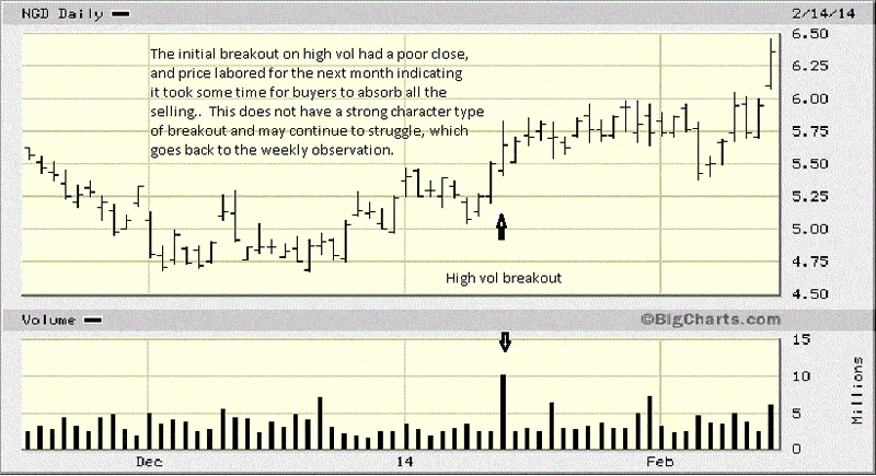
An apparent potential breakout was developing at the beginning of January. The chart comments explain the entry. You can see the correction in late January held the initial breakout area very well, and that augured for higher prices to come, and price did move higher.
Last Friday was another breakout day to buy on the opening. We did not draw lines to show the TR since the early January breakout, but once you add them, you will see how the two breakouts were similar, leaving a TR. Patterns repeat.
Breaking a TL, [Trend Line], is not that significant of an event. Of greater importance are previous swing highs/lows and high volume, wide range bars. The TL has been broken, but NGD has some overhead resistance with which it must overcome. Compared to ANV, NGD is a relatively stronger chart.
Whenever you have a choice of which stock to buy, always buy the stronger performer. It has proven that from its relative strength, it will likely perform better than others.
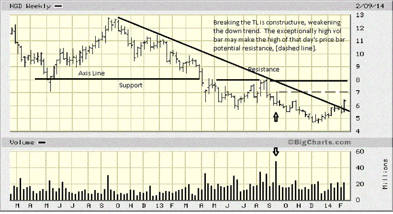
There is a breakout on the daily chart, from Friday, but when you look at the weekly chart and see potential overhead resistance, the upside may be limited.
You can also see how NGD labored in its initial January breakout, relative to ANV.
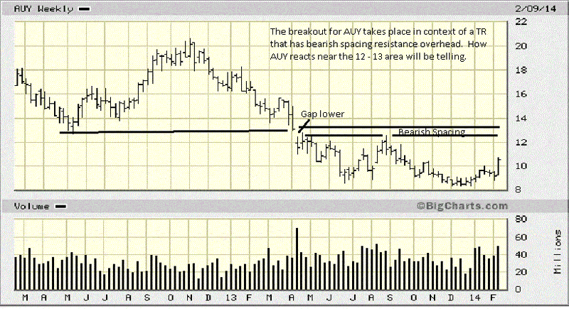
What stands out on the weekly AUY is the gap lower when price broke a previous support area from May ’12. A horizontal line is drawn from the low prior to the gap day. It will act as future resistance.
The next two rally attempts failed to close the gap area. This left a space which is what is referred to as bearish spacing. It occurs when the next rally after a swing low fails to reach the swing low price. What this tells you is that sellers were confident enough in expecting lower prices that they did not need to see how the last swing low would hold on a retest.
AUY has these issues and may not be the strongest buy candidate. The daily chart may show something different.
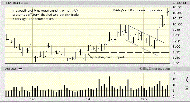
The explanations for each chart is a way of explaining a “story” behind each chart and its developing market activity. We just qualified how the weekly AUY could have issues. The daily chart presented a situation that provided a low risk entry with greater potential profit in the trade shown below.
Here is the “story.” When you see correction from the January high to the early February low, it forms a downsloping pennant. If it looks like price could breakout to the upside, there is a great trading opportunity.
When you look at the February low, you see how it stopped at 1. the January opening gap, and 2. the supportive TR that followed the gap. The decline in February, stopping at an obvious support could lead to a rally. The bar after the February low rallied on increased volume, which means increased buying. If price can rally higher next day, you can place a buy stop above the top pennant line and buy what should be a breakout.
Let us assume you placed a buy stop at 9.30 or 9.40. Price closed strongly that day, and it continued to over $10, as of Friday. Forgetting the potential for AUY to continue higher, what counts is how you can use past market activity as a guide that helps present a greater probability of market direction as events develop into a defined pattern, as just described.
The initial protective sell stop would have been around 8.70. It could now be moved to 9.70, providing a risk free trade. There was no guesswork or need to “predict” anything. The market advertised the situation as it developed, and you will see situations like this occurring frequently.
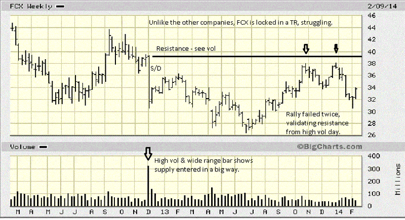
FCX is in a TR, and compared to a few other companies below, you can better understand why this would not be a good candidate for a buy. Why not? You want to be buying those stocks that have already proven strength by moving higher. FCX failed in two attempts against proven supply, noted by the December ’12 high volume, wide range bar lower.
S/D means Supply overcame Demand, and that price level will be defended by those who sold in order to protect their profits. The two failed rallies in October and December ’12 are a testament to that pattern. Note the very small range of the last weekly bar in December. The reason why it is so small is because sellers were much stronger than the buyers, preventing buyers from staging any kind of rally. It is a point of resistance.
The rectangle shows the small range bar from the weekly chart. You can see how volume was weak, a lack of demand, and sellers stepped up and took control. We said of the weekly bar that it was resistance. Look at the mid-January retest of that failed swing high. Not only did price stop at that level, new aggressive selling entered the market, noted by in sharp increase in volume, adding to that price level as future resistance.
When you understand that past support, once broken, become future resistance, you can see why FCX stopped at 34, Friday. Volume declined, again, indicating a lack of demand. That could change by Monday, but for now, until increased demand shows up, FCX is not the best buy candidate.
Worth pointing out is the fact that there are people who are buying these lesser performing stocks. Why? They are not reading the charts, for one, and they do not understand the concept of relative strength, as you now do, and hopefully, you are beginning to make better buy decisions.
We did mention there is a high degree of logic to be found in market activity, as shown in the charts.

The KISS principle at work.
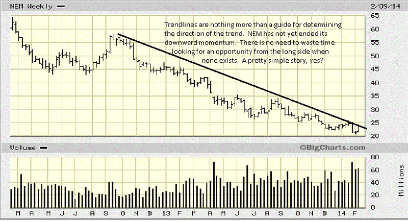
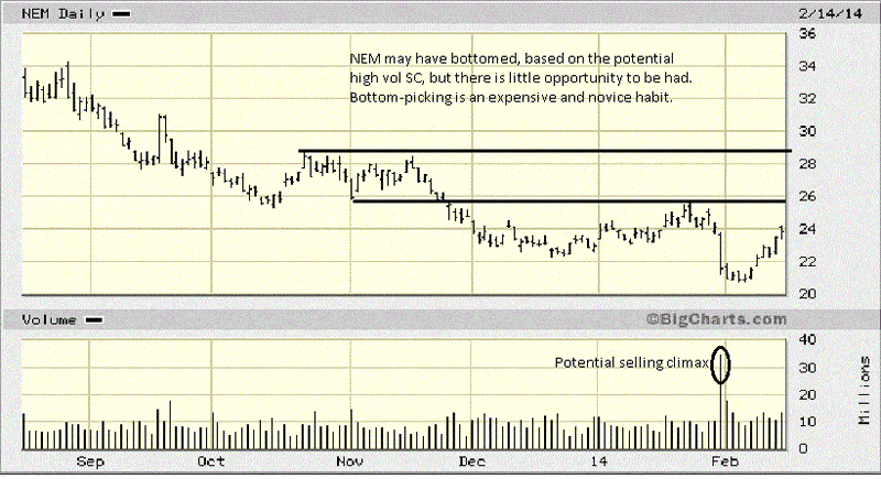
After reviewing the previous charts, do you see any reason to buy NEM?
You will note that we are using only the stock symbols and not the names. Sometimes, stocks have greater name recognition. We do not care. We are only interested in the stock’s price recognition, relative to others within the same category.
One should exercise a little more caution in new situations with little price history, and AEX is included precisely for that reason. Brief as its price history is, there is already a red flag bar at the rally high. Volume increased, but price closed at the low of the range, letting you know sellers were stronger than buyers.
See how the market is “giving” you specific information? Knowing that, would you want to be a buyer of AEX?

The “story” comes from the weekly, just covered. With a poor close, one can expect a sell off to occur, or at least the probability of a sell off is much greater than a rally. You want to find those situations which tell you that the “probability” of a directional market move is greater in one direction than the other. this is what will give you an edge in decision making.
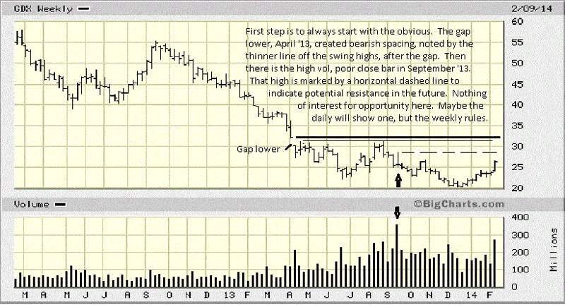
For as negative as the weekly chart appears, there was actually a low risk, greater reward probability situation that developed when GDX stayed in a TR for the last half of January into early February. Take a look and see if you can spot a few reasons why this was a reasonable short-term buy candidate. You will get some answers in the next paragraph, but you want to learn to look for your own “story” developing.
TRs lead to breakouts. In the middle of January, there was a gap up in price, just under 23. For the next six TDs, price moved sideways and held the gap up, indicating support. From the end of January though the first part of February, the bottoms of the day ranges stayed above the support line.
Note how volume declined just prior to the upside breakout. The declining volume told you that there was no selling pressure at the February low. It was followed by a relatively strong rally and high-end close bar, just under resistance at 24. A buy stop just above 24 made sense, just as a buy stop on the AUY daily chart was a strategic move. The risk was a stop just under 23!
Price gapped higher next day. A buy stop automatically put you in the trade, and price rallied, as the probability of recent developing market activity revealed.
Each situation is unique in how the future will unfold, something you cannot know in advance. By trading relative strength stocks and using recognized pattern situations that have a “story” behind them, the probability of you trading/investing successfully have increased in your favor dramatically.
Now you are trading with an edge. There is no reason to ever do otherwise.

By Michael Noonan
Michael Noonan, mn@edgetraderplus.com, is a Chicago-based trader with over 30 years in the business. His sole approach to analysis is derived from developing market pattern behavior, found in the form of Price, Volume, and Time, and it is generated from the best source possible, the market itself.
© 2013 Copyright Michael Noonan - All Rights Reserved Disclaimer: The above is a matter of opinion provided for general information purposes only and is not intended as investment advice. Information and analysis above are derived from sources and utilising methods believed to be reliable, but we cannot accept responsibility for any losses you may incur as a result of this analysis. Individuals should consult with their personal financial advisors.
Michael Noonan Archive |
© 2005-2022 http://www.MarketOracle.co.uk - The Market Oracle is a FREE Daily Financial Markets Analysis & Forecasting online publication.


