The Real State of the Union
Politics / US Economy Feb 03, 2014 - 10:54 AM GMTBy: Andy_Sutton
 Before anyone gets all bent out of shape, this is NOT going to be a political essay. To restate my position on the issue of politics, I couldn’t care less what group or party anyone belongs to, but rather, about how they do the job they were entrusted with doing. In my lifetime we’ve had but a few lawmakers who truly did their jobs with the trust and stewardship of their constituents in mind. That group grows fewer as we egress from the former America into this brave new world of offshoring, economic microcephalism, and blatant malfeasance.
The goal this week is to take a look at the real state of America – from an economic perspective. We’ll leave the societal and anthropological degradation to those who are better equipped. Believe me when I say there is more than a full plate of economic issues out there. The sad thing is that even though we live in an information age, unless you really start digging, you’ll remain relatively uninformed about what is actually going on. Take for example this week, which has featured a full breakdown of the fiasco called the Grammy awards, which contained all sorts of vile and filthy ‘entertainment’. So bad was it that Alabama quarterback A.J. McCarron pointed out that it was evidence of all the evil in the world. Spot on A.J. and kudos to you for speaking out.
However, the Grammy’s weren’t the only place evil was at work. As I pen this piece there is a battle going on. Not just for the stock market or the bond market. Not just for the USEconomy – or what’s left of it – or for the resolution of various fiscal imbalances. No, this battle is much bigger. It is a battle for the very future of mankind. Being a little dramatic this week, Andy? No, not really. We are in fact at another seminal point in history. While we fiddle, Rome burns. Actually, that’s not correct; Rome has already burned, but nobody has bothered to tell the modern day Romans that. The bread and circus idiocy is still in full force. Only the forecasted February cold has prevented a sellout of the upcoming Stupor Bowl. This is our world. But I digress. I’m going to break down a couple of metrics that you don’t hear about very much these days, but paint a fairly accurate picture of what is really going on.
Velocity of Circulation – The ‘Speed’ of the Economy
I’m going to start out with the trump card this week and go from there. This is probably the one most important tell-all metric out there. And I’ll say up front that even it is biased because the data that goes in is junk. But we’ll talk about it because it is one of the few metrics that hasn’t changed in derivation despite the fact that what goes in has. Even more importantly, it is a simple concept that anyone can grasp – unless you happen to work in the mainstream financial press. Another benefit of velocity of circulation, aka monetary velocity, is that the various ‘schools’ of economic thought don’t argue too much about its validity as a construct. They will, however, dismiss or embrace it as is in accordance with their particular worldview.
The calculation is a simple one – GDP divided by whatever monetary aggregate you desire. This is where it gets a little dicey. Which is the ‘best’ aggregate to use? Many will say M1. Others will say M2. Still others will say M3, which, contrary to popular belief, can still be derived despite its discontinuation in 2006 for the purposes of saving taxpayer money. I’m not joking; that’s the official reason that was given at the time. At any rate, we’re going to use both M1 and M2.
The interpretation of velocity of circulation is akin to inventory turnover in a business. It is the measure of how fast money moves through the economy, much like how fast inventory circulates through a business. In the numerator you have the total ‘value’ (albeit distorted) of economic activity represented by GDP, then in the denominator, you have the money supply with which that activity was generated. The higher the quotient, the faster money moved in the economy in a given period. The lower the number, the slower money moved through the economy, again, in a given period. This is not golf. Higher is better. A vibrant, growing economy will feature consistent velocity under a specie system as growth in GDP is accompanied by concomitant growth in money supply. Under a fiat system, you will notice more volatility – and we’ll get to that in a bit.
Let’s start by taking a look at M2 velocity of circulation. Our aggregates use a tiered system, with M0 being the lowest – see Wikipedia article as a reference. Each subsequent aggregate includes all the components of the preceding aggregate and adds some additional components of its own. M2 includes all physical currency and coinage (M0), regardless of where they’re held, not-so-USFed deposits (MB), demand deposits, checkable deposits, and traveler’s checks (M1), plus most savings accounts, money market accounts, retail money market mutual funds and ‘small’ time deposits – CDs under $100,000. The ‘fed’ has used what is called MZM or money of zero maturity, which is M2 – time deposits and money market mutual funds.
It is my personal opinion that M2 is the most accurate measure simply because its components are still very easily accessible to move throughout the economy in the form of transactions. Money market funds can be sold with the click of a mouse. CD’s can be unloaded, although not quite as easily. It isn’t like the holder is forfeiting a fortune in interest in either instance so the motivation for holding versus spending isn’t nearly as strong.
Just for understanding’s sake, M3 is M2 plus large (>$100,000) time deposits, institutional money market mutual funds, Eurodollars, and repurchase agreements. M3 has historically been the broadest measure, but there are a couple of ‘broader’ measures in sporadic use and are mentionable in this context. M4 is M3 plus all commercial paper. Commercial paper is defined as corporate debt with a maturity of less than 270 days. Some institutions add T-bills to M4 as well. While we can use either M3 or M4 to calculate a velocity, it must be understood that a good bit of those aggregates is slower moving by nature and will put a drag on the overall number. People have used M3/M4 velocity to make the point about flagging economies in the past, but those velocities are going to be slower, even in a healthy economy, all else being equal.
So with all that said.. Drum roll please…
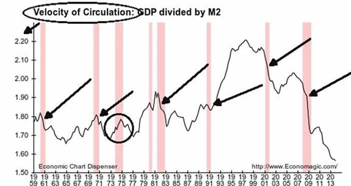
A couple of things worth noting. First, not all drops in M2 velocity proved to be recessions – at least not according to the Bureau of Economic Analysis. Keep that in mind. BEA also claims that the ‘great recession’ ended in Q2 2009. Note also that, save for the recession of 1973-75, every recession feature ONLY drops in velocity. The ’75 recession ended with a drop, which continued into 1977, well after BEA considered the recession to be over. Good food for thought. I am not asserting that recessions should be measured merely by monetary velocity, only that one must take BEA’s analysis with a grain of salt because they use a GDP metric that counts borrowed money as growth, which it clearly is not. In other words, if the government runs what are now trillion dollar a year deficits and those deficits cause GDP to rise, BEA says the recession is over. That’s what Keynesianism gets you.
What is also ironic is that when consumer credit really started to take off in 1993, M2 velocity was nearing its all-time high, making a very nice head and shoulders pattern. The pattern is interesting because if this were a stock chart, the H&S pattern called the ‘crash’ in velocity. There is also a larger H&S pattern too with the shoulders in 1981 and 2007 with the head falling in 1999. It is interesting, to say the least, that a monetary chart had patterns that played out the same as a stock chart pattern would be expected to.
Let’s take a look at M1 velocity….
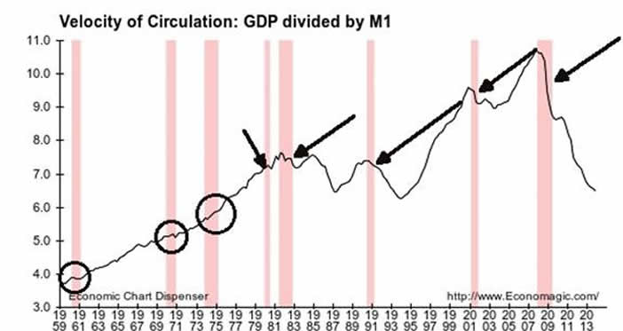
M1 plays out a tad differently; remember that it doesn’t include the savings accounts, money market accounts, retail money market mutual funds, and CD’s <$100,000 that are included in M2. M1 is a more cash and fungible money based aggregate. Note that while there are divergences, even M1 velocity is tanking and has continued to do so long after BEA declared the ‘great recession’ to be defeated. Oddly, recessions prior to the paradigm shift in monetary policy in the early 1980s featured stagnant and even rising M1 velocity. Since then, recessions have featured decreasing M1 velocity.
Summation of Velocity
In summation, using the two most popular measures of monetary velocity, both show an economy with decreasing speed. Mathematically, the monetary aggregates are growing faster than GDP and that is saying something considering that a) the powers that be assert there is next to no inflation and b) that the government is borrowing and spending money like crazy to keep this sham of an economy solvent. Money is not moving through the economy at an increasing rate, but at a decreasing one. If we took the borrowing (at all levels) out of GDP, the velocity figures would be even worse. Keep in mind we’re liable to see a boost in velocity as the adjustments the government made last year to GDP start hitting the figures. They added about a half trillion by goosing the metrics. Some of it was probably legit, while much of it was not. These machinations are akin to corporations maintaining stock prices by borrowing money to buy back shares and goosing earnings by one-off cost cutting measures rather than by growing revenues.
The Unemployment Rate versus the Workforce
A second metric you don’t hear much about these days, although it has been added to some mainstream news as a sort of ‘by the way…’ type of byline, is the workforce participation rate. Bernanke’s legacy will be QE and his incredible ‘leadership’ at the end of his tenure as he bravely tapered. Please note the sarcasm. His biggest legacy in my book, however, will be his very accurate prediction in 2009 of a jobless recovery.
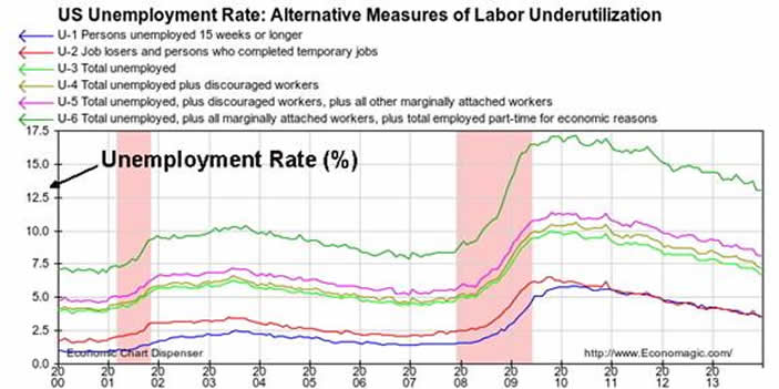
Upon first glace at the unemployment chart, it would appear that Ben was in fact wrong about the jobless recovery. U-3, which is the rate we all hear trumpeted on the ‘news’ peaked just shy of 10% in 2010 – after the recession supposedly ended. U-6, the broadest and most honest measure you’ll see from BLS, peaked around the same time at 17.4%. If you remember a year or so ago, the not-so-USFed listed a ‘target’ of 6.5% as measured by U-3 for tapering. The most recent figures came in at 6.7% in December – just above the fed target. So it all makes sense, right? The banksters are keeping their word and more Americans are employed, and Bernanke was just wrong about the jobless recovery, right? Not exactly.
The real question is not U-3, but how we got there. I won’t deny there has been some jobs growth, mostly at the lower end of the pay scale. Hospitality/Leisure and other temporary and service positions have seen some growth, but nothing near what would be required to lower the rate that much. We can do a full dissection of that another time, or, to be honest, you can do it on your own. All you need is an Internet browser and a calculator. It’s not rocket science; they just make it out to be so that the average person throws their hands up and quits, saying they just don’t understand economics. Anyway, let’s look at the workforce. You see, anyone who gives up looking for work counts among the employed, not the unemployed. In fairness, people also retire voluntarily and they leave the workforce as well, but we can’t count them as employed anymore, however, that’s exactly what BLS does in its metrics.
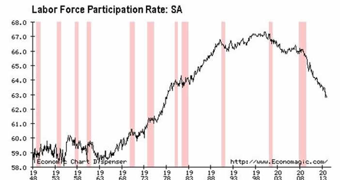
Let’s do a brief chronology of what we’re seeing here. The participation rate was comparatively lower in the late 40s through the early 70s. Then we went off the gold standard, inflation took off, and most importantly, families put a second worker in the workforce. The participation rate took off and peaked around the same time as M2 velocity. We’d need to do further study to see if there is a real connection there, but I don’t believe in coincidences. Since the peak before the dot-com led recession, the participation rate has dropped from a high of over 67% to just under 63%. While 4% doesn’t seem like a lot of people, at our current population, we’re talking about roughly 12.5 million Americans. These are people who were working and who are no longer working – for whatever reason. They’re either drawing down savings, running up debt, or receiving some type of transfer payments from the government for their existence. Or some combination thereof.
The Keynesian would look at the above chart and say that this is a good thing because we’re so rich we can afford to pull workers out of the labor force and still achieve our status as the richest nation on earth. If I hear that again, I’m going to need a barf bag. I’m not going to print them because they’re readily available, but go look at the debt metrics and then preach to me how rich we are. This kind of thinking is an exercise in lunacy.
To boost the validity of this metric, coupled with the velocity data, we can point to the use of SNAP (food stamps), Americans on SSDI (disability), unemployment, and other government prop-up programs. Do some people need temporary assistance? Absolutely. However, this dependency mentality has become a way of life and even a career choice for too many. And that population is growing. The retired are going to be drawing down their savings because Social Insecurity just isn’t enough. The POTUS said that the other night.
Conclusions
In conclusion, we have a contracting workforce, albeit slowly, a lower labor force participation rate – in fact, we’re back down to levels not seen since the late 70s. The speed of the economy as measure by M1 and M2 velocity of circulation is absolutely cratering. The economy is flagging not recovering. The government interference – and it has been substantial – has failed to light a fire under the real economy as we knew it would. It has, however, created choice spots of wealth, which was the whole point to begin with.
I’m going to do one final exercise to make the point on the real state of the union – personal income. For this one, we’re not going to look at all the data (since 1929), but just at this new century. It’ll make the reality much clearer, especially with regard to our changed paradigm.
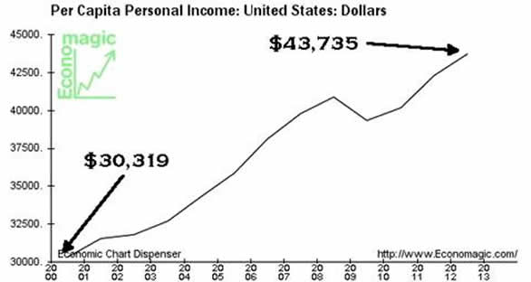
To outline, in 2000, the average per capita personal income was $30,319. In 2012 (2013 numbers aren’t available yet), it was $43,735. Sounds like a big boost, right? Ok, let’s look at inflation.
If we use 2%, as the powers that be would have us believe, the average person would have had to make $38,451 in 2012 just to cover inflation. Forget about taxes, fees, surcharges, etc. So in this scenario, the average person came out around $5,300 ahead. Add the extra taxes and fees and they might still be ahead, but by a considerably lesser amount. But does this scenario represent reality?
Next I’ll use what I’ve experienced with my clients. I specifically ask them to track and report to me their price inflation per annum so we can see what the benchmarks need to be. Almost all report back between 5-7%. I give them ranges: Less than 3%, 3-5%, 5-7%, 7-10%, greater than 10%. So let’s choose the middle of the road and call it 6% as experienced by my clients. At that rate, the average person would have had to make $61,007 just to keep pace with inflation. Um, Houston, we have a problem. This is a simple future value calculation FV=(1 +[inflation rate]) to the year power. So for 2012 using my clients at 6% inflation, it would be FV=(1+.06)12, which equals a multiplier of 2.012. Multiply that by $30,319 and they’d need to make $61,007 to keep pace with inflation alone. Suddenly there is a near $18,000 gap. The equation above assumes a steady rate of 6% inflation. Variations from year to year are going to happen, but this is meant to be illustrative. John Williams uses 1980 methodologies to calculate price inflation and his figure currently is close to 5% and it hasn’t been this ‘low’ in quite a while. So it is a good chance that my 6% example is actually LOWER than what many people are experiencing. I’m wide open to feedback on this from readers if you happen to track your annual cost of living.
Now do you see where the credit bubble comes into play? It is filling this gap. And we haven’t even considered taxes, etc. Now, with this information in front of you, I’ll let you, the reader, decide on what the true state of our union is, rather than having it read to you like some fourth grader by politicians of all stripes whose primary goal is the management of your expectations.
By Andy Sutton
http://www.my2centsonline.com
Andy Sutton holds a MBA with Honors in Economics from Moravian College and is a member of Omicron Delta Epsilon International Honor Society in Economics. His firm, Sutton & Associates, LLC currently provides financial planning services to a growing book of clients using a conservative approach aimed at accumulating high quality, income producing assets while providing protection against a falling dollar. For more information visit www.suttonfinance.net
Andy Sutton Archive |
© 2005-2022 http://www.MarketOracle.co.uk - The Market Oracle is a FREE Daily Financial Markets Analysis & Forecasting online publication.


