Four Totally Bad Stocks Bear Markets
Stock-Markets / Stocks Bear Market Jan 15, 2014 - 02:18 PM GMTBy: PhilStockWorld
 Courtesy of Doug Short: Note from dshort: At the request of Greg Patterson at The Advisory Group in San Francisco, here’s updated comparison of four major cyclical bear markets. The numbers are through today’s close.
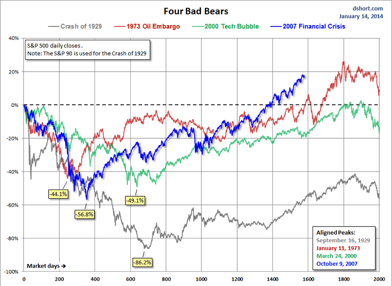
This chart series features an overlay of the Four Bad Bears in U.S. history since the market peak in 1929. They are:
- The Crash of 1929, which eventually ushered in the Great Depression,
- The Oil Embargo of 1973, which was followed by a vicious bout of stagflation,
- The 2000 Tech Bubble bust and,
- The Financial Crisis following the nominal all-time high in 2007.
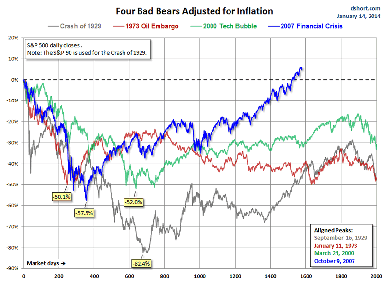
The series includes four versions of the overlay: nominal, real (inflation-adjusted), total-return with dividends reinvested, and real total-return.
The first chart shows the price, excluding dividends for these four historic declines and their aftermath. As of today’s close are now 1577 market days from the 2007 peak in the S&P 500.

Inflation-Adjusted Performance

Nominal Total Returns
Now let’s look at a total return comparison with dividends reinvested. Interestingly enough, the post-Oil Embargo market is the top performer, up 30.5%. But our current post-Financial Crisis market is a very close second, up 30.1% from the 2007 peak.
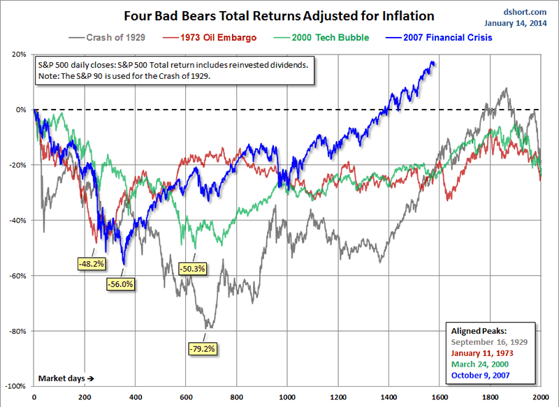
Real (Inflation-Adjusted) Total Returns
When we adjust total returns for inflation, the picture significantly changes. The spread between three of the four markets narrows, but the current real total return has pulled far ahead.

Here is a table showing the relative performance of these four cycles at the equivalent point in time.

For a better sense of how these cycles figure into a larger historical context, here’s a long-term view of secular bull and bear markets, adjusted for inflation, in the S&P Composite since 1871.
These charts are not intended as a forecast but rather as a way to study the current market in relation to historic market cycles.
Footnote: In previous commentaries on these bad bears, I used the Dow for the first event and the S&P 500 for the other three. However, I’m now including a pair of total return versions of the chart, which requires dividend data. Thus I’m now using the S&P 90, for which I have dividend data. The S&P 90 was a daily index launched by Standard & Poor’s in 1926 and preceded the S&P 500, which dates from March 1957.
Inflation adjustment is based on the Consumer Price Index.
- Phil
Philip R. Davis is a founder of Phil's Stock World (www.philstockworld.com), a stock and options trading site that teaches the art of options trading to newcomers and devises advanced strategies for expert traders. Mr. Davis is a serial entrepreneur, having founded software company Accu-Title, a real estate title insurance software solution, and is also the President of the Delphi Consulting Corp., an M&A consulting firm that helps large and small companies obtain funding and close deals. He was also the founder of Accu-Search, a property data corporation that was sold to DataTrace in 2004 and Personality Plus, a precursor to eHarmony.com. Phil was a former editor of a UMass/Amherst humor magazine and it shows in his writing -- which is filled with colorful commentary along with very specific ideas on stock option purchases (Phil rarely holds actual stocks). Visit: Phil's Stock World (www.philstockworld.com)
© 2014 Copyright PhilStockWorld - All Rights Reserved Disclaimer: The above is a matter of opinion provided for general information purposes only and is not intended as investment advice. Information and analysis above are derived from sources and utilising methods believed to be reliable, but we cannot accept responsibility for any losses you may incur as a result of this analysis. Individuals should consult with their personal financial advisors.
PhilStockWorld Archive |
© 2005-2022 http://www.MarketOracle.co.uk - The Market Oracle is a FREE Daily Financial Markets Analysis & Forecasting online publication.


