Gold Bear Market Trend Update 2014
Commodities / Gold and Silver 2014 Jan 03, 2014 - 11:33 AM GMTBy: Brian_Bloom
 The Gold Universe (shares and gold price) looks like it “may” be about to reverse the bear trend in which it has been trapped for some time. Should this happen, the evidence suggests that fear for the integrity of fiat currency denominated capital markets rather than fear of inflation will be the ultimate cause. (Brian Bloom)
The chart below – courtesy stockcharts.com shows that gold shares catapulted up from a bear trap sell signal on December 26th and that the new price objective of 102 – if reached – will result in an upside penetration of the bear trend line.
Chart #1: $XAU – Traditional P&F Chart
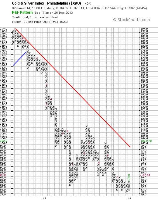
Unfortunately, when viewed in context of the 3% X 3 box reversal chart below, 102 represents a resistance level.
Chart # 2: $XAU – 3% X 3 Box Reversal P&F Chart
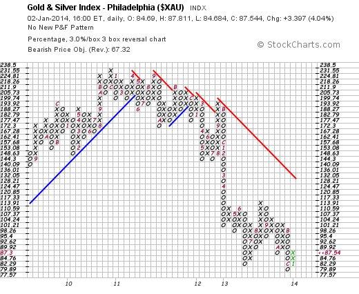
Further, even if that resitance level is penetrated on the upside, the “vertical” count technique will only yield a target of 128.21, which will still be below the long term falling trend line. However, applying the “horizontal” count technique results in an upside count target of 136.01.
But there is a subtlety associated with the differences of these two measures:
The vertical count technique will be appropriate if we are attempting to forecast the extent of the next move with the prevailing trend, whilst the horizontal count technique will be appropriate if we are attempting to measure the extent of a reaction against the prevailing trend. Two things follow:
- Given that the prevailing trend is clearly “down”, the horizontal (technical reaction) count is the more appropriate technique
- Given that the target move of such a technical reaction is expected to take the index to a level that is above the falling trend line, we may well be watching the early stages of a trend reversal.
Of course, “one swallow does not a summer make”, so are there any other technical clues?
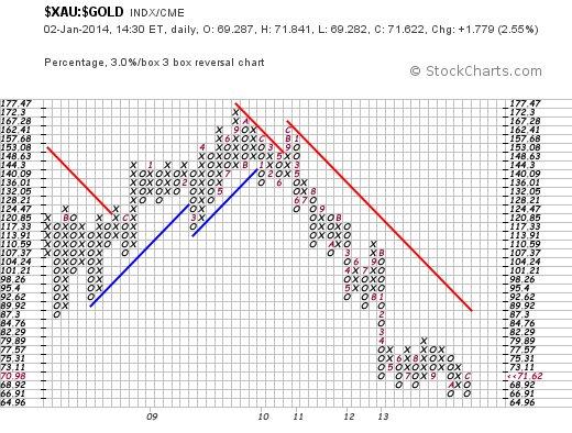
Well, one such clue might lie in the ratio of gold shares to the gold price. The chart below shows a Point & Figure interpretation of this ratio:
A break above 77.57 may take the ratio as high as 101.21.
Chart #3: Ratio of $XAU/$GOLD – 3% X 3 Box Reversal
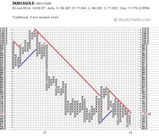
Further, based on the more sensitive chart below, the move is likely to begin if the ratio can rise above 73 (it closed at 71.62 last night)
Chart #4: Ratio of $XAU/$Gold – Traditional P&F
Now what might all this mean?
Well, first off it needs to be emphasised that no meaningful signal has yet been given – all we have are subtle clues.
However, given that the gold universe is a barometer of fear, if that upside break does manifest – in the face of central bankers who absolutely do not want it to manifest – then it will be reasonable to conclude that the equity market may well turn out to be the dangerous place we have been opining about for some months.
From a fundamental perspective, the reality is not easy to discern. On the one hand there has been a massive effort to drive the world’s developed economies and it “seems” to have been having the desired effect. The US economy is embracing the potential of that country becoming energy self sufficient once again, and the European economies “seem” to be coming out of their tailspins. Abenomics “seems” to be driving the Japanese economy out of its deflationary spiral.
The key word here is “seem”. The two issues that have been of concern to this analyst relate to:
- Declining “energy return on energy invested” (the new energy resources that are being brought on line are of a lower quality than those we have used up, and NET annual per capita energy output has been in a declining trend for over 25 years)
- Sovereign debt, in relation to which massive headwinds to further economic growth would be experienced if either of the following two scenarios manifest:
a. The debt has to be repaid (whether out of earnings or out of freshly printed money would be irrelevant)
b. Interest rates started to rise, because the burden of “servicing” the sovereign debt would force a larger proportion of sovereign income to be applied to this servicing
So, ignoring both 1 and 2 (a) above for the time being, what is happening in respect of 2 (b) above?
OOPS!! The chart below, of the ten year yield in the US, is forecasting a move to 5.45%!
Chart #5: 10 Year Treasury Yield – Traditional P&F Chart
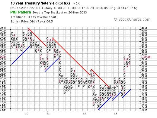
Further, based on the chart below – of the 30 year yield – if the latter yield were to rise above 4%, the new vertical count move might be expected to culminate at around 4.9%
Chart #6: 30 year yield – Traditional P&F Chart
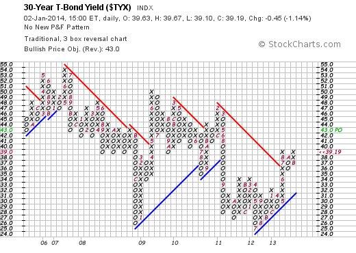
Now this state of affairs is very interesting because, in an era of inflation, one would expect the longer dated yield to outperform the shorter dated yield.
It follows from the expectation that the 10 year yield might rise to 5.45% against an expected rise in the 30 year yield to 4.9%, that the markets are not expecting an outbreak of price inflation. Therefore, we should conclude that the reason yields are expected to rise is because the markets are anticipating a downward pressure on capital availability.
In turn, this will be consistent with a rolling back of Quantitative Easing – which has already tentatively begun.
So, if this is in fact the case, then why has the Dow Jones Industrial Index been rising to new heights?
This is a very interesting question. Either the actually rising yields are sending an incorrect investment message or the actually rising equity prices are sending an incorrect investment message. Logic dictates that they can’t both be correct.
Which brings us back to the gold universe:
Clearly, if the gold universe starts to rise in an environment of rising interest rates, then the reason for this will be more likely related to fear of dysfunctionality in fiat currency denominated markets than to anticipation of inflation.
Overall Conclusion
Whilst it is still too early to tell, the recent rises to new heights of the Dow Jones Index might have been a result of “price ramping” activities of vested interests (central banks, algorithm traders, Financial Institution investment managers). The final arbiter of whether or not trouble lies ahead will be if the gold universe reverses its prevailing bear trend. The leading indicator of such a development will be if the ratio of the $XAU/$Gold rises above 73.
Author Comment
Everything else being equal, my personal preference is to look for the positives in life rather than the negatives. I would be only too happy if, for some reason that I do not yet understand, the equity markets are rising because they are anticipating a growth in value-add activities across the entire global economy. Yes, fracked gas is coming on stream in a big way. Unfortunately (so far) only a small proportion of fracked gas resources has been able to be recovered from any particular deposit. Unfortunately, the EROEI of these new fracked gas resources is typically lower than that of oil. Yes, there has been an increasing momentum of new economically relevant technologies making their way to market. Unfortunately, barring the outbreak of global hostilities, there appears to be no commercial driver that will fast-track the commercialisation of these technologies in the short term. Yes, unemployment in the US “seems” to be on the decrease. Unfortunately, this is a consequence of statistical sleight of hand. The percentage of economically active people no longer looking for work has been rising and “net” unemployment has not yet reached healthy levels. Yes, the Chinese economy has been growing at a phenomenal pace – up to now. Unfortunately, the “driver” of this economic activity has changed from exports to debt funded local activity and the level of this debt has now become so large as to be spooking the Chinese authorities. Yes, the US economy seems to be on an upward trend. Unfortunately, it is now well understood that an additional $1 of QE can only be expected to give rise to a substantially lower than $1 increase in GDP – which is ultimately why the US Fed is now predisposed to want to cut back on QE. Unfortunately, this cutting back on QE is likely to drive interest rates higher, which will create headwinds for future growth.
So what do we do about all this?
From a “problem solving” perspective – as opposed to a “wallpapering over the cracks” perspective – the answer lies in embracing HIGHER EROEI energy paradigms than oil; which is what both my factional novels investigate via the media of their entertaining storylines. Unfortunately, if the politicians suddenly get a rush of honest blood to their heads, the reality is that it is going to take a generation to fix the problems that their historical attitude of profligacy has caused.
Author, Beyond Neanderthal and The Last Finesse
Links to Amazon reader reviews of Brian Bloom’s fact-based novels:
Beyond Neanderthal and The Last Finesse are now available to purchase in e-book format, at under US$10 a copy, via almost 60 web based book retailers across the globe. In addition to Kindle, the entertaining, easy-to-read fact based adventure novels may also be downloaded on Kindle for PC, iPhone, iPod Touch, Blackberry, Nook, iPad and Adobe Digital Editions. Together, these two books offer a holistic right brain/left brain view of the current human condition, and of possibilities for a more positive future for humanity.
Copyright © 2013 Brian Bloom - All Rights Reserved
Disclaimer: The above is a matter of opinion provided for general information purposes only and is not intended as investment advice. Information and analysis above are derived from sources and utilising methods believed to be reliable, but we cannot accept responsibility for any losses you may incur as a result of this analysis. Individuals should consult with their personal financial advisors.
Brian Bloom Archive |
© 2005-2022 http://www.MarketOracle.co.uk - The Market Oracle is a FREE Daily Financial Markets Analysis & Forecasting online publication.


