Will the U.S. Housing Market Tank Again?
Housing-Market / US Housing Dec 18, 2013 - 05:17 AM GMTBy: Marty_Chenard
 We discussed long term interest rates last week, but it is too important to ignore given the critical juncture the Federal Reserve is at now. (FYI ... there are 4 important charts posted below today that show long term interest rates, median income, and employment. Please be sure to see them.)
We are talking about long term (30 year yields) interest rates and how they are on the edge of a major jump to the upside. Even though the Fed has not made much progress in the past month, they need to get their act together or they will lose the battle.
It is an important battle because if 30 year yields jump up, mortgage rates will jump with them. And we know that high mortgage rates and high loan rates would not be good for consumer spending or the economy.
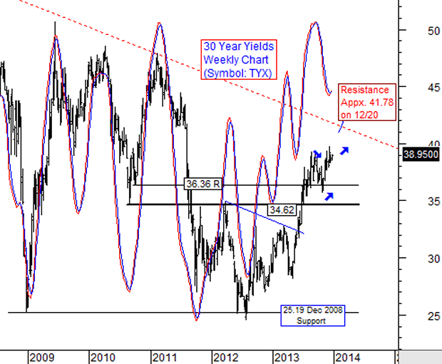
Take a look at our 6+ year Weekly chart on the 30 year yields .... The oscillator is already starting to turn up and if the Fed can't stop it from rising now, the 30 year yields will rise another 5+ percent. If it goes to the red dotted fan resistance line, then the rise could be close to 7%.
Even a 7% rise would not end the 19 year Bear market on yields. To begin the basing process for a new upside Bull market on 30 year yields, the TYX would need to rise above 41.75 and trend higher from there. A housing question: If interest rates go up, does the number of houses sold go up or down?
There are 4 charts on this page, so please scroll down to view them all.

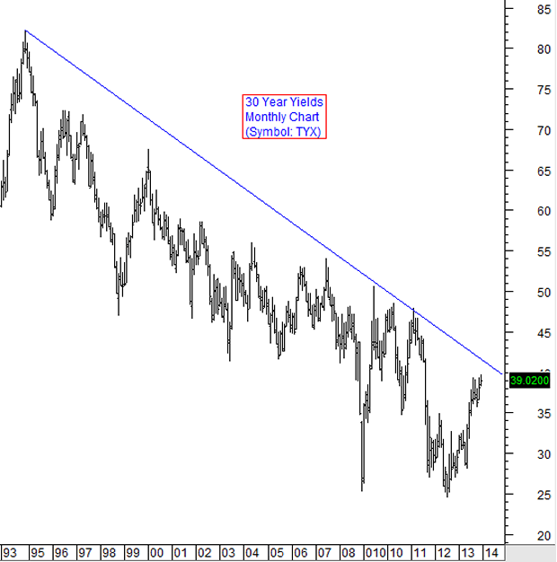
This chart shows the Bear market on the 30 year yields since 1993. For homeowners, it has been a good thing allowing many to buy homes that they otherwise couldn't afford. Housing question: If interest rates go back up, will home owners will find it more difficult to find buyers?

These next two charts are "food for thought" charts ....
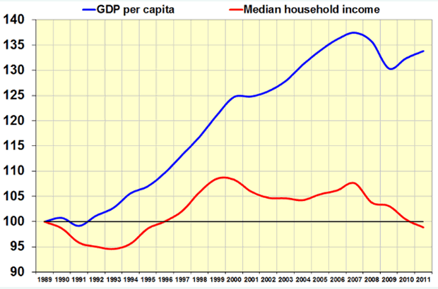
This chart shows how Median household income is going out of phase with the GDP per capita that has risen during the past 20+ years. Housing question: How will this effect housing prices even if interest rates remained the same?

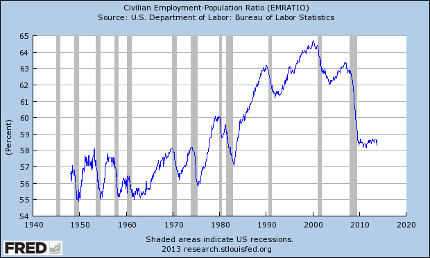
Last chart ... This chart by the St. Louis Federal Reserve shows their counts of the Civilian Employment-Population Ratio. This is simply the number in the labor force employed divided by the total population.
Note how the percent employed has dropped since 2000 and how it has remained low. Since people can only pay what they can afford, here is another housing question: What will happen to the long term prices of housing if this chart doesn't change?

By Marty Chenard
http://www.stocktiming.com/
Please Note: We do not issue Buy or Sell timing recommendations on these Free daily update pages . I hope you understand, that in fairness, our Buy/Sell recommendations and advanced market Models are only available to our paid subscribers on a password required basis. Membership information
Marty Chenard is the Author and Teacher of two Seminar Courses on "Advanced Technical Analysis Investing", Mr. Chenard has been investing for over 30 years. In 2001 when the NASDAQ dropped 24.5%, his personal investment performance for the year was a gain of 57.428%. He is an Advanced Stock Market Technical Analyst that has developed his own proprietary analytical tools. As a result, he was out of the market two weeks before the 1987 Crash in the most recent Bear Market he faxed his Members in March 2000 telling them all to SELL. He is an advanced technical analyst and not an investment advisor, nor a securities broker.
Marty Chenard Archive |
© 2005-2022 http://www.MarketOracle.co.uk - The Market Oracle is a FREE Daily Financial Markets Analysis & Forecasting online publication.


