Gold Gut Check 2013 - Is the Secular Bull Market Still on Course?
Commodities / Gold and Silver 2013 Oct 03, 2013 - 10:46 AM GMT 
This issue we team up with the charting research services, Macrotrends.net and Thechartstore.com, to bring you a grouping of highly illuminating charts on the gold and silver markets. Though we are a full five years from the genesis of the 2008-2009 financial crisis, its aftershocks still influence (in fact, dominate) economic policy as well as activity in the financial markets, including gold. Every once in a awhile, it pays to revisit the fundamental drivers of gold demand -- particularly investment demand -- in order to determine whether or not the secular bull market is still on course. If nothing else, it helps to clear the synapses of excessive media wash and re-establish why gold remains vitally important to the contemporary investment portfolio. For some, these charts will serve as an affirmation; for others a revelation -- a golden gut check of sorts. As you are about to see, the price of gold may have changed over the past year, but the fundamental monetary forces driving it have not.
Before proceeding to the charts, I would like to briefly address the rebirth of silver as a monetary metal. Gold has always been a monetary metal first and a commodity second. On the other hand, silver up until the 2008-2009 crisis was generally considered a commodity first and a monetary metal second -- something that might perform well in inflationary times but not so well in deflationary times. Since then, the public -- not market analysts and pundits -- has determined that silver has regained its status as a monetary metal. In fact, since 2008 the metal has performed very well under what could only be described as disinflationary circumstances -- a close cousin to deflation. At USAGOLD over the past few years, we have witnessed this phenomenon first hand by processing a large number of silver orders, primarily in coin form, placed with long-term asset-preservation investors. As a result of this reclaimed status, the first chart we offer in this analysis includes silver.
Gold and silver adjusted for inflation
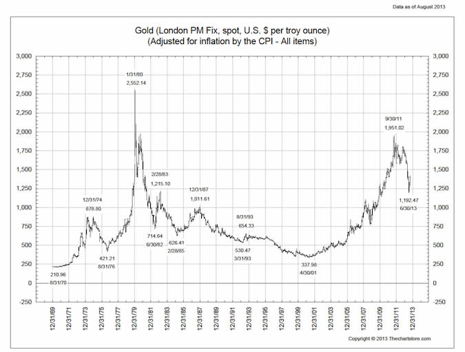
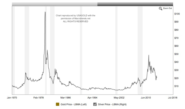
The first two charts show the inflation-adjusted price of gold and silver respectively from 1970 to present. In 1971 the United States officially severed the link between the dollar and gold and allowed it to float against other currencies. Many consider that delinking as the beginning of the modern era in economics and finance. It has been my view since the early 1970s that as long as that separation exists, gold will trend higher due to the government's propensity to run deficits and the central bank's acquiesence in printing money (when necessary) to cover them. The inflationary process has accelerated significantly since the 2008 financial crisis and the introduction of quantitative easing. The ramifications of these policies which are still in the process of translating to the general economy. Now, with both metals falling into the same monetary metal category, they should be analyzed accordingly -- a change that reintroduces the traditional gold-silver ratio as an important piece of the overall precious metals market analysis. (Please see Gold-silver ratio signals trading opportunity within IRAs by George R. Cooper, September, 2013)
 |
|---|
Chart courtesy of Thechartstore.com |
 |
|---|
Chart courtesy of Macrotrend.net |
As you can see, there is considerable headroom between gold and silver's end of June, 2013 lows ($1192/oz and $18.50/oz respectively) and the inflation-adjusted highs of $2552/oz for gold and $105/oz for silver*. Another feature worth noting on the gold chart is the similarity between the double peak structure and correction of the past two years when compared to the 1973-76 chart period. Also please note, gold's inflation adjusted low in the area of $420 in 1976. From there, gold went up six times to its inflation adjusted highs in 1980 of $2552/oz.
Keep in mind, too, that this chart is based on the current Bureau of Labor Statistics rendition of the Consumer Price Index -- a statistical interpretation many experts consider to be understated. Milton Friedman, the famed monetarist, quantified a roughly five-year lag between monetary inflation (the expansion of credit and money printing) and price inflation as represented in various retail and wholesale indices. If that is the case, we should be seeing the initial results of the Fed's money printing, which began in 2009, right about now. The rebounds in housing and auto sales might be the first signs that the monetary inflation has taken root in the general economy.
* These inflation adjusted highs coincide with a nominal cycle highs in 1979-1980 of $845/oz for gold and $49/oz nominal for silver.
What bubble?
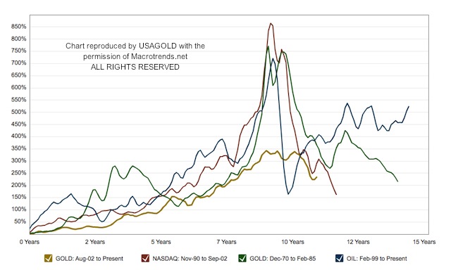
It has been said, mostly by those who have taken up the profession of central banking, that financial bubbles can be identified only in retrospect. One can only assume that a corollary to this presumption would be that the absence of a financial bubble can be ascertained only after the fact. The chart immediately below undermines once and for all the argument that gold has been in a bubble over the past several years. In the previous segment, we mentioned that the new economic era began in the early 1970s when the United States broke the link between the dollar and gold. From that point forward, the U.S. and world economies and financial markets simply began to behave differently. "The world financial system," says Macrotrends, "moved from the relative discipline of the gold-dollar, fixed-currency standard to a system of free-floating currencies in 1973. This move unleashed a series of asset pricing bubbles over the subsequent decades."
 |
|---|
Chart courtesy of Macrotrend.net |
With all the confusion when it comes to identifying bubbles, there is a certain amount of science that can and should be applied to the problem. This comparative life cycle chart of various bubbles by Macrotrends is a significant step in that direction. The "v" shaped vertical spikes represent real bubbles. The rounded-off, subdued gold chart for the current gold market does not match up well with the true bubble markets, which featured strong rocket trajectory climbs and then equally stunning collapses. "This chart," says Macrotrends, "tracks the performance of gold since July of 2002 against the three largest bubbles of the last 40 years. Past bubbles have shown strong but steady growth for the first 7-8 years before moving into a hyper-growth phase for the last 18-24 months. Each series is adjusted for inflation and is smoothed with a 3-month moving average."
Macrotrends states that gold would have had to spike to $3000 for it to have reached true bubble status in the period 2009 through 2013. When compared with the NASDAQ and oil bubbles, the current gold market looks tame -- it has developed more like a traditional, secular bull market experiencing a healthy correction than a bubble suffering a rapid deflation. In keeping with the previous chart on the inflation-adjusted price of gold, we may not see that spike, or hyper-growth phase, until we experience another inflation wallop similar to what occurred in the late 1970s.
( Please see "Gold a Bubble? NOT-EVEN-CLOSE" by Jonathan Kosares, October, 2010)
Traveling partners - the monetary base and gold
 |
|---|
Chart courtesy of Macrotrend.net |
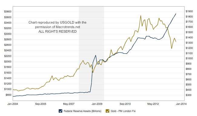
Those of you who follow the analysis on these pages regularly will recognize the chart reproduced immediately above. Federal Reserve assets essentially make-up quantitative easing, i.e. the $85 billion per month shelled out by the Federal Reserve. QE comes down to the purchase of two kinds of securities -- U.S. Treasury paper (bonds, notes and bills) and mortgage-backed securities. The Federal Reserve buys the Treasury paper from the federal government and the mortgage-backed securities from commercial banks. The first is a direct form of monetization (money printing); the second is an indirect form since a good portion of those funds are in turn also used by the banks to purchase Treasury paper. At present the asset side of the Fed's balance sheet stands at just over $3.6 trillion -- up about $2.8 trillion since the beginning of the financial crisis in late 2008. While the market pundits and Wall Street analysts talk incessantly about "tapering", the Fed has quietly accelerated purchases, as you can see, like at no time since 2008. As I wrote in this newsletter back in June, heed what the Fed does, not what it says.
At first glance, it looks like the growth in Federal Reserve assets and the gold price are correlated, but what is really going on with this tandem is that they are both being pushed by the same force -- a bad economy. It causes the Fed to print money and investors to buy gold. Over the long run, the monetary base has led gold higher but, as you can see, over the past twelve months the gold price has crossed decisively under the reserve bank credit trend line. The two developments together have made for an interesting chart divergence — the sort of thing that catches the attention of technicians and value investors alike.
 |
|---|
Chart courtesy of Macrotrend.net |
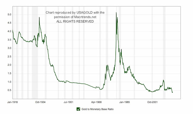
Our last chart, immediately above, is the coup de grace in our review of the monetary fundamentals and gold. It shows the ratio of gold to the monetary base, and another way of presenting the relationship shown in the previous chart. "This chart," says Macrotrends, "shows the ratio of the gold price to the St. Louis Adjusted Monetary Base back to 1918. The monetary base roughly matches the size of the Federal Reserve balance sheet, which indicates the level of new money creation required to prevent debt deflation. Previous gold bull markets ended when this ratio crossed over the 4.8 level." In other words, with the multiple currently under 0.5x, we have a long way to go before this ratio returns to its all-time highs. Too, the greater the divergence between the two, as shown in the overlay chart, the more geared that latent potential becomes. At a 5x multiple, as achieved in the 1930s and early 1980s, gold would need to be priced at over $6000 per ounce. Though we are not prepared at this juncture to suggest gold is headed for such a plateau, we can suggest at $1300 to $1400 per ounce, it appears undervalued, if not radically undervalued.
Afterword
We live In the age of instant conmmunication and information overload, yet the critically important relationships we have shown in these charts remain generally overlooked -- in fact hiding in plain sight. Keep in mind the lessons contained in these charts for the long run and don't be distracted by the anti-gold chatter in the mass media meant to lead you away from the real reasons for gold ownership, i.e. as a safe haven against the continuing currency depreciation and systemic dangers likely to result from the monetary excesses discussed in this issue of our newsletter.
By Michael J. Kosares
Michael J. Kosares , founder and president
USAGOLD - Centennial Precious Metals, Denver
Michael J. Kosares is the founder of USAGOLD and the author of "The ABCs of Gold Investing - How To Protect and Build Your Wealth With Gold." He has over forty years experience in the physical gold business. He is also the editor of Review & Outlook, the firm's newsletter which is offered free of charge and specializes in issues and opinion of importance to owners of gold coins and bullion. If you would like to register for an e-mail alert when the next issue is published, please visit this link.
Disclaimer: Opinions expressed in commentary e do not constitute an offer to buy or sell, or the solicitation of an offer to buy or sell any precious metals product, nor should they be viewed in any way as investment advice or advice to buy, sell or hold. Centennial Precious Metals, Inc. recommends the purchase of physical precious metals for asset preservation purposes, not speculation. Utilization of these opinions for speculative purposes is neither suggested nor advised. Commentary is strictly for educational purposes, and as such USAGOLD - Centennial Precious Metals does not warrant or guarantee the accuracy, timeliness or completeness of the information found here.
Michael J. Kosares Archive |
© 2005-2022 http://www.MarketOracle.co.uk - The Market Oracle is a FREE Daily Financial Markets Analysis & Forecasting online publication.


