


Worst of Credit Crisis Over? Watch the Stock/ Bond Ratio
Stock-Markets / Credit Crisis 2008 Apr 04, 2008 - 11:11 AM GMT

 Is the worst of the credit crisis behind us? Some of my perma-bear friends will probably think of hospitalizing me for merely raising the question. The short answer, however, is that nobody actually knows. Sure, one can deliberate the fallout of the subprime saga to the nth degree, but even a crystal ball regarding the economic variables doesn't necessarily mean getting the markets right.
In muddled times such as these it is often helpful to keep things truly simple. And seeing that these posts are styled as “Picture du Jour”, I am in any event supposed to deal only with a single graph (plus maybe one or two complementary ones).
The graph in question is the so-called stock/bond ratio that serves the useful purpose of indicating to what extent safe-haven buying of bonds as opposed to stocks is taking place. This is a price-relative chart, meaning it is calculated by dividing one time series by another in order to ascertain relative out- or underperformance. In this instance the comparison is between stocks (using the S&P 500 Index as proxy) and government bonds (using the US 10-year Treasury Note) as illustrated by the monthly graph below.
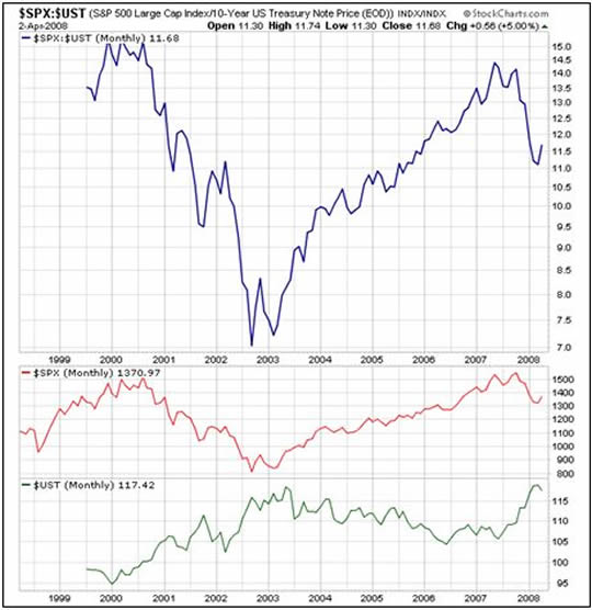
Source: StockCharts.com
The price relative (blue line in the top section of the diagram) clearly demonstrates how bonds have outperformed stocks over two distinct periods, namely from the middle of 2000 until the middle of 2002, and from the middle of last year until recently. Studying the raw data, the periods of under-/outperformance of stocks (red line) and bonds (green line) can be seen clearly.
Let's now zero in on movements over the past few weeks by looking at a daily chart.
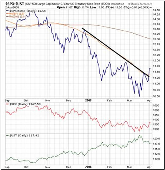
Source: StockCharts.com
The blue relative line reveals how stocks have started outperforming bonds from the middle of March (with stocks moving higher and bond prices declining) as risk aversion has started becoming less pronounced. Are we seeing a turning point of any importance, especially as we have been “fooled” by a few false spikes in the blue line over the past few months?
In my opinion it is too early to draw specific conclusions. There are, however, a number of pointers one should be cognizant of in trying to assess the situation, including the following:
• The spread between the Fed funds rate and two-year Treasury Note yield is now 35 basis points, the lowest level since July 2007 (see graph below).
• The CBOE Volatility (VIX) Index has dropped from 32% to 23% and is threatening to break its 200-day moving average (i.e. bullish for stocks).
• Credit Default Swap (CDS) spreads have narrowed.
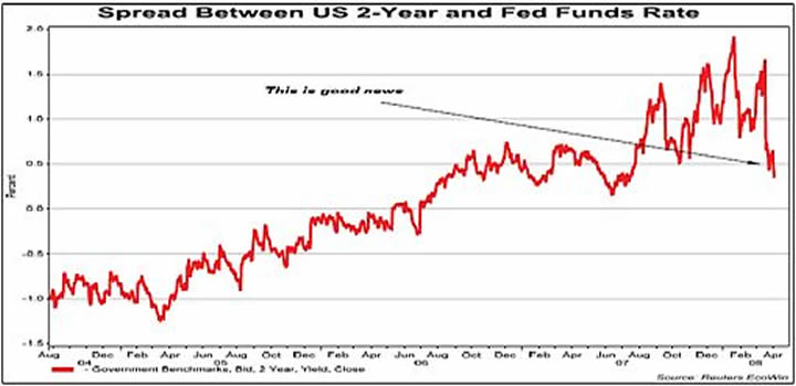
Source: GaveKal – Checking the Boxes , April 3, 2008.
Although I am of the opinion that US long-dated bonds are topping out (see post “ US Long Bonds in Injury Time ” of March 28, 2008), I still can't get excited about the prospects for the stock market beyond an intermediate rally, especially given a rather sombre earnings outlook and still relatively high valuation levels.
The stock/bond ratio may very well have some further backing and filling to do before registering an “all clear” turning point. But let's closely watch the spreads and other risk parameters and keep an open mind about interpreting the language of the market.
It will be very interesting to hear readers' opinions on this issue. Please share your thoughts with us by participating in the following quick poll:
By Dr Prieur du Plessis
Dr Prieur du Plessis is an investment professional with 25 years' experience in investment research and portfolio management.
More than 1200 of his articles on investment-related topics have been published in various regular newspaper, journal and Internet columns (including his blog, Investment Postcards from Cape Town : www.investmentpostcards.com ). He has also published a book, Financial Basics: Investment.
Prieur is chairman and principal shareholder of South African-based Plexus Asset Management , which he founded in 1995. The group conducts investment management, investment consulting, private equity and real estate activities in South Africa and other African countries.
Plexus is the South African partner of John Mauldin , Dallas-based author of the popular Thoughts from the Frontline newsletter, and also has an exclusive licensing agreement with California-based Research Affiliates for managing and distributing its enhanced Fundamental Index™ methodology in the Pan-African area.
Prieur is 53 years old and live with his wife, television producer and presenter Isabel Verwey, and two children in Cape Town , South Africa . His leisure activities include long-distance running, traveling, reading and motor-cycling.
Copyright © 2008 by Prieur du Plessis - All rights reserved.
Disclaimer: The above is a matter of opinion and is not intended as investment advice. Information and analysis above are derived from sources and utilizing methods believed reliable, but we cannot accept responsibility for any trading losses you may incur as a result of this analysis. Do your own due diligence.
Prieur du Plessis Archive |
© 2005-2022 http://www.MarketOracle.co.uk - The Market Oracle is a FREE Daily Financial Markets Analysis & Forecasting online publication.