Analysing Marc Faber's Stock Market Crash Forecast
Stock-Markets / Financial Crash Aug 11, 2013 - 01:11 PM GMTBy: PhilStockWorld
 Courtesy of Doug Short: Thursday on CNBC, Marc Faber made front headlines across the web calling for a 1987-style crash in the stock market. Faber cites a strong rally in the face of lackluster corporate earnings growth and weakening market breadth to characterize the backdrop to 1987, and says we have a similar outcome today.
Given the enormity of the crash that occurred then, and the fear that many investors have for such a repeat event, let’s take a look at the comparisons between now and then and see how close they match up.
In both cases, the stock market had rallied quite strongly from the start of the year. In 1987, the S&P 500 had rallied more than 30% by early August. Though not quite as strong, the S&P 500 has rallied 19% YTD.
Not All Rate Spikes Are Equal
Similar to that year, we also experienced sharply rising interest rates; however, the big difference today is they are coming off of extremely low levels. For example, the 10-yr UST yield rallied from a low of 6.97% in December 1986 to a high of 10.23% in October 1987 for a 46.8% rise or 3.26% rise in rates. Recently, the 10-yr UST yield hit a low of 1.63% in May and rallied 68% to a high of 2.74% in July for a 1.11% rise in yields. So, while we have seen a great percentage jump in interest rates this year, from an absolute level they have risen just over a single percent, while they jumped more than 3% in 1987. What’s more important, however, are the widely differing circumstances that led to this jump in rates then and now.
Back then, the Federal Reserve hiked interest rates from 5.875% in December 1986 to a high of 7.25% in September as rising inflation from a weakening trade deficit led to foreigners dumping their US bonds, which then depressed the dollar. Currently, the Fed is not raising interest rates, our trade deficit is improving from a surge in domestic energy production and declining oil imports, and the USD Index has rallied more than 15% from the lows in 2011 to its recent highs?a complete polar opposite to the backdrop seen in 1987.
How About Stock Market Breadth?
“Dr. Doom” also pointed out to weakening breadth near a new high in the market as evidence of a coming major market decline. One data point he cited was of 170 new 52-week lows on Tuesday and Wednesday. Since he doesn’t say which index this applies to, nor how many stocks are hitting new highs in comparison, let’s take a look at new highs/lows data for the S&P 500.
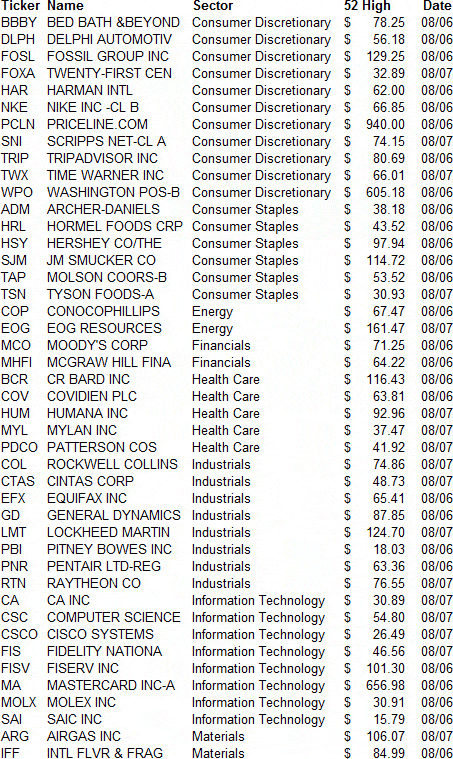
Between Tuesday and Wednesday the S&P 500 saw more than 44 stocks hit new 52-week highs while only 3 saw new 52-week lows, meaning for every stock hitting a new 52-week low there were nearly 15 stocks making new 52-week highs, not the kind of deteriorating breath you see at major tops!
What is even more encouraging is digging into the details of who was making a new high or low. The list of the 44 stocks hitting new 52-week highs this Tuesday/Wednesday is shown below.
S&P 500 52-Week Highs from 08/06/13-08/07/13
Source: Bloomberg
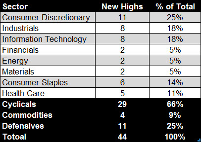
What is more than obvious at looking at the list above is the dominance of economically-sensitive sectors versus defensive (non-economically sensitive) sectors. A breakdown of the sector composition is shown below in which 75% of the new highs were in economically-sensitive sectors versus 25% in defensive ones. Typically at tops you see money gravitating to safety in which cyclical sectors are weak, as they’ve already begun their bear markets, while the stock market hits new highs and is dominated by defensive stocks; clearly this is not the case today.
S&P 500 52-Week Highs from 08/06/13-08/07/13
Source: Bloomberg
And of the new lows during the two day period, one was a gold stock (NEM), which isn’t surprising given the slide in gold prices, another was a fertilizer stock (MOS) given the slide in potash prices, and the third (JCP) has company specific issues not related to the economy.
S&P 500 52-Week Lows from 08/06/13-08/07/13

Source: Bloomberg
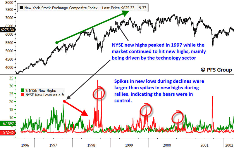
Looking at 52-week highs/lows data is insightful in spotting market tops as fewer and fewer stocks hit new highs and more stocks are hitting new lows even as the stock market rallies to its ultimate peak. This was seen at the 2000 and 2007 tops, but is lacking in the present case. For example, you can see that 52-week highs on the NYSE peaked in 1997, more three years before peaking in 2000, as the major index was largely being driven higher by tech stocks.
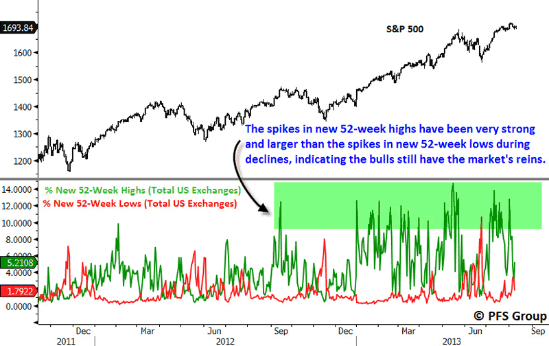
A key hallmark for spotting when a market top is occurring and when the reins of control have shifted from the bulls to the bears is to look at spikes in 52-week highs during rallies and spikes in 52-week lows during declines. As long as the spikes in new highs during rallies is greater than the spikes in new lows during declines, the bulls remain in charge. However, when the spikes in new lows during declines is greater than the spikes in new highs on rallies, a bear market is beginning as the bears are in the driver’s seat. You can see this took place during the 1998 Asian Currency Crisis at which point the bulls lost control and the market began a topping process.
Source: Bloomberg
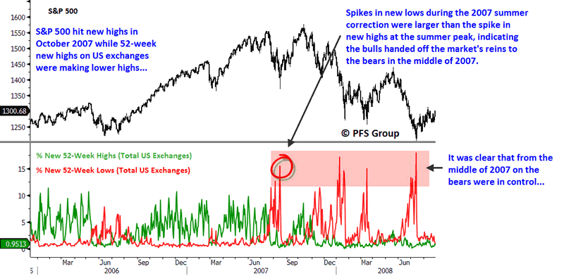
We saw a similar dynamic at the 2007 market top as the bulls remained in control until the summer of 2007 when the spike in new 52-week lows during the summer’s decline exceeded the spike in new 52-week highs leading up to the summer’s market top. From the summer of 2007 on, the bears had full control and would not release their grip on the market until 2009.
Source: Bloomberg
In stark contrast to 2000 or 2007, new 52-week highs on US exchanges are far outpacing new lows and shows that the bulls remain firmly in the driver’s seat, contrary to Faber’s assertion of a market top forming.
Source: Bloomberg
Market Not at Extremes Like 1987
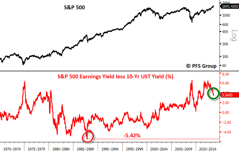
Another important point to bring up is that markets are mean-reverting, meaning whenever they become stretched to major extremes, like a rubber band they snap and move back to the mean (average) and usually go beyond the mean as they overcorrect. For example, at the 1987 peak the earnings yield (inverse of the price-to-earnings ratio) on the S&P 500 was 5.42% lower than the interest rate on the 10-Yr UST, which, going back over the last half century, was the worst spread seen and sharply reversed with the crash. Conversely, the earnings yield on the S&P 500 exceeded the interest rate on the 10-Yr UST in the early 2000s for the first time since the late 1970s and currently rests at a positive spread of 3.56%, indicating that stocks are more attractive than bonds. The positive spread has come down from the highs in 2012 but the difference between now and then is quite stark.
Source: Bloomberg
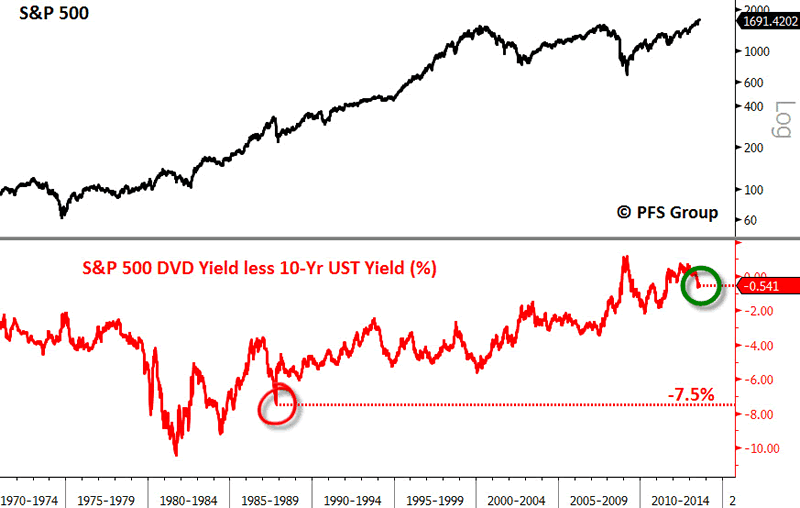
Another way of looking at relative value is the dividend yield on the S&P 500 versus the yield on the 10-Yr UST. Leading into the 1987 crash, the 10-Yr UST was yielding 7.5% MORE than the dividend yield of the S&P 500, meaning that investors who had huge stock market gains were viewing the bond market as a more attractive investment given the much higher yield and began to make the exit in force during the crash. In stark contrast, at the 2009 bear market bottom the S&P 500′s dividend yield exceed the 10-Yr UST yield for the first time in a half century! Even at the November 2012 bottom the spread between the dividend yield on the S&P 500 relative to the 10-Yr UST was almost where it was at the March 2009 market lows and we are not that far off as the 10-Yr yield is only 0.54% more than the S&P 500′s dividend yield.
Source: Bloomberg
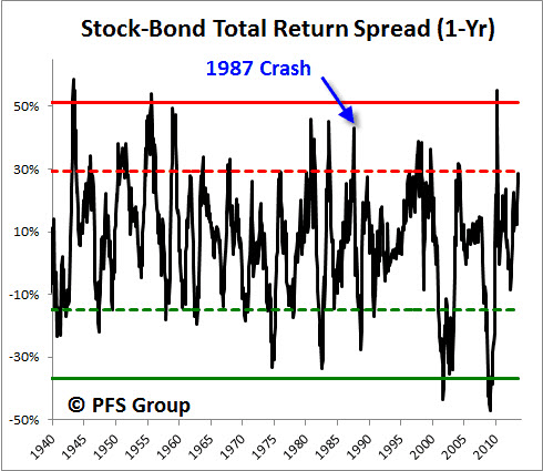
What is perhaps the most similar to 1987 is the relative one-year performance spread between the S&P 500 and the 10-Yr UST. Major stock market peaks are seen when stocks outperform bonds by 40% plus over a year’s time and at the 1987 peak stocks outperformed bonds by more than 45%, while presently stocks have outperformed bonds by 29%. Thus, while overall conditions are very different than in 1987, we could see a period of time in which bonds outperform stocks to help bring back the relative performance in line with the long term average of 7% over a year’s time.
Source: Bloomberg
Summary:
While I greatly respect Dr. Faber (AKA: “Doctor Doom”), I think his comparison of the current environment to 1987 is off the mark. I do believe that stocks could tread water ahead of the September FOMC meeting and may possibly correct more (See: “Possible Short-Term Top; No Bear Market on the Horizon“), but I simply do not see the same circumstances in place that warrant a repeat of the 1987 crash.
Originally posted at Financial Sense
(c) PFS Group PFS Group
- Phil
Philip R. Davis is a founder of Phil's Stock World (www.philstockworld.com), a stock and options trading site that teaches the art of options trading to newcomers and devises advanced strategies for expert traders. Mr. Davis is a serial entrepreneur, having founded software company Accu-Title, a real estate title insurance software solution, and is also the President of the Delphi Consulting Corp., an M&A consulting firm that helps large and small companies obtain funding and close deals. He was also the founder of Accu-Search, a property data corporation that was sold to DataTrace in 2004 and Personality Plus, a precursor to eHarmony.com. Phil was a former editor of a UMass/Amherst humor magazine and it shows in his writing -- which is filled with colorful commentary along with very specific ideas on stock option purchases (Phil rarely holds actual stocks). Visit: Phil's Stock World (www.philstockworld.com)
© 2013 Copyright PhilStockWorld - All Rights Reserved Disclaimer: The above is a matter of opinion provided for general information purposes only and is not intended as investment advice. Information and analysis above are derived from sources and utilising methods believed to be reliable, but we cannot accept responsibility for any losses you may incur as a result of this analysis. Individuals should consult with their personal financial advisors.
PhilStockWorld Archive |
© 2005-2022 http://www.MarketOracle.co.uk - The Market Oracle is a FREE Daily Financial Markets Analysis & Forecasting online publication.


