How Falsified U.S. GDP Data will Lead to Much Higher Gold and Silver Prices
Commodities / Gold and Silver 2013 Aug 02, 2013 - 09:21 PM GMTBy: Steve_St_Angelo
 While it seems that just about all of the economic data coming out of Wall Street or the U.S. Government is manipulated, there is one piece of data that is not. This valuable piece of information may also give us an idea on just how much the U.S. GDP data is being falsified.
The problem today with modern economics is that it has totally divorced itself from the physical economy. Everything is based upon a financial adjustment of one figure or a recalibration of another. Nothing is as its seems in the "Wonderful World of Financialization."
However, there is still one metric in the physical economy that we can use to gauge whether the economy is indeed growing or on the other hand, contracting. This simple measurement has provided concrete evidence showing that the Global GDP growth rate has been slowly declining for decades.
ENERGY: The Destroyer of Manipulated Government Economic Data
To be able to get back to a more fundamental approach in forecasting the health of the economy, we should be looking at the data coming from the energy market. In the article, "Evidence that Oil Limits are Leading to Declining Economic Growth", the author provided the following graph:
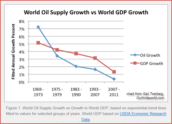
Here we can see that as the world's annual oil supply growth declined, so did the global GDP growth rate. In the beginning of the 1970's decade the global oil supply grew more than 7% annually while the global GDP growth rate increased approximately 5% during that time period.
However, during the 2007-2011 period, the world's oil supply annualized growth rate fell to just 0.5 percent, while the global GDP growth rate was down to little more than 1%. Thus, energy has everything to do with determining the growth rate of the world's economies.
To get an idea of what is taking place in the U.S. economy, I obtained total energy consumption data from the U.S. Energy Information Agency (EIA). While the energy supply provides us a good gauge of global economic growth, consumption is a better tool analyzing the United States due to the fact that we use a great deal more energy than we produce.
That graph below reveals how changes in energy consumption paralleled the rise and fall in the U.S. GDP growth rate:
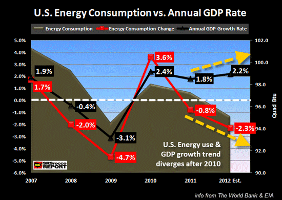
The energy information is provided by the amount of quadrillion (quad) Btu's of energy consumed from 2007 to 2012. In 2007, before the housing and banking collapse, the United States consumed over 100 quad Btu's of energy which was a 1.7% increase over 2006. That same year, the U.S GDP growth rate averaged 1.9%
Then at the bottom of the recession in 2009, total energy consumption by the states declined to 94.6 quad Btu's which was 4.7% lower than in 2008. Furthermore, U.S. GDP growth fell substantially to a negative 3.1% that year. The chart shows, as energy consumption declined so did the annual GDP growth rate.
Once the impact of QE1 and other clandestine stimulus packages by the FED & Treasury finally made its way into the economy, total energy consumption in the U.S. shut up 3.6% in 2010 as the GDP growth rate increased to 2.4%. Again, energy consumption was an excellent indicator of economic growth in the U.S. economy.
However, in the next two years, something odd occurred.... as the total U.S. energy consumption continued to decline, the GDP growth rate stubbornly decided to go its own way into positive territory. Basically, the energy consumption rate and GDP growth rate diverged after 2010 (especially in 2012).
You will see that in 2011 as U.S. energy consumption declined 0.8%, the GDP growth rate was still a positive 1.8%. Moreover, as energy consumption fell even further to a negative 2.3% in 2012, the U.S. economy supposedly grew an additional 2.2% that year. Thus, the difference in U.S. energy consumption and the GDP growth rate was an amazing 4.5%.
Now, there are several factors here we need to address to understand what is really taking place here.
First, energy consumption and the GDP growth rate are not going to be directly related. That being said, if we take the difference between energy consumption and the GDP growth rate for each year and provide a simple average, we arrive at an 1.1% figure. So, from 2007 to 2010 the difference in annual energy consumption to the GDP growth rate was approximately 1.1%. (Note: I am using the degree in difference each year not a positive or negative net change).
This 1.1% seems appropriate if we compare it to the first chart that shows the global GDP growth rate was approximately 1% higher than the world annual increase in oil supply from 2007-2011.
If we go by the 1.1% average difference in annual energy consumption vs. the U.S. GDP growth rate, we can safely assume that the official 2.2% GDP growth in 2012 rate may have actually been negative.
Second, a part of the decline in energy consumption in 2012 was due to a relatively mild winter in the states in which there was less demand for heating in the residential and commercial sector.
Third, a more reliable indicator of whether the U.S. economy is growing or contracting, is the energy consumption data from the industrial & transportation sectors.
This next chart shows the change in U.S. energy consumption in the industrial and transportation industry.
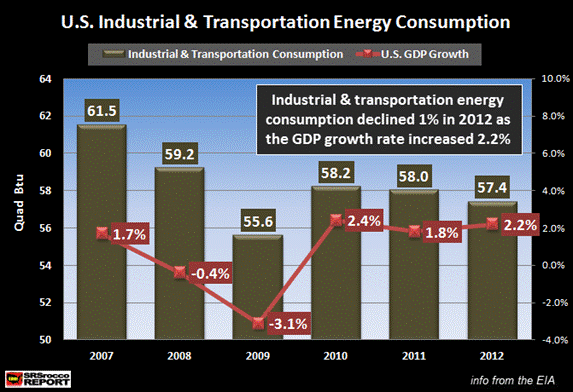
Again, the energy data in the graph is shown in quadrillion Btu's. Here we can see that as energy consumption in the industrial and transportation industry declined from 2007 to 2009 so did the U.S. GDP growth rate. In contrast, as energy consumption in these two sectors increased in 2010, the U.S. economy grew by a supposed 2.4%.
Then in 2011 and 2012 the same pattern takes place as was the case in the first U.S. energy chart. That is, as industrial & transportation energy consumption fell, the U.S. GDP growth was still positive.... especially in 2012. Somehow, the United States was able to grow its economy 2.2% in 2012 while its industrial and transportation industries consumed 1% less energy.
The 2012 GDP growth data seems quite faulty when you realize that industrial and transportation energy consumption fell to a greater degree (58.0 in 2011 to 57.4 in 2012) than it did in 2011 (58.2 in 2010 to 58.0 in 2011) which stated a lower GDP rate.
Of course, I can be blamed for being guilty of "cherry picking" the data to prove my point as the differences in prior years' energy-GDP relationships may be greater in percentage terms. However, it still takes growing energy consumption to produce positive GDP growth.
Furthermore, overall GDP statistics are probably manipulated to a greater degree due to the following factors (paraphrasing from the article linked above):
1) Understating the rate of inflation: GDP is calculated by adding up the increase in sales of all goods and services and then subtracting the amount of GDP that was due to inflation. Governments have utilized new methods of figuring inflation (by actually under-reporting the real inflation rate) which changed since the 1980's. Which means the stated official GDP figure is probably a lot higher due to understating the real inflation rate.
2) Increasing Huge amounts of Debt: The U.S GDP is figured by the amount of goods and services sold, not how they will be paid for. If the Fed or U.S. government provides programs such as Quantitative Easing and allows easy financing to anyone with a heartbeat to purchase a car, boat or home... this can increase GDP, but in an inflated unsustainable fashion.
Falsified GDP Data will Turn Out to be Positive for the Precious Metals
So, the real question is how will manipulated GDP data be good for gold and silver? The answer is simple. All manufactured and manipulated data has to answer to the forces of the fundamentals at some point.
Even though everyone on CNBC and Wall Street (including Fed Chairman Bernanke) were putting out great economic data while stating how good the future prospects for the market looked in 2007, the following two years turned out to be the exact opposite -- a complete economic disaster.
That is why I believe the Fed announcement of QE3 in Sept of 2012 was necessary in their eyes. If we remember from the data provided by the charts above, U.S. energy consumption was falling in 2012 to a larger degree than 2011, and unless something drastic was done, the conditions in the economy would have continued to disintegrate in 2013. Basically, the watered down QE2 had run its course and much more was needed.
Today, the Fed hints of "TAPERING" to the public while in secret it plans to unleash QE4. I would actually be surprised if they didn't blurt out the word "TAPER" from time to time. The only thing that is keeping the U.S. economy and dollar alive is a lot of hot air, arm-twisting and cow excrement.
The Fed states that they will start to shut off the QE TAP when the U.S. employment situation improves. Well, if they are looking at some of the very charts that they are producing there at the St. Louis Fed, conditions in the labor force are continuing to deteriorate.
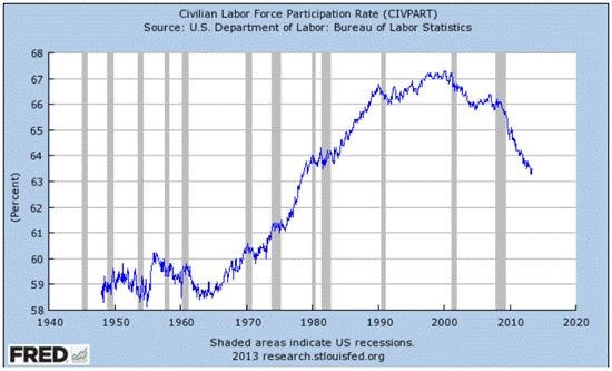
As we can see from this chart, the civilian labor participation rate has fallen substantially since the economic crisis during 2008-2009 period. It doesn't seem to matter how much stimulus is released into the market, the U.S continues to head towards another economic collapse.
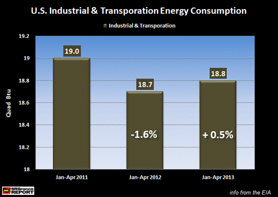
Now, if you are in the mood for a good laugh, let me present the final chart of the day. With all the Fed money printing, Treasury & Mortgaged Backed Security purchases, zero to low-interest lending and Central Bank Vaudeville Acts, industrial & transportation energy consumption has risen a paltry 0.5% during the first four months of 2013 compared to the same period last year:
Sure, it may be true that it takes time for the impact of monetary stimulation to work its magic, but we are already beginning to see signs that the housing market is topping and turning down as well as other negative economic indicators.
So, if the Fed really decides to "TAPER", I believe the U.S. economy will suffer a massive stroke disintegrating to levels much worse than what was witnessed during the 2008-2009 time period.
The reason why this manipulated GDP data is positive for the precious metals is due to the fact that gold and silver are stores of wealth that will find their true value when the real market fundamentals finally kick in. The longer and larger degree in which the GDP data is manipulated, the higher the revaluation of the precious metal values will become.
I don't believe in trading the precious metals or do I care about the short-term moves in the paper prices of gold and silver. This is a war of attrition. The Fed and Central Banks are playing with fire by pushing the price of gold and silver down to the level of their production costs.
Analysts who are forecasting $850 gold are doing so because they are standing in a VACUUM TUBE. Never in the history of mankind has the value of gold been driven below its cost of production for an extended period. Very few if any gold analysts realize how energy impacts all aspects of the gold and silver mining industry.
There was a huge difference as it pertains to profit margins in mining gold in the 1930's and 1970's compared to the conditions presently. I will be discussing this in a future article.
Finally, as the U.S. economy stands at the edge of a cliff, very few are prepared for what is coming. The Fiat Monetary QE to Infinity System has an expiration date. Of course it is impossible to know what day that will be. However, the fundamentals and the value of real money always win out in the end.
At the SRSrocco Report, we will explore how energy will impact the mining industry in the future. Falling ore grades and decreasing yields are only part of the problem. As net oil exports continue to decline, energy prices will rise putting more pressure on the mining industry. Thus, rising energy costs will guarantee rising prices of gold and silver.
© 2013 Copyright Steve St .Angelo - All Rights Reserved Disclaimer: The above is a matter of opinion provided for general information purposes only and is not intended as investment advice. Information and analysis above are derived from sources and utilising methods believed to be reliable, but we cannot accept responsibility for any losses you may incur as a result of this analysis. Individuals should consult with their personal financial advisors.
© 2005-2022 http://www.MarketOracle.co.uk - The Market Oracle is a FREE Daily Financial Markets Analysis & Forecasting online publication.


