


The Most Rigged Economic Indicators
Politics / Economic Statistics Jul 23, 2013 - 02:59 PM GMTBy: Money_Morning

 Garrett Baldwin writes: On August 2, the Bureau of Labor Statistics will report the official unemployment rate. But this number doesn't tell the accurate story of the jobs picture here in the United States.
That's usually the case with government-produced economic indicators. Whatever the government figure will say, it will not truly reflect reality. Simply put, it's a rigged number.
When it comes to cheating the numbers, nobody does it better than Uncle Sam.
U.S. investors rely on accurate government data in order to make investment decisions in various sectors of the economy.
But what if these figures reflected negative headlines on a near-constant basis? It wouldn't instill much confidence. And it certainly would cost a lot of people in Washington their jobs.
That's why Uncle Sam plays games with the numbers and presents a far rosier picture of the world to low-information voters and investors. But we're paying attention here at Money Morning, and that's why we're holding a spotlight on the fuzzy math in Washington.
Counting down, here are the four most rigged government statistics in America today:
4) Poverty Levels: Just in case we ever need to justify massive redistribution of wealth in the U.S., we need look no further than a recent decision by the Obama administration to redefine poverty in the United States.
The old way of measuring poverty was based on purchasing power, meaning just how much meat and potatoes can one purchase with the income he or she has.
But the new definition brought into the White House in 2010 is a measure of comparative purchasing power. This means, how much meat and potatoes can you by in comparison to your neighbors.
This fixes a statistical figure to a percentage of Americans' buying power in comparison to the median income level and the richest in the U.S. When you look at this figure, it is unfair that some people can buy 100 steaks when others can only purchase five.
Here's why it's a rigged trick.
If Americans tomorrow become two times more productive, and income doubled for everyone in the country, there would still be the same level of poverty, because there would still be a statistical comparison of purchasing power.
This means that poverty will always be an epidemic in the United States, even if individuals were given more opportunity and produced more. The statistical figure breeds class envy over the long-term.
3) Consumer Price Index: Famed PIMCO bond manager Bill Gross once deemed the U.S. Consumer Price Index an "haute con job." And for good reason.
The CPI measures the price level of goods and services purchased by consumers and is one of two definitions for inflation (the other being a calculated statistic from money supply figures).
Unfortunately, CPI is a very broken economic indicator.
Providing a measure of inflation, the CPI tells us just how much the price of goods is increasing over time.
But here's the problem. The Core CPI number excludes food and energy from its formula. This is done because "these goods show more price volatility than the remainder of the CPI."
But that's very convenient given that rising energy and food costs push up the price of many other products and services that Americans purchase.
One can tell this figure is rigged just by factoring in just how under-reported the cost of energy is alone. In 2008, when oil hit $150 a barrel and food prices were near all-time highs, the official CPI was just 4%. With the cost of food and energy at record highs, the government tried to claim that the CPI was a mere 4% inflation. In reality, the real level of inflation was at least double this figure.
But there's a reason why government does this.
To overstate the economy's growth figures. Inflation is naturally bad for growth rates - particularly in GDP, which we'll look at in a minute.
If GDP grows by 2% and inflation was 1%, then real growth was 1% in simple terms. That's good for politicos, but the reality is worse of anyone trying to maintain a standard of living. Rigging the CPI allows government to rig other numbers, including wages, GDP, and purchasing power.
2) Gross Domestic Product: GDP is a measure of consumer spending, investment by industry, and government spending, plus the difference between exports and imports.
Talk about a con job. Annual GDP is one of the most rigged government figures.
There are two reasons that this is a rigged figure.
First, it doesn't properly take inflation into the equation, meaning that the real GDP (growth minus inflation) doesn't truly reflect the value of the production over time.
Yes, we have an annual GDP of $16 trillion, but how does that figure compare to the size the economy would be measured in the value of the dollar 50 years ago. In real terms that figure would be $2 trillion. The cumulative rate of inflation in the U.S. economy since the United States went off the Gold Standard in 1971 is 86.3%.
Second, one of the best tools of rigging the books is the "readjustment" period. Since there is a lag in available information to confirm and complete its estimate, the Commerce Department's Bureau of Economic Analysis regularly puts out a number to quantify the quarterly growth figure.
Then, as time passes, the BEA is able to readjust that figure as more information comes in. All too often, however, we find that the readjustment is lower than the previous estimate, meaning that the initial figure shown in the headlines is a gross exaggeration.
Each quarter we've seen continued overstatements, only to have the BEA revise GDP growth downward and claim ignorance later. Finally, remember that so long as government can borrow money or print dollars, it can artificially inflate GDP to any level it wants to.
Of course, there are consequences, which is why the government portion of this figure must always be monitored.
In 2011, 38.9% of all U.S. spending was done by governments at the local, state, and Federal level, a staggering figure that retards real growth in the economy (all money spent by government is either taxed or borrowed).
To put just how high that figure is, we spent more money at the government level than Canada (by percentage of GDP), and nearly twice the rate of China - a communist nation. The freest economies in the world typically reflect lower government spending, like Chile, Hong Kong, and Singapore.
1) The Unemployment Rate: No figure is more important to a president and members of Congress than the unemployment rate, which is why they officially rigged it for good in 1994.
There are two sets of the unemployment rate in the United States. The first is the U-3 or "Official Unemployment Rate." This masked rate gets in the news and fools the low-information voter into seeing the economy through rose-colored glasses.
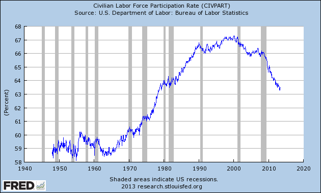
But the U-3 unemployment index ignores millions of Americans who have been out of work for an extended period and have given up looking for work. It also counts part-time workers. This change began under Lyndon Johnson and has compounded under every Presidency since. As you can see in the chart above, the civilian labor force rate is now down to a 30-year low, as millions of disenchanted Americans have left the job market, gone on disability, and are not seeking a job (a requirement to be counted in the U-3 rate).
As of June 2013, the labor participation rate stood at 63.5%. If the workforce population were the same size today as it was in January 2009, the official unemployment rate would be above 10%.
Currently the broader measure of unemployment, the U-6 rate, sits just shy of 15%. But some economists have argued that the real unemployment rate in the U.S. sits around 21% to 22% when you factor in all of the working-age Americans who are able to work, but can't find a job and undocumented workers who are part of the labor force and are also jobless.
The government has been rigging the books as long as politicians have been trying to maintain a grip on power. I wouldn't go bowling with anyone in Washington and let them keep score.
So what other numbers do you know about that are rigged?
Education, test scores, crime data? Let us know about the tricks your local or state government is playing with the numbers with your comments below.
And for how the government decided to change the GDP calculation to make us look richer, check this out.
Source :http://moneymorning.com/2013/07/22/the-four-most-rigged-economic-indicators/
Money Morning/The Money Map Report
©2013 Monument Street Publishing. All Rights Reserved. Protected by copyright laws of the United States and international treaties. Any reproduction, copying, or redistribution (electronic or otherwise, including on the world wide web), of content from this website, in whole or in part, is strictly prohibited without the express written permission of Monument Street Publishing. 105 West Monument Street, Baltimore MD 21201, Email: customerservice@moneymorning.com
Disclaimer: Nothing published by Money Morning should be considered personalized investment advice. Although our employees may answer your general customer service questions, they are not licensed under securities laws to address your particular investment situation. No communication by our employees to you should be deemed as personalized investent advice. We expressly forbid our writers from having a financial interest in any security recommended to our readers. All of our employees and agents must wait 24 hours after on-line publication, or after the mailing of printed-only publication prior to following an initial recommendation. Any investments recommended by Money Morning should be made only after consulting with your investment advisor and only after reviewing the prospectus or financial statements of the company.
Money Morning Archive |
© 2005-2022 http://www.MarketOracle.co.uk - The Market Oracle is a FREE Daily Financial Markets Analysis & Forecasting online publication.