US Manipulated CPI Inflation Statistics- Stagflation 1980 and Now
Economics / Stagflation Mar 14, 2008 - 03:25 PM GMTBy: Tim_Iacono
 There's been a lot of talk in recent months about how different the current period is from bouts of "stagflation" in the 1970s and early 1980s. According to the BLS (Bureau of Labor Statistics), "inflation" peaked in 1980 at around 14 percent or so and many pundits today say that we'll never see those levels ever again.
They're probably right ... but not for the reasons you might think.
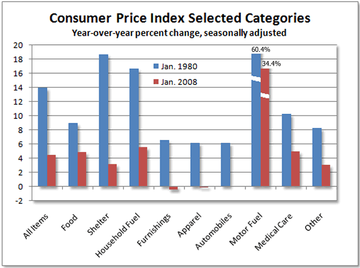
To explain why, it is helpful to compare today's "inflation" to that which was reported three decades ago. An example of this appears below where the annual percent changes for selected consumer price index categories are shown for January 1980 alongside price increases in January 2008.

As shown in the first pair of blue and red bars, headline inflation was 4.4 percent earlier this year while 28 years ago it was 13.9 percent.
That's a big difference, but where does that difference come from?
Where are there pairs of big blue bars and little red bars in the chart above?
One look at the middle of the chart and it is clear that "inflation" has been completely vanquished from furnishings, apparel, and automobiles - the small red bars that are visible for these groups hang below the y-axis rather than rising above it. The combination of inexpensive imported goods and relentless quality adjustments have squelched any BLS-reported price increases for these goods for many, many years now.
Of course, the rising cost of motor fuel is literally "off the chart" both then and now, up 64.4 percent in 1980 and up 34.4 percent today. Prices for household fuel rose at almost 17 percent in 1980 but at less than 6 percent in January.
Housing costs (shelter) were rising much faster back in 1980 than today.
Look at that!
A whopping 18 percent increase in the cost of shelter back when bell-bottoms were in style versus only a 3 percent increase today.
Hmmm...
When comparing overall "inflation" between then and now, in order to more properly judge the appropriateness of the second half of the "stagflation" label some are applying to conditions today, the data in the first chart above is all but meaningless without knowing how these price changes are weighted when calculating the overall inflation total.
For example, if motor fuel only makes up 5.5 percent of the overall price index (as it does today) then, whether the cost of gasoline was rising at a rate of 60 percent or just 34 percent, that would only be a difference of a little over one percentage point for the overall inflation total - that won't explain how you get from 4.4 percent two months ago to 13.9 percent in 1980.

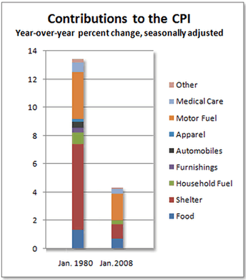
As shown in the next chart, the biggest factor in the huge difference between inflation in 1980 and inflation today is shelter.
And what is the major component in the shelter category today?
Owners' equivalent rent.
Recall that before 1983, back when "inflation" was raging, the real costs of home ownership were used to calculate the cost of shelter. This all changed a few years into Ronald Reagan's first term and, for the purposes of calculating "inflation", had the effect of relegating housing cost increases to mild single-digit numbers forever after.
Regardless of how fast and how high home prices would climb in the 25 years since owners' equivalent rent came into existence, shelter costs would never rise more than six percent.
(This is one of the less-appreciated elements of the "Reagan revolution").
Accounting for a full 33 percent of the overall consumer price index today, shelter costs are the single biggest difference between inflation in 1980 and inflation today - not energy, not food, not health care, and not consumer goods (though the complete absence of any inflation in furniture, apparel, and automobiles ought to have made at least a few economists scratch their heads instead of patting themselves on the back).
Of the 9.5 percentage point difference between the 13.9 percent rate of inflation in 1980 and January's 4.4 percent rate, shelter accounts for a full 5.1 percentage points, motor fuel accounts for 1.4 percentage points, and both household fuel and food account for 0.6 percentage points each.
Everything else is in the noise.
Which has changed more since 1980, inflation or how it's calculated?
ooo
[Note: Some sub-categories in the BLS data, such as recreation and education, are not available as individual data series going all the way back to 1980 so they've been excluded from the data above. They are not believed to be material to this discussion and this explains why the second chart shows a 1980 inflation rate of 13.4 percent instead of 13.9 percent with a slightly smaller total for 2008 as well. Also note that the current CPI weightings were applied to the 1980 data since the weightings from 28 years ago could not be found at the BLS website, but this too would not significantly affect the results.]
By Tim Iacono
Email : mailto:tim@iaconoresearch.com
http://www.iaconoresearch.com
http://themessthatgreenspanmade.blogspot.com/
Tim Iacano is an engineer by profession, with a keen understanding of human nature, his study of economics and financial markets began in earnest in the late 1990s - this is where it has led. he is self taught and self sufficient - analyst, writer, webmaster, marketer, bill-collector, and bill-payer. This is intended to be a long-term operation where the only items that will ever be offered for sale to the public are subscriptions to his service and books that he plans to write in the years ahead.
Copyright © 2008 Iacono Research, LLC - All Rights Reserved
Tim Iacono Archive |
© 2005-2022 http://www.MarketOracle.co.uk - The Market Oracle is a FREE Daily Financial Markets Analysis & Forecasting online publication.


