


Gold and Silver Apocalypse Now?
Commodities / Gold and Silver 2013 Apr 15, 2013 - 07:19 AM GMT

 In this Weekend Report I would like to take an unbiased look at the precious metals complex that has been showing substantial weakness since the October highs of last year. I’m going to show you some charts, further along in this article, that will shed some light on what is really taking place right now. Keeping an open mind is key to being successful in the markets.
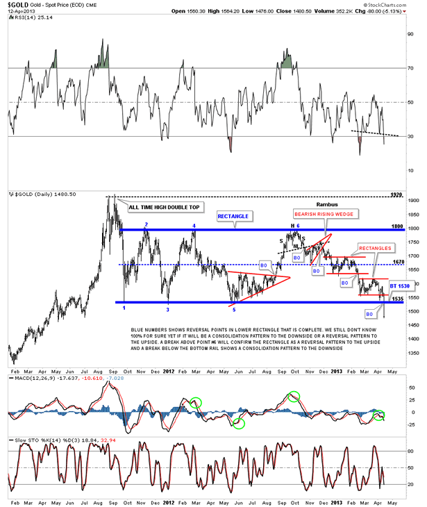
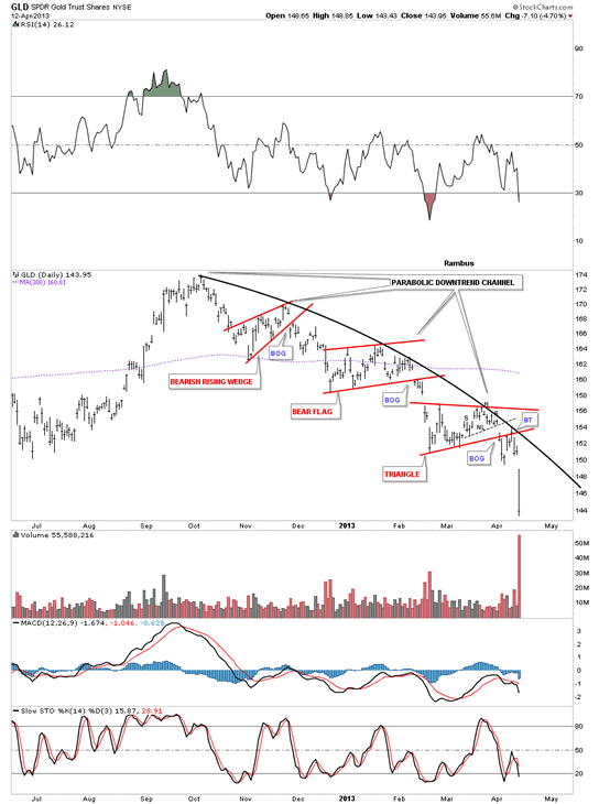
This week marked the breakout of gold from the very large 20 month rectangle that finally let us know that the big sideways trading range is in fact a consolidation pattern to the downside and not a reversal pattern to the upside. The breakout was classic from a Chartology perspective. You can see on the the chart below there was a very large daily bar that was created on Friday April 12, 2013 on heavy volume. A breakout like this shows the bulls were exhausted and the bears are back in charge. The bulls had no fight left and are now in retreat looking for the next place in which to try and establish some support. It’s possible that we may see a backtest to the bottom blue rail of the large rectangle that will now reverse its role from support to resistance before the move lower begins in earnest.
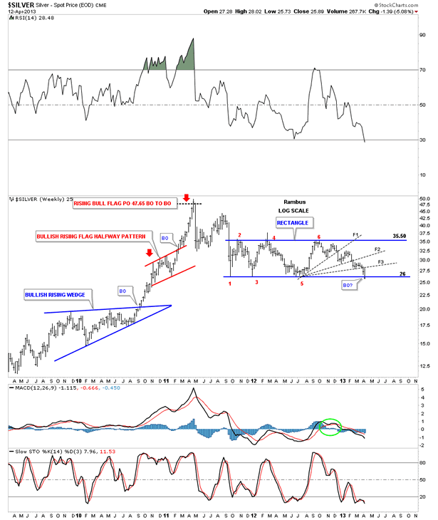
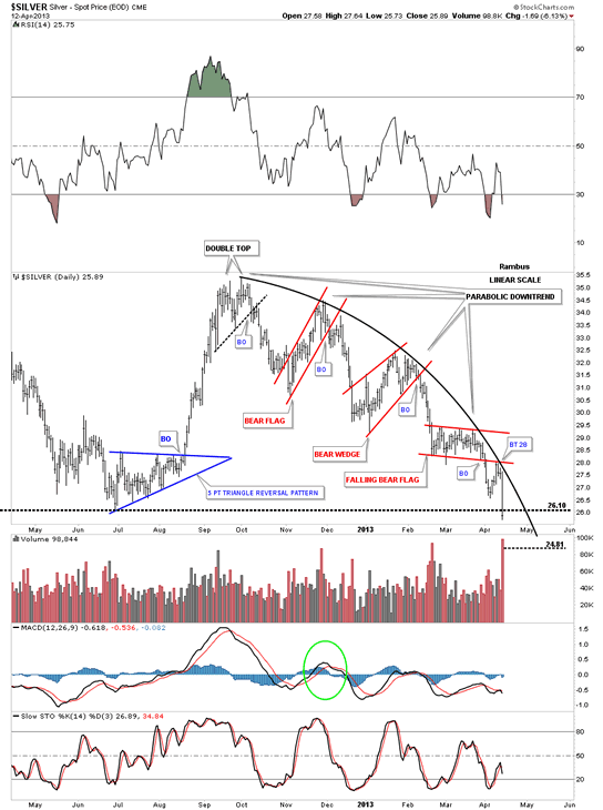
Next lets look at the silver rectangle that shows a very similar setup to gold. As gold broke significantly below the bottom rail of its rectangle silver is just barely cracking its bottom rail at this time. The three fanline pattern, starting off point #5, is giving us a heads up that silver will break below its bottom blue rail. Also like gold you can see an even number of reversal points, six, that tells us this is a consolidation pattern to the downside. Another clue that this pattern is a consolidation pattern to the downside is that it has formed below the previous high. In order for this pattern to be a reversal pattern to the upside it would need an odd number of reversal points such as 5, 7 or more. The evidence is mounting for a consolidation pattern to the downside.
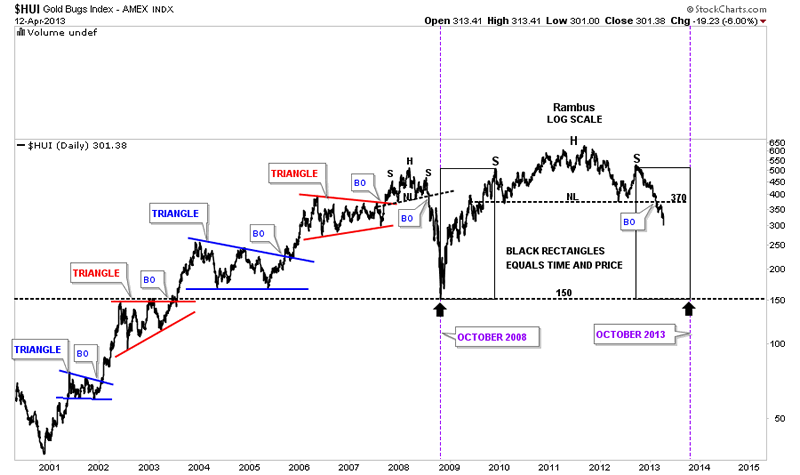
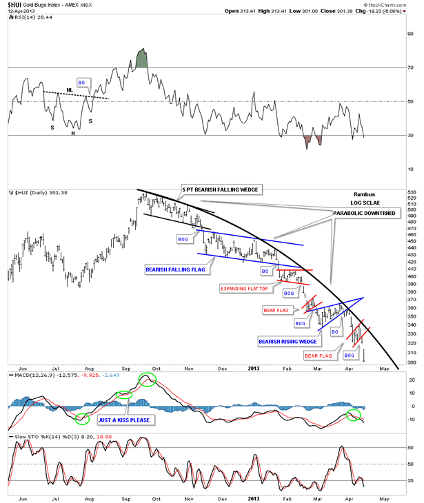
Now that we can see that gold and silver have broken out from their respective six point rectangles lets look at the HUI and see if the precious metals stocks are in a confirmed downtrend like gold and silver. This next chart shows a huge H&S topping pattern for the HUI that broke down in February of this year a full two months before gold and silver did. The precious metals stocks are leading the way down for gold and silver that puts the whole complex in a confirmed downtrend or cyclical bear market.
Next I would like to look at some shorter term charts for gold, silver, and some precious metals stocks that will show how bad the situation really is for this sector. I just want to say right here, before we look at the charts to follow, that the Chartology you are about to see is what it is and it’s just my interpretation of what the charts are showing me. Many of you will be in denial and will not accept what these charts are saying and that’s fine. Just use them as part of your overall view of the what your own interpretation of the precious complex is and take it from there.
The first chart I would like to show you is a daily look at gold that is showing a parabolic downtrend that has been forming since the important high made in October of 2012. Most of the time all we here about is the parabolic moves to the upside that happen on a much larger scale. Parabolic moves can also happen in the short term charts as this daily chart shows.
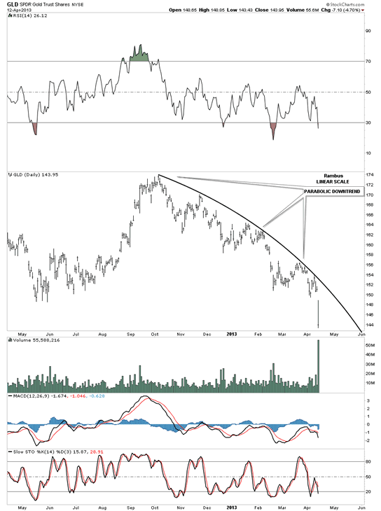
Now I would like to show the the same chart that shows why this parabolic move lower is developing the way it is. You can see there have been three smaller chart formations that have formed one below the next that is creating the parabolic downtrend. Many are trying to put straight trendlines on their charts trying to show a downtrend channel which isn’t working very well. As you can see the curved trendline was hit four days ago along with the backtest to the small red triangle that has led to this most recent decline.
Silver has a beautiful looking parabolic downtrend that started to form off its double top high back in October of 2012. Again you can see how each smaller red consolidation pattern has formed below the previous one creating the curved downtrend rail when the tops are connected. You can also see that silver has cracked the all important bottom support rail at 26.
The precious metals stocks are several months ahead of gold and silver and are showing a strong parabolic downtrend well in progress. The Chartology, of this daily chart for the HUI, shows all the smaller consolidation patterns that have formed off the October high made last year. From a Chartology perspective this chart is as good as it gets. We have been following this beautiful downtrend channel since the breakout from the black 5 point bearish falling wedge reversal pattern. Some say I show too many chart patterns that are unnecessary but from my perspective each and every consolidation formation is giving us an important clue to the bigger picture. If you study each consolidation pattern, on the chart below, you will see each one has at least four reversal points which is what you have to have to form a consolidation pattern at a minimum. Sometimes there are six, eight or more and as long as there are an even number of reversal points you will have a consolidation pattern that will breakout in the direction of the move leading into the consolidation pattern.
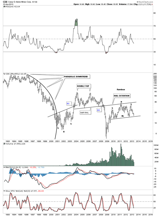
Lets look at a weekly chart that shows a parabolic downtrend that happened back in the later part of the 1990′s on CDE. You can see all the clean touches that occurred on the curved downtrend rail. Try to put a straight trendline where the parabolic trendline is and see what you get.
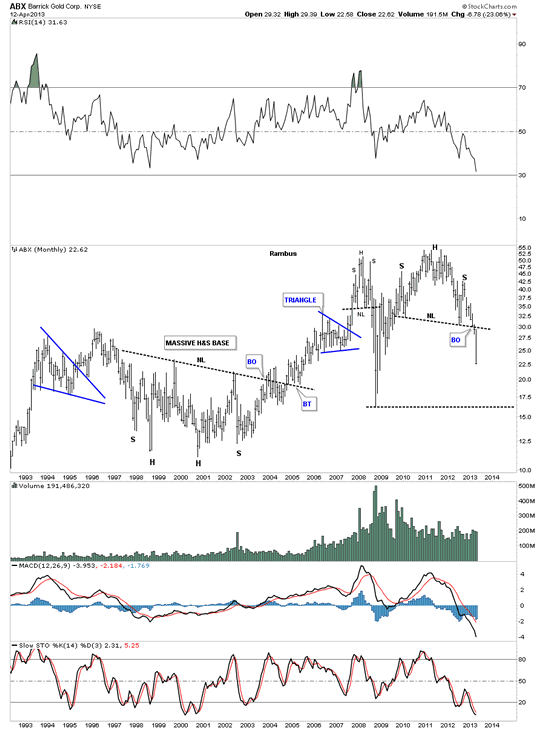
Lets now look at some individual precious metals stocks that exhibiting some parabolic downtrends. ABX is the biggest precious metals producer and is showing an accelerating parabolic downtrend, that started back in August of 2011. ABX has also broken out from the massive H&S top that few are willing to recognize even at this point in time. Denial can make an investor broke faster than anyway I know.
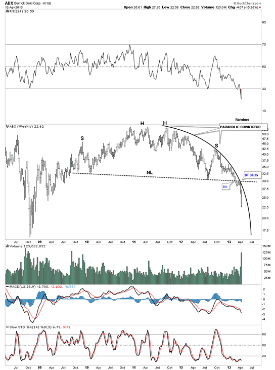
Lets look at the monthly chart, for the biggest cap precious metals stock, that really puts things into perspective regardless of how one may perceive the fundamentals. This chart isn’t lying but the the strong fundamentals, that so many are espousing for the precious metals complex are.
ASA is showing a very large parabolic downtrend that stated all the way back in October of 2010.
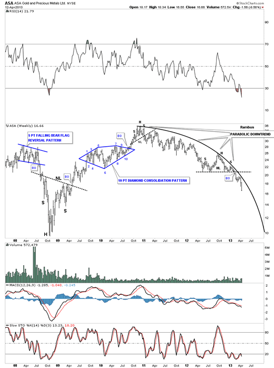
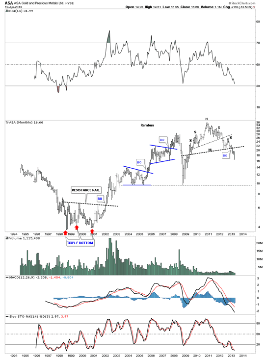
The monthly look at ASA shows a double H&S top formation that is in the third month of breakout.
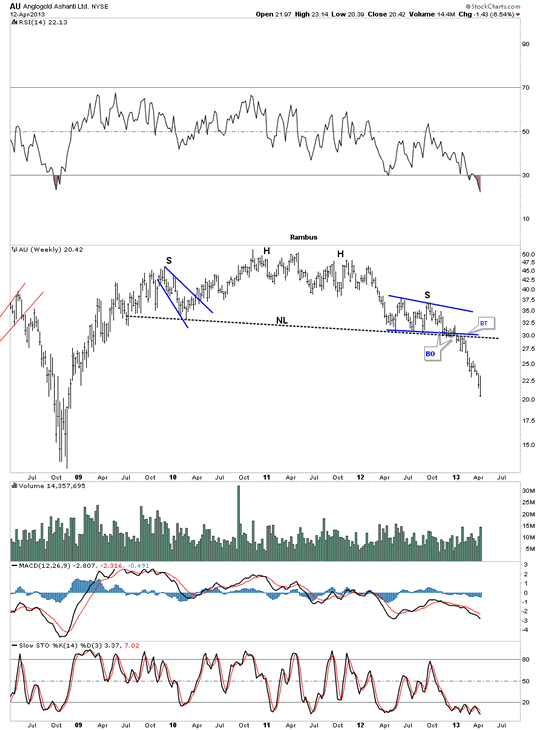
AU is showing us a parabolic downtrend that started in October of 2010 which now seems to be accelerating to the downside.
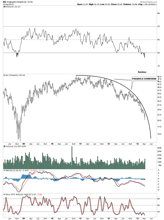
In conjunction with the parabolic downtrend channel AU has also broken out of its own massive H&S topping pattern.
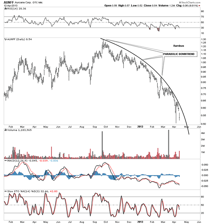
Lets look at one more precious metals stock that has an accelerating parabolic downtrend that started last October of 2012. As you can see it has lost well over 50% of its value since the parabolic downtrend began.
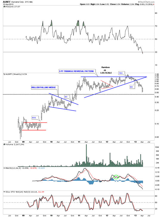
The weekly chart for AUNFF shows its topping pattern as the five point triangle reversal pattern.
I could show you countless other precious metals stocks with the same characteristics as the ones above. We don’t have to beat our heads against the wall to figure out why the precious metals complex is so weak right now. All we have to do is follow the price action and everything else becomes irrelevant. This is the beauty of Chartology. It doesn’t make any difference what the fundamentalist say or how short or long the commercials are, who’s buying and selling the precious metals, or how the stockpiles are falling to such low levels. It’s all baked in to the price action that shows up on charts. How one interprets this price action is an entirely different story. Some use Elliot Wave and some use cycles to interpret the charts. For me, following the price action, by looking for patterns that form consolidation or reversal patterns is the purest form for analyzing a stock or index as the charts above show. Just one simple trendline on a chart, think neckline on the ABX chart above, can mean the difference between success or failure. Above the neckline and the chart is positive and below is negative.
It still amazes me how this old school of charting is still relevant in this day and age with all the high powered computer programs out there that are trying find an edge in the markets. Understanding the price action between the bulls and the bears is a never ending story that goes back to the beginning of the stock markets. Its the interpretation of these battles, in the form of consolidation or topping patterns, is all that is needed to be on the right side of the markets more than on the wrong side. And that is the bottom line. To be right more than you are wrong. All the best…Rambus
Gary (for Rambus Chartology)
FREE TRIAL - http://rambus1.com/?page_id=10 5 day free trial to Rambus Chartology (first timers only please)
gmag@live.ca
Rambus Chartology is Primarily a Goldbug TA Site where Bembers watch Rambus follow the markets on a daily basis and learn a great deal of Hands on Chartology from Rambus Tutorials and Question and Answers .
Most Members are Staunch Goldbugs who have seen Rambus in action from the 2007 to 2008 period at www.goldtent.org and now Here at Rambus Chartology since early 2012 .
To review his Work and incredible calls from the 2007-2008 period click on the “Wizard of Rambus’ ….”What If (2008 Gems) ! ”
© 2013 Copyright Rambus- All Rights Reserved
Disclaimer: The above is a matter of opinion provided for general information purposes only and is not intended as investment advice. Information and analysis above are derived from sources and utilising methods believed to be reliable, but we cannot accept responsibility for any losses you may incur as a result of this analysis. Individuals should consult with their personal financial advisors.
© 2005-2022 http://www.MarketOracle.co.uk - The Market Oracle is a FREE Daily Financial Markets Analysis & Forecasting online publication.