German DAX – Different Country, Different Culture. People Are People
Stock-Markets / European Stock Markets Apr 10, 2013 - 10:03 AM GMTBy: Michael_Noonan
 The one common denominator that crosses all cultures, even religions, is money. It is the
global equalizer. We take a look at the DAX, Germany’s stock market. Do the “precise”
Germans fare any better at investing than at, say, building cars?. Likely not. Money goes
to the core of the human psyche as the fundamental driver for tapping into the fear/greed
element from which few escape, at least when it comes to investing.
Unfortunately, DAX does not have volume, a vital element that shows the ebb and flow of two incredibly important principles, supply and demand. Why it volume so important? It shows the effect from the cause factor of investors/traders making buy/sell decisions.
You may see two daily bars of equal price range and close, and they appear to be equal. When the volume factor is added, one bar with volume of 15,000 shares and the second bar with 120,000 shares, they are far from equal. The lesser volume shows a lack of demand, the other a force of demand that convey very important information for decision- making.
With that handicap, let us proceed to what the DAX may be saying at this random point in time.
For German readers unfamiliar with how we analyze markets, it is based on current developing market activity and compared to historic activity, using the factors of price, shown by size of range and location of the close, informing us who won the battle between buyers and sellers. The other critical factor, volume, is missing. As a consequence, some of the analysis will lack more pertinent detail.
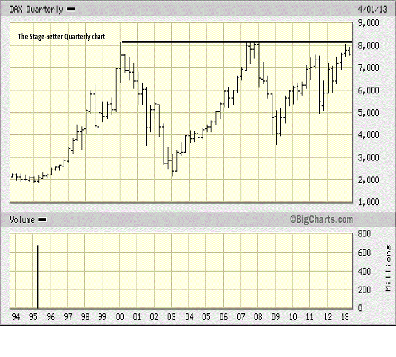
Not many look at Quarterly charts. It is our starting point as a reference and context when compared to the progressively smaller time frames. What we want to see is a synergy from one time frame to the next. It does not always exist, but when it does, it makes an analysis more compelling. From whatever time frame once views a market, it is important to be aware of support or resistance on the next higher time frame. The higher the time frame, the more controlling is the chart. What jumps out immediately is the persistent resistance that started with the 2000 high, stopping the rally in 2008, and now price is retesting that same level. The first Qtr, 2013, second bar from the end, was the smallest range since the 2011 swing low. The narrow range tells us demand was weak, otherwise, the range would have extended higher. The location of the close, mid-range the bar, confirms the weak demand because sellers were present, as would be expected.
The First Qtr 2013 looks weak, and sets the stage for how the other charts may appear.

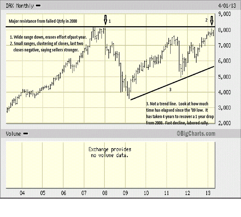
Note the TR, [Trading Range], just prior to arrow 1. The inability to rally above the high established in 2000 said demand was weak, and once again, you see how small the ranges were for the bars attempting to rally. Weak demand opens the door for supply to enter, as sellers note the inability of buyers to extend the rally. An analysis of volume, during the TR may have made the “red flag” potential clearer.
The size of the decline, at 1, shows how sellers took control with EDM, [Ease of Downward Movement], erasing the previous 12 month’s effort in just a single month.
The arrow at 2, shows small ranges, a lack of demand, and closes in the middle, telling us sellers are meeting the effort of buyers each month. As it did in 2007, this can open the door for sellers to rout buyers and carry the market lower.
Compare the length of time for the EDM, in 2008 and early 2009, with the length of time for price to recover back the retest to the 2007 high. This is an example how a protracted effort tells us that the market is relatively weak.
What can be said is that the current trend, for the past few years, is up. The question is, can it sustain itself in view of what the message of the market has been since 2000? All we are doing is making factual observations, letting the market tells us what to expect, moving forward.

At no time is there any discussion or consideration to fundamental factors, country or world situations. All of that information shows up in the charts, and it becomes a matter of “reading” the message from the market itself, the most reliable source of all.
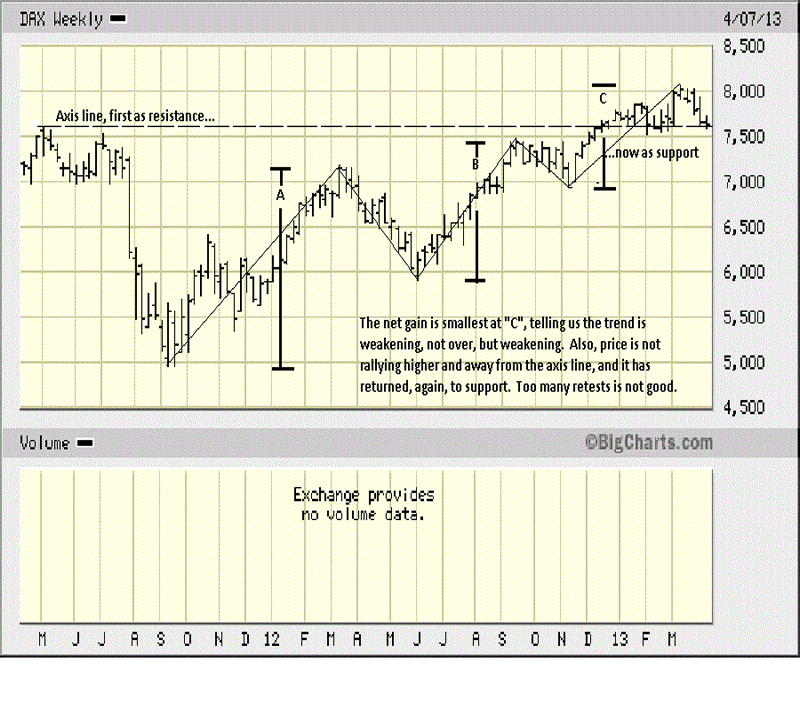
When you look at the net gains from each swing high to the next swing high, it is apparent that the upward momentum is laboring. Almost all of swing high “C” has been a struggle, a lot of sideways movement. It is at a support level, as defined by the weekly time frame, and you can better understand why it is so important to be aware of the next higher time frame.
The weekly is above a former resistance line, now acting as support, whereas the monthly shows all the current activity under important resistance.
The first week of March was a wide range bar up with what appears to be a strong close. The second week, fifth bar from the end, was very small. What happened to the buyer’s effort? It disappeared. What looked like strong demand may have been an exhaustion rally, instead. We cannot say for sure, without the volume story to confirm, but the 2nd week in March is a red flag warning.
The second and third bars from the end show greater EDM, wider ranges and poor closes. This tells us sellers took control from buyers. Can they keep it? In an up trend, the onus for change is on sellers; demand has already been proven by virtue of the trend.
Concern is for the inability of buyers to lift price higher, away from support. It is critical to observe the how of a market’s response. Right now, price is not responding well to the existing support. After a one-time spurt higher, as just described, price has returned to the level from which it had moved sideways from mid-December until the March rally.
Too many tests of support is the market’s way of telling us demand cannot move higher, and support will likely give way. There is no guesswork here, just a factual reading of the developing market activity and applying the logic it conveys.

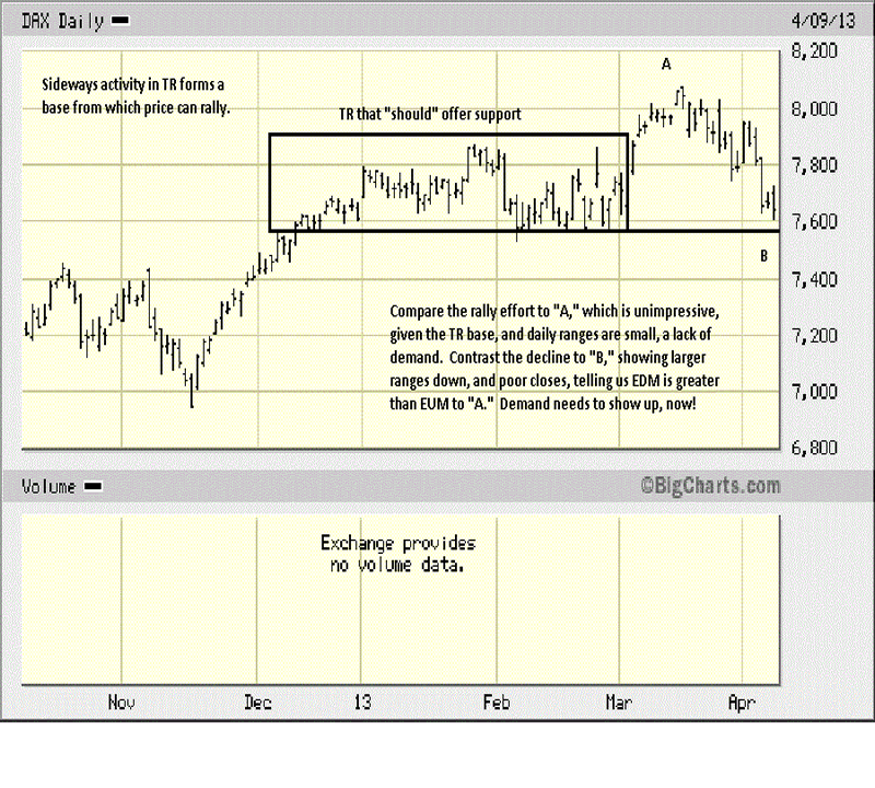
The box captures the sideways trading from mid-December to March. It formed a base from which a rally can be sustained. How did the rally unfold? In small ranges with not very strong closes, a sign of little demand effort/ability. Compare the bar ranges in the rally to “A” with those in the decline to “B.”
Based on a series of factual observations, from the Quarterly chart to the current daily, the DAX is at a critical juncture. As an index, it is telling us to look very closely at individual stocks to make a decision to remain long, or not, or at least use close stops, [stops being something stock "investors" for some reason fail to use.].
Volume would have made this analysis more compelling in conclusions, but one thing is certain: caveat emptor!

By Michael Noonan
Michael Noonan, mn@edgetraderplus.com, is a Chicago-based trader with over 30 years in the business. His sole approach to analysis is derived from developing market pattern behavior, found in the form of Price, Volume, and Time, and it is generated from the best source possible, the market itself.
© 2013 Copyright Michael Noonan - All Rights Reserved Disclaimer: The above is a matter of opinion provided for general information purposes only and is not intended as investment advice. Information and analysis above are derived from sources and utilising methods believed to be reliable, but we cannot accept responsibility for any losses you may incur as a result of this analysis. Individuals should consult with their personal financial advisors.
Michael Noonan Archive |
© 2005-2022 http://www.MarketOracle.co.uk - The Market Oracle is a FREE Daily Financial Markets Analysis & Forecasting online publication.


