


Gold vs. S&P 500 – Where is the Value?
Stock-Markets / Financial Markets 2013 Mar 28, 2013 - 05:52 PM GMTBy: J_W_Jones

 This past week we received the final 4th Quarter GDP number which came in at 0.39%. The total 4th Quarter growth was terrible, plain and simple. Based on the performance in the equity markets that we have seen thus far in the 1st Quarter of 2013 investors would expect strong GDP growth. However, the only thing spurring stock market growth is the constant humming of Ben Bernanke’s printing press.
The real economy and the stock market are no longer strongly correlated. Essentially, they are meaningless. How do you evaluate risk when Treasury linked interest rates are artificially being held down by the Federal Reserve? How do you evaluate earnings growth estimates when most government based statistics are manipulated or “smoothed” to perfection?
My final argument to anyone who is a true believer that the stock market is representative of the economy is a very simple premise. If the stock market is the economy, how does the stock market evaluate small business earnings growth when most small businesses are not publicly traded? It is a simple question, but I have yet to find a sell side analyst that can work around it with facts.
To back up this information, here is a chart courtesy of www.zerohedge.com that demonstrates the S&P 500’s price action compared to economic data and overall macro risk.
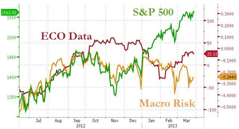
The chart above clearly depicts the divergence between the macroeconomic data and the performance of the S&P 500 Index. Yet the sell side continues to scream that stocks are cheap, earnings are going to ramp up later this year on insane S&P 500 earnings growth expectations, and the consumer is going to remain strong even though payroll taxes have increased and the “wealthy” are paying more in taxes.
Even amid those concerns, no one knows for sure what the impact that Obamacare and the various new taxes associated with it will have on the business community. Again, the only thing driving growth is directly linked to the Federal Reserve’s balance sheet expansion. The chart below is courtesy of the Federal Reserve’s website.
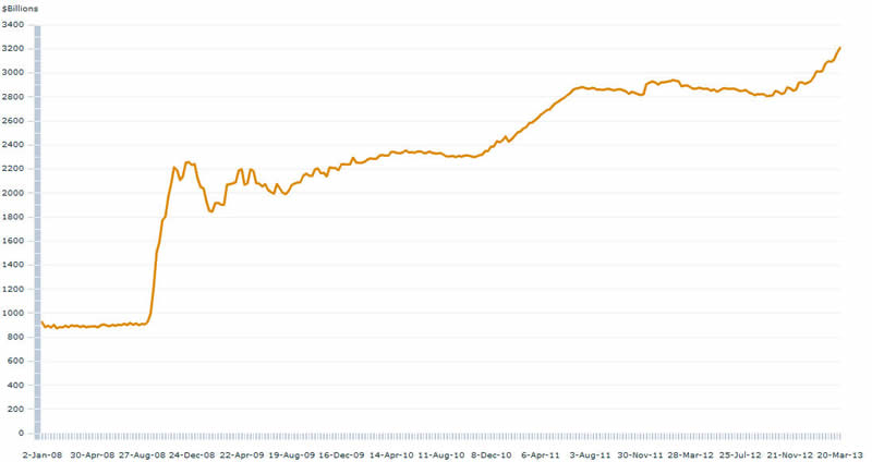
On August 8, 2007 the Federal Reserve’s total assets were $869 billion dollars. As can clearly be seen today, according to the Federal Reserve the central bank’s total balance sheet has grown to over $3.2 trillion dollars. The increase is on the verge of rising exponentially. With QE, QE2, QE3, Operation Twist, Extended Operation Twist, and now with QE 4 in Perpetuity this trend is certainly unlikely to shift.
At this point in time the Federal Reserve is printing roughly $85 billion dollars each month to purchase Treasury securities with a focus on the long end of the maturity curve. As primary dealers of Treasury securities process these flows the money eventually finds its way into riskier assets that offer higher rates of returns through balance sheet machinations at large money center banks.
It has proven that the flow of the Federal Reserve’s printed monies are more important than the total money stock for a variety of reasons and inflation according to the government’s data is under control ex food and energy.
However, how are people supposed to survive without food and energy in today’s world? The last time I went to fill up my gas tank or to purchase food prices have gone up significantly. According to the 1990 version of consumer price reporting, real consumer inflation is running around 6% currently and shadowstats.com has the following comparison.
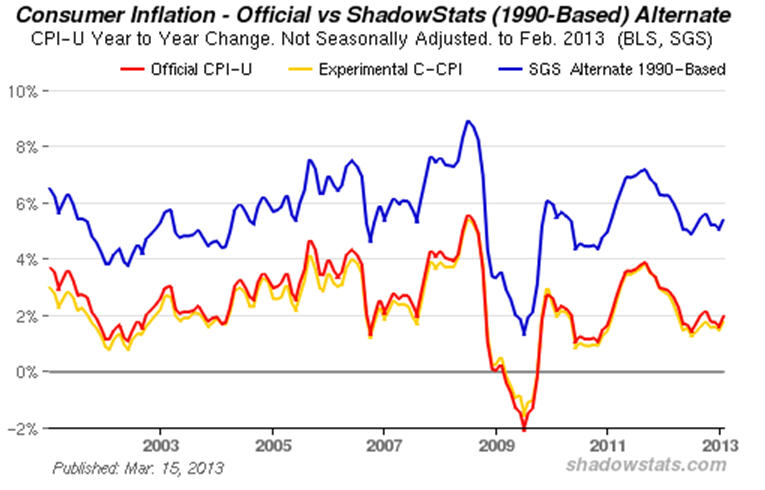
Unfortunately the 1980 based inflation numbers are even uglier, which based on Shadowstats’ data chart would place consumer inflation at nearly 10%. The calculations being used by Shadowstats.com are based on the government’s OLD ways of calculating inflation. The calculations were adjusted over time and today the data is completely manipulated by not including items that typically experience the largest levels of inflation.
Normally I talk about price action, probability based option trading, and technical information. However, before investors consider buying stocks near the all-time NOMINAL (non-inflation adjusted) highs, why not simply consider the backdrop of the total economic situation.
Central banks around the world are printing money at an alarming rate and their balance sheets are growing to levels not seen in human history. Interest rates are being manipulated to levels that are historically at record lows or near record lows based on real inflation data.
Macroeconomic indicators are issuing a cautionary tone with significant divergences showing up in many areas. Earnings expectations for the S&P 500 in the 3rd and 4th Quarter of 2013 are extreme and borderline ridiculous.
So before jumping headlong into equities based on some sell side analysts recommendation or even worse, a financial advisor who is more interested in his/her commission than they are about producing gains consider the following comparisons.
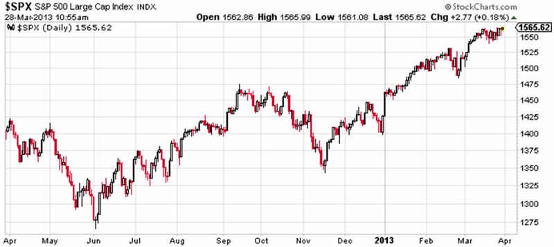
S&P 500 Index (SPX) Price Chart – 1 Year Price History
Gold Futures Spot Price Chart – 1 Year Price History
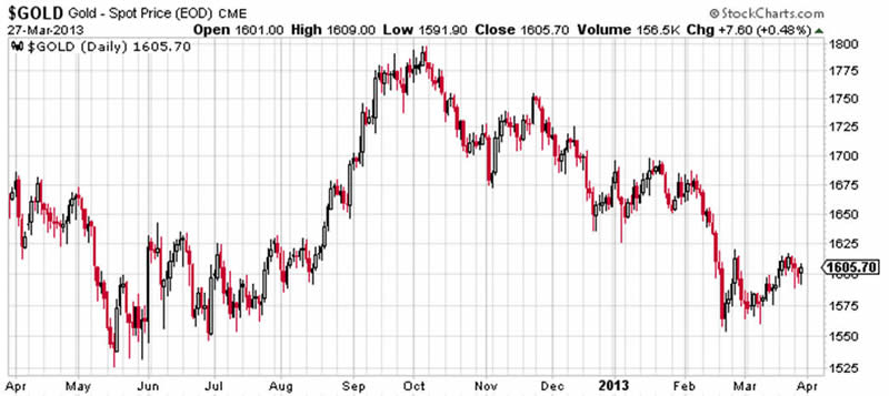
Clearly paper gold represented by gold futures is no substitute for physical ownership, but when one considers the fundamental backdrop for gold versus the S&P 500 Index, it should be clear which asset is offering the most value at current price levels. It does not require any inserted trendlines or oscillators, it should be clear which asset is expensive and which asset is cheap based on the real long-term economic fundamentals.
I will give you a hint regarding which asset is offering the most value. It can’t be printed, it has represented the store of value since the advent of modern civilization, and it is senior to all paper currencies.
Happy Option Trading!
Simple ONE Trade Per Week Trading Strategy?
EASTER 30% OFF SPECIAL
COUPON: EASTER30
Join www.OptionsTradingSignals.com today
JW Jones
J.W. Jones is an independent options trader using multiple forms of analysis to guide his option trading strategies. Jones has an extensive background in portfolio analysis and analytics as well as risk analysis. J.W. strives to reach traders that are missing opportunities trading options and commits to writing content which is not only educational, but entertaining as well. Regular readers will develop the knowledge and skills to trade options competently over time. Jones focuses on writing spreads in situations where risk is clearly defined and high potential returns can be realized.
This article is intended solely for information purposes. The opinions are those of the author only. Please conduct further research and consult your financial advisor before making any investment/trading decision. No responsibility can be accepted for losses that may result as a consequence of trading on the basis of this analysis.
J.W. Jones Archive |
© 2005-2022 http://www.MarketOracle.co.uk - The Market Oracle is a FREE Daily Financial Markets Analysis & Forecasting online publication.