


Stocks Bear Market Focus Point: “The warnings are out there, but no one is listening, they just don’t want to know.”
Stock-Markets / Stocks Bear Market Mar 04, 2013 - 10:34 AM GMTBy: Garry_Abeshouse

 “The warnings are out there, but no one is listening, they just don’t want to know.”
I can’t think of a better introduction to these pages than the single sentence directly above. Denial is easy. Ignoring history is easy. But evading the financial iceberg that lies in wait for the unwary is going to be hard. In fact nothing about economics and financial markets is easy. Fragmented by opinions, emotions and fraud, ignored by denial and distorted by time, much of economic history lies there just beneath the surface ripples, “representing all the sins we never had the courage to admit to and the all the lies we were never forced to face”.
So the big question then becomes, how do you effectively build a case for the re-emergence of a Bear Market in 2013?
The answer is - with extreme difficulty.
Will Rogers was once quoted as saying
"There are three kinds of men: the ones that learn by reading; the few who learn by observation; the rest of them have to touch an electric fence."
Albert Einstein once defined Insanity as “doing the same thing over and over again and expecting different results”.
These two observations came from people who understood well the vagaries of human conduct and the inability of many individuals to learn the lessons of history. And while spoken in different contexts, they more or less describe the psychology surrounding a Bull Trap and where we could be marketwise at this point in time.
Leaps of faith attempt to defy the odds against winning.
“Even when US sports commentator Jim Murray railed against the carnage at the Indianapolis 500, there was a laugh, however dark, in his outrage: ‘Gentlemen, start your coffins.’”
Watching the short term charts on the markets unfold their story is much like watching a slow motion train wreck in action, where half the observers appear to be oblivious to what is occurring and the rest panic stricken, as they watch for what lies ahead.
At the end of a long run up equities, there is one thing that all Bull traps have in common: the free fall aftermath preceding exposure of the reasons behind the market collapse, hence the name “Bull Trap”. This is the time when the inept and corrupt are exposed for who they are and what they have done. It exposes how they have spent months and often years scheming and hiding mismanagements and frauds from all who would dare to look and from all who ignored or covered up what they saw. It is only then, that complacencies and frauds are revealed and losses calculated allowing the blame game to start all over again, just as it did in 1929, in 2000 and in 2008.
Uptrends and Bull Traps
In the Charting vernacular we have a saying, “The trend is your friend until it isn’t.” Applying a similar view to Bull Traps you could say, “Optimism is your friend until it isn’t.” or even "Markets ignore bad news until they don't”. These bon mots may be obvious in hindsight, but often difficult to discern in the here and now.
There are different types of Bull Traps, but the type that concerns us now is the one that mostly makes its presence felt at the top of a significant price rise. Signs that you are in the middle of one vary, and may or may not include very high peak daily volumes leading up to the top, combined with loud expressions of excessive optimism or alternately by complacency in the face negative outlooks. Personally, I have always found picking Bull Traps highly nerve racking, as most of what you read at the time is usually along the lines of how “the market is overbought and susceptible to a retracement prior to rising to new highs over the coming months”. In fact the words “Bull Trap” are rarely mentioned by market analysts of any type in any discussion on market prices at any time.
Convergence of highs.
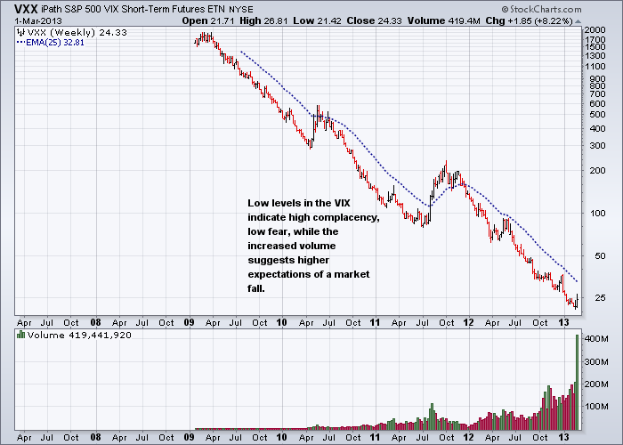
For over three and a half years now, since the second half of 2009, I have been waiting for a similar convergence of indices and bellwether stocks as to what I saw in the equity markets in 2008. The current convergences of key indices and bellwether stocks are now at all time and/or cyclical highs and at the end of a long, drawn out and worn out bull trend. This, combined with surveys indicating excessive bullishness and indicators such as the $VIX showing excessive complacency are major warning signs that a Bull Trap may be waiting just around the corner. It should be noted also that economists as a group, are rarely able to pick market tops with any accuracy and their arguments to the contrary view only compound the confusion at the time (see discussion at the tail end of this commentary).
The key issue here is that at “Bull Trap” time, conflicted emotions are high and there is always a complex variety of unknowns, which cloud the issues and hamper accurate decision making. This is also the time when the careful comparative analysis of charts can hopefully improve the decision making process.
Bull Trap Comparisons – 1987- 2000 – 2008 – April/May 2011 - 2013?
Any student of physics will know that Newton’s 4th Law of Motion states that “The longer a body is at rest with its feet firmly planted in the air, the more likely the probability the body will plummet to earth and splatter on the ground”.A similar principle applies to raw eggs and financial markets.
I have a rule about comparing historical charts, and that is history virtually never repeats itself in exactly the same way. In this case, while having some similarities, the topping out processes in involved in the 1987, 2000, 2007/2008, April/May 2011 and 2013 tops also have significant differences as well. That being said, there is one commonality worth looking at, as my market analysis from May 14th 2011 shows, and that is even now in March 2013, very little has changed. In fact I could almost use the same wording today; just changing the dates and it could be just as pertinent now as it was then.
What I did not anticipate then or when the market bottomed in September 2011, was how the powerful combination of unlimited cheap money, combined with a large supply of financial analysts always available to sell a positive spin on the markets whether it was true or not, could push up much of the US equity markets to test and
often exceed the levels reached in 2007/2008. What I do believe however, is that this cannot go on forever and that now or soon will be a testing time for this belief.
I would like to stress that the longer equities remain at these high levels the shorter the odds that there will be one of those “unexpected Black Swan events” at a time that is I suppose, unexpected.
|
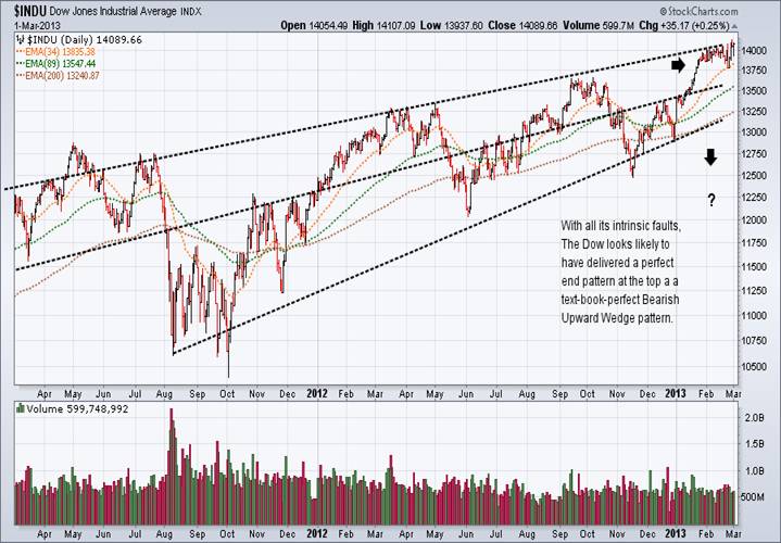
Tight congestion areas lasting for one or more months appear to be a common feature of most market tops.
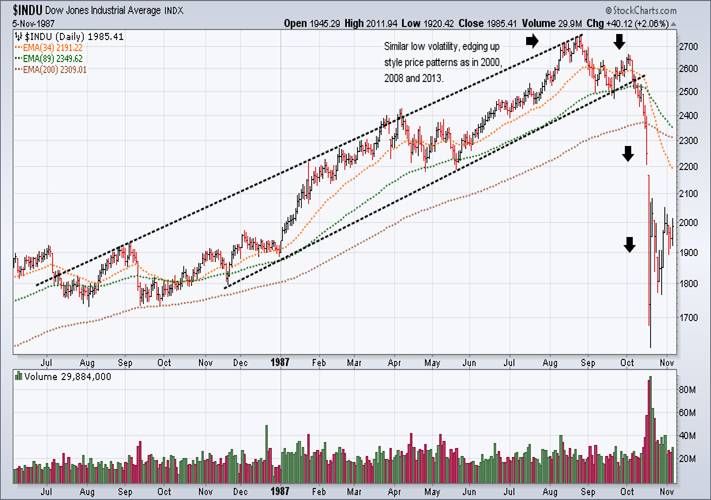
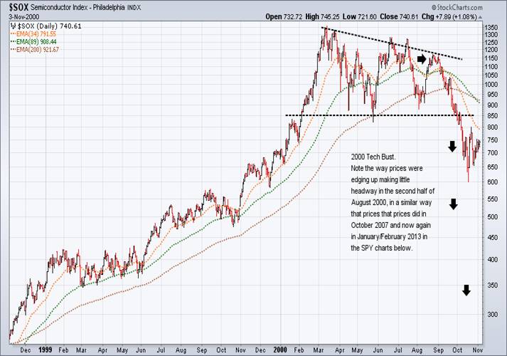
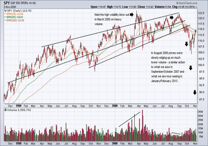
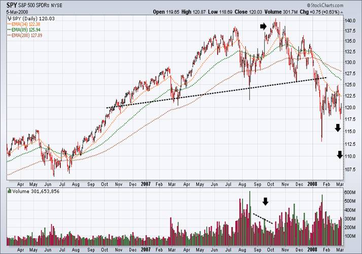
You will notice that well-defined chart patterns and trend lines are a common feature of the charts shown below. The combination of the conformity of price patterns and trend lines, together with the high level of convergence of key equities as shown in the monthly charts below, indicates that the risk of a sudden fall in equities has never been higher over the last four years than it is now.
When multiple charts are compared, a narrative is created, making the bearish story more solid and hopefully one for future text books if it pans out as expected. Later on in this commentary I shall give the “convergence factor” more depth and breadth by showing a series of monthly charts to support this view.
What is interesting about the charts below is that they all showed similar tight low volatility price patterns in the last month before they fell. This similarity also occurs in the market now. The final exhaustion of the bull trend in the low volatility pattern arrowed in these charts, is typified by prices edging up by tiny increments until the price finally peaks and collapses. Volume at this time mirrors the emotions felt while this pattern is in process. Decreasing low volume at this time implies a high level of complacency, while rising volume towards the end implies rising confusion, with more buyers being sucked in at the top.
As I mentioned before, who would have thought that in September 2011 that many equities would rise to exceed all-time highs. Another generalised market feature worth mentioning is the increasingly drawn out nature of tops as politicians find new ways to influence a positive mood in these markets. They know that the longer they keep markets high the easier it becomes to maintain their political power. And they are very conscious of the fact, that as soon as markets start to fall the media will begin asking the difficult questions they have no wish to answer.
I would like to stress that the longer equities remain at these high levels the shorter the odds that there will be one of those “unexpected Black Swan events” at a time that is I suppose, unexpected.
Dow 30 Index ($INDU) – The Stock Market Crash of 1987.
Semiconductor Index ($SOX) – 2000 Tech Bust
S&P 500 ETF (SPY) – 2000 Tech Bust
S&P 500 ETF (SPY) – 2008 GFC
Dow Jones 30 Industrials Index ($INDU) – 2013 GFC2?
Sentiment at extreme highs and lows usually matter:
“The warnings are out there, but no one is listening, they just don’t want to know.”
If the Bull Trap over the coming weeks comes into force as expected, it would suggest that equity indices shown below will complete top reversal patterns ahead of a return to bear market conditions. But over the short term it will be interesting to see how they trade during February and March, the most likely time for a topping out to occur. Coincidently, Fund managers appear unconcerned even bullish on the future of equities, but the $VIX and Risk Aversion Charts below indicate that the type of complacency that exists now, when coinciding with historically high equity prices, is usually a good time to be cashed up rather than committed.
January 19th 2013 - The Sydney Morning Herald headline, “Fund managers Bullish on Shares”, quoting HSBC:
''It's a material shift in the overweight stance towards equities,'' HSBC's head of wealth management, Mike Danby, said. ''The Australian economy is so globally linked, that's always good news. I've heard the negative slant, which is when the world sneezes, the Australian market catches a cold. There's obviously the reverse of that and I think we're seeing it. ''There's no question any signs of improvement in the US's and China's underlying performances are going to drive a positive reaction here as well, and I think you can see that as an underlying trend.''
“FUND managers are moving back into shares again as optimism grows about US and Chinese economic data, a global survey says. About 75 per cent of global fund managers were holding an overweight position towards equities in the first quarter of this year, an increase from 40 per cent in the last quarter, the HSBC survey released on Friday found. No fund manager held a positive outlook for bond or cash, with more than 60 per cent underweight on cash as an asset class. More than 30 per cent of fund managers were underweight on bonds, compared with 20 per cent in the fourth quarter last year.”
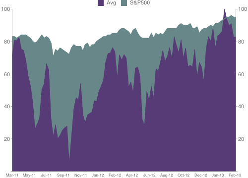
If you compare the NAAIM Survey of Management Sentiment chart directly below with the main equity indices, you will find that it is usually a good indicator of market peaks, especially when it stays around or above 80 for a number of weeks as it is currently doing. This chart also correlates very nicely with the low levels currently experienced by the $VIX Indicator and the VXX ETF, where both show high levels of complacency and low levels of fear in US equity markets. The high recent volume in the VXX ETF is also indicative that an increasing number with a more bearish lean are putting their money with their mouths are. So even though confusion reigns, the bulls still dominate.
February 27th 2013 - Note that the NAAIM Number high on the Sentiment chart below is 104.25, which is not only off the chart but at an all-time high. The previous all-time high was 92.61 reached on January 3rd 2007. The survey began in July 2006. The latest number is 82.77 for 27 02 2013.
NAAIM Survey of Management Sentiment chart
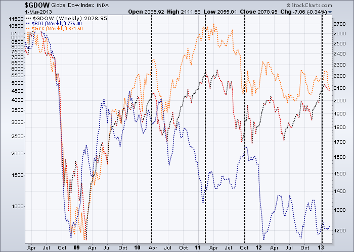
The following weekly dashed line chart, graphs the Equal Weighted Global Dow of 150 stocks (red); the Baltic Dry Index (blue) and the S&P GSCI Industrial Metals Spot Price Index (orange). The four black dashed vertical lines correspond to the peaks on the NAAIM Survey of Management Sentiment chart just above. Not exactly heavyweight analysis I know, but combined with the other charts in this commentary, this comparison chart does add some weight to my argument that we are either at or fast approaching a high in equities.
Who do you believe?
Abbie Joseph Cohen, Goldman Sachs Senior US Investment Strategist has her say . . . .
March 1st 2013 – CNBC – “The rally in the stock market is real and supported by the fundamentals, Goldman Sachs's Abby Joseph Cohen told CNBC on Friday. In a "Squawk Box" interview, Cohen said short-term concerns about the automatic spending cuts notwithstanding, her models peg fair value for the S&P 500 index at 1,575 — a 4 percent premium to Thursday's close. "There are other models, including the Fed model, that show fair value as high as 1,700 or 1,750."
During Thursday's session, the Dow Jones Industrial Average came within 15 points of its all-time closing high of 14,164 before finishing lower. "[The rally] is supported by improving fundamentals in the U.S. economy and, very importantly, valuation," the senior U.S. investment strategist said. "[With] equities at a (price-to-earnings) ratio at 14 times earnings, they're just not expensive."
Cohen added: "Our sense is that there is a lot of cash on the sidelines." She advised that investors may do well to put that money to work in stocks — or to shift out of longer-term bonds into stocks, which she describes as the "better investment."
Example of a dangerous financial cocktail:
Unrealistic expectations + extreme complacency + cheap money = Will always peak into a Bull Trap.
The monthly chart of the Dow Jones US Business Support Services Index peaked at 300 at the height of the Tech Boom, after which it fell to a low of 108 in 2002. It rose to a high of 238 in 2007 prior to the GFC, when it fell again to 118 at the end of 2008. From there it rose above the 2007 pre GFC high and is now in March 2013, testing the 2000 Tech Boom peak. It should be noted that the percentage rise between 2002 and 2007 is the same as between 2008 and 2013. In theory this index represents the health of businesses in the USA. In practice all it really represents is the over optimistic expectations of financial analysts as they use the cheap money provided to them from the US Fed to push up equity markets to unrealistically high levels that cannot be sustained.
Note the disconnect between the assessment of future expectations and the Business and Mining Indexes shown below. Combine this with the extreme complacency shown in the $VIX and you have a dangerous cocktail that should be a warning to everyone, but it does not appear to be the case. The convergence of a large number key bellwether stocks at all time and/or cyclical highs also shown below, serves to reinforce the current danger in equities at the moment.

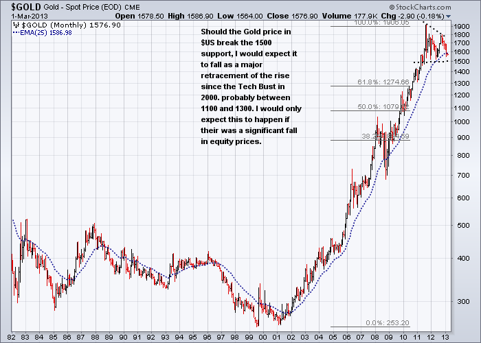
The short term success of Gold as an investment may depend upon which is your home currency.
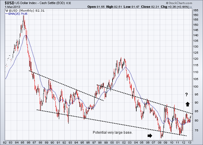
I expect the first shake out in equities when it comes, to also trigger off an overdue sell off in precious metals, as investors begin to realise that in deflationary times, gold does not buy food, shelter and your kids’ education. If you look at any long term chart of the gold price, you will see it has climbed up to these levels over the last 40 years, together with equity markets, as a hedge against inflation rather than against anticipated deflation. The mindsets are quite different. In deflationary times, cash and easily convertible safe haven money is usually the way to go, hence the initial move to the US dollar – despite all the naysayers about the trillions of dollars of debt. At the same time, the US will actively resist any strong move up in their currency as it is also in their interests to keep their currency from moving skywards.
But for gold and silver there is a flip side to this as I have mention before. The main thrust of any move down in the gold price will be in terms of the US dollar. In almost all other currencies this fall will be tempered by corresponding rises in the gold price in terms of their own currencies – taking into account of course any net fall that gold may suffer. Life was never meant to be easy.
Gold Monthly chart going back to 1982
One rule that should always be followed – Watch the Leaders and the Bellwether stocks
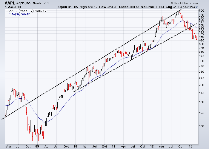
Many of monthly charts of profile global leaders coming from a very broad range of industries, have at least one thing in common - they are all testing historical and/or cyclical highs with little upside potential and all are highly vulnerable to serious falls in weakening economic conditions. Due to space restrictions I cannot show the charts here, but they include AAPL, AMZN, BHP, BIDU, BRK/B, CAT, DIS, EBAY, FDX, HON, LMT, MAT, MMM, ORCL, T, TSM, UTX, VZ, WHR, WMT (Stockcharts.com codes).
Till next time.
Garry Abeshouse
Technical Analyst.
Sydney Australia
I have been practicing Technical Analysis since 1969, learning the hard way during the Australian Mining Boom. I was Head Chartist with Bain & Co, (now Deutsch Bank) in the mid 1970's and am now working freelance. I am currently writing a series of articles for the international "Your Trading Edge" magazine entitled "Market Cycles and Technical Analysis".
I specialise in medium to long term market strategies.
© Copyright Garry Abeshouse 2013
Disclaimer: The above is a matter of opinion provided for general information purposes only and is not intended as investment advice. Information and analysis above are derived from sources and utilising methods believed to be reliable, but we cannot accept responsibility for any losses you may incur as a result of this analysis. Individuals should consult with their personal financial advisors.
© 2005-2022 http://www.MarketOracle.co.uk - The Market Oracle is a FREE Daily Financial Markets Analysis & Forecasting online publication.