


Wheat Commodity Analysis - A Technical Treatise For All Markets
Commodities / Commodities Trading Feb 04, 2013 - 09:18 AM GMTBy: Michael_Noonan

 What could wheat possibly have in common with gold/silver, or the S&P, or interest rates? When put into chart form, they are all the same: Bars that show highs, lows, closes, and volume. Market psychology affects all players, regardless of market. The factors of fear and greed are no different in a wheat trader than for a silver, S&P or interest rate trader, even stock investors.
The corollary to the above is that precious metals and/or S&P traders also think they have nothing in common with grain traders. All miss the point. Profit/loss opportunity, which is what the market provides, is the exact same across the board. Markets are neutral! They do not care what is being traded nor by whom. All markets do is reflect back what the collective is doing, be it in wheat, silver, cotton, stocks, you name it.
The absolute best aspect about charts is that they transmit the most reliable and unsurpassable information from the highest source, the market[s] itself. Incredibly, the information is there for everyone to see as it develops in present tense real time. It tells you what the cumulative decisions are from all participants, from those with the most information and most money, pitting against those with less information, less money, and everyone in between.
If ever you want to know what smart money, or controlling influences are doing in the market, they may try to disguise what they do, and most often succeed, but it is all there in the charts for anyone to read, if they so choose.
We choose.
Everything in the following charts reflects activity in ANY market. If you are not a grain trader, view the chart as gold, or AAPL, or whatever you trade, and focus on how the activity develops. It happens in your area of interest, all the time.
Pure Chartists as we are, whenever something stands out in any market, we take notice to find out why. It could lead to opportunity unexpected, and that can lead to a potentially low-risk trade. When updating the daily wheat chart, Friday's down day was a surprise. One thing about which we are confident in the markets is, there are no accidents. Everything happens for a reason.
The following six charts are reviewed in a Holmesian effort to see if what happened happened for a reason few expect. We always start with the higher monthly time frame and work down, looking for synergy within a little blip that stands out, Friday's decline.
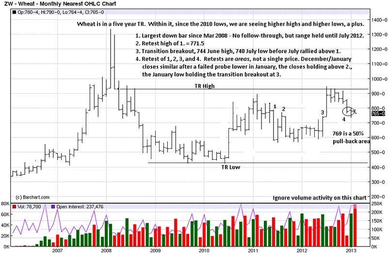
When you start looking, it is amazing what information can be gleaned. All of the transactions from the past relate to present tense developing market activity. What need be done is to find the market distinctions between present and past, and charts do it best. The monthly allows the overall price structure to be put into a context that should relate to lower time frames, which in turn, refine the one[s] before it.
The importance of bar 1 shows where the largest range down occurred. Wide range bars can often contain future market activity bound within its high and low. We see that to be the case for the next year of trading.
Bar 2 was a retest of the high of bar 1. Markets are continually testing and retesting all important highs, lows, supports. resistance, breakouts, breakdowns, and from these retests we glean important information in how price reacts to them. A weak market will have a small reaction, a strong market will react sharply, with many shades in between.
There was a market transition at area 3. A rally had already begun, but this one did not stop at the high of bar 1. Point 4 is more of an area, and markets revolve around areas more than a single price level, so one must be flexible and adhere to a single price point.
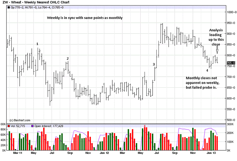
The weekly shows the same points that apply on the higher time frame. Point 3 is an important inflection point because it shows how price barely stopped at previous point 2 resistance, as a strong rally continued unabated. That inflexion point becomes an area of support, which is where price recently stopped, at 4.
All of this is leading to why wheat closed relatively so much lower on Friday, and why did it stop where it did?
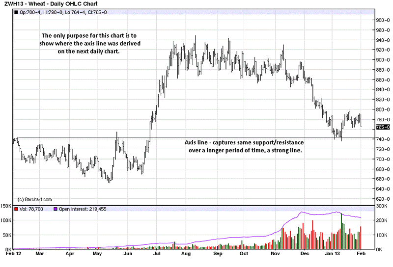
This daily chart shows from where an important axis line came. An axis line is one around which price finds support and/or resistance over time. It is a fairly strong area. You will not see the left hand side on the next daily chart.
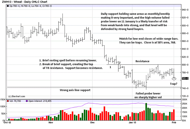
The explanations on the daily chart are stand alone and need not be repeated. What is important is the sharply higher volume increase when price made a failed probe lower on a wide range bar with a mid-range close. That bar is pivotal. Friday's low close is now retesting that support level.
We circled the close because we often see it can lead to a bear trap. Scroll back to the last daily chart and note the June 2012 low-end close. It is better to point it out before price confirms or negates the close, otherwise, it looks like a hindsight observation.
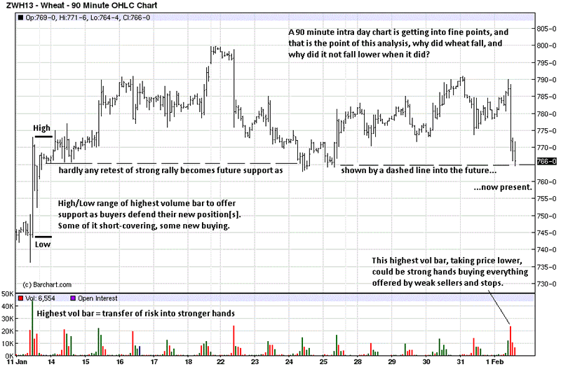
The activity at the beginning of this 90 minute intra day chart starts from that high volume failed probe at support. The highest volume bar produced the largest intra day up bar, and we drew dark lines to show the high and low of the range because it should offer support in the future as buyers from that time defend their position[s].
We wanted to look at intra day activity to better understand Friday's surprising [to us] sell off and low-end close. The immediate question is, why was the high volume bar not at the upper end of the trading range, when selling short made more sense and offered greater profit opportunity? We next look at a 10 minute chart for the answer, but we wanted to show how controlling influences, [smart money], needs to acquire their positions over a period of time, due to their size, and accumulation cannot take place in a single day. As we view it, that increased volume was smart money buying into an area of support.
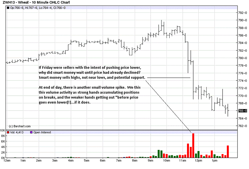
The 10 minute chart is cutting this analysis to a fine point, however, the flow of price behavior, from the monthly down to this 10 minute chart has a rhyme to it. It is the information that the market provides on an ongoing basis that allows us to make what can be more highly informed buy/sell decisions that offer an edge and reduce risk.
The stage is set, if we are in sync with the market forces.
By Michael Noonan
Michael Noonan, mn@edgetraderplus.com, is a Chicago-based trader with over 30 years in the business. His sole approach to analysis is derived from developing market pattern behavior, found in the form of Price, Volume, and Time, and it is generated from the best source possible, the market itself.
© 2013 Copyright Michael Noonan - All Rights Reserved Disclaimer: The above is a matter of opinion provided for general information purposes only and is not intended as investment advice. Information and analysis above are derived from sources and utilising methods believed to be reliable, but we cannot accept responsibility for any losses you may incur as a result of this analysis. Individuals should consult with their personal financial advisors.
Michael Noonan Archive |
© 2005-2022 http://www.MarketOracle.co.uk - The Market Oracle is a FREE Daily Financial Markets Analysis & Forecasting online publication.