Stock Markets Continue to Defy Gravity
Stock-Markets / Stock Markets 2013 Jan 22, 2013 - 09:41 AM GMTBy: Andre_Gratian
 Current Position of the Market
SPX: Very Long-term trend - The very-long-term cycles are down and, if they make their lows when expected (after this bull market is over) there will be another steep and prolonged decline into late 2014. It is probable, however, that the severe correction of 2007-2009 will have curtailed the full downward pressure potential of the 120-yr cycle.
SPX. The structure has been altered by the fiscal cliff resolution rally.
Intermediate trend: - SPX made a top at 1474 and is engaged in an A-B-C intermediate correction.
Analysis of the short-term trend is done on a daily basis with the help of hourly charts. It is an important adjunct to the analysis of daily and weekly charts which discusses the course of longer market trends.
Market Overview
The SPX pushed past the 1472 projection to a new high of 1485 on Thursday. After a brief 9-point pull-back, it moved back up to 1485 on Friday and closed on the high of the day. It may end its rally with a short-term double top at this level, or it could push a little higher next week. The Dow has followed SPX, but NDX continues to lag. A succession of bullish reports have kept the indices afloat, but sooner rather than later, the cycles will assert themselves and pull the averages down into the first week of February. The amount of time remaining could still allow for a significant decline to take place.
Last week, VIX traded at its lowest level since April 2007. We will discuss its implications (if any) later, but I suspect that even with a decline in store for the indices, their main trend could continue into mid-2013. In 2007, the market topped about nine months after the VIX made its low. If history repeats itself, there should be a 3-4 week decline in the market during which the VIX rallies, and then the market will go on to make new highs. That would work out pretty well with my expectations for the continuation of the bull market into mid-year before the onset of a new bear market.
One of the sectors which had kept the SPX buoyant over the past few weeks has been the financial group represented by XLF. Until a couple of weeks ago, it was leading the market. Now, it has begun to lag. That is one of the signs that should announce that a reversal is coming. A reversal could also be triggered by some negative news. If IBM reports disappointing earnings on Tuesday after the close, this would do it. We are in the time frame when a negative trigger of some sort could be pulled!
Chart Analysis
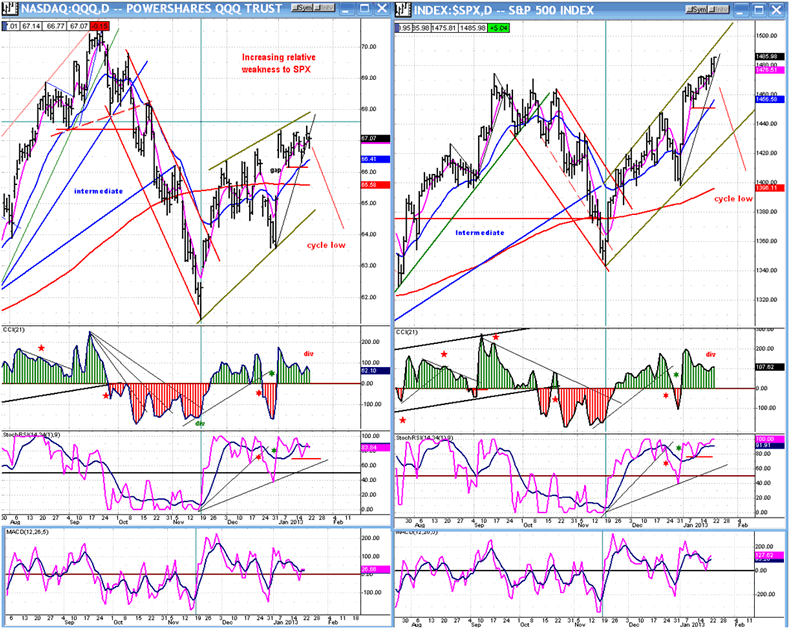
I am going to reproduce the same two charts (courtesy Q charts) that I showed you last time -- the QQQ on the left and the SPX on the right -- in order to show you the progress which has taken place in the two indices over the past week.
The SPX moved a few points higher, enough to surpass the 1474 high of last September. The QQQ went nowhere and, if anything, increased its relative weakness to the SPX. I know that I am beginning to sound like a broken record, but since QQQ normally leads the SPX, we can assume that this is not bullish behavior for the market.
Thus far, neither index has given a sell signal and we have to wait for it. The indicators are a combination of overbought and negative divergence with the worst divergence in the A/D -- which makes it a double negative. For a sell signal, the indicators will have to drop below their zero line. Since there are no useful minor trend lines, we'll have to rely on the MAs -- starting with the pink 8-dma -- to be crossed on the downside by the price. That would be an initial warning. Next, the blue 21-dma should be crossed at about the time that the CCI turns negative. A confirmed near-term sell would also come when the indices close below their short horizontal red trend lines. Should that occur, prices would then be expected to continue down into the first week of February.
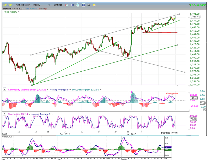
The hourly SPX chart is a little more descriptive. It shows the deceleration in the price uptrend that took place after the initial surge off the 1398 bottom, and if we apply a trend line to that pattern, an initial sell signal should be given when it is broken (1477). But for a confirmed sell, an hourly close below the 1452 level will be needed.
On the Point & Figure chart, the deceleration pattern, as it already stands, gives us a fifty-point decline potential which would take us below the lower channel line that would keep on rising until we make our low in about three weeks. On the other hand, a count taken to the top of the initial spike would add another 30 to 45 points to that decline. This sounds like a lot for 3 weeks of decline, but is something to be kept in mind, nevertheless.
The hourly chart also shows negative divergence appearing in the indicators and, as in the daily indicators, the divergence is the most pronounced in the A/Ds.
Cycles
A 3-wk cycle high is due around the week-end.
A more important cycle cluster is due during the first week of February.
Breadth
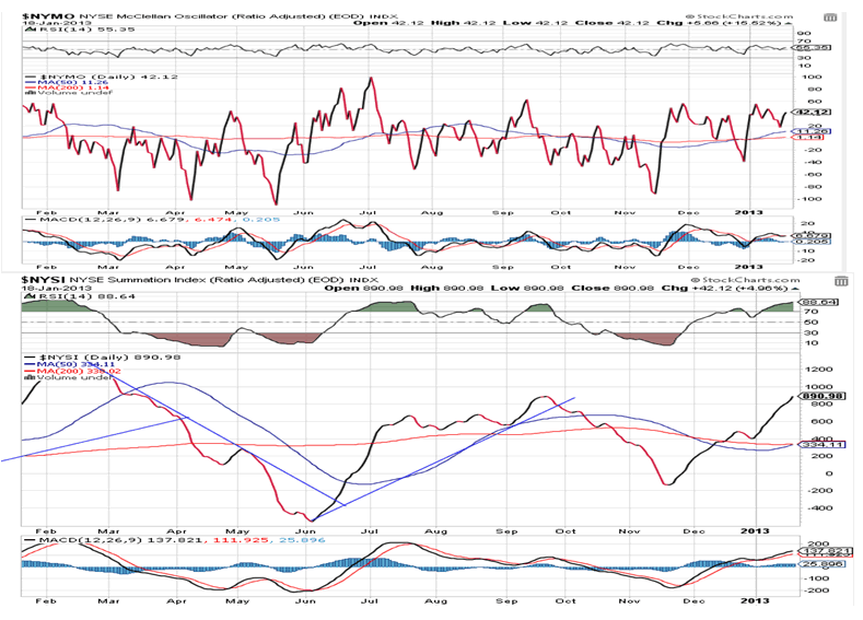
The McClellan Oscillator and Summation Index (courtesy of StockCharts.com) are posted below. Because the NYMO has remained above the zero line, the NYSI has continued to move up, suggesting continued strength in the intermediate trend.
On a short-term basis, however, the NYMO has not been able to make any more headway and is even showing some negative divergence against both the NYSI and the SPX. The RSI of the NYSI continues to be overbought and must correct sooner or later (sooner rather than later?).
These indicators offer two perspectives. The short-term perspective is best expressed by the NYMO which has now stalled for the better part of the month with deceleration and negative divergence especially noticeable in the MACD. This suggests that a short-term market correction is due, in line with my expectations. However, there is too much strength in the NYSI to suggest that this will be anything more than an average intermediate correction which will be followed by higher market prices.
Sentiment Indicators
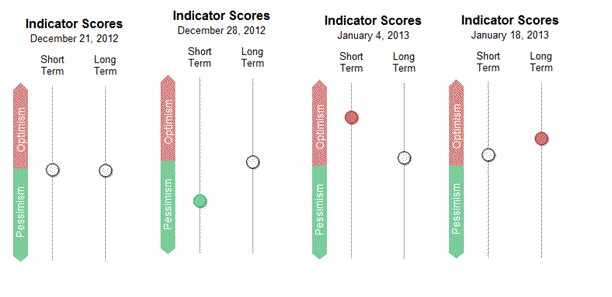
Both indicators of the SentimenTrader (courtesy of same) moved into the red, this past week. The one that really counts is the long term indicator and this is the highest it has been in many weeks; but it is not nearly high enough to signal a bull market top.
If the market does correct from here, it will bring the indicator back down into the green where it will have even a longer road to travel to the level required to signal an end to the major trend.
VIX
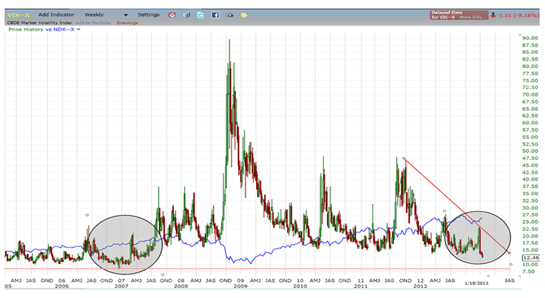
The last time that the VIX was at this level was in late 2006/early 2007. This is what is shown on the chart below. The blue line is the NDX which is used to compare the VIX with a price index. What does it tell us? Probably nothing of short-term value, but it could hint at more uptrend for the bull market, perhaps lasting well into 2013.
The best way to evaluate the VIX might be to treat it as a stock or index, with the understanding that it is a contrary indicator and that when it shows that it is ready to bottom, the market should be ready to move in the opposite direction. So let's analyze it that way.
The weekly chart indicators have become oversold with no sign of divergence. This may be telling us that more work will have to be done before a low of intermediate or long-term proportion takes hold and that the index is ready to start a sustained uptrend.
The daily and hourly indicators are equally oversold, but here, positive divergence abounds in the daily CCI and has started to form in the hourly CCI. In addition, the P&F chart showed a potentially final target of 12.00-12.50 which was met on Friday, thereby alerting us to an imminent near-term reversal.
XLF (Financial SPDR)
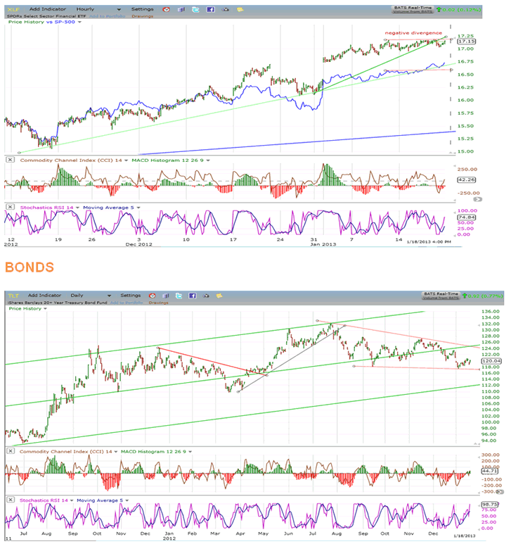
XLF is also a good contrary indicator. Here, its price action is compared to that of the SPX (blue line).
The chart shows that since the beginning of the rally, XLF was in sync with, or leading SPX. In the past couple of weeks, this has changed with SPX now taking the lead and XLF beginning to fall behind.
Deceleration and divergence are now showing in the XLF and is particularly noticeable in the histogram which has become and remains negative. This is an indication that XLF has lost its upside momentum and is ready to correct. In addition - like VIX - it has met a P&F projection at 17, which is the reason why it is stalling at this level. A near-term reversal in the XLF should be followed by the same action in the SPX.
TLT looks more and more as if it has started a significant correction, but it is still trading in a long-term uptrend and is not susceptible to an immediate price collapse. It is more likely to continue developing its distribution top and may even attempt a re-test of its previous high by coming out of the wedge-shaped correction pattern. We'll give it more time to clarify its immediate intentions.
GLD (ETF for gold)
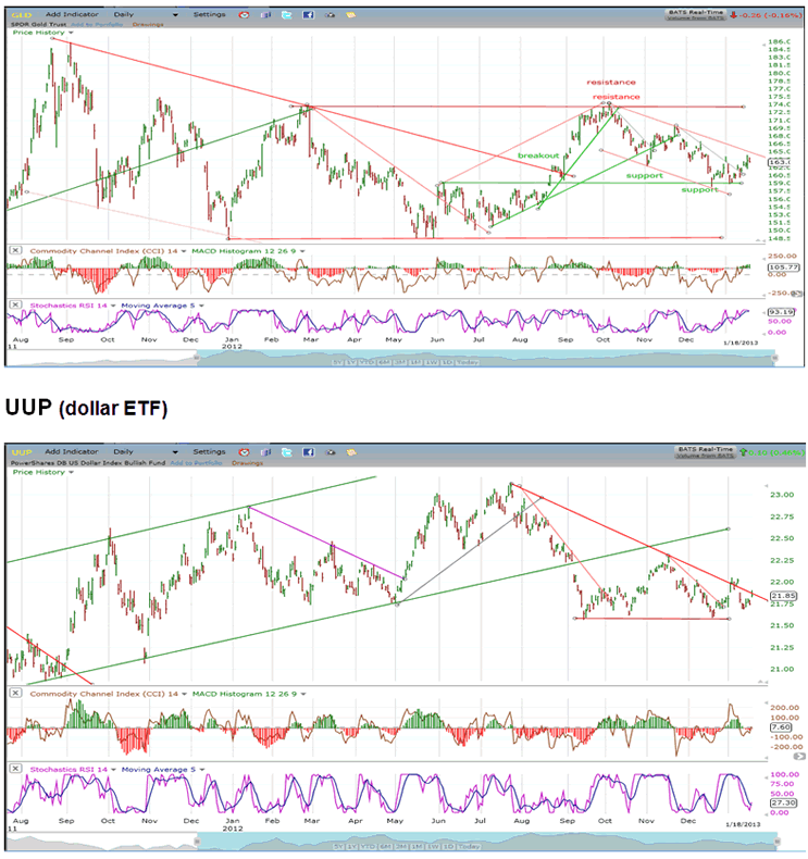
Since making an all-time high at 185 over a year ago, GLD has traded in a broad price range which could turn out to be consolidation before it extends its long-term uptrend, or distribution which will eventually lead it to lower prices. Its 25-wk cycle, which bottomed recently, has enabled it to bounce to the top of its short-term down-channel. It could pull back one more time, extending the small base that it has already started. If it pulls back with the market into early February, it could still fill an existing 157 projection before it attempts to move out of the channel.
Although UUP appears to be making a H&S pattern -- which would have negative implications for the short and intermediate prospects for the index -- this will most likely evolve in a base from which a new uptrend will emanate. Already the downtrend line is being challenged (for the second time) with an oversold SRSI and a positively diverging CCI. On the P&F chart, UUP looks more as if it is making a fulcrum pattern which has the potential of carrying the index much higher when it gets going.
USO (United States Oil Fund)
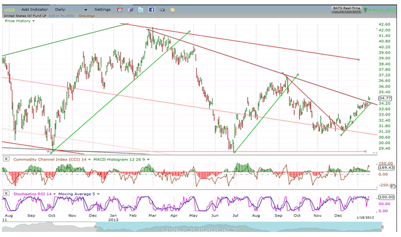
With the help of an al quaeda-linked group attack on a gas facility in Algeria, USO has managed to move up to an important downtrend line. Now that the Algerian situation is under control, USO will likely retreat once again. Let's see how far it pulls back before making any more forecasts.
Summary
The indices -- with the exception of NDX -- continue to make new highs and defy the gravitational pull exerted by the cycles which are scheduled to bottom in the first week of February.
We are entering a crucial week which should put an end to this pattern and begin the completion of the A-B-C intermediate correction which started at 1474. If strength persists beyond this week, we may have to go back to the drawing board.
FREE TRIAL SUBSCRIPTON
If precision in market timing for all time framesis something that you find important, you should
Consider taking a trial subscription to my service. It is free, and you will have four weeks to evaluate its worth. It embodies many years of research with the eventual goal of understanding as perfectly as possible how the market functions. I believe that I have achieved this goal.
For a FREE 4-week trial, Send an email to: ajg@cybertrails.com
For further subscription options, payment plans, and for important general information, I encourage
you to visit my website at www.marketurningpoints.com. It contains summaries of my background, my
investment and trading strategies, and my unique method of intra-day communication with
subscribers. I have also started an archive of former newsletters so that you can not only evaluate past performance, but also be aware of the increasing accuracy of forecasts.
Disclaimer - The above comments about the financial markets are based purely on what I consider to be sound technical analysis principles uncompromised by fundamental considerations. They represent my own opinion and are not meant to be construed as trading or investment advice, but are offered as an analytical point of view which might be of interest to those who follow stock market cycles and technical analysis.
Andre Gratian Archive |
© 2005-2022 http://www.MarketOracle.co.uk - The Market Oracle is a FREE Daily Financial Markets Analysis & Forecasting online publication.


