Most Popular
1. It’s a New Macro, the Gold Market Knows It, But Dead Men Walking Do Not (yet)- Gary_Tanashian
2.Stock Market Presidential Election Cycle Seasonal Trend Analysis - Nadeem_Walayat
3. Bitcoin S&P Pattern - Nadeem_Walayat
4.Nvidia Blow Off Top - Flying High like the Phoenix too Close to the Sun - Nadeem_Walayat
4.U.S. financial market’s “Weimar phase” impact to your fiat and digital assets - Raymond_Matison
5. How to Profit from the Global Warming ClImate Change Mega Death Trend - Part1 - Nadeem_Walayat
7.Bitcoin Gravy Train Trend Forecast 2024 - - Nadeem_Walayat
8.The Bond Trade and Interest Rates - Nadeem_Walayat
9.It’s Easy to Scream Stocks Bubble! - Stephen_McBride
10.Fed’s Next Intertest Rate Move might not align with popular consensus - Richard_Mills
Last 7 days
Friday Stock Market CRASH Following Israel Attack on Iranian Nuclear Facilities - 19th Apr 24
All Measures to Combat Global Warming Are Smoke and Mirrors! - 18th Apr 24
Cisco Then vs. Nvidia Now - 18th Apr 24
Is the Biden Administration Trying To Destroy the Dollar? - 18th Apr 24
S&P Stock Market Trend Forecast to Dec 2024 - 16th Apr 24
No Deposit Bonuses: Boost Your Finances - 16th Apr 24
Global Warming ClImate Change Mega Death Trend - 8th Apr 24
Gold Is Rallying Again, But Silver Could Get REALLY Interesting - 8th Apr 24
Media Elite Belittle Inflation Struggles of Ordinary Americans - 8th Apr 24
Profit from the Roaring AI 2020's Tech Stocks Economic Boom - 8th Apr 24
Stock Market Election Year Five Nights at Freddy's - 7th Apr 24
It’s a New Macro, the Gold Market Knows It, But Dead Men Walking Do Not (yet)- 7th Apr 24
AI Revolution and NVDA: Why Tough Going May Be Ahead - 7th Apr 24
Hidden cost of US homeownership just saw its biggest spike in 5 years - 7th Apr 24
What Happens To Gold Price If The Fed Doesn’t Cut Rates? - 7th Apr 24
The Fed is becoming increasingly divided on interest rates - 7th Apr 24
The Evils of Paper Money Have no End - 7th Apr 24
Stock Market Presidential Election Cycle Seasonal Trend Analysis - 3rd Apr 24
Stock Market Presidential Election Cycle Seasonal Trend - 2nd Apr 24
Dow Stock Market Annual Percent Change Analysis 2024 - 2nd Apr 24
Bitcoin S&P Pattern - 31st Mar 24
S&P Stock Market Correlating Seasonal Swings - 31st Mar 24
S&P SEASONAL ANALYSIS - 31st Mar 24
Here's a Dirty Little Secret: Federal Reserve Monetary Policy Is Still Loose - 31st Mar 24
Tandem Chairman Paul Pester on Fintech, AI, and the Future of Banking in the UK - 31st Mar 24
Stock Market Volatility (VIX) - 25th Mar 24
Stock Market Investor Sentiment - 25th Mar 24
The Federal Reserve Didn't Do Anything But It Had Plenty to Say - 25th Mar 24

Market Oracle FREE Newsletter

How to Protect your Wealth by Investing in AI Tech Stocks

Gold $1109 Price Target Still Prevails 

Commodities / Gold and Silver 2012 Nov 03, 2012 - 10:15 AM GMT

By: Brian_Bloom

Commodities

Diamond Rated - Best Financial Markets Analysis Article
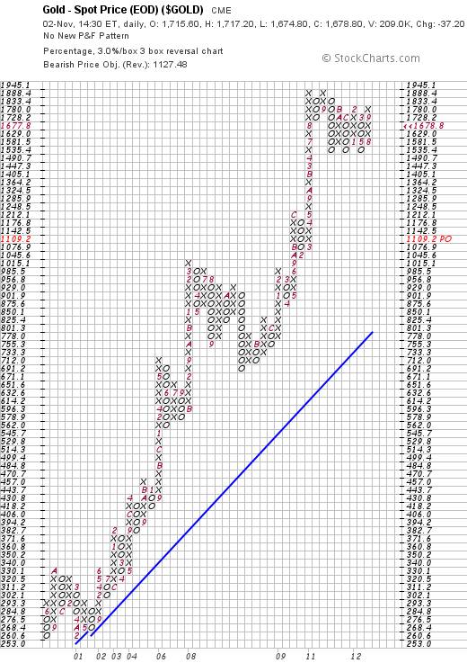
Within the context of a Primary Bull Market, the price destination target of $1,109 an ounce for gold remains prevalent; as can be seen from the 3% X 3 box reversal Point & Figure chart below (courtesy stockcharts.com)


Chart #1 – 3% X 3 Box reversal P&F chart

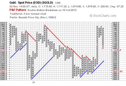
Intriguingly, on the more sensitive scale, $10 X 3 box reversal P&F chart below, a sell signal was given on October 15th.; and the price destination on this chart is $1,560 an ounce, which level (if it is reached) will penetrate the rising blue trend line on the downside.

Chart #2 - $10 X 3 box reversal P&F chart

Of course, this begs the question as to “why?”

If Dr Bernanke is up to his eyeballs in Quantitative Easing and the US dollar is inevitably going to collapse as a consequence, then why are the P&F charts anticipating a strong downside technical reaction? (Within a Primary Bull Trend, for the benefit of those who find such questions as offensive as nails scraping on a blackboard)

Well, as a starting point, let’s have a look at a chart of the US Dollar.

Interestingly, according to the chart below, the market is in two minds about the dollar index. It tried (and failed) to rise above its falling trend line and there is now as much chance of the dollar index falling back to 76 as rising to 102.

Chart #3 – P&F chart of US Dollar Index.

The following two charts may shed some light. They are reproduced from an analysis done by Tony Boeckh (www.boeckhinvestmentletter.com).

(Note: Tony is one of the world’s pre-eminent economic analysts. He was one of the founding editors of the Bank Credit Analyst)

Chart #4 – Risk Zone Nations with high Debt:Cash Flow ratios

Explanation: Tony pointed out that Gross Savings within a country represents the cash flow that is available to service and/or pay down its debts. He credited this method of analysis to Bruce Ramsay, a contributing editor to the Boeckh Investment Letter

Quote:

“Debt/CF multiples of 30x or lower are a good indicator of financial strength and countries in this zone can be considered to have optimum leverage.”  

By contrast, countries with ratios of above 30:1 are likely to be headed for financial trouble – perhaps debt reconstruction or default.

Note from the above chart that one of the supposed bulwarks of the Euro zone – France – has an upward trending ratio that is now above 60:1.

Whilst all of the above nations – including Japan – are headed for trouble – the following chart shows the ‘basket cases’ of Europe.

Chart # 5 – Extreme Leverage Nations

Against this background “Safe Haven” countries are few and far between.

Just how nerve wracking this indecision has been is apparent from the chart below, which shows that the agglomerated index of global industrial equities is reaching a point of decision where the probabilities favour a breakdown – flowing from the Head and Shoulders reversal pattern that “might” be in the process of evolving. (Source:  http://www.google.com/finance?cid=10264130 )


Chart #6 – S&P Global 1200 Industrial Index

Summary and Interim Conclusion

Whilst the S&P Global 1200 Industrial Index shows indecision with a bias towards bearishness, the clearly emerging financial stresses in the PIIGS –and now France – seem to be pointing to the inevitability of a debt restructure and/or default within and hence either a restructure and/or breakup of the European Union.  Japan is also showing evidence of further financial deterioration. All of this points to the potential for deflation, and this would explain the ‘surprising’ (at face value) bearish targets of the P&F charts for the Gold Price despite the fact that it is obvious to “everyone who has half a brain” that the gold price must explode upwards because the US Dollar is heading for collapse.

This brings us to the inevitable question: What will happen to the US’s equity market?

The chart below (courtesy DecisionPoint.com) dates back to the 1920s and clearly shows that the S&P 500 index is hitting resistance of the upper trend line.

Chart #7 – S&P Industrial Index  1925 – 2012.

Conceivably, the world is awaiting the outcome of the US Presidential elections to determine whether the US dollar index (chart #3)  will fail to rise above its descending trend line and whether the S&P 500 will break above the upper trend line (as it did when Dr Greenspan pushed the monetary pedal to the metal). Arguably (by some) if Mr Obama is re-elected then the Dollar Index will collapse and both gold and the S&P will rise through the roof. Arguably (by others) if Mr Romney is elected then the US economy will continue to recover, the dollar will rise to 102 and the S&P 500 will consolidate.

Unfortunately, people in today’s world have been conditioned to react to “sound bites” and its not necessarily as clear cut as the above; for two reasons:

  1. The Gold price charts (P&F) are giving off signals that most gold bugs will not be predisposed to want to pay attention to; and
  2. The S&P Global 1200 index is representative of over 70% of the world’s equities and, together, Europe and Japan have economies that are greater than that of the US.

In this context, it becomes important to take a view of the Japanese Stock Market. (Source: http://www.forecast-chart.com/historical-nikkei-225.html )

Chart # 8

Arguably, this chart may have significant downside support but it is moot whether the chart will continue to crawl along the bottom or enter a rising trend.

Overall conclusion

In context of several European countries having excessively high (and deteriorating) ratios of debt/cash flow – and in context of a global equity market that is reaching for a decision point that seems more likely to break down than up because of this – the gold price is behaving in a manner that is contrary to the expectations of “most people” and is signalling the possibility of deflation. Intriguingly (as has been alluded to in earlier blogs) the US economy seems to have upside potential.  Whether it can capitalise on this potential in the foreseeable future seems to be dependent on who will win the presidential elections.

Author note:

That there is reason to be far more bullish about the US’s economic future than is generally understood, may be seen from the “Context” page of my website at http://www.beyondneanderthal.com/mission-overview/ , which also has a link to a video entitled “The Five Breakthrough Technologies Reshaping the Economy”.

However, I have been opining for a couple of years now that “Business risk” is far less threatening in today’s economic environment than “market risk”. What I mean by this is that one should be investing in fundamentally undervalued businesses rather than in situations that seem appealing on a relative technical strength basis. Apple and Facebook are two examples of the latter where investments have been made on sentiment rather than on future business fundamentals. From the perspective of “buy low and sell high”, the equity and bond markets both seem to be generally high. Therefore there is too much “market” risk.

Nevertheless, within a fundamentally over-valued market there are always fundamentally undervalued opportunities. Going forward, what will very likely change is that the ubiquitous short term “trading” mentality will be bludgeoned out of the markets and a far healthier “investor” mentality will take its place – where investors recognise that dividends and cash flows are important and that capital gains may take years to manifest.

The evidence as reflected in the chart below - of the ten year treasury yield - is that yields may well have bottomed. Mr Bernanke cannot have it both ways. He cannot expect to flood the markets with cash – which will inevitably lead to price inflation – and also expect yields to remain low. At some point, Mr Bernanke’s honeymoon will end and the market will swat him aside.

In theory (as his doctoral dissertation apparently concluded) the reason that the Great Depression manifested was that there was a liquidity crunch – which is why he is behaving like a demented fireman with the high pressure cash hose set to maximum. In reality, the credit crunch was merely a symptom. The Great Depression manifested because oil and related technologies had not yet taken over as the primary drivers of the world’s economy. It took a World War to facilitate that. From this analyst’s perspective it seems that the “continuation of QE to infinity” is not as certain as many people seem to believe.

Chart #9 – P&F chart of US 10 Year Treasury note Yield

Brian Bloom

Author, Beyond Neanderthal and The Last Finesse

www.beyondneanderthal.com

Beyond Neanderthal and The Last Finesse are now available to purchase in e-book format, at under US$10 a copy, via almost 60 web based book retailers across the globe. In addition to Kindle, the entertaining, easy-to-read fact based adventure novels may also be downloaded on Kindle for PC, iPhone, iPod Touch, Blackberry, Nook, iPad and Adobe Digital Editions. Together, these two books offer a holistic right brain/left brain view of the current human condition, and of possibilities for a more positive future for humanity.

Copyright © 2012 Brian Bloom - All Rights Reserved

Disclaimer: The above is a matter of opinion provided for general information purposes only and is not intended as investment advice. Information and analysis above are derived from sources and utilising methods believed to be reliable, but we cannot accept responsibility for any losses you may incur as a result of this analysis. Individuals should consult with their personal financial advisors.

Brian Bloom Archive

© 2005-2022 http://www.MarketOracle.co.uk - The Market Oracle is a FREE Daily Financial Markets Analysis & Forecasting online publication.


Post Comment

Only logged in users are allowed to post comments. Register/ Log in