Why Is Future Silver Supply More at Risk than Gold?
Commodities / Gold and Silver 2012 Jul 30, 2012 - 12:34 PM GMTBy: Steve_St_Angelo
 The focus of the markets and the alternative media is firmly placed on the continued disintegration of the world financial system. Many believe that the collapse of the fiat monetary system along with the global banking cartel is the worst possible outcome. However, this may actually turn out to be the good news in a sea of bad news that is lurking around the corner.
As the world's attention is currently directed at its massive paper-debt dilemma, a physical problem looms larger each passing day. This is what I call, the brontosaurus in the living room. The information provided in this article may help connect the dots to the reader who has been grossly misinformed by the highly specialized analysts in the various industries and media.
In the future as tens of trillions of dollars of debt masqueraded as wealth implodes, there will be a stampede into the best safe havens available -- the precious metals. Many believe gold will play the major roll in this upcoming transfer of wealth. While this may be true, silver could actually turn out to be the better choice when we consider the factors presented in this article.
The inspiration to write this article came while I visited several historic mining towns in Utah. One of these mines was the Horn Silver Mine located in Frisco, Utah. After spending most of the day looking at the remains of the town, its old kilns and the abandoned mine, I began to wonder how much silver was produced there and what were the size of its ore grades.
The Horn Silver Mine in Frisco was discovered in 1875 and by 1881 it was producing over one million ounces of silver annually. However, in a rush to get the silver out of the ground and not taking the time to brace the tunnels correctly, the mine collapsed in Feb, 1885. The one fortunate part about the mine collapse is that it took place between shifts so no one was hurt.
The mine recovered and started to produce again at a decent rate in 1887, but it never regained the level it had achieved prior to the mine collapse. In the 30+ years the mine was in operation, it produced over 14 million ounces of silver. This may not seem like a great deal today, but in its heyday it was the largest silver mine in Utah.
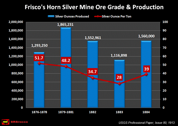
In its initial years of operation, the Horn Silver Mine produced silver at a staggering 1,608 g/t (grams per ton) or 51.7 oz/t (ounces per ton). We must remember that during this time, the United States was calculating these ore grades in short tons or 2,000 pounds. Today the predominant industry standard is measured in metric tonnes or 2,205 pounds. Thus, these earlier figures were approximately 10% lower than the comparable ore grades today. If we adjust the difference to fit present standards, it would be 1,769 g/t or 56.8 oz/t .
To understand just how much the ore grades have changed in the silver mining industry in the past 100+ years, I decided to compare the Horn Silver Mine to a present day silver mining company. I choose First Majestic Silver Corp because it is a smaller producer and it has relatively decent silver ore grades (more about this later).
The Horn Silver Mine vs. First Majestic
If we look at the data compiled by the United States Geological Survey in 1913, we can see the annual amount of silver produced at the Horn Silver Mine:
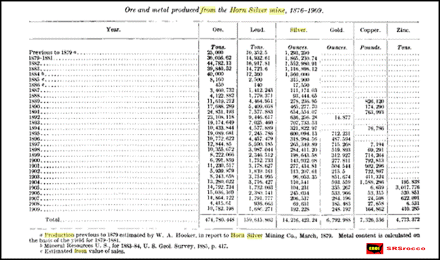
The copy of the original image is hard to read, but the important figures to focus on are in the ORE & SILVER columns. We can see that prior to 1885, the mine was producing the most silver in a given year. At its peak in 1884, the Horn Silver Mine extracted 40,000 tons of ore and produced 1.56 million ounces of silver. The full potential of the mine was never reached due to the collapse of the main tunnels in 1885.
To get a better idea of richness of the silver ore grades that were extracted from the Horn Silver Mine in the first few years of production, take a look at the graph below:
Furthermore, during the first several years of production, the Horn Silver Mine produced 10,352 tons of lead at a staggering 41% ore grade. In its final year of recorded production in 1909, the mine provided 192,22 oz of silver at 18 oz/t and 1,686 tons of lead at a 15% ore grade.
If we fast forward to the present day and look at First Majestic's Q1 2012 Financial Report, we can get an idea of just how much more ore is required to be processed to produce silver. In the second quarter of 2011, First Majestic processed 482,077 tonnes of ore to generate 1.78 million oz of silver. The reason I selected Q2 2011 will become apparent in the following charts.
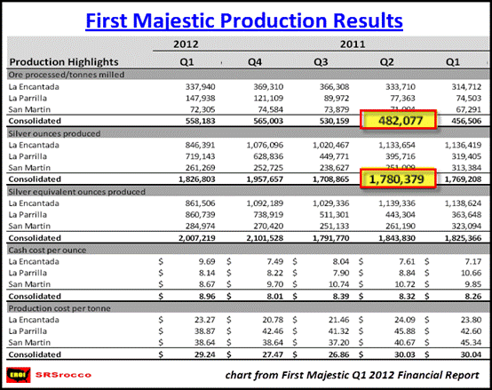
I took all the data from this report and compiled the graph below:
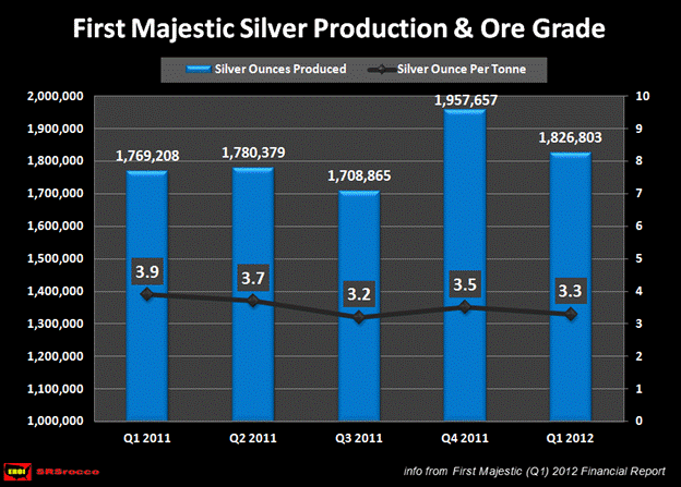
In the five quarters shown above, First Majestic produced silver at a range of 3.2-3.9 oz/t. Furthermore, according to their Q2 2011 results, First Majestic's average lead ore grade was 1.2% -- a far cry compared to its historic counterpart.
During the 30+ years the Horn Silver Mine was in commercial production, it processed a grand total of 474,780 tons of ore and supplied 14.2 million oz of silver. On the other hand, First Majestic processed 482,007 metric tonnes of ore (in just one quarter!) to produce 1.78 million oz of silver. This is the reason why I choose First Majestic's second quarter of 2011 as a comparable -- it was based on a similar volume of processed ore.
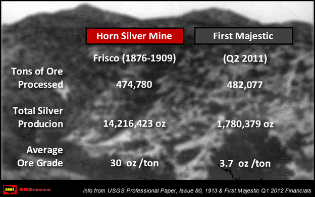
Over the life of the Horn Silver Mine, it produced 8 times more silver than First Majestic (in Q2 2011) when we compare tons of ore processed. Thus, First Majestic has to process 8 times more ore to produce the same amount of silver that came from the Horn Silver Mine.
We must remember, that during the late 1800's and early 1900's the majority of the work was done by human and animal labor supplemented by coal and wood energy sources. Today, the majority of work is accomplished by diesel powered earth moving machines and electricity from the grid or onsite electric generation. This is an extremely important factor when we consider the future production of silver... more on this later in the article.
How Do Other Silver Mining Companies Stack Up?
I can just hear it now. The skeptics are probably saying "Why don't you compare the Horn Silver Mine with mining companies that are producing silver at higher ore grades?" That is actually a good idea. Below you will find out how the more notable silver mining companies compare to the historic Horn Silver Mine:
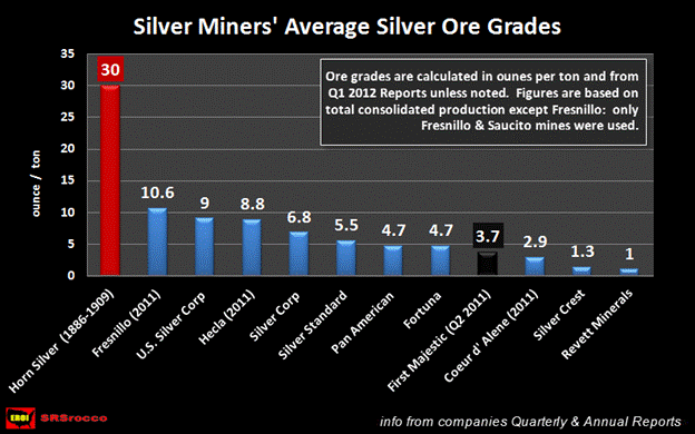
As the graph states, the silver ore grades were calculated by the mining companies' Q1 2012 financial reports (unless noted) and by their total consolidated production. Fresnillo was the exception because its three primary gold mines (containing low grade silver) would have lowered its average silver ore grade unfairly.
Fresnillo had the highest average silver ore grade (10.6 oz/t) compared to the other current producers represented in this graph, while Silver Crest (1.3 oz/t) and Revett Minerals (1.0 oz/t) came in last. If we look at the different silver ore grades from the graph we can assume the average silver ore grade from the current producers would be between 5-6 oz/t.
Regrettably, I did not take the time to compile an overall average ore grade from all the current silver miners when I was acquiring the information for the article. However, I may be reproducing this figure as well as many other interesting statistics in future reports on the silver miners (possibly for a fee if the demand is there).
We can plainly see that the Horn Silver Mine produced nearly 3 times more silver during its lifetime than Fresnillo -- the highest silver ore grade of the group. If we compare the average silver ore grade of the Horn Silver Mine (30 oz/t) to estimated average of all the current miners (5-6 oz/t), then 5-6 times more ore is required to be processed today to produce the same amount of silver during the lifespan of the Horn Silver Mine.
For those who may have the notion that the Horn Silver Mine was an exceptionally high grade mine of its time... it wasn't. The average silver ore grades in the United States and Australia were extremely rich during the 1880-1900 period. For additional factual data, click on the link to my article PEAK SILVER AND MINING BY A FALLING EROI, and scroll down to the chart that shows the average ore grades of various metals in Australia. During the 1880-1900 period, the average silver ore grades for mines in Australia were 1,000-1,400 g/t.
Now that we have an idea on how present silver ore grades have declined compared the silver mines in the previous century, let's take a look at the future.
If we take a stroll to GoldMinerPulse.com where they have a link to their Silver List and we click on the area that says: BY GRADE, we will see a better view of the table below:
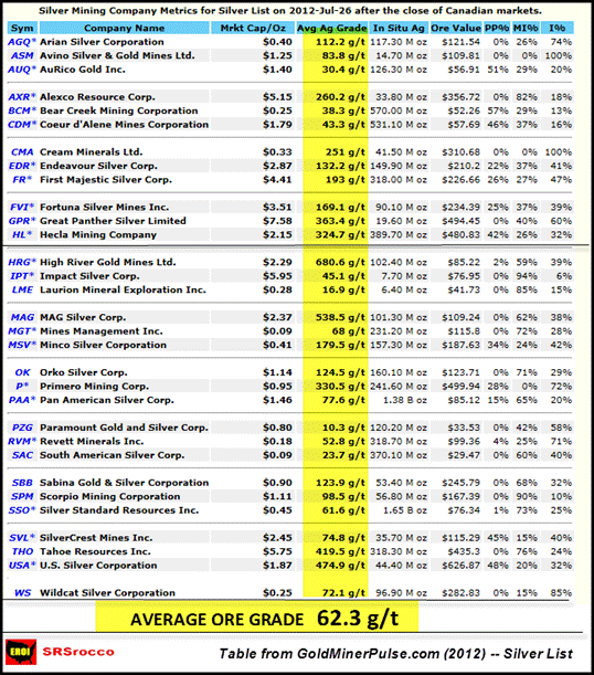
The companies posted above made the Canadian GoldMinersPulse Silver List if more than 25% of their in-situ (in the ground) value came from in-situ (in the ground) silver. Basically, the lower value and lower grade companies didn't make the cut. If we examine the list we can see that most of the predominant Canadian Silver Miners are included. Furthermore, this is the list in which I selected the majority of companies when constructing the Silver Miners Average Silver Ore Grades graph above.
The figure that stands out like a sore thumb and highlighted in yellow, is the overall average or grade of 62.3 g/t (or barely 2 oz/t) for all the companies on this list. This number is based on an average of all the companies' proven & probable reserves, measured & indicated and inferred resources. Some of these companies are still explorers and have not yet made it to the commercial production stage. Moreover, the later stage resources such as measured & indicated and inferred, normally contain the companies' lowest ore grades.
At a glance, we can see that Coeur 'd Alene (530 million oz @ 43 g/t) and Pan American Silver (1.38 billion oz @ 77 g/t) have helped bring the overall average down due to their larger volume of reserves & resources comprised of substantially lower ore grades.
The problem that the silver mining industry faces as its ore grades continue to decline, is the increased energy costs in processing more tonnage of ore to produce the same or even less silver in the future. Enter the Brontosaurus.
THE ENERGY SITUATION: The Brontosaurus In The Living Room
Alright, I get it. What do ore grades and energy have to do with the future supply of silver? A great deal as you will see. It is quite unfortunate that the U.S. Government and the main stream media have recently put forth the information claiming, "The Future Oil Independence of the United States" when quite the opposite is true.
In describing these so-called energy delusions during a recent interview with Chris Martenson, James Howard Kunstler stated, "It's like a collective psychological break by everybody in American Society, fostered by a climate of the retailing of lies." This may seem a bit blunt, but I believe Kunstler hits it right on the forehead here.
The situation in the future global oil industry is so dire, it is simply amazing that we find very little in the way of open honest public debate. To truly understand the ramifications of a declining oil supply on the world's markets, a book can easily be written. However, it can be addressed here in four simple charts.
The first chart is taken from an excellent article written by Gail Tverberg titled, "Evidence that Oil Limits are Leading to Limits of GDP Growth." Here we can see in plain grade-school logic that as the world oil supply declines... so does global GDP -- pretty straightforward stuff.
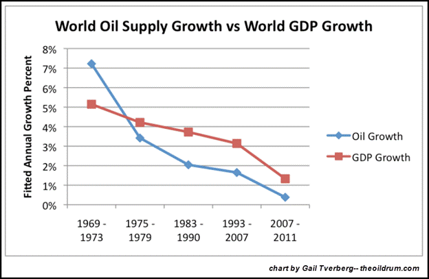
If the oil supply growth turns negative as well as the world GDP, how will this affect the mining industry? Does anyone actually believe the mining industry will continue to grow its metal production while the world oil supply and global GDP decline? Well, according to the future forecasts by expert mining analysts... they don't see a problem with it.
The world is currently experiencing a plateau in global oil production and will soon be heading down the slope of continued depletion. Very few realize the massive amount of oil the world's oil fields supplied in just the past decade. In a comment to a post on TheOilDrum.com , written by Jeffrey Brown (westexas) and citing official sources, the world produced 23% of the total cumulative oil production to date between 2002 and 2011. The second chart below puts it into perspective:
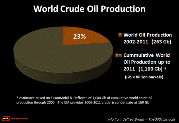
From the research provided by ExxonMobil and Ken Deffeyes, the world's cumulative oil production up until 2005 was 1,000 Gb (billion barrels) with an additional 160 Gb (EIA) produced from 2006-2011 for a grand total of 1,160 Gb. According to this ENERGY REPORT, the total ultimate recoverable reserves of conventional oil are 2,000 Gb. Thus, the world has approximately 840 Gb of conventional oil reserves remaining. The peak of conventional crude has come and gone without the slightest peep from the oil industry.
To offset the peak of conventional crude, unconventional sources such as Tar Sands, Shale Oil and Natural Gas Liquids have be utilized. Even though these unconventional energy sources have supplemented the overall supply to help meet the demand of the market, they suffer from a lower EROI (energy returned on invested). The lower the EROI of unconventional oil sources, the lower net energy is available for the market -- basically, it costs more to produce and you get less to use in the economy.
The third chart, The Falling EROI: The Destroyer of Net Energy, forecasts how the declining EROI of global oil and natural gas destroys the amount of net energy available for the market. The ratios in red depict the amount of energy consumed in the production of oil & natural gas. For instance, in the 1930's, it only took one barrel of oil to produce 100 barrels in the industry. You can see how the ratios have declined as we move up the oil production graph.
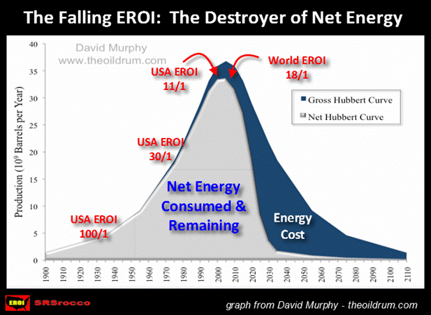
Few realize that capital formation in the financial markets is derived from a high degree of net energy. As the net energy continues to decline, so will the availability of capital formation... thus crushing the growth of the global economy.
The three charts above should provide enough information to win over the worst peak oil skeptic. However, if this is not the case, the last chart should clear up things nicely. Most of the diehard contrarians of peak oil always bring up the fact that total global liquid oil production is still rising. While this may be true in total liquid energy production, it is not when we look at net oil exports.
It really doesn't matter how much oil a country can produce, but rather how much it can export that matters. In the final chart we can see that Available Net Oil Exports have already peaked in 2004-2005. The Land Export Model and the chart below were developed by Jeffrey Brown. According to Brown's calculations and based on past trends, available net oil exports will decline from 35 mbd (million barrels a day) in 2010 to 16 mbd by 2020 -- a 50%+ decline in ten years.
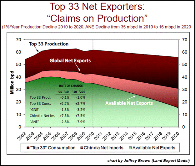
The chart is based upon a conservative 1% annual decline rate of global oil production. The dark red area of the chart shows the amount of oil consumed by the "Top 33" oil exporters. The light red area denotes the (increasing) amount of oil consumed by China & India and lastly, the green area forecasts how much net exports will be available for the remaining oil importing countries. Of course these are only forecasts based on prior trends, but if these trends do continue the world will have to survive on a great deal less oil by the end of the decade.
For those who would like to acquire more detail concerning the energy situation going forward, you can do so at my second peak silver article," PEAK SILVER REVISTED: Impacts of a Global Depression, Declining Ore Grades & a Falling EROI".
So... how does the approaching energy predicament impact the future silver supply as well as the broader mining industry? Well, according to the United States Geological Survey (USGS), in their most recent update of world silver reserves, it doesn't seem to matter that much at all.
WORLD SILVER RESERVES: A Good Percentage May Just Stay Where They Lay
If you spend any time in the precious metal blogosphere you will read comments stating that the world only has 10-12 years worth of silver reserves remaining. This may have been true a few years ago, but it is no longer the case. It looks as if the folks at the USGS finally decided to add some figures to the countries with a N/A in their reserve column as well as update others with existing reserves.
In 2009, the world held 270,000 metric tonnes of silver reserves (nearly the same amount for the past decade). However, in their latest 2012 Silver Mineral Commodity Summary, the world now has a whopping 530,000 metric tonnes of silver reserves -- amazing what a few taps on the keyboard can do.
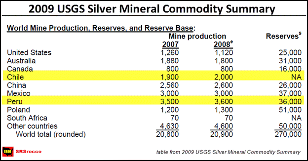
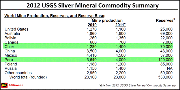
In just three years, the USGS has nearly doubled world silver reserves. If we take a close look at the tables, we can see that the majority of increases came from Chile and Peru. In 2009, those Chileans had no idea how much silver they had in reserve, but by the very next year they managed to scrape together 70,000 metric tonnes (displayed in the 2010, 2011 & 2012 Silver Mineral Summaries). This is by no means a paltry figure as it turns out to be more than 2.25 billion ounces.
Furthermore, I guess those Peruvians didn't realize that they had an additional 84,000 metric tonnes of silver reserves just laying around in 2009. All kidding aside, Chile and Peru accounted for 154,000 of the total additional 260,000 metric tonnes of silver reserves added since 2009.
As it turns out, the world now has more than 22 years worth of silver reserves remaining. This may seem like a real bummer to the silver enthusiasts who were touting the low silver reserves as another bullish reason to own the metal. On the other hand, reserves on paper may not be reflective of the true amount of metal the world may be able to produce in the future -- especially in a world of declining energy reserves.
For instance, a good portion of Chile's newly acquired 70,000 metric tonnes of silver reserves may just have to stay where they lay.
CHILE: Cracks Beginning To Appear In Its Massive Copper Industry
Chile is by far the King of copper producers. In 2011, Chile produced an estimated 5.4 million metric tonnes of copper. Peru came in as a distant second at a mere 1.2 million metric tonnes. One of the by-products of copper production is silver and in 2011, Chile produced 42.1 million ounces of the precious metal. Chile is now the 5th largest silver producing country in the world.
For Chile to be able to produce those so-called 70,000 metric tonnes of silver reserves, it will have to mine a great deal of copper to do so. In order for the Chileans to be able to mine their huge copper reserves, they will need a growing supply of energy (especially liquid energy such as diesel to run the massive earth moving machines).
When I was researching diesel consumption in the mining industry, I came across an interesting trend taking place in Chile's copper industry. In the past six years (2005-2010) when Chile's copper production remained virtually flat, its consumption of diesel and fuel oil in the extraction of the ore has increased a staggering 50%.
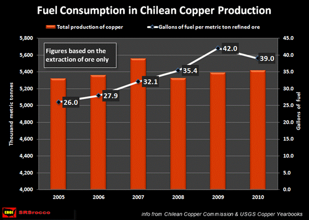
This huge increase in consumption of liquid fuels was due to falling copper ore grades and the aging of the mine as well. As open-pit mines age, the haul trucks transporting the ore will have to burn more fuel as the mine expands and deepens. If Chile wants to grow their copper and silver production, they will only do so if they can grow their energy base. This is where the situation gets interesting.
In a recent news article, "Chile $100 Billion Copper Push Under Threat by Energy Scarcity", it was made clear that if Chile did not make massive upgrades to its electric power generation, a $100 billion worth of copper projects could be in jeopardy.
from the article:
The biggest-ever pipeline of copper projects is under threat as Chile, the world's top producer, struggles to contain rising opposition to new power plants.
... "Chile will have to shelve many of the country's mining investments due to the high cost and scarcity of electricity," Joaquin Villarino, president of mining lobby group Consejo Minero, said in Santiago on April 19. Delays will jeopardize a "significant" part of the proposed mine investments, he said.
and from another article concerning the same subject:
There are no easy fixes for tumbling ore grades at massive mines in northern Chile, protests over key energy projects that are threatening mining expansions and possible disruptions from extreme weather and labor unrest.
.... World No. 3 copper mine Collahuasi's output dipped in the first quarter of the year due to weather disruptions and grades, Anglo reported on Thursday, while the world's No. 1 copper mine Escondida saw its output plummet 25 percent last year due to a shock two-week strike and ore grade slips. (Link to the article: HERE)
Chile faces several daunting challenges in the future if it plans to increase its overall copper production. Furthermore, these two articles failed to mention the future threat of peak oil and the declining net oil exports on top of their rapidly increasing domestic mining problems. If we consider all of these factors facing the future of Chile's mining industry, it may be prudent to believe that a good portion of its copper and silver reserves may just stay where they lay.
Future Silver Supplies More At Risk Than Gold
We have witnessed that as silver and copper mines age, their ore grades continue to decline. This is also true in the overall mining industry when we consider the passage of time. Unfortunately, the best quality low hanging fruit in the industry were picked over a century ago. Today, a good percentage of the mining companies are just going over old mines and trying to make something out of the remaining scraps and crumbs left behind.
It would be nice if this phenomenon of falling ore grades did not affect the gold industry... but it does. Again, as ore grades decline and as open-pit mines age, it takes more energy to extract and produce the same amount of gold. To get an idea of the energy demands in the gold industry, I have focused on the top five gold miners in the world.
Trying to obtain the energy information and to list it in a standard format was a task in itself. The amount of fuel consumed was listed differently in various company reports. Mining operations chose to present their figures in either petajoules, megajoules, gigajoules, cubic meters or barrels. Each was then converted to more recognized measurement in gallons.
In 2005, the top five gold miners (Barrick, Newmont, Goldcorp, Newcrest & Kinross) consumed approximately 303 million gallons of diesel in their operations. By 2010, this figured increased 55% – to a total of 470 million gallons. (additional note: Lihir Gold now merged with Newcrest was excluded from Newcrest's figures in the chart below)
If we look at the diesel consumption in the top five gold miners, 20.4 gallons of diesel were needed to produce one ounce of gold in 2006. To produce this same ounce of gold in 2010, nearly 24 gallons of diesel were required.
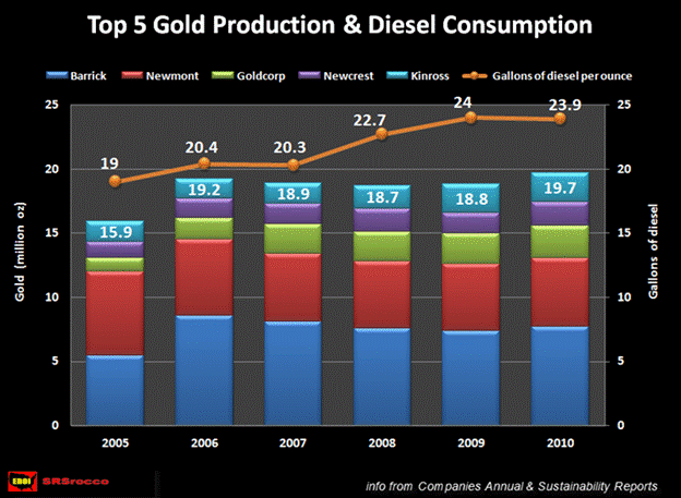
New gold mining projects slated to come online in the future on top of those already in production will need additional sources of diesel to run their operations. If available net oil exports continue to decline, where will these companies acquire the liquid energy to run their gold mines? I would imagine this question rarely if ever crosses the minds of mining analysts.
Even though the gold mining industry faces the same future energy problems as the silver industry, it may indeed suffer a great deal less. Why?
The following chart provides the answer:
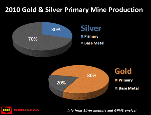
In order for the future global silver production to grow, it must predominantly take place in the base metal mining industry. When the world oil supplies start their inevitable decline in the next several years it will also force global GDP to fall as well. As the global GDP declines, so will the supply of base metals such as copper, lead and zinc. Thus, future silver supply is at more risk than gold because 70% of its production comes from the mining of base metals.
In contrast, 80% of the world's gold production comes from primary mines. When the world finally succumbs to the gravity of the hundreds of trillions of dollars in derivatives reverting back to their original value of zero, gold will become the center of banking and trade. Because the majority of gold comes from primary mines, it makes perfect sense for the world to focus its energy sources on the very metal that will be in the forefront of global banking industry.
That being said, this is not at all negative for silver. Silver is still the second best monetary metal to gold. In addition, as future base metal production declines (along with it silver production), this would force the price of silver to increase in response to its enhanced rarity.
I would also imagine this will motivate the mining industry to enlarge its number of primary silver producers as well as increase its overall percentage of primary silver production. We must remember, the most efficient way to use less energy to extract silver is the mining of underground reserves with high ore grades. That is why it makes perfect sense that these underground high ore grade mines will take a premium in the future -- basically, they utilize a higher EROI in their production.
Final Remarks
It is simply amazing to see professional engineers and geologists planning and designing technical mining reports for operations that are based on 25, 50 and 100 year life spans (such as the Alaska Pebble Project) without a comprehensive consideration of the future energy supply.
Future world energy constraints will impact the production of silver in a larger degree than gold. As the world finally catches on to the fact that silver production will decline greater in percentage than gold, its value will more than likely increase to a greater extent than gold.
Got your physical silver?Steve St .Angelo Independent researcher residing in southwest Utah
Contact SRSrocco@gmail.com
© 2012 Copyright Steve St .Angelo - All Rights Reserved Disclaimer: The above is a matter of opinion provided for general information purposes only and is not intended as investment advice. Information and analysis above are derived from sources and utilising methods believed to be reliable, but we cannot accept responsibility for any losses you may incur as a result of this analysis. Individuals should consult with their personal financial advisors.
© 2005-2022 http://www.MarketOracle.co.uk - The Market Oracle is a FREE Daily Financial Markets Analysis & Forecasting online publication.


