Gold Price Technical Analysis, Continues to Target $1100
Commodities / Gold and Silver 2012 Jul 11, 2012 - 04:18 AM GMTBy: Brian_Bloom
 A critically important question that needs to be addressed is whether the gold price has been consolidating within a Primary Bull trend or whether the gold price is entering a Primary Bear trend. It is argued below that whilst the retracement has represented a secondary reaction within a Primary Bull market, this reaction is not yet over and – on a balance of probabilities – it seems likely to continue to head south until the gold price reaches $1100.
This article lays out the various bullish and bearish interpretations of the charts to arrive at the above conclusion based on a balance of probabilities. Whilst there can never be any certainties in technical analysis, the view of some that it is akin to reading tea leaves in a tea cup, is demonstrably incorrect.
Author Note: The charts below are courtesy of stockcharts.com
Chart #1 – Daily gold chart: 2 year view #1
The green line shows that gold price fell from a high of around $1925 in September 2011 to a low of around $1538 – which low has been tested (and held) twice. Clearly, the gold price has been falling. This is a matter of objective fact.
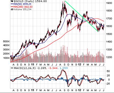
Chart #2 – Daily gold chart: 2 year view #2
Cautious interpretation: The blue lines show that gold has been moving in a trading range of between $1538 and $1700 (or $1800, if one takes the more optimistic view)
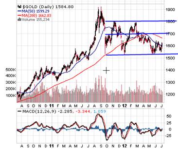
Chart #3 – Daily Gold Chart: 2 year view #3
Optimistic interpretation: The orange lines represent a three line fan formation which – IF it breaks up above the third fan line – holds the promise of a continuation of the preceding bull trend. The expectation of the optimists is that – because the lower horizontal blue line in Chart 2 above has held, therefore, this is bullish and the fan line will be penetrated on the upside.
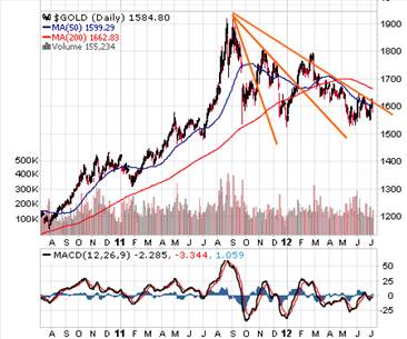
There is a serious potential problem with this bullish view: It will only be bullish if the third fan line is broken on the upside. 3 line fan formations are not ipso facto bullish.
To demonstrate that this is more fact than opinion, below is an example of a three line fan formation that failed to break. It is reproduced from Technical Analysis of Stock Trends, Edwards and Magee, 5th edition, at page 256.
Chart #4
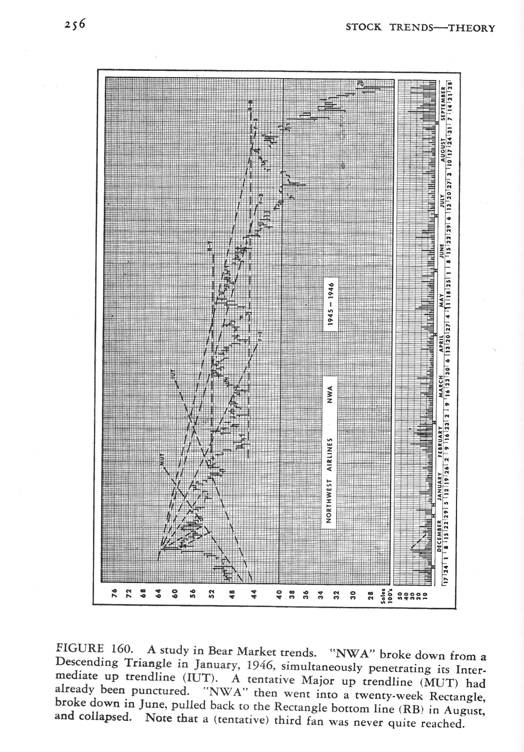
The following needs to be emphasised: The fan formation on Northwest Airlines chart – after travelling within a trading range represented by horizontal support and resistance lines – failed to penetrate on the upside, and then broke down below the support level of the descending right angled triangle. Thereafter, it made a half-hearted attempt to retrace the break, failed to break above both the third fan line and the (now) resistance of the previous support, and then collapsed.
And this brings us to the more pessimistic interpretation of the patterns emerging on the weekly chart of gold.
Chart #5– Daily gold chart: 2 year view #4
Pessimistic interpretation: The pink lines show that the gold price – as with the chart above that was reproduced from Edwards and Magee – has been (with the exception of a week or two) travelling within the confines of a descending right-angled triangle. It has been pointed out in previous articles by this analyst that a descending right-angled triangle is more often a bearish pattern than a bullish pattern.
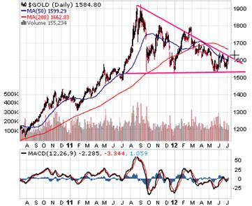
Now, if the prevailing intermediary trend is “down”, then we need to take a close look at recent short term price/volume movements. To that end let’s look at the daily charts of the past few months.
Chart # 6 – Daily gold chart: 3 month view
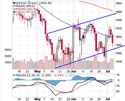
The two upward pointing parallel lines may be interpreted as a “flag formation”, which is typically a technical reaction within a prevailing trend. Given that the flag is pointing up, it is arguable that the prevailing trend is down.
The reader’s attention is drawn to the MACD histograms, which appear to be weak, and to the falling tops of the moving average of the MACD, and to the fact that IF the black line continues to head south, it will cross over the read line and give a “sell” signal.
What is the probability that this latter scenario will unfold?
Chart # 6 – Daily gold chart: 2 year view #5
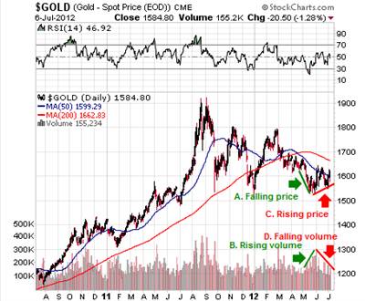
What this chart is showing is that the gold price fell on rising volume (selling pressure) – which some might argue was an exhaustion of the trend); and the subsequently rising price was accompanied by falling volume – which is typically a warning signal that there is an absence of buying pressure. i.e. The gold price has been “floating” up in a desultory market.
Now let’s take a look at the Fibonacci resistance levels in context of the “prevailing” falling trend line.
Chart # 7 – Daily gold chart: 2 year view #6
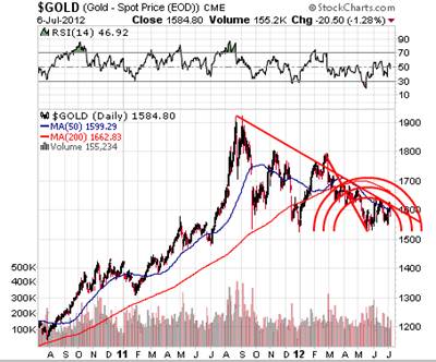
The reader will note that the lower semi-circle intersects the downward pointing trend line at the exact point where the gold price is now resting. This represents formidable resistance to a further rise in price and the question arises: “What is the probability that this formidable resistance will be overcome against the background of an absence of buying pressure as evidenced by the falling volume in chart # 6 above?”
Interim Conclusion #1
A purely technical analysis of the bar charts seems to be favouring the conclusion that, on a balance of probabilities, the gold price will likely break down from the descending right-angled triangle and, if this turns out to be the case (and given that the descending triangle was accompanied by the emergence of a three line fan formation that failed to be penetrated on the upside) the gold price will likely see significant weakness in the coming weeks/months.
Now let’s switch our attention to the Point & Figure charting technique. This analyst has read a significant number of predominantly emotional analyses that argue (based largely on fundamentals) that the gold price has been manipulated on the downside. Well, that may or may not be the case in the short term but, as any seasoned market analyst will attest, no market is capable of being manipulated in the longer term. The market is more powerful than any of its constituent components. To look past the “noise” that typically accompanies computer driven trading orders and those of vested interests and sharks and leeches and whoever else we might wish to lump into this heinous group of manipulators, the following 3% X 3 box reversal chart is presented – also courtesy stockcharts.com:
Chart # 8 – 3% X 3 box reversal P&F chart of gold
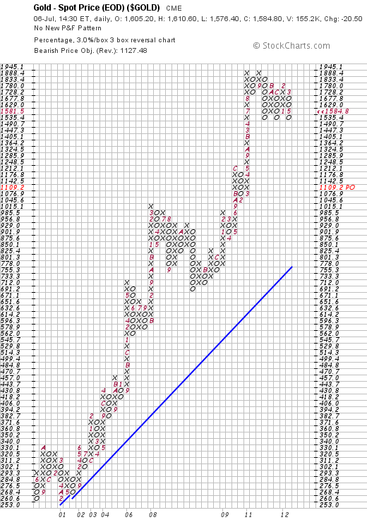
Whilst this chart is showing strong support at the $1535 level, the reader will note that a “sell” signal was given when the price fell below $1728 and that, following this sell signal, the downside target of $1,109.20 is being measured. Importantly, this level – if it is reached – will still be above the rising blue trend line.
Interim Conclusion #2
Based on Point & Figure chart analysis, the gold price has given a sell signal and the measured move target of $1,109.20 is suggesting that the current move in the gold price is a Secondary bear reaction within a Primary Bull Market.
This conclusion can be validated by looking at the monthly chart of the gold price, courtesy Decisionpoint.com.
Chart #9 – Monthly chart of the gold price
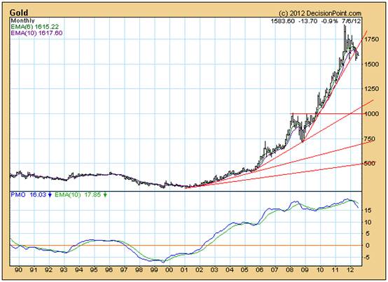
The reader’s attention is drawn to the array of upward pointing trend lines, each successive line rising at a more acute angle of incline. Strictly speaking, this chart should have been plotted on a semi log scale because investment returns are calculated in percentage terms. Investors are interested in percentage returns as opposed to arithmetic returns. However, angles of incline on arithmetic charts have a value in that markets tend to like to move at “cruising speeds”. In that context, one might think of the steepest angle of incline as having the least torque. When it becomes obvious that the torque is unable to overcome the resistance, what happens is that the market then adjusts to find a lower gear at which it can cruise. That lower gear is represented by the next (less acute) historical “angle of incline”. And it happens that this next angle of incline is offering support at around $1100 if one looks forward a few months.
Importantly, this chart confirms that, at any price above $500, the gold price will still be moving within a Primary Bull Market.
Interim Conclusion # 3
The probabilities not only favour a breakdown from the descending right angled triangle in Chart # 5 above, they also favour the conclusion that the price will fall (over the ensuing weeks/months) to a level of around $1,100, and that this level will still be rising at a relatively acute angle.
Interim Conclusion #4
Ignoring all the fundamental arguments and all the emotional outbursts of analysts who have convinced themselves that the gold price is going to rise to at least $3,500 an ounce – which it may well do in the fullness of time – the charts are pointing to the conclusion (on a balance of probabilities) that the enthusiasm of the bulls has been overdone and that the speculators will need to be eliminated from the game before the gold price can continue to rise again.
Author observation
Of course, there is an argument that the reason the gold price will rise (maybe to as high as $10,000 an ounce) is that fiat currencies have lost their value and that the only “true” currency is gold. Rather than engage in that debate, let’s look at the facts. Let’s have a look at a couple of charts of the dominant fiat currency – the US Dollar. Below is a chart of the US Dollar Index.
Chart #10 – Weekly chart of the US Dollar Index
Ideally, it would be preferable if the above chart had volume patterns that we might use to confirm whether or not we are looking at a genuine “Reverse Head-And-Shoulders formation – which has already broken up through the neckline and has already retraced its path back to that neckline and is now looking like it wants to continue upwards.
Let’s proceed from the base assumption that this is a genuine Head and Shoulders reversal pattern. The measured move would be the distance from the head to the neckline added to the level of the neckline. Thus 82-73= 9. 82 + 9 = 91.
Let’s look at what a move to 91 might mean. Below is a monthly chart of the US Dollar, courtesy Decisionpoint.com
Chart #11 – Monthly chart of the US Dollar Index
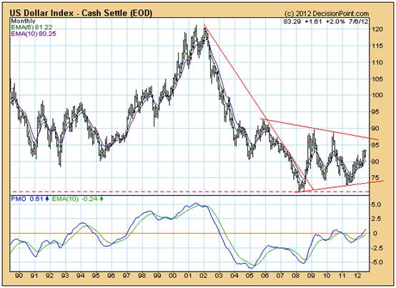
Whoops! Will you look at that! If the US Dollar Index rises to 91, it will penetrate the downward pointing trend line on the upside, and if that happens, the world will – arguably – be facing a whole new investment ballgame.
What does the desensitised Point and Figure Chart show?
Chart #12 – 3% X 3 box reversal chart of the US Dollar Index.
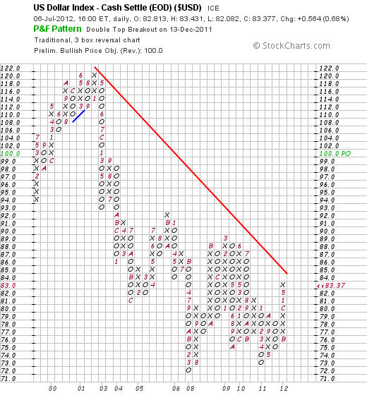
Fascinating! The desensitised chart of the US Dollar gave a buy signal on December 13th 2011, and that buy signal gave rise to a measured move target of 100.
Overall conclusion
As Mark Twain might have put it, rumours of the death of the US Dollar may be premature. In this context, the supposedly logical alternative, gold, may not yet be ready to continue along its Primary upward path. Doubtless, the fundamental reasons for all this will emerge over time. This analysts has had a crack at presenting these reasons in the series of three articles that looked at the possibility of deflation in the US and inflation in Europe. Nevertheless, in context of all of the above technical “hints” that the market has been giving since December 2011, it seems likely that the gold price – which will remain in a Primary Bull trend, will continue along its secondary reaction until it reaches around the $1100 level. That the timing of breakdown is likely to be imminent, flows from the fact that the price of gold is now being squeezed into the apex of a bearish descending right-angled triangle. The break down might happen at any time within the next four weeks. Of course, if there is in fact “manipulation” then we might even see a “false” break-up – on low volume.
And, finally, whilst all of the above is based on pure logic, a black swan might emerge which could have the capacity to change everything. Clearly, the market is not expecting that black swan but, by definition, it never does.
Author, Beyond Neanderthal and The Last Finesse
Beyond Neanderthal and The Last Finesse are now available to purchase in e-book format, at under US$10 a copy, via almost 60 web based book retailers across the globe. In addition to Kindle, the entertaining, easy-to-read fact based adventure novels may also be downloaded on Kindle for PC, iPhone, iPod Touch, Blackberry, Nook, iPad and Adobe Digital Editions. Together, these two books offer a holistic right brain/left brain view of the current human condition, and of possibilities for a more positive future for humanity.
Copyright © 2012 Brian Bloom - All Rights Reserved
Disclaimer: The above is a matter of opinion provided for general information purposes only and is not intended as investment advice. Information and analysis above are derived from sources and utilising methods believed to be reliable, but we cannot accept responsibility for any losses you may incur as a result of this analysis. Individuals should consult with their personal financial advisors.
Brian Bloom Archive |
© 2005-2022 http://www.MarketOracle.co.uk - The Market Oracle is a FREE Daily Financial Markets Analysis & Forecasting online publication.


