Silver’s Trend and the Death of Technical Analysis
Commodities / Gold and Silver 2012 Apr 05, 2012 - 06:12 AM GMTBy: Steve_St_Angelo
 The death of technical analysis has arrived. What took place in the markets (especially in the precious metals) on April 3rd & 4th proves this in spades. There were several calls made prior to the takedown, by some very well known individuals in the precious metal field, that became NULL & VOID when either bottoms or chart patterns failed.
I am not going to name names, but I would imagine those who have been following the gold and silver markets for quite some time, know who I am talking about. That being said, I don’t blame them one bit. Trying to make short term calls based on technical analysis presently has become nearly impossible when the markets are constantly manipulated. I think it is time that we all just realize a monkey throwing a dart at a trend line on a wall is just as useful as short term technical analysis.
There are only a few technical analysts that I respect. They gain my favor due to the fact that they use technical analysis to forecast future inflationary trends. Those who are still predicting deflation in their charts may need to find other employment as their calls have been wrong time and time again.
Furthermore, I am completely surprised by the psychotic nature of the so-called RISK ON & RISK OFF TRADE. Doesn’t anyone take the time to stand back for a minute and just look at what is going on? Does anyone see the insanity of it all? It is simply amazing to watch grown adults place bets one day, and then take them back the next – a trend which occurs over and over again.
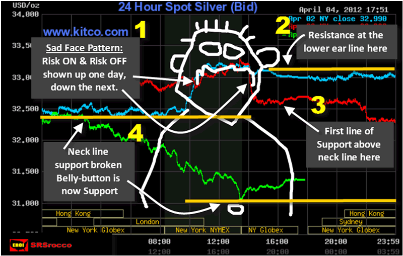
I decided to take a stab at my own version of technical analysis as it pertains to the silver market between April 2nd and April 4th.

If we follow the numbers, we can get a clear picture of what took place in the price of silver over the past three days. In number 1, we see the typical RISK ON – RISK OFF trade. This is shown in the SAD FACE PATTERN. On April 2nd, after silver added $0.70, the line of resistance occurs at the bottom of the EAR LINE LEVEL (number 2). Following the FOMC meeting which occurred the very next day, the market responded appropriately by taking back all bets knocking the price of silver back down to the very same level it was the day before… this is shown in number 1 & 3.
Once trading commenced during our favorite early London Markets, the Neck Line was broken and the price of silver dropped all the way down to the BELLY-BUTTON SUPPORT LINE. This can be found looking at the number 4 chart description. We are going to have to wait and see if this support line is broken in the next several days. If so, the next line of support will be at the BELT LINE and below that is the next support level at the KNEE LINE.
If the price of silver can rally from here, the first line of resistance will be the NECK LINE followed by the BOTTOM EAR LINE. If we can take out both of these levels, there is no resistance until we reach the top of where the BASEBALL CAP LINE would be.
All kidding aside, I do believe it’s time for the precious metals community to move their focus away from short term technical analysis and to concentrate on fundamentals and long term trends instead. (The chart above was courtesy of Kitco.com with my added comments)
SILVER’S TEN YEAR TREND
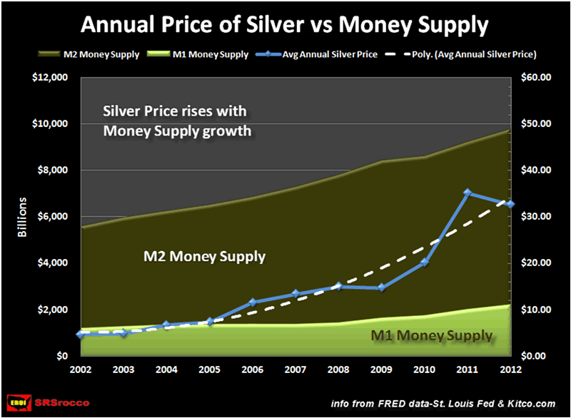
Even though I believe the price of silver will trend much higher over the next several years, these short-term manipulated market corrections can still be quite frustrating. After reading a great deal of frustrated investors on several internet blogs, I decided to put together a 10 Year Silver Trend Chart. While it is true I find very little benefit in short term technical analysis, I do see a great deal of merit in charting long term trends.
If we remove all the volatility and focus only on the annual average price of silver, we can see that the overall trend is still quite positive. Not only is the trend positive, but it is starting to head into an exponential trajectory.

The average annual silver price is shown by the light blue line. The average price of silver in 2012 is currently $32.63 which is lower than 2011 when it hit $35.12. It is difficult to make a forecast on where the average price of silver will be in 2012, but we still have almost nine months remaining in the year to find out. If we do get an “Official Announcement of QE 3” shortly, silver should have no problem taking out the previous year’s average price. I did say “Official”, as QE has not stopped regardless of what MSM regurgitates on a daily basis.
The white dashed line is a polynomial trend based on silver’s annual average price line. This polynomial trend removes even more volatility to give the reader a clearer picture of where silver is heading. Both of these lines are superimposed over the M1 & M2 money supply chart areas. In 2002, the M1 money supply was $1,197 billion and the M2 money supply was $5,587 billion. Today the M1 money supply has grown to $2,208 and M2 is now $9,788. The price of silver is moving higher along with the increase of both M1 and M2 money supply. There is a clear distinction between the two – while the money supply is heading up in a linear fashion; the price of silver is now heading into an exponential trend. I would imagine we would be witnessing a steeper exponential chart pattern if it weren’t for the past 6-8 month BUSHWACK & HAMMER TRADE mastered by the wonderful folks in Wall Street and at the FED.
CRITICAL FACTORS THAT WILL IMPACT SILVER
I did not plan on writing this article as I am currently working on two that will be out shortly. The first one will be titled Critical Factors That Will Impact Silver. I will be discussing several important areas that will impact the price of silver as well as its future supply. There will be several charts and graphs that compare how the money supply during the 1930’s depression impacted silver much like it has today.
There will also be an update on the top three silver miners in 2011 along with some very interesting surprises. I will be publishing this article before the Silver Institute puts out their 2011 World Silver Survey on April 19.
For example, silver production at the Fresnillo mine (Mexico’s largest primary silver mine) declined a whopping 15.5% in 2011 due to falling ore grades. Fresnillo has increased its diesel consumption to bring more gold and silver production to the market. Without growing supplies of diesel in the future, the mining industry hits a brick wall. This will be discussed in greater detail in the following article that focuses on diesel consumption in the top 5 gold mining companies as well as copper industry.
A FEW WORD TO READERS WHO SEND EMAIL REPLIES
One of the most rewarding aspects of writing these articles is getting replies from readers in all corners of the world. I enjoy doing the research that goes into these articles, but I do make mistakes. Several readers have sent information that have either changed my opinion or provided me with data that I was unable to find. I just want to say… I really appreciate the feedback and look forward to it. I also encourage anyone in the industry who has actual field experience to send an email as to their opinion or expertise on whether or not the information in the article is accurate or worthy.
Steve St .Angelo Independent researcher residing in southwest Utah
Contact SRSrocco@gmail.com
© 2012 Copyright Steve St .Angelo - All Rights Reserved Disclaimer: The above is a matter of opinion provided for general information purposes only and is not intended as investment advice. Information and analysis above are derived from sources and utilising methods believed to be reliable, but we cannot accept responsibility for any losses you may incur as a result of this analysis. Individuals should consult with their personal financial advisors.
© 2005-2022 http://www.MarketOracle.co.uk - The Market Oracle is a FREE Daily Financial Markets Analysis & Forecasting online publication.


