


Increasing Signs of a Stock Market Top, UK FTSE Leading the Way?
Stock-Markets / Financial Markets 2012 Apr 02, 2012 - 03:29 AM GMTBy: Andre_Gratian

 Current Position of the Market
SPX: Very Long-term trend - The very-long-term cycles are down and, if they make their lows when expected (after this bull market is over) there will be another steep and prolonged decline into late 2014. It is probable, however, that the steep correction of 2007-2009 will have curtailed the full downward pressure potential of the 120-yr cycle.
SPX: Intermediate trend - The intermediate uptrend is still intact, but a short-term top may already have started to take shape.
Analysis of the short-term trend is done on a daily basis with the help of hourly charts. It is an important adjunct to the analysis of daily and weekly charts which discusses the course of longer market trends.
Market Overview
Once again, the SPX is looking toppy, but more so this time. For the past two weeks, most of the trading has been range-bound, causing price deceleration and a move toward the trend line from 1159. Holding on to that trend line will be key to whether the index can continue its uptrend. More importantly, if the trend line breaks, most likely so will the 1386 support level which has contained prices during the last fourteen days.
We'll do more analysis of the daily chart under "Chart analysis" but for now, I want to show you a chart of the SPX weekly trend compared to that of the FTSE.
As you can see below, the FTSE (red line) is already making a short-term correction and is in danger of breaking a support level which corresponds to 1340 in the SPX. The comparable support at 1386 was broken in the past week. Historically, the FTSE has been a lead indicator for the SPX. For example, in January 2011, the FTSE started to show relative weakness to the SPX, and it was not long before the latter started to follow. Eventually, an intermediate top was created followed by a sharp decline in prices.
It's possible that we are starting a similar pattern, beginning with a minor decline followed by higher prices, and eventually expanding into an intermediate top. Just as it took some time for the 2011 top to form, the SPX may go through a similar process between now and June.
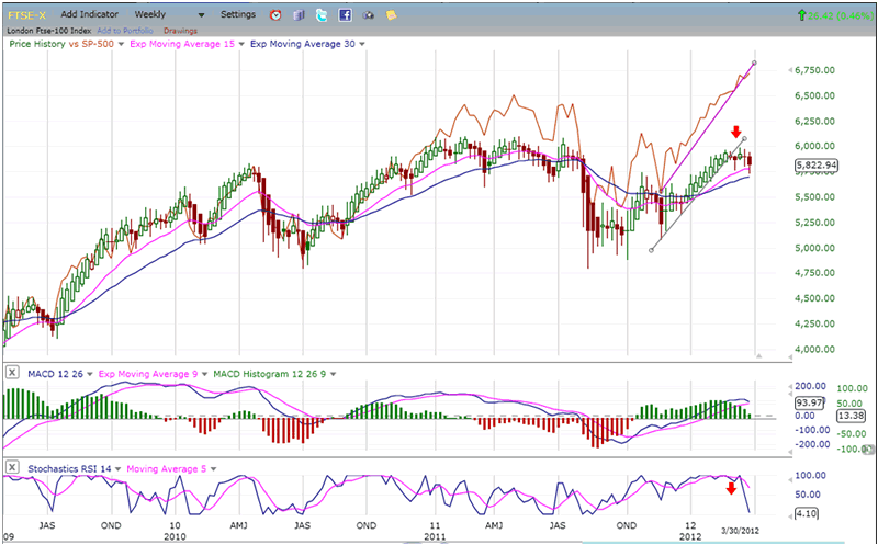
Chart analysis
I think we can all agree that 1) the SPX is overbought and in need of a correction, and 2) there is obvious deceleration taking place, both being precursors of another interim correction in the trend that began at 1159. It might have started on 3/20 had not Bernanke rallied the troops with some bullish statements. All this did, actually, was to postpone the inevitable, creating a larger area of distribution in the form of a potential Head & Shoulders pattern and suggesting that a correction is just around the corner.
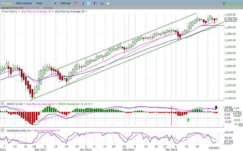
A caveat! As probable as this looks, we will need confirmation from the SPX which will need to break both its trend line AND the 1386 support level. The daily indicators are already in a downtrend with the MACD histogram increasingly negative over the past two sessions.
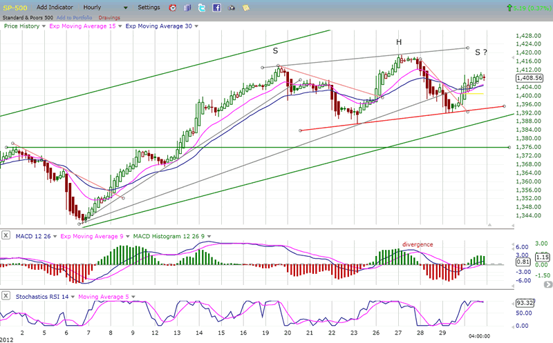
Furthermore, as you can see on the Hourly Chart below, there was negative divergence at the 1419 top - presumably the head of a potential H&S pattern under formation. The hourly indicators are overbought and may have started to roll over on Friday. Selling off on Monday would put the indicators in a downtrend cycle which would perpetuate the decline that started at 1419. It would also complete the right shoulder of the H&S pattern and, if the red neckline is broken, that would essentially confirm the pattern.
Structurally, it appears the first wave down from 1419 to 1391 was impulsive, and that the rally to Friday's high was corrective -- if over.
If it does occur, the correction may be fast and shallow, possibly confining itself to about 1365. This would be the minimum target for the H&S pattern, which is supported by a P&F projection as well as a Fibonacci one, making that level pretty convincing as the target for the move.
There are a couple of reasons why this would be a move of short duration. First, the daily momentum indicators are already oversold (although not yet in a position to give a buy signal), and so is the NYSE summation index ( as we will see later).
Cycles
Another reason for anticipating a correction is that the 13/14-wk high-to-high cycle peaked on 3/19 and is most likely responsible for the decline. As mentioned before, that decline was ostensibly interrupted by Chairman Bernanke's bullish speech of 3/26, although a 5-wk cycle bottomed on Friday 23rd and was the "real" cause of the bounce. Undoubtedly, the chairman's speech exacerbated the move which led to a brief and unsustainable new high at 1419.
Two small cycles bottoming on the 28th and 29th brought us back down from 1419 and caused the re-bound into Friday's high.
The premise is that the 13-14-wk cycle downward pressure is still in play. That cycle has set an historical precedent of bringing about corrections averaging about 75 SPX points, varying according to the market condition. If we do get a move down to 1365, that would be a decline of 54 points -- certainly acceptable in a strong uptrend!
Also helping the bears, a short-term cycle is scheduled to bottom next Friday.
Breadth
The NYSE Summation Index (courtesy of StockCharts.com) is a valuable indicator which can clarify the market position and which deserves close scrutiny at this time
The index had been in a declining mode since its high of September 2009, and finally hit bottom in August 2011 at about -670. When the SPX made its low in October the NYSI, which had already started an uptrend, pulled back to about -430, thus creating strong positive divergence with the SPX.
The NYSI went on making a series of higher highs until February 9th, 2012, when it peaked at about +1430. On that date, the SPX made a high of 1354 which was followed by a shallow correction and a series of new highs. On the other hand, after it started down, the NYSI kept going, making a new low last Friday of 664.20. The two higher highs made by the SPX since February 9 were barely acknowledged by the NYSI.
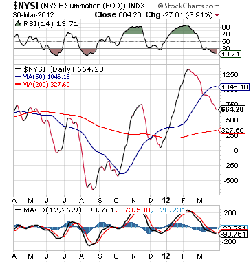
We need to construe this steady decline in breadth as a sign of weakness which has, thus far, been ignored by the market. Normally, under such circumstances, reality sets in all at once with a sharp adjustment in prices. Will this take place again this time?
Sentiment
The SentimenTrader (courtesy of same) continues to show a bearish bias, but is not at an extreme reading, which suggests that we should not yet be at an important top. (unchanged)
VIX
I have posted below a 2-hr chart of the VIX because I think that it best represents the index's condition at this time.
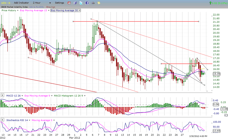
Since March 13, the VIX has been building a base. On the P&F chart, with a reversal back above 17, the VIX would have a minimum target of 22, and perhaps 25. The 200-DMA which comes in at 23 could provide some resistance.
The VIX has already made a higher high and a higher low, which has created positive divergence with the SPX. This is bullish for the index and potentially bearish for the market. The daily SRSI, although overbought, is in a solid uptrend and, with the 2-wk SRSI about to reverse up, the index is in a good position to break out. Such a move by the VIX at this time would practically ensure that the SPX would drop below the 1386 level.
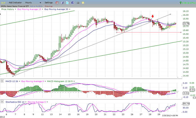
XLF (Financial SPDR)
Because the SPX is chock-full of financial stocks, it is difficult for the SPX to continue going up if the financial index is not, and if the financial index is in a downtrend, sooner or later the SPX will join it.
The hourly chart of the XLF looks very much like the SPX hourly chart, except that over the last couple of days, the XLF has gotten relatively weaker than the SPX. This was evident on Friday, where the SPX went slightly past its last near-term high, but the XLF did not. If you take a look at the banking index (BKX) you will see that the divergence is even more pronounced, especially the negative divergence with the 1419 top.
The hourly MACD is already negative, and the SRSI is getting overbought. Sure looks like the next move's gonna be down!
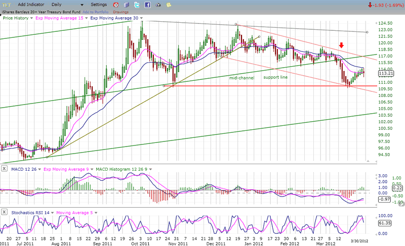
BONDS
I am providing an 8-month perspective of TLT (Ishares Barclays 20+year treasuries). There is nothing positive about this chart; not just over the short term, but over the intermediate (and perhaps long term) as well. An important projection of 125 was filled in early October, at the same time that the SPX made a 3-yr cycle low. The patterns between the two indices are different. While the SPX has been in a steady uptrend, TLT spent most of this time creating a massive distribution top from which it has just started coming down.
The green outside trend lines represent a long-term channel, while the middle line is the mid-channel line. It served as support for quite a while but was recently penetrated. The index has found temporary support at a previous low but, although it may spend some time at that level, it should eventually break below. The big uptrend was created by easy money and low interest rates but, unless the Fed primes the pump once again, the bond market will have difficulties remaining afloat.
In the last newsletter, I gave the following P&F projections derived from the distribution top: 107 - 101 - 94 - 88 -- and possibly lower. There is no time projection given for TLT to achieve these objectives.
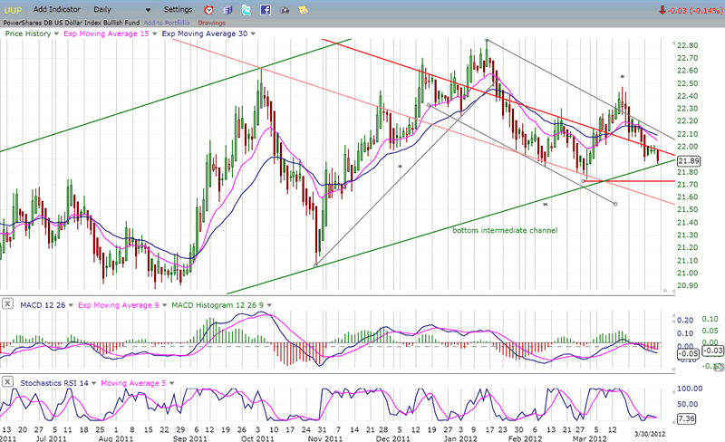
UUP (Dollar ETF) Daily Chart.
UUP looks like it is stuck in a neutral trend and is forming a secondary level of accumulation around 22. The original base around 21 has a potential projection to 25, but seems to be moving up toward that target at a snail's pace. It's already been 7 months since it broke out of its base and it is still struggling to get out of the lower half its long-term downtrend channel.
The indicators, which are oversold - at least, the SRSI is - suggest that it may attempt another up-move before too long. The MACD is holding well and the histogram is beginning to decelerate. UUP should also find support from the lower trend line of its intermediate up-channel. If it were to break below, it would be a sign that the consolidation pattern could be significantly extended.
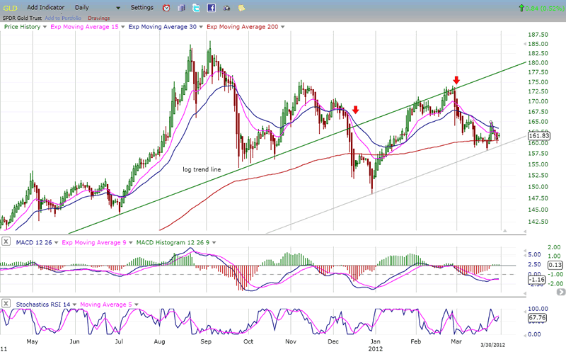
GLD (ETF for gold)
GLD broke an important long-term log trend line from 2008 when it started to decline, after filling a projection at 186. The first wave down bounced off the trend line, but the second wave took it below. It subsequently tried to get back into an uptrend, but it turned out to be only a back-test of the broken trend line.
The current decline came to rest on a parallel of the trend line drawn across the first low. The combination of that parallel and of the support provided by its 200-EDMA has temporarily stopped the decline, but GLD is having a problem regaining its upside momentum. It's very possible that, if it cannot make more headway quickly, it will drop below the MA and turn what already looks like an extended intermediate consolidation into something more.
The fact that the daily SRSI was in an uptrend for a couple of weeks and reached overbought with no significant movement in price is a potential sign of weakness and, if the market does start correcting, it's more than likely that GLD will break down further and worsen its technical situation. It's interesting that when you compare this chart to the one of UUP (above), you can see that GLD made its high when UUP made its low in September of last year, and that neither one has been able to make significant progress in the direction of its initial move.
Adding to the similarity of these opposite trends is the fact that UUP is struggling to get above its 200-DMA, while GLD is struggling to stay above!
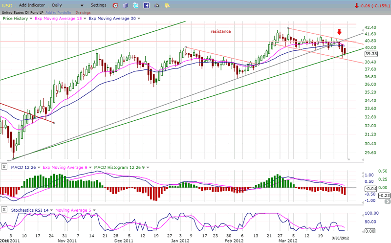
OIL (USO)
USO was not able to move past the resistance band to get to its 44 target on this attempt and has pulled back. The retracement does not look that serious, and the index is now sitting on a strong support level. My feeling is that it is simply extending its consolidation until market conditions improve, and then it will resume the attempt at reaching its 44 projection. If it continues to drop below 37 it would signify that it has started a longer corrective phase.
The fact that it pulled back to 39 is another indication of the general market weakness. Since the market may undergo a short-term correction, let's see what happens to USO over the next couple of weeks. By then, both the market's and USO's technical conditions will have become clearer.
Summary
Signs that the market may be topping have increased in the past two weeks and, with the SPX potentially creating a small Head & Shoulders pattern, the onus will be on the market to neutralize it over the next few days.
1386 is a level which has to hold in order to prevent a decline into the end of next week. If that level is broken, the retracement could continue until it reaches 1365.
FREE TRIAL SUBSCRIPTON
If precision in market timing for all time frames is something which is important to you, you should consider a trial subscription to my service. It is free, and you will have four weeks to evaluate its worth.
For a FREE 4-week trial. Send an email to: ajg@cybertrails.com
For further subscription options, payment plans, and for important general information, I encourage you to visit my website at www.marketurningpoints.com. It contains summaries of my background, my investment and trading strategies and my unique method of intra-day communication with Market Turning Points subscribers.
By Andre Gratian
MarketTurningPoints.com
A market advisory service should be evaluated on the basis of its forecasting accuracy and cost. At $25.00 per month, this service is probably the best all-around value. Two areas of analysis that are unmatched anywhere else -- cycles (from 2.5-wk to 18-years and longer) and accurate, coordinated Point & Figure and Fibonacci projections -- are combined with other methodologies to bring you weekly reports and frequent daily updates.
“By the Law of Periodical Repetition, everything which has happened once must happen again, and again, and again -- and not capriciously, but at regular periods, and each thing in its own period, not another’s, and each obeying its own law … The same Nature which delights in periodical repetition in the sky is the Nature which orders the affairs of the earth. Let us not underrate the value of that hint.” -- Mark Twain
You may also want to visit the Market Turning Points website to familiarize yourself with my philosophy and strategy.www.marketurningpoints.com
Disclaimer - The above comments about the financial markets are based purely on what I consider to be sound technical analysis principles uncompromised by fundamental considerations. They represent my own opinion and are not meant to be construed as trading or investment advice, but are offered as an analytical point of view which might be of interest to those who follow stock market cycles and technical analysis.
Andre Gratian Archive |
© 2005-2022 http://www.MarketOracle.co.uk - The Market Oracle is a FREE Daily Financial Markets Analysis & Forecasting online publication.