Stock Market May be Ready for Short-term Uptrend
Stock-Markets / Stock Markets 2011 Jun 20, 2011 - 02:12 AM GMTBy: Andre_Gratian
 Very Long-term trend - The continuing strength in the indices is causing me to question whether we are in a secular bear market or two consecutive, cyclical bull/bear cycles. In any case, the very-long-term cycles are down and, if they make their lows when expected, there will be another steep and prolonged decline into 2014-16.
Long-term trend - In March 2009, the SPX began a move which evolved into a bull market. Cycles point to a continuation of this trend for several more months.
SPX: Intermediate trend - The SPX has met its 1370 projection and appears to be making a fairly shallow intermediate correction.
Analysis of the short-term trend is done on a daily basis with the help of hourly charts. It is an important adjunct to the analysis of daily and weekly charts which discusses the course of longer market trends.
Market Overview
Week seven and counting...! After a decline of 112 points, the SPX finally had an up-week - by 52 cents! WOW!
The SPX and the QQQ both essentially met their potential Point & Figure projections for the decline when they dipped to intra-week lows. Now we must wait to see if these will work their magic again and give us a worthwhile reversal.
The VIX finally awoke from its torpor and rallied past the 20 mark to which it had been confined for the entire decline until the past three days when it finally rose to 24.65 last Thursday, and promptly reversed to 21 on Friday, before closing at 21.85. What does this mean? Is it bearish or bullish? It depends on what it does next week. It is now in an uptrend channel and would have to close below 19 on an hourly basis (below 18 would be more convincing) to get out of it.
That's one! Two, is the QQQ. Last week, it dipped and closed slightly below its March low and slightly violated its 200-DMA, finishing right on it. This is obviously a level which it must hold if it is going to rally right away. Just the fact that it is underperforming the SPX is a negative.
Three, concerns the dollar! Last week, it challenged its weekly downtrend line from the April high, closing right on it. Exactly 7 weeks ago (when the decline in the SPX started) it bounced off a two and a half year channel bottom and, although it has not given a convincing weekly reversal yet, the daily trend will be doing so if it can move outside that trend line. Granted, the dollar and the SPX have not always trended in opposite directions, but they have most of the time. On its daily chart, the UUP (dollar ETF) has met with strong resistance every time it has rallied to its 200-DMA. On Friday, the moving average was at 22.26, and UUP closed at 21.45, so it has some room to move up before hitting it. When it does, it will also meet with other resistance lines, and possibly complete an a-b-c correction in a downtrend. If it breaks above its downtrend line, this could take another week or two to accomplish. Would the SPX be able to rally, or even stand still, during that time?
Four, the XLF (financial sector) which has never convincingly reversed from its long-term downtrend, and which has now been in a decline not seven, but seventeen weeks, has yet to show that it has bottomed. Last week looked more promising; it kept its weekly range slightly above the previous one, and closed a little higher on a weekly basis. Also, the good news is that it, too, seems to have met its downside P&F projection, and on the daily chart, it looks like it has made a double-bottom.
And that's not all! We are in the middle of a cycle cluster (which will be discussed under "Cycles").
By contrast to these potential (or real) negatives, the SentimenTrader is showing some very bullish readings which are usually indicative of a low in the market.
Therefore, when we consider the above, we are left with a lack of certainty as to whether the decline is over, if there is more to come, or if the indices need to do some base building. It would appear that the third option may be the most likely one, especially considering the current cycle configuration. We'll find out next week!
As we do every week, let's look for clues in the charts.
Chart Analysis
I won't show the weekly chart of the SPX, but I can assure you that the MSO, being flat on its bottom is not giving us any indication that it's ready to reverse. Its MACD is still declining with the histogram also in a downtrend-- not exactly a sign of strength! But, at 15.86, the MACD it is still positive! (I would feel much more bearish if it had already gone negative.)
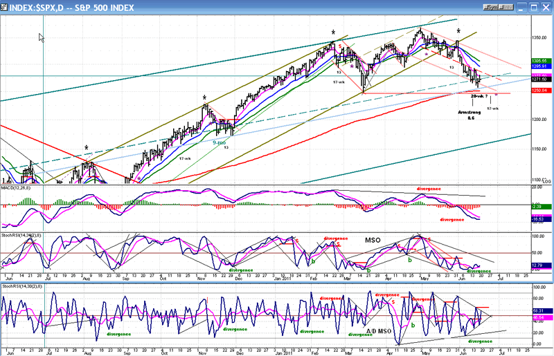
Below is the Daily SPX Chart. There are a lot of technical clues on that chart, and they are not all negative.
Let's start with the price pattern itself. When you are watching the market all day long, time passes sooo slowly and the down-trend seems interminable, with the hourly chart making lower low after lower low! It's no wonder that traders have to guard against getting into a bearish funk as the decline progresses! One way to get your perspective back is to look at a daily chart.
At a glance, you can see that the current pull-back has the profile of a short-term correction -- just like the others that you see on the chart -- only a little more extensive. And, although deceleration of the downtrend is obviously occurring, a little more time may be required to turn things around. Why? Because after making a shallow downtrend for about three weeks, the SPX suddenly got weaker and dropped to the bottom half of a wider channel where it has been trading ever since. Until it shows that it is ready to get back in the upper portion of its channel, it won't be ready to resume an uptrend.
There are good reasons for the price to firm up at the present level: the SPX is still trading in the top half of the intermediate channel and has only retraced to the middle of that channel where it could now get some support from the mid-channel line (dashes), and from the light-blue internal trend line parallel to the channel lines, slightly below. That trend line has 3 former points of contact: in August, in September, and in November, and is currently at 1255 - which is in the vicinity of the SPX downward projection of 1250-1253. Last week, the SPX rallied from 1258, just above it. It also enjoys the support from its 200-DMA.
On a scale of 1 to 10, my competency as an Elliott Wave analyst probably ranks a 3 or 4, but it does not stop me from second-guessing the market structure along with the worst of them. Everything considered, I think that we could be making an intermediate-term correction in the form of a triangle before resuming the uptrend. (One of the best, Tony Caldaro, thinks it's an "irregular" pattern.)
And what do say the indicators? As opposed to the weekly, the daily MACD is showing some deceleration in its histogram. Note, however, that it made a decisive new low vs. the mid-March price.
This is negative divergence and does not bode well for the next rally! Hence, we could eventually see the correction developing into a triangle pattern which would require one more down-leg.
The price MSO has gathered a little bit of positive divergence over the last few days. It must now punch through its larger down-channel to signal a reversal. The A/D MSO is the most bullish with pronounced positive divergence taking the form of an uptrend as the SPX was progressively making new lows. This is the shape that reversals take: the A/D is the first to give a signal, the price MSO is next, and the MACD always lags. It is clear that the indicators are warning us that an incipient market bottom is forming.
The Hourly Chart is next. In it, you can see the top of the intermediate channel, the mid-channel dashed line, and the light-blue support line which is just below it. The pink horizontal line is where I thought the SPX could go according to a short-term P&F projection. Close enough, if we rally from here!
The black letters (a-e), categorize the bottoming formation as a reverse triangle (also known as a broadening formation). This is not just an Elliott term, but a fairly common pattern discussed by most analysts, some of which believe that it comes at market reversal points. So, according to this configuration, the pattern is either complete at "e?", or we are in the process of making the final down-wave.
Note how the #3 gray trend line stopped the rally on Friday! The #1- #3 labeling designates fan lines. When the third fan line is broken, you normally get a trend reversal. The fact that #3 stopped the rally on Friday means that the pattern and the decline may not be complete. That could fit nicely into the current cycle pattern. Note also the letters C, D and E. They point to the levels and trend lines that must be overcome on the upside in order to confirm a reversal. Friday's action took care of A and B, but until the rest are also mastered, we don't have one!
Since touching the bottom of its red channel about mid-way through the decline, the MACD has shown some positive divergence at each low, but it has not gone through the top of the channel. Only when it does will it signal a reversal.
The price MSO showed some divergence at the last two price lows, but it, too, could not come out of its down-channel on Friday.
The A/D (always the first to give a signal) did, but could not maintain the momentum and fell back as the day progressed.
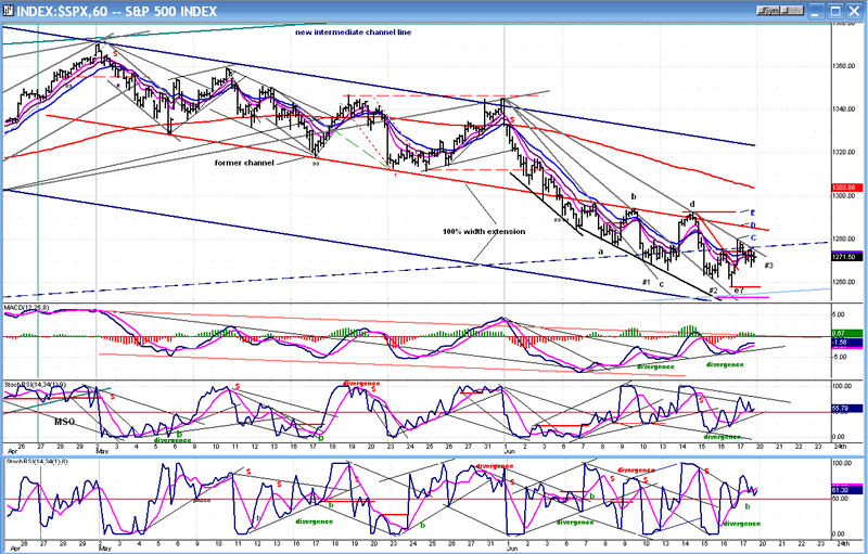
All three indicators ended the day in a tepid uptrend which could easily morph into a decline. So, at the end of the week we are left with the same condition of uncertainty in the hourly indicators that has resulted from the analysis done above. Needless to say, next week could be an important week which could point to the near-term market direction!
Cycles
I will re-state what I said a couple of weeks ago: "It looks as if the index is tracking the anticipated cycles, each one of them possibly causing a low point in the market, with the last one -- Martin Armstrong's 8.6 year cycle - making a final near-term low in the middle of the month. We'll have to see what kind of effect this would have on the weekly oscillators if it follows this scenario, and if it is enough to reverse them. We also have a 17-wk cycle bottoming about a week later, but its effect may be muted."
Except that the 8.6-yr cycle was not the last one of the cluster! It is possible that the 20-wk cycle may have made its low on Thursday, although it was ideally due on this coming Wednesday. It's not unusual for this cycle to diverge from an exact phase by being a week late or early.
Next will be the 17-wk cycle mentioned above, ideally due a week from Monday, but which often comes in a little early. And then, a less important 40-day cycle due to make its low a few days after the 17-wk.
Breadth
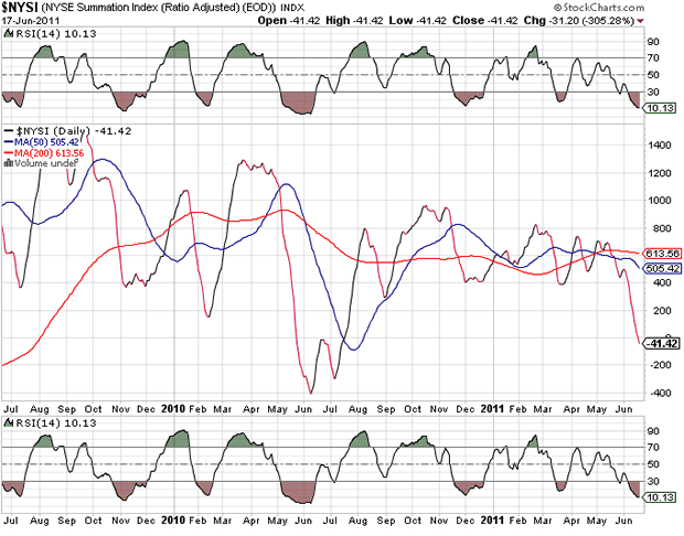
We'll now look at the NYSE Summation Index (courtesy of StockCharts.com). Oops! That took a little bit of a tumble in the past couple of weeks. Not only did it close at its lowest level since the intermediate correction of last year, but it went negative as well. I think that it is trying to re-define this correction as intermediate in nature. But the RSI is the most oversold since last June, and it could be ready to turn up.
I said earlier that the daily chart profile looks like a short-term correction! I may be more correct to say that it is a short-term correction within an intermediate one, perhaps one which is not yet complete.
Sentiment: And here is the white knight coming to the rescue of the bulls! The SentimenTrader (courtesy of same) is unequivocally bullish! It says so, right above the indicator: "Extreme pessimism (market should rally).
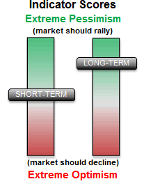
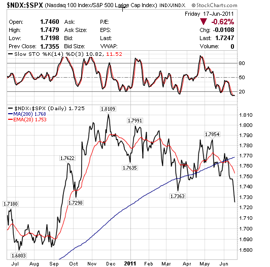
Our white knight may have to do battle with the black one, which may prove to be a worthy opponent! Lookee here at the NDX:SPX ratio: Like the NYSI, it gives us some reason to expect a protracted correction before the market can rise to a new high.
This week, we'll also analyze treasuries in the form of TLT, Barclay's 20+ year Treasury Bond Fund. Weekly chart on the left, and daily on the right.
The index came down from a high of 123 in December 2008, declining to a low of 88 in April 2010, and again to 89 in February 2011. It appears to be a good inverse indicator to the equity indices. That's why it's important to pay attention to what it is telling us today. It may resolve the ambiguity which exists between the various market components.
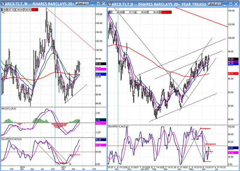
The P&F chart tells us that the current move could take TLT to 105-108, in the vicinity of its previous top. That confirms what the weekly indicators are saying. The index is in an intermediate uptrend and this does not sound very promising for the equity bulls! However, the P&F chart also tells us that it might pause at 98-98.5. That's only a point to a point and a half away from where it closed on Friday. That could give the equity indices a respite from their bearish condition and give them an opportunity to rally.
Our analysis of TLT tells us the same thing that everything else we have looked at is saying. We should note, however, that the last time TLT went to 109, it only resulted in an intermediate correction for the equity indices. Since the index seems ready to duplicate this performance over the short-term, we could surmise that the market may only have to undergo another intermediate correction -- which is already pretty far along -- and that the bull market could continue on its merry way afterwards.
Summary
Reading the technical tea leaves results in the picture of a market which may soon be ready to have a short-term uptrend, but which will probably have to spend some additional time completing an intermediate correction that may have started with the 1344.07 top in mid-February. This is the thinking of Tony Caldaro, and I believe he is right. That is the date on which the financial index made its recent high. The move to 1370 was premature, and this why the market needed additional corrective action.
There are some cycles bottoming in the Fall which may help the indices to complete their intermediate correction in that time frame, followed by a final bull market top in 2012.
FREE TRIAL SUBSCRIPTON
If precision in market timing for all time frames is something which is important to you, you should consider a trial subscription to my service. It is free, and you will have four weeks to evaluate its worth.
For a FREE 4-week trial. Send an email to: ajg@cybertrails.com
For further subscription options, payment plans, and for important general information, I encourage you to visit my website at www.marketurningpoints.com. It contains summaries of my background, my investment and trading strategies and my unique method of intra-day communication with Market Turning Points subscribers.
By Andre Gratian
MarketTurningPoints.com
A market advisory service should be evaluated on the basis of its forecasting accuracy and cost. At $25.00 per month, this service is probably the best all-around value. Two areas of analysis that are unmatched anywhere else -- cycles (from 2.5-wk to 18-years and longer) and accurate, coordinated Point & Figure and Fibonacci projections -- are combined with other methodologies to bring you weekly reports and frequent daily updates.
“By the Law of Periodical Repetition, everything which has happened once must happen again, and again, and again -- and not capriciously, but at regular periods, and each thing in its own period, not another’s, and each obeying its own law … The same Nature which delights in periodical repetition in the sky is the Nature which orders the affairs of the earth. Let us not underrate the value of that hint.” -- Mark Twain
You may also want to visit the Market Turning Points website to familiarize yourself with my philosophy and strategy.www.marketurningpoints.com
Disclaimer - The above comments about the financial markets are based purely on what I consider to be sound technical analysis principles uncompromised by fundamental considerations. They represent my own opinion and are not meant to be construed as trading or investment advice, but are offered as an analytical point of view which might be of interest to those who follow stock market cycles and technical analysis.
Andre Gratian Archive |
© 2005-2022 http://www.MarketOracle.co.uk - The Market Oracle is a FREE Daily Financial Markets Analysis & Forecasting online publication.


