Asset Class Behavior Following Fed Interest Rate Cuts - Part 4 of 4
InvestorEducation / Learning to Invest Oct 23, 2007 - 12:37 AM GMTBy: Chris_Ciovacco

 Editor's Note: This article is Part IV in a four-part series.
In Part III of this four-part series, I concluded the periods following the first Fed rate cut in July 1995, September 1998, and January of 2001 were most similar to today's economic landscape. We can use the information from Part III as one of many factors when determining our asset allocation for the coming year. The next logical step is to explore how different asset classes performed relative to each other in each of the three respective historical periods (1995-1996, 1998-1999, 2001-2002).
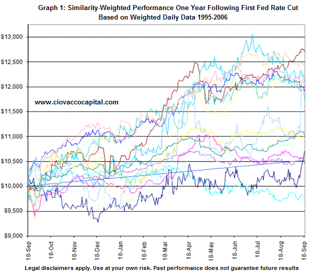
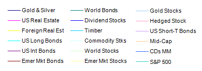
I used the historical performance of each asset class to construct asset allocations which would have been prudent for each particular period. The resulting three asset allocations can then be combined into one allocation using the similarity weights found in Part III , Table 3, column 2. If there is a 16.54% probability the next year may look like 2001-2002, it makes sense to consider weighting 16.54% of your assets to an asset allocation which performed well under those economic conditions. The same is true for the other two historical periods. I have made these allocation calculations down to the last penny, but the detail is not necessary to convey the results. The specific results are not as important as the relative results, such as gold stocks performed better than long-maturity U.S. Treasury bonds in the year following the first Fed rate cut. Graph 1 illustrates the similarity-weighed historical path of each asset class one year after the first rate cut by combining weighted daily historical data from each of the three periods.
Since history never repeats itself in exactly the same way and understanding the limitations of the above analysis, it is helpful to blend the historical findings with information that can be gathered from the current investment environment. I chose to use two additional methods of exploring the relative attractiveness of various asset classes (NOT included in Graph 1). The first was to use the model I previously created based on the past 3-month, 6-month, and 1-year relative performance of each asset class. This model uses history to produce probabilistic outcomes for the next year. I also felt it was important to get an early read on the market’s reaction to the recent .50% rate cut.
Therefore, I also included the relative performance of each asset class from the close on September 17, 2007 (the day before the cut) to September 26, 2007. You’ll notice in Graph 1, the leadership for the year after a rate cut was established soon after the cut was announced (based on the similarity-weighted average for the paths taken after the cuts in 1995, 1998, and 2001). The final results are shown in Table 4. Based on the blended relative rankings of the Fed analysis, the one-year relative performance model, and the relative performance since the September 18, 2007 rate cut, the green items in Table 4 appear the most attractive for the next year, the items in yellow are moderately attractive, and on a relative basis the items in red are the least attractive. For example gold mining stocks ranked highly in all three models. Therefore, from a risk-reward perspective they appear attractive relative to our other investment options. Items in red have the least favorable risk-reward profile for the next year based on the three models.
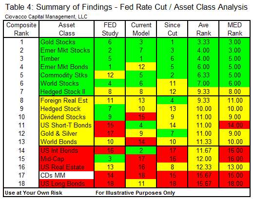
Update As Of October 17, 2007: Table 4 was compiled using data as of September 26, 2007. The updated composite rank as of October 17, 2007 is (1) Gold Stocks, (2) Emerging Market Stocks, (3) Commodity Stocks, (4) Dividend Stocks, (5) Emerging Market Bonds, (6) Gold & Silver, (7) Foreign Real Estate, (8) Mid-Cap Stocks, (9) Hedged Stocks, (10) World Stocks, (11) World Bonds, (12) Timber, (13) U.S. Real Estate, (14) Hedged Stock II, (15) U.S. Short Bonds - TIPS, (16) U.S. Intermediate Bonds, (17) CDs - Money Market, (18) U.S. Long Bonds. Use at your own risk.
What does it all mean?
In a nutshell, investors might consider, within the context of their individual needs and risk-reward profile, reducing their exposure to the items in red (Table 4) and possibly increasing the exposure to the items in green. The objective for most growth investors is not to eliminate the items in red (Table 4) or to only invest in the items in green, but to use the results as a guide to possibly make some “tweaks” to their asset allocation.
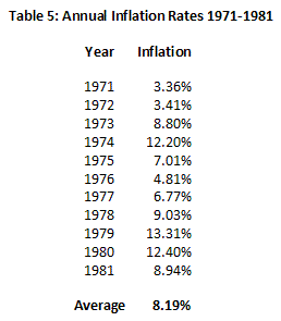
To emphasize the importance of maintaining the balance between risk of principal loss and risk of purchasing power loss, I have included the annual inflation rates from 1971 through 1981 in Table 5. I doubt many investors have assumed in any financial projection we could experience an 11-year period where the average annual inflation rate is 8.19%. Notice inflation was somewhat tame, as the published figures show today, in 1971 and 1972. Annual inflation rates more than doubled in 1973 going on to average 9.26% annually between 1973 and 1981.
ETF's which offer exposure to the asset classes shown in Table 4 are IYR, RWR, ICF, RWX, DRW, TLT, IEF, AWF, DVY, VDE, XLE, EFA, EEM, TIP, VBR, and CEF.
Full Disclosure: The author and his clients have long positions in RWX, AWF, and CEF, as well as long exposure to other pooled investments in all the asset classes shown in Table 4.
Chris Ciovacco
Ciovacco Capital Management
Copyright (C) 2007 Ciovacco Capital Management, LLC All Rights Reserved.
Chris Ciovacco is the Chief Investment Officer for Ciovacco Capital Management, LLC. More on the web at www.ciovaccocapital.com
Ciovacco Capital Management, LLC is an independent money management firm based in Atlanta, Georgia. As a registered investment advisor, CCM helps individual investors, large & small; achieve improved investment results via independent research and globally diversified investment portfolios. Since we are a fee-based firm, our only objective is to help you protect and grow your assets. Our long-term, theme-oriented, buy-and-hold approach allows for portfolio rebalancing from time to time to adjust to new opportunities or changing market conditions. When looking at money managers in Atlanta, take a hard look at CCM.
All material presented herein is believed to be reliable but we cannot attest to its accuracy. Investment recommendations may change and readers are urged to check with their investment counselors and tax advisors before making any investment decisions. Opinions expressed in these reports may change without prior notice. This memorandum is based on information available to the public. No representation is made that it is accurate or complete. This memorandum is not an offer to buy or sell or a solicitation of an offer to buy or sell the securities mentioned. The investments discussed or recommended in this report may be unsuitable for investors depending on their specific investment objectives and financial position. Past performance is not necessarily a guide to future performance. The price or value of the investments to which this report relates, either directly or indirectly, may fall or rise against the interest of investors. All prices and yields contained in this report are subject to change without notice. This information is based on hypothetical assumptions and is intended for illustrative purposes only. THERE ARE NO WARRANTIES, EXPRESSED OR IMPLIED, AS TO ACCURACY, COMPLETENESS, OR RESULTS OBTAINED FROM ANY INFORMATION CONTAINED IN THIS ARTICLE. PAST PERFORMANCE DOES NOT GUARANTEE FUTURE RESULTS.
Chris Ciovacco Archive |
© 2005-2022 http://www.MarketOracle.co.uk - The Market Oracle is a FREE Daily Financial Markets Analysis & Forecasting online publication.


