The Big Picture - 2008 Economic Contraction to Hit US Economy Due to Dollar Stagflation
Economics / US Economy Oct 05, 2007 - 01:00 AM GMTBy: Brian_Bloom
 There is an anomaly in the equity markets which seems not to be drawing enough attention.
This anomaly can be seen by comparing the following two monthly charts (courtesy Decisionpoint.com).
Chart 1 is of the Index of 30 Dow Industrial stocks
Chart 2 is of the Standard and Poor Index of the 500 large cap stocks.
Chart 1
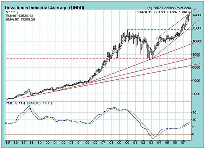
Chart 2
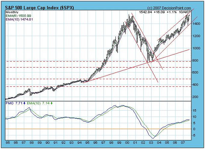
The anomaly is that the Dow has broken to new heights whilst the $SPX has not. What could this mean?
The Price Momentum Oscillators (PMOs) of both charts peaked in mid 1998, and by mid 1999, the PMO of the Dow could be seen to be weaker than the S&P. At that point, the Dow was leading the rest of the market down.
Of interest, both PMO's bottomed in early 2003 and neither PMO has yet reached anywhere near its 1998 high.
This begs the question: Is the Dow still leading the way, or is the non confirmation by the $SPX sending us a warning signal.
On a more mundane level – which is at the level where most of us live and breathe – when I focus on the prices in the supermarket it is becoming clear to me that price per unit of most items has been rising. The other day, for example, I complained to my wife that my toothpaste (which is still costing me the same per tube) seems to be running out faster. When I investigated, I discovered that the amount of toothpaste being put into the tube is significantly less. Instead of its previous 150 grams, it now contains 110 grams.
Recently, our local Woolworths supermarket (it's the largest supermarket chain in Australia) has been pushing its “own brand” products. In years gone by, no-name brands would have been cheaper than branded items. Now I notice that the emphasis is on quality. Their WOW “premium” own-brand is starting to become noticeable present at eye level height (the prime real estate in any supermarket) and the average price is higher that I am used to paying. The justification for this is that the content of the package is higher quality. It represents better value for money. Perhaps I'm a cynic. But I don't find any discernable difference in the quality. All I'm seeing is higher prices in disguise.
There are others straws in the wind, but the bottom line conclusion is that inflation is rearing its head. How did this come about?
In simplistic terms, the M3 money supply within the USA grew from $11.562b in 1983 to $29.216b in 2003 (I chose these numbers because they happened to have been handily available). That's a compound growth rate of 4.74% p.a.
Theoretically (oversimplifying), given a population growth rate of .97% p.a. over that same period, price inflation should have been running at around 3.77% p.a. (4.74% minus .97%) assuming no gains in efficiency. (Strictly speaking this is not mathematically correct, but I am trying to make a point in principle)
In fact there were gains in efficiency. Manufacturing was shifting to Asia in general during that period; and to China in particular. That region of the world had spare capacity and much lower labour costs; and it had access to raw materials at a relatively low cost.
For example, let's look at the monthly charts of the commodities indices.
Chart 3
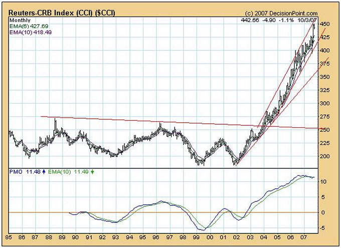
Chart 4
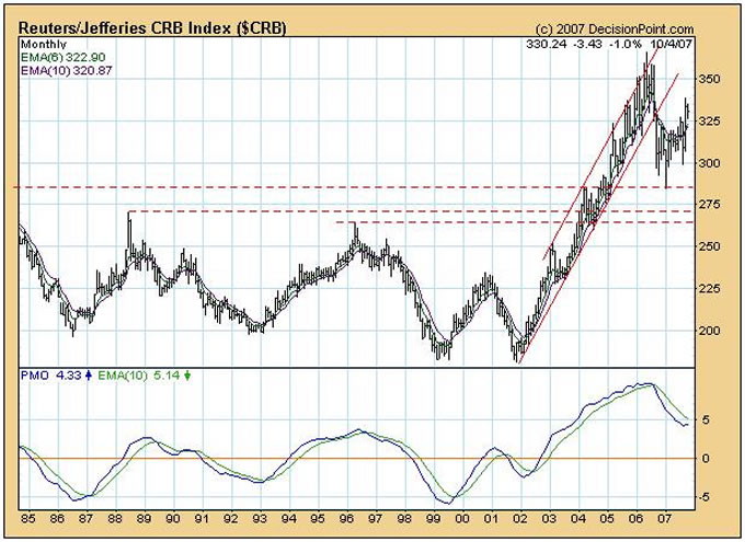
I have chosen to use both the $CCI and $CRB because there is also an anomaly with these two charts. At a guess I would assume that the $CRB has recently been used more for hedging purposes. Nevertheless, the fact remains that both indices are currently significantly higher than they were twenty years ago.
This is relevant for two reasons:
- It happens that manufacturers in China are now having difficulty in attracting additional low-cost labour. i.e. They are having to pay a higher price to attract more labour.
- Raw material input costs are in rising trends.
It follows that, if the USA continues to inflate its money supply, and given that we have already enjoyed the benefits of cost efficiencies flowing from the shift to relatively low cost nations, inflation in its money supply is virtually certain to translate to price inflation within the USA's borders. The Chinese and Indians have no room to cut prices anymore. (The price of toothpaste in the USA will also be rising)
I have been reading recently that US M3 (the measure that Alan Greenspan made it more difficult for us to access) has been growing at 15% p.a. – that's MORE THAN THREE TIMES its historical growth rate from 1983 -2003
Coupled with a falling US Dollar, this situation is likely to be exacerbated.
Chart 5
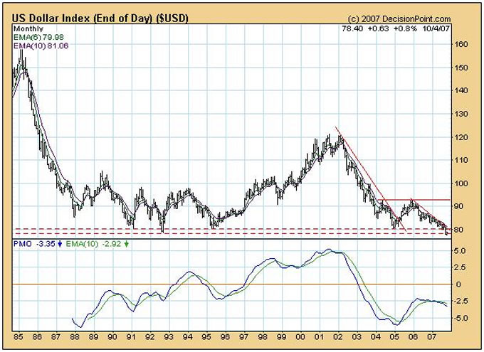
The monthly chart above shows a downward pointing PMO.
Understanding all this, I was previously of the view that the Central Banks would fight tooth and nail to prevent a breakdown in the US Dollar. Quite apart from the fact that a “double whammy” hit of rising money supply and rising import prices in US Dollars would make the lives of US Consumers unbearable, 70% of the world's financial reserves are denominated in US Dollars. It was my view that the Central Banks would not stand by and watch the value of these reserves decimated.
Apparently, I was wrong. Apparently, the Fed's computer models showed that a 15% growth in money supply and a cut in the bank lending rate would not impact negatively on US economic growth
Of course, the situation might still reverse itself, but let's proceed from the assumption that I was wrong, and that the worlds Central Banks will not move to protect the US Dollar. The question that now needs to be answered is: What will take the place of the US Dollar?
Alan Greenspan has recently been quoted as saying that the Euro will likely take over, but there are some who are pointing to the rising gold price and saying: “Gold will take over”.
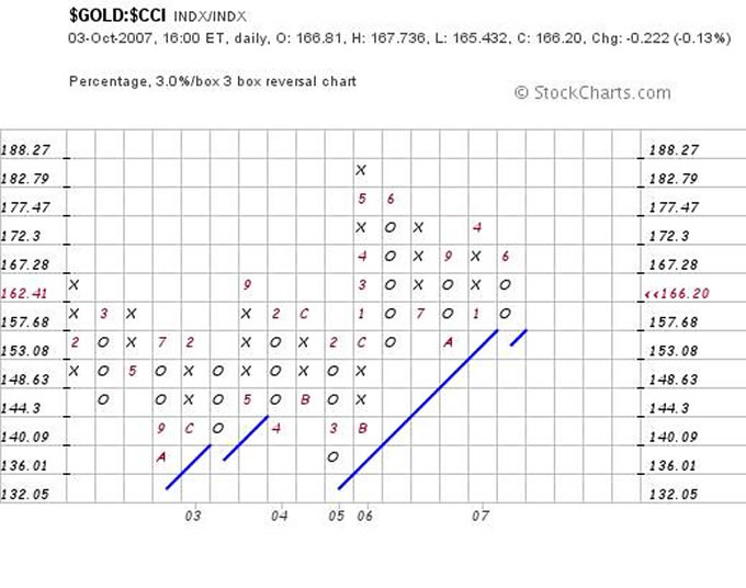
Well, this last sentiment is relatively easy to validate. Let's see what the gold price (in US$) is doing relative to commodities, as an example.
According to the chart below of the gold price divided by the $CCI, since 2006 gold has been dickering around relatively speaking. (Chart courtesy stockcharts.com). In fact, relatively speaking, Gold is now back to its 2003 peak as compared with commodities.
Chart 6
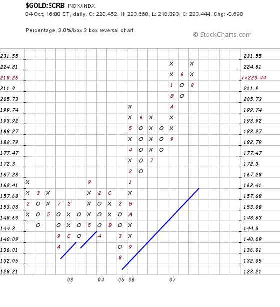
Intriguingly, the Gold Price Relative to the other Commodities Index, the $CRB, is hitting a double top – as can be seen from the chart below. But it needs to break through to be worthy of comment.
Chart 7
What about the Gold Price in Euros?
Chart 8
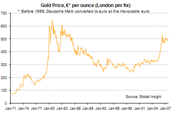
The chart above (source: http://www.gold.org/value/stats/statistics/monthlysince1971.html ) shows gold well below it 1980 peak.
So, when we put all the above together, it would seem as if the Euro is stronger than gold, which, in turn, is stronger that the US Dollar.
Some people are arguing that the centre of gravity of the world economy will shift to Asia, so let's test that argument.
The following table – sourced from http://en.wikipedia.org/wiki/List_of_countries_by_GDP_(nominal ) reflects the world's top 15 GDP countries in 2006 as per IMF statistics
| Rank | Country | GDP (millions of USD) |
| — | Gross world product | 48,144,466 |
| — | European Union | 14,527,140 |
| 1 | United States | 13,244,550 |
| 2 | Japan | 4,367,459 |
| 3 | Germany | 2,897,032 |
| 4 | People's Republic of China | 2,630,113 2 |
| 5 | United Kingdom | 2,373,685 |
| 6 | France | 2,231,631 |
| 7 | Italy | 1,852,585 |
| 8 | Canada | 1,269,096 |
| 9 | Spain | 1,225,750 |
| 10 | Brazil | 1,067,706 |
| 11 | Russia | 979,048 |
| 12 | South Korea | 888,267 |
| 13 | India | 886,867 |
| 14 | Mexico | 840,012 |
| 15 | Australia | 754,816 1 |
The problem is that Europe (apart from the UK) has not been growing – as can be seen from the following Table
% Contributions of Major Economies to the World Economy (US$ Billion)
(2002 GDPs expressed in 1995 $ and exchange rates)
| Ranking by size | ||
| United States | $ 9,234 |
26.2% |
| Japan | $ 5,667 |
16.0% |
| Germany | $ 2,708 |
7.7% |
| France | $ 1,832 |
5.2% |
| United Kingdom | $ 1,361 |
3.9% |
| Italy | $ 1,234 |
3.5% |
| China | $ 1,207 |
3.4% |
| Brazil | $ 812 |
2.3% |
| Canada | $ 753 |
2.1% |
| Spain | $ 739 |
2.1% |
| Korea , South | $ 680 |
1.9% |
| India | $ 534 |
1.5% |
| Netherlands | $ 505 |
1.4% |
| Australia | $ 469 |
1.3% |
| All Other Countries | $ 7,577 |
21.5% |
| Total | $ 35,311 |
100.0% |
Source: http://www.eia.doe.gov/pub/international/iealf/tableb2.xls
Note: Readers should understand that the above Table is expressed in 1995 dollars. The 2002 numbers are therefore significantly less in dollar terms than they should be for comparison purposes. However, in terms of percentage contributions, this table is very valuable for comparison purposes.
In summary, in the four years since 2002, nominal growth in the world economy has been driven by an expansion of the USA's proportional contribution from 26.2% to 27.5%.
During that time:
§ China and India's combined contribution has grown from 4.9% to over 7%,
§ the UK's contribution has grown from 3.9% to 4.9% and
§ Australia's contribution has grown from 1.3% to 1.57%. However,
§ the proportional contribution of previous powerhouses of Europe, namely Germany France and Italy, has shrunk from 16.4% to 14.5%
Interim Conclusion
Whilst the European Union as a whole contributed more to overall world GDP than did the USA in 2006, the USA's proportional contribution has been growing whilst Europe's contribution has, overall, remained fairly static and perhaps even shrunk slightly.
It follows that whilst the Euro may take over from the US Dollar, the EU also cannot “drive” world economic growth going forward. (Unless something structural changes to facilitate this growth).
There is another anomaly: All the world's constituent GDP numbers in the above tables are quoted in US Dollars. It follows that, if world GDP continues to be measured in inflating dollars, the USA's proportion might continue to grow – even as overall volumes begin to shrink. (It is my view that this has already begun to occur – which is how the US contribution grew to 27.5% in the first place. Note that the US Dollar Index fell from 120 to less than 80 during the period 2002-2006. Common sense dictates that if the US Dollar index has fallen by 33%, it is almost impossible that the US economy could have gained market share in volume terms during that time).
By contrast, if world GDP were to be measured in Euros going forward, it seems more likely that European contribution will grow because the US contribution shrinks (continues to shrink) in volume terms – rather than the EU growing its output in volume terms.
Overall Conclusion
When measured in volumes of output (as opposed to fiat currencies) it seems reasonable to anticipate that world economic activity may begin to contract more noticeable from 2008 onwards, and that US citizens will suffer the brunt of the impact because “stagflation” will be exaggerated there relative to other countries. The non confirmation of the $SPX and the Dow Jones Industrial Index should be treated as a warning. If the $SPX does indeed break up to new heights it will be because of a deterioration in the US Dollar, not because the US economy is growing.
Author's comment
All this begs the question: “So what do we do about it?”
It is this analyst's view – which he has been repeatedly emphasising over the years – that the ultimate driver of the world's economy is “energy”. Until we accept that there is an urgent need to move away from Neanderthal Fire, and towards replacement energies (and associated technologies) which are economically sensible, the underlying economic situation will continue to deteriorate. Ultimately, if we do not take action soon enough, it will become impossible to manage the mountain of debt that has been building to facilitate the US to continue to drive the world economy, and the $450 trillion derivatives industry – which is symbiotically interlinked with the debt markets – seems likely to implode. Nuclear Fission, Biofuels and other “quick fix” solutions do not pass the common sense test and the world's political leaders are leading us astray by taking us down those paths.
It's time to change our thought paradigms. Electing new political leaders who are proposing variations on the old themes will not solve our problems. We have reached a point in history where our political leaders, by and large, are the problem. “What we do about it?” is proposed in my forthcoming novel, Beyond Neanderthal.
By Brian Bloom
www.beyondneanderthal.com
Since 1987, when Brian Bloom became involved in the Venture Capital Industry, he has been constantly on the lookout for alternative energy technologies to replace fossil fuels. He has recently completed the manuscript of a novel entitled Beyond Neanderthal which he is targeting to publish within six to nine months.
The novel has been drafted on three levels: As a vehicle for communication it tells the light hearted, romantic story of four heroes in search of alternative energy technologies which can fully replace Neanderthal Fire. On that level, its storyline and language have been crafted to be understood and enjoyed by everyone with a high school education. The second level of the novel explores the intricacies of the processes involved and stimulates thinking about their development. None of the three new energy technologies which it introduces is yet on commercial radar. Gold, the element , (Au) will power one of them. On the third level, it examines why these technologies have not yet been commercialized. The answer: We've got our priorities wrong.
Beyond Neanderthal also provides a roughly quantified strategic plan to commercialise at least two of these technologies within a decade – across the planet. In context of our incorrect priorities, this cannot be achieved by Private Enterprise. Tragically, Governments will not act unless there is pressure from voters. It is therefore necessary to generate a juggernaut tidal wave of that pressure. The cost will be ‘peppercorn' relative to what is being currently considered by some Governments. Together, these three technologies have the power to lift humanity to a new level of evolution. Within a decade, Carbon emissions will plummet but, as you will discover, they are an irrelevancy. Please register your interest to acquire a copy of this novel at www.beyondneanderthal.com . Please also inform all your friends and associates. The more people who read the novel, the greater will be the pressure for Governments to act.
Brian Bloom Archive |
© 2005-2022 http://www.MarketOracle.co.uk - The Market Oracle is a FREE Daily Financial Markets Analysis & Forecasting online publication.


