


World Sovereign Debt Map
Interest-Rates / Global Debt Crisis Oct 01, 2010 - 03:46 AM GMTBy: Seth_Barani

 Debt creates problems. It is seldom known to solve problems, especially in the long run. Countries with high debt are vulnerable to currency weakening as debt drives assets out of those countries towards low risk, high yielding countries.
Here is an easy reference to sovereign debt of countries in the world. A simple color-code has been used, where red denotes public debt per capita over $10,000, yellow denotes debt per capita between $1,000 and $10,000, and finally, green color denotes debt per capita under $1,000. The color-code may be a bit deceptive in borderline cases where the debt is close to $1,000. The data for a couple of countries are a bit old (e.g. 2008). The map should only be used to gain some idea into the big picture but not for cherrypicking potential investment destinations.
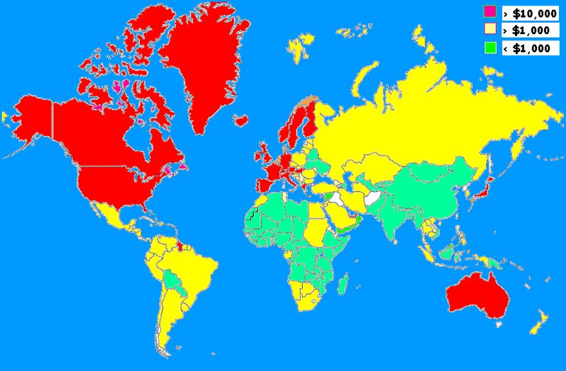
An interesting pattern emerges from the color-coding. There is some connectivity between countries with similar color! It shows that the pattern of government borrowing/spending may have some cultural underpinnings.
Red States: Most of these are ultra-capitalist nations and are economically and politically close to United States. Did these countries assume that US would lead their way in borrow-and-spend voodoo economics? Japan leads the show with nearly $78,000 per person. This is just the sovereign debt. We haven't even delved into consumer/commercial debt. On yearly basis the US per capita debt grew fastest (from $15,000 to $28,000 in a few years), but per capita debt for some other countries (e.g. Norway, $55,000) are way higher than USA.
Yellow States: The south American nations do not seem interested in drinking US binge. China is close to crossing the $1000 milestone and may turn yellow quite soon. East European nations and Russia are also somewhat fiscally sensible.
Green States: Other than India, many of them are in Africa with low GDP, low debt, but rich in resources. Unfortunately, most of the African nations are kept in perpetual conflicts by arms supplied by some Red and Yellow States.
One may argue that governments spend more because of the catalysis given by higher GDP. I would argue the reverse - higher government spending is reflected in an artificially elevated GDP. The recent 'stimulus' in US aimed at propping up the GDP is one such example. Further, the belief that higher GDP may service the sovereign debt is only half-valid. GDP must combine with low tax rates to have a better chance of surviving the debt.
Question: Which countries have low debt/GDP ratio?
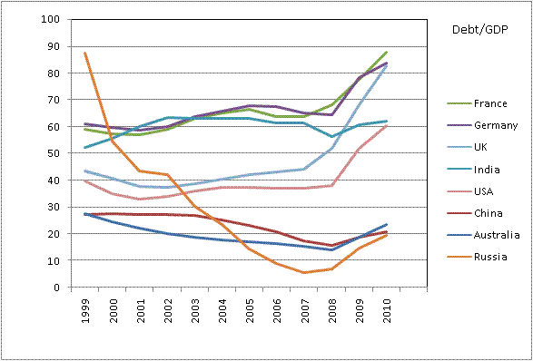
We didn't include Japan in the chart because it will cast a shadow on other countries. Japan is in a terrible shape with nearly 200% debt/GDP and one wonders how long will it be before its ratings are downgraded.
From the above chart one can see that Russia has aggressively cut down the sovereign debt vs GDP ratio from almost 90% to 20%. China and Australia also have performed well to keep a low ratio. USA is not badly placed being in the middle order along with India but we haven't included the intragovernment borrowing (e.g. from Social Security Trust) for US data. If the intragovernment borrowing is included, the ratio would be close to 90% instead of the 60% shown in the graph. Across the Atlantic, UK, France and Germany are outdistancing themselves from others and knocking at the 100% mark. Some interesting countries not included in the chart are (a) Saudi Arabia that has significantly cut down its public debt, but perhaps mainly from its oil revenues (b) Belgium, which has been near the 100% mark most of the years (c) Iceland whose debt grew fast from 43% to 115%, (d) Iran whose debt decreased from 30% to 18%, (e) Italy always above the 100% mark - congrats! (f) Romania seriously working to reduce the ratio with high fiscal responsibility.
As mentioned earlier, debt servicing is easier if the tax rates are low, since there is room to increase the taxes. From that perspective, countries with high tax rates are Belgium, Germany, Denmark, France, Italy, Finland. Lower rates prevail in Australia, China, India and Russia. Japan, UK and USA also have some cushion left before they can catch up with European nations on tax rates. Thus, one can surmise that while Japan, UK and USA may resort to increasing taxes, EU nations will be forced to accept austerity. When the average American is forced to deleverage his debt, Uncle Scam will be actively monitoring his bank savings account and at the very first sign of improved personal savings his taxes will be hiked. Note: Kicking and screaming to austerity still will not result in any retirement savings for Americans!
The combination of per capita debt, debt/gdp and the tax rates show that countries like Russia, China and India have low debt per capita, low taxes and low debt/GDP ratio. Australia, while it has low debt/GDP ratio and tax rate, it has a high per capita debt. The EU-US belt is both high in per capita debt and high debt/GDP ratio and without much room left for additional taxation. We anticipate that Belgium will soon be renamed as BellyUpGium, owing to its high debt, high per capita debt, high debt/gdp ratio and very high tax rates.
Author Seth Barani is a PhD in physics and is a freelance capital market researcher and trader. He can be reached at s.barani@gmail.com.
© 2010 Copyright Seth Barani - All Rights Reserved
Disclaimer: The above is a matter of opinion provided for general information purposes only and is not intended as investment advice. Information and analysis above are derived from sources and utilising methods believed to be reliable, but we cannot accept responsibility for any losses you may incur as a result of this analysis. Individuals should consult with their personal financial advisors.
© 2005-2022 http://www.MarketOracle.co.uk - The Market Oracle is a FREE Daily Financial Markets Analysis & Forecasting online publication.