


Exhaustion Gap on Yields Chart!
Interest-Rates / US Bonds Sep 03, 2010 - 04:21 AM GMTBy: Brian_Bloom

 Summary: The charts are signalling an important change in market attitudes to risk – and by implication, the Fed’s attitude to risk. If yields are to rise from here it will be because investors in treasury bonds are expecting to incur capital losses. Why would this be? This article comes to the conclusion that we are heading for a period of tight capital markets. If money is tight, credit will be tight. If credit is tight, then, to borrow money will require the borrower to pay higher rates of interest to compensate the lender for his higher level of risk. If credit is tight, consumer demand will, at best, not grow and, at worst, fall. In the former case, we can expect a steady-as-she-goes outcome. In the latter case, the result will be a slow down in economic activity and a so-called “double dip” recession.
Conclusion: The key to the future direction of the markets will be consumer/investor confidence. As long as there are no “accidents” confidence is unlikely to deteriorate further and the markets are likely to churn. However, any accident at this point will likely lead to a double dip recession.
****
One of the most powerful tools in the technical analyst’s arsenal arises from the study of gaps on a bar chart which plots high/low/closing prices. Essentially, a gap occurs when the opening price of today is higher than yesterday’s high, and proves to be the low of the day. Alternatively, it opens up lower than yesterday’s low and proves to be the high of the day.
This type of chart behaviour typically arises from raw emotion on the part of investors and, over time, when the emotion recedes and rationality returns, the chart price reverses itself to “cover the gap”.
The only type of gap that does not get covered is one where a stock has been neglected and investors suddenly realise that the underlying fundamental situation has changed. For example, a company may have been quietly growing its revenue and profits lines in an environment where very few shares in that company have been changing hands and the price has been languishing. The day arrives when the underlying momentum of profitability growth in that company becomes obvious (a deal is announced or annual profits have doubled or some other reason) and investors scramble to get in. This causes a “breakaway” gap – which is unlikely to be covered because it does not arise from emotion. (Of course, if the fundamental profitability of a company has been deteriorating – out of sight of investors – and this fact suddenly emerges, then the breakaway gap may be on the downside.)
If the momentum in the change in profitability is “structurally” different then, as more and more investors become aware of this fact, more and more place buy (or sell) orders. If an “at best” order is placed then this might cause a “runaway” gap.
I could go on and on about the theory, but the philosophical point that I am trying to make is that gaps (which are not subsequently covered) cannot be engineered by market manipulators. They happen for a genuine market related reason. The investor waits to see whether they may have arisen from emotion – in which case they will likely be covered. If a breakaway gap is followed by more than one runaway gap then the investor had better sit up and take notice – because it will be as if a steam train has started running out of control – either on the upside or the downside.
Gaps on daily charts are fairly common and most (over 90%) are covered within a reasonable short period of time. Gaps in weekly charts are rare, because they arise from the price on a Monday morning being out of range of that at which it closed on the Friday afternoon.
The reason for going into all this theory is to illustrate to the reader that the gap on the weekly chart of the 30 year bond yield below (courtesy DecisionPoint.com) may turn out to be very significant.
![]()
|
|
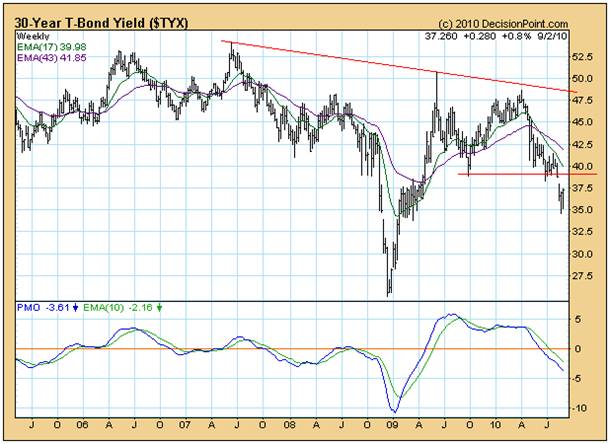
The reader should note how, in June 2007, the yield on the chart above peaked and then began to fall. In around June 2008 it started to rise again and then, immediately preceding the collapse in the equity markets, it began to fall again.
This may be interpreted as professional and well informed investors having taken early action – before the stock market collapse. In October 2008, when the market as a whole started to react to the financial unravelling, more an more people bailed into treasuries causing the price to rise and yields to fall – until the emergence of the “exhaustion gap” – towards the end of October. This was a sign that the last of the uninformed investors were panicking into treasuries and that the yields would probably start to rise thereafter – buying “pressure” in treasuries was approaching exhaustion and the gap would very likely be covered. It was.
Sure enough, after a few weeks had passed, the exhaustion gap was covered and continued to rise until around June 2009, when professional investors began to relax again, and the yields entered a trading range. They fell mildly until October 2009 as treasury portfolios were being topped up and then started rising again – until April 2010 - as normal market conditions manifested. We can validate this argument by checking on how the equity markets were performing in June 2009 – see chart below, courtesy BigCharts.com.
What happened between June 2009 and April 2010?:
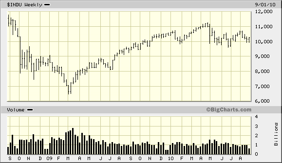
Well, in July 2009, with the panic having receded following the various stimulative packages, the equity market started to rise again and it kept rising until the end of April 2010. At that point, the market fell sharply and then entered a trading range.
Going back to the first chart, we see a second potential exhaustion gap that occurred three weeks ago – within the context of rising bottoms on the PMO oscillator. It seems a fair bet that the most recent exhaustion gap will be covered. This is highly significant!
So, the question arises as to “why”. Why will investors be selling out of treasuries? Are they confident that the equity markets are about to enter a period of bullishness and that the returns from equities will outpace the returns from treasuries?
Or are they fearful that there is a coming credit crunch and that interest rates are about to rise? Because if interest rates rise, then treasury yields will also have to rise. This will give rise to capital losses.
But, if interest rates are going to rise – structurally – how can this be good for business? The economy is not overheated. To the contrary, like a boxer on the mat, it is on its knees, shaking its head to clear it.
Let’s take a closer look at the equity price charts. Below is the Point and Figure chart of the $SPX (Standard and Poor 500), courtesy Stockcharts.com
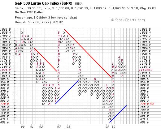
I have deliberately chosen a 3% X 3 box reversal chart so as to ignore trading “static”.
The rising blue line on the right hand side of the chart shows that the market is currently moving within a bull trend and the congestion of zeros and crosses in the four columns on the right hand side indicate that the market has most recently been in a trading range – from which it must either break up or down. If it breaks “up” (above 1212) then, technically, we can anticipate a very strong rise of the order of magnitude of at least 15% and at most 60%.
On the other hand, if it breaks down, below 1015, then it can be expected to pull back to “at least” 778.
Which now brings us to the question of fundamentals.
Given that the economy is “on the mat” the question arises as to what will cause prices to rise between 15% and 60%?
There is an argument that Helicopter Ben will man the printing presses and flood the markets with money, thereby causing rampant inflation. Of course, if we experience rampant inflation then corporations will raise their prices and they might report strongly rising monetary profits even as their volumes of trade are shrinking. On the other side of the coin, if we experience rampant inflation, then interest rates must rise to compensate. Who will lend money at (say) 4% interest in an environment of (say) 20% inflation?
Under a Helicopter Ben scenario, both equity markets and treasury yields will rise.
But there is another argument which flows from the base assumption that the Fed’s utterances are to be treated as “spin”. The same argument also flows from the high probability that, as bankers and/or professors of finance or economics (or whatever else he/they used to be) Ben Bernanke and the other members of the Board of the United States Federal Reserve understand just as well as you and I do that a tidal wave of money will give rise to a tidal wave of inflation. One would have to genuinely believe that the Federal Reserve Board is populated by stupid, mindless and/or corrupt individuals who are prepared to move to deliberately destroy the US economy (and perhaps the world economy as well) if one were to accept the argument that the Fed is about to hit the “print money” button.
Of course, it’s possible. But, from my perspective, I have a significant level of doubt. I do not believe that I am cleverer than Ben Bernanke and his team. Neither do I believe that any sane person would deliberately set out to destroy the foundations of an entire society. For what purpose? To gain power? Power over what? A smouldering ruin? A some point we need to come to our senses. If this world is genuinely being managed by an evil cadre of stupid people then, frankly, we’re all doomed anyway – the evil, stupid cadre included. This talk of conspiracies is just childish nonsense and the time has come to start thinking and talking like mature adults.
So, let’s look specifically at the probability that the utterances of the US Federal Reserve are calculated to be manipulative – ie that they are “spin”, calculated to influence investor behaviour in general. (This is a concept that is quite distinct from assuming the existence of evil conspiracies. It is a concept that flows from the assumption that the Fed is just doing its job of maintaining “order” in the economy/markets. And yes, there are inbuilt conflicts of interest when you put the fox in charge of the hen house; when you put the presidents of publicly owned banks onto the Boards of Directors of the various regional Federal Reserve organizations throughout the country. Clearly, their decisions will have a bias towards favouring the interests of their constituencies above the interests of the public at large. If that is “evil” behaviour then we are all of us evil. )
Here are some fundamental facts:
This week I read a report in USA Today which was very worrying. (See: http://www.usatoday.com/money/economy/2010-09-01-ism-grows_N.htm )
The report was entitled ISM: Factory growth speeds up; desire to hire surges - which was presumably intended to give the impression that the worst is over and that the economy is growing again. On reading the article however, it became fairly clear to me that the headline was just “spin”.
Here is a key quote:
- “Wednesday's [Institute of Supply Management’s] report suggests that moderate growth will likely continue, said Norbert Ore, the chair of the survey.
However, a measure of new orders, which are a gauge of future business, dipped to the lowest level since June 2009 after surging earlier this year. Economists said that suggests growth in the manufacturing sector will slow in coming months.”
I also read an article about motor car sales in August 2010. (see http://online.wsj.com/mdc/public/page/2_3022-autosales.html for details)
In summary, car sales were 30.9% down on August 2009 sales and light duty trucks were down 7.5% on August 2009 – largely because of the unusually high August 2009 sales as a consequence of the Cash for Clunkers program.
I also read an article about sales of existing homes in an article dated August 24th in respect of July home sales (see http://finance.yahoo.com/news/Home-sales-at-15year-rb-2107272584.html?x=0 )
Quote:
“WASHINGTON (Reuters) - Sales of previously owned U.S. homes took a record plunge in July to their slowest pace in 15 years, underlining the housing market's struggle to find its footing without government aid.”
Now, with the above in mind, the best one could argue is that the erosion of the economy may have bottomed. But, other than an ISM index number of 56.3 (as against April’s number of 60.4, a six year high) there is no evidence that the US economy is growing.
Interim conclusion
The conclusion one must draw from the above fundamental facts are that any statements to the effect that the economy is growing again are probably just “spin”.
So, getting back to the exhaustion gap on the 30 year bond chart. What can we conclude?
We can conclude that yields have bottomed. We can conclude that, if we assume that the Governors of the Fed are just “people” like you and me, who have a greater level of responsibility than your or I have, it is probable that any talk of spruiking the economy by pumping money into it is just spin.
But, will it follow that, because 30 year yield s have bottomed, they are likely to rise?
Well, let’s have a closer look at the Dow Jones Industrials on a daily chart (courtesy BigCharts.com).
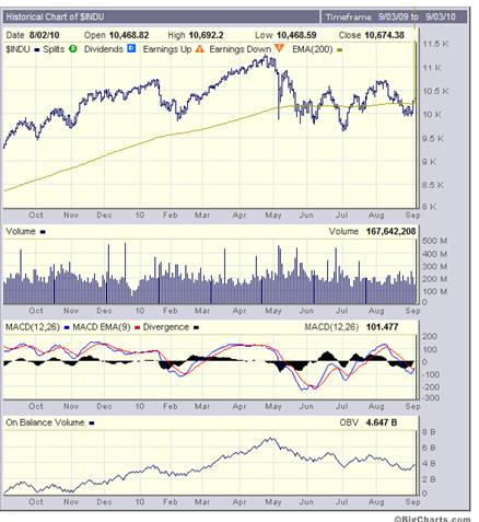
It is clear that the MACD oscillator was oversold and is now showing strength. But it is also clear that the On Balance Volume Chart has been trending down and that the Index is having trouble rising above the resistance being encountered at the 200 day Moving Average level. Arguably, the best we can expect is that the equity market will continue in a trading range for the foreseeable future.
As money (savings) continues to flow into pension fund accounts, this money will need to go somewhere. However, if (as is being foreshadowed by the ISM report) employers are moving to hire more people against a backdrop of falling order books, then all that we can expect is an upward pressure on corporate costs and a downward pressure on profits.
Much has been made, recently, of the strong rebound in the Baltic Dry Goods Index. The argument is that the Chinese economy is motoring ahead. Well let’s look at that.
Below is a 5 year chart of the Baltic Dry Goods Index. (Source: http://www.bloomberg.com/apps/quote?ticker=BDIY:IND )
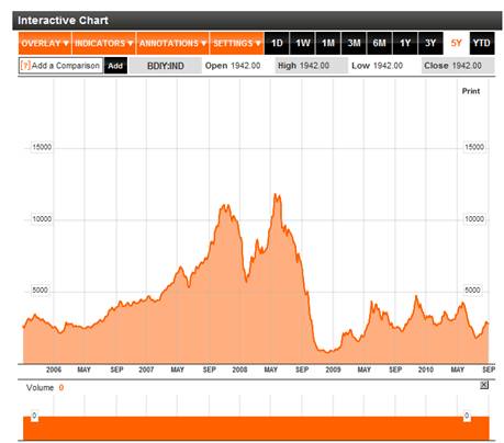
Yes, the Baltic Dry Goods Index has been rising – but there does not seem to be anything to get excited about.
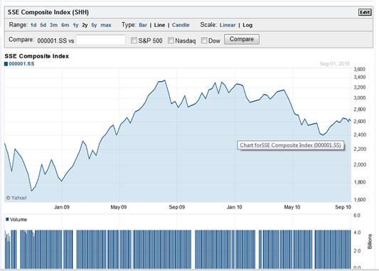
By contrast, a quick look at the Shanghai Index shows that it is at the top of a bounce in a bear trend and may even be looking to fall again. (Source: http://finance.yahoo.com/q/bc?s=000001.SS&t=my&l=on&z=l&q=l&c= )
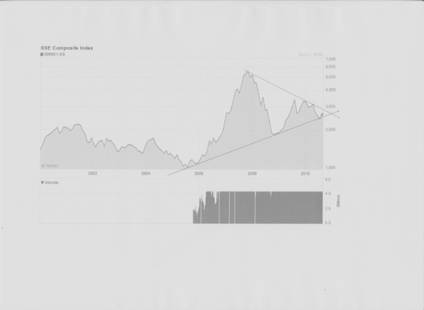
Note how the Shanghai Index is approaching the apex of a triangle. Note, also from the chart below – which takes a closer look that:
- There has been a series of falling tops since January 2010.
- There has been a (tiny) pattern of falling tops in the past few days
- If the Index fall from this level, it will penetrate the lower boundary of the triangle on the downside
Interim conclusion #2
The Shanghai Index is not giving off bullish signals. i.e. Any observations that the Chinese manufacturing sector is robust is just “spin”
So, if the Chinese market re-enters a Primary Bear Trend and yields on US Treasuries have stopped falling could these two factors be indicating the possibility of a tightening capital market?
This is the $64,000 question because if the Chinese economy starts to wallow then the predisposition of the Chinese authorities to fund additional US borrowings is likely to wane. The US government will be faced with the dilemma of whether it should keep borrowing from the Fed – which would involve the Fed just printing the money – or whether it should move to cut expenditure and balance the budget.
Well, if the Fed just printed the money, but the US current account remained in deficit then it follows that the additional US dollars will flow out of the country – provided the creditors will accept the dollars in payment.
Okay, let’s look at the dollar chart.
The monthly chart of the US Dollar Index (courtesy DecisionPoint.com) is not showing signs of weakness of consequence
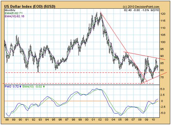
In fact, its PMO has just given a buy signal as it entered positive territory for the first time since 2003.
And, if US dollars printed by the Fed to allow the US government to keep spending are then going to flow out of the country and continue to be accepted by foreigners, then inflation in the USA will not rear its head.
Why would foreigners continue to accept US Dollars?
Because if they stopped then the exports to the USA would dry up and their economies would contract.
Conclusion
If we proceed from the base assumption that the people who determine the United States economic and banking policies are not evil people, then it must be concluded that the time has arrived when they now recognise that the US continuing to spend more than it earns is a recipe for disaster. Capital markets are likely to become tighter as an increasing level of responsibility creeps in to political decision making. Trade and budget deficits will in all likelihood continue for the foreseeable future, but there will be a downward pressure on borrowing – caused by a rising level of yields. This will need to be balanced by continuing efforts to “jawbone” a improvement in confidence. Barring an accident, the markets are likely to travel sideways for the foreseeable future (10-15 years has been argued in earlier articles). Assuming an accident, confidence will be dented and consumption will likely contract sharply.
Overall Conclusion
The exhaustion gap on the weekly chart of the 30 year bond yield is pointing to a best case scenario of a waning interference by the Fed in the capital markets as the realisation is embraced that continuing along this path is a recipe for disaster in the current circumstances. A best case scenario is “steady as she goes” and years of economic churning as the stimulus efforts in the energy markets (argued in other articles) gathers momentum. Any market “accidents” will likely erode consumer/investor confidence, leading to a double dip recession.
By Brian Bloom
Once in a while a book comes along that ‘nails’ the issues of our times. Brian Bloom has demonstrated an uncanny ability to predict world events, sometimes even before they are on the media radar. First he predicted the world financial crisis and its timing, then the increasing controversies regarding the causes of climate change. Next will be a dawning understanding that humanity must embrace radically new thought paradigms with regard to energy, or face extinction.
Via the medium of its lighthearted and entertaining storyline, Beyond Neanderthal highlights the common links between Christianity, Judaism, Islam, Hinduism and Taoism and draws attention to an alternative energy source known to the Ancients. How was this common knowledge lost? Have ego and testosterone befuddled our thought processes? The Muslim population is now approaching 1.6 billion across the planet. The clash of civilizations between Judeo-Christians and Muslims is heightening. Is there a peaceful way to diffuse this situation or will ego and testosterone get in the way of that too? Beyond Neanderthal makes the case for a possible way forward on both the energy and the clash of civilizations fronts.
Copies of Beyond Neanderthal may be ordered via www.beyondneanderthal.com or from Amazon
Copyright © 2010 Brian Bloom - All Rights Reserved
Disclaimer: The above is a matter of opinion provided for general information purposes only and is not intended as investment advice. Information and analysis above are derived from sources and utilising methods believed to be reliable, but we cannot accept responsibility for any losses you may incur as a result of this analysis. Individuals should consult with their personal financial advisors.
Brian Bloom Archive |
© 2005-2022 http://www.MarketOracle.co.uk - The Market Oracle is a FREE Daily Financial Markets Analysis & Forecasting online publication.