


Stock and Gold Market Analysis for Dow, Nasdaq, Bonds, IBM, AAPL and BIDU
Stock-Markets / Stock Markets 2010 Jul 05, 2010 - 02:11 PM GMTBy: JD_Rosendahl

 The stock market finished last week on a down note. It couldn't find any legs all week long, as disappointing economic data rolled out all week, and uncertainty filled the market place. Even Biggs had concerns and sold stocks.
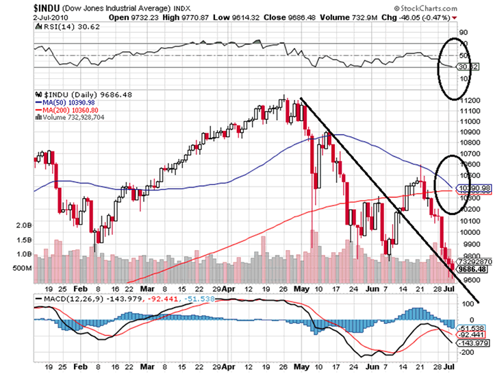
$INDU: The DOW traded down to its prior down trend line. The RSI has moved into oversold territory. There's nothing technically bullish so far on the DOW. The 50 and 200 day MAs are about to cross, which often can pull price in that direction, so maybe a little bounce next week, however, It still looks like this leg down has not finished.
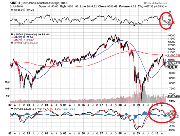
The weekly chart below reflects both the RSI and MACD have more room to the downside before getting oversold.
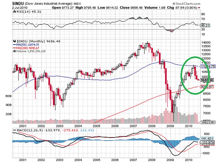
The monthly chart of the DOW below reflects an Evening Star forming March-April-May, with the market failing at the 50 month MA. June was a month of follow through on that pattern. Where we close for July will be interesting. A lower close near the 200 month MA will create 3 down months, and a 3 Black Crows pattern and possibly roll the monthly MACD over. Those would both be bearish. Note: The SP500 is already below its 200 month MA.
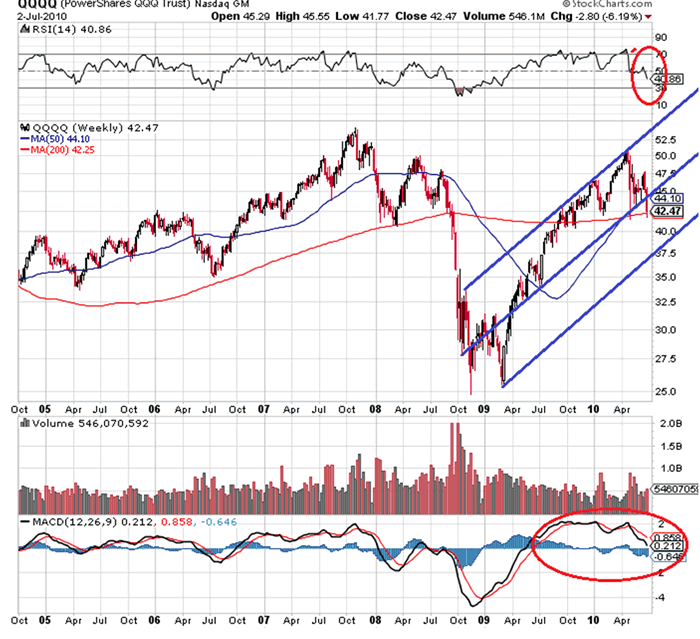
QQQQ: The weekly chart of the Qs has stopped right at the 200 week MA. The bearish part of this chart is both the RSI and MACD have much further to go before they reach oversold on the weekly time frame. They don't have to go there, but if they do, we have a lot further to go on the downside before we hit oversold.
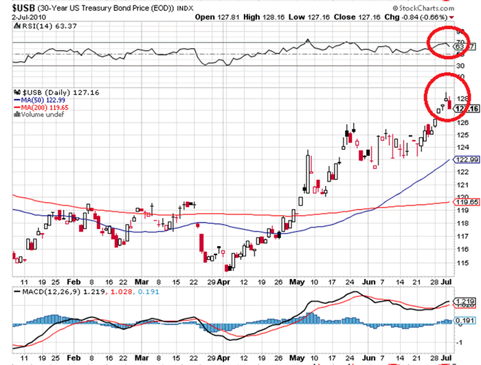
$USB: The daily chart of the long bond has approached overbought and maybe ready for a little pull back, which should correlate with a little bounce in the stock market.
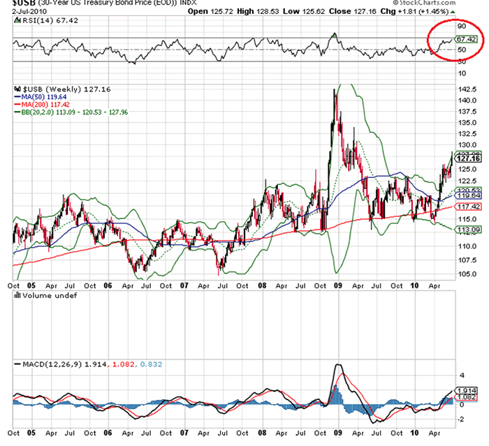
The weekly chart of the long bond below reflects the safety trade is still on. There's room on the RSI for more upside, and the Bollinger Bands are still widening. I'm personally putting more weight on the weekly chart of the $USB, and it's time frame dominance will keep the $USB from pulling back too much to burn off overbought conditions on the daily.
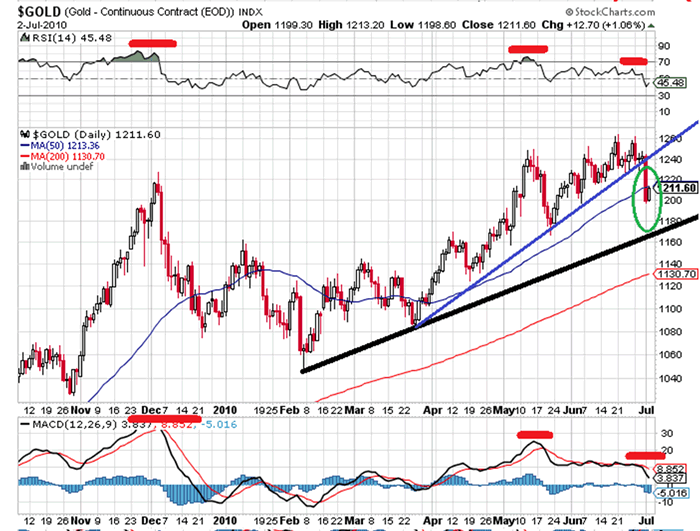
Gold: The daily chart of gold is below. We have multiple bearish divergences going on the daily chart. The gold market looks tired and need of some corrective behavior of price and/or time. Gold broke below the blue uptrend line, which is not terribly significant. Gold did have a big down day followed by an inside day on Friday. That indicates further price weakness in the near future. A break below the black up trend line is far more bearish.
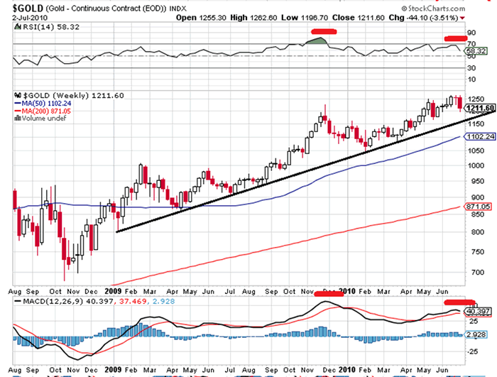
The weekly gold chart below reflects some bearish divergences on the RSI, and forming on the MACD. The black up trend line is the same as on the daily. We've already touched this trend line on several occasions, so it has some significance. A break below that would probably release more selling pressure down to the 50 week MA at $1100.
Big Stocks Watch:
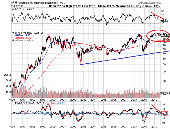
IBM: The weekly chart of IBM reflects a battle right at its prior peak. It has struggled in this price zone, while both the RSI and MACD have rolled over.
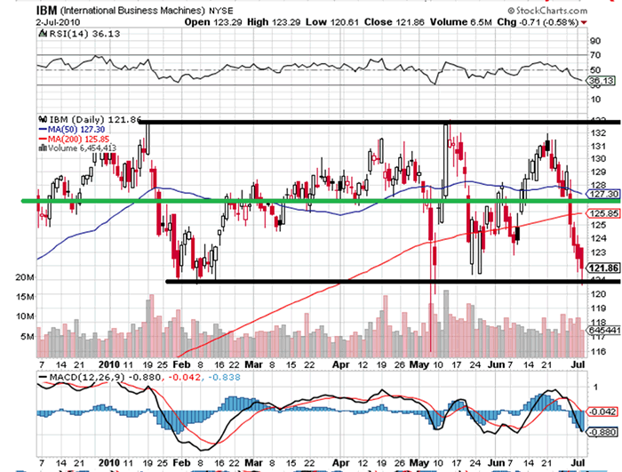
IBM's daily chart below highlights the trading zone or battle ground for IBM. The green line is the prior peak, and just happens to be exactly in the middle of this battle zone. We could be due for a little bounce since we are at the bottom channel line. That being said, if IBM gets below its bottom channel line, it's over for the market.
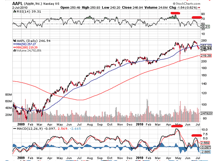
AAPL: Below is the daily chart of AAPL. We have some bearish divergences on the RSI and MACD, and AAPL looks to be doing what so many other stocks have done. Fall below the 50 day MA and move down to or below the 200 day MA. We should now soon, if this is the case.
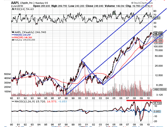
In the weekly chart of AAPL, I've used the Pitchfork for visual perspective. Notice the MACD, we are right back at previous levels that ushered in a sell off.
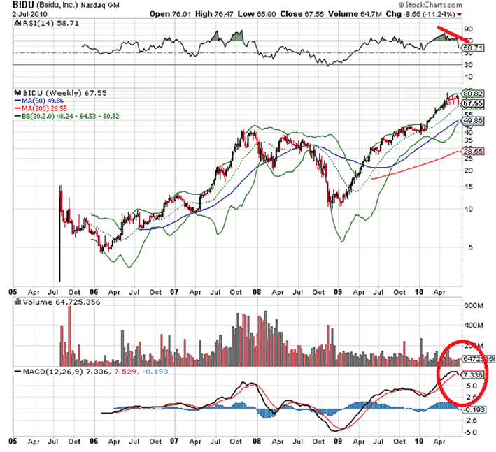
BIDU: A market favorite has powered to overbought levels on the weekly chart below. There's a little bearish divergence on the RSI, and the weekly MACD is rolling over. The picture lacks multiple divergences to be really bearish on this stock, but it does seem tired and ready for corrective behavior in price or time.
From My Trading Desk: For my recent trades, open positions, and stocks and ETFs on my watch list please go to http://roseysoutlook.blogspot.com/ There's more charts and technical analysis.
Hope all is well.
By J.D. Rosendahl
www.roseysoutlook.blogspot.com
J.D. Rosendahl was a former stock broker/investment consultant (currently not licensed) before becoming a Commercial Banker for the past 14 years. He manages his family's wealth, helping them avoid the high tech bubble and the real estate bubble melt downs and preserving wealth.
© 2010 Copyright J.D. Rosendahl - All Rights Reserved
Disclaimer: The above is a matter of opinion provided for general information purposes only and is not intended as investment advice. Information and analysis above are derived from sources and utilising methods believed to be reliable, but we cannot accept responsibility for any losses you may incur as a result of this analysis. Individuals should consult with their personal financial advisors.
© 2005-2022 http://www.MarketOracle.co.uk - The Market Oracle is a FREE Daily Financial Markets Analysis & Forecasting online publication.