


S&P Chart Set Up For Reaction to the G20 Austerity Summit
Stock-Markets / Stock Markets 2010 Jun 28, 2010 - 10:01 AM GMTBy: Mike_Paulenoff

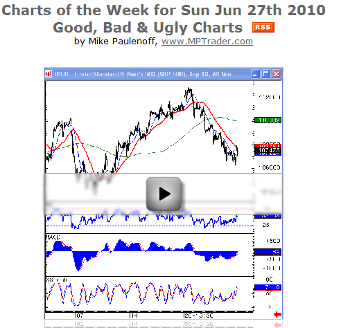
 Tonight’s Charts of the Week video looks at how the emini S&P chart is set up for overnight trading in reaction to the G20 summit amid concerns that the summit succeeds in creating austerity measures that don’t cripple the economic recovery. It also looks at how key financial stock charts are set up to react to developments in the financial reform bill that could negatively impact these stocks.
Further, the video examines what bonds are telling us in terms of anticipating G20 success or lack thereof, and whether the negative-looking Shanghai Composite may be a precursor to a drop in the S&P 500, which has the potential for a multi-month head-and-shoulder top breakdown under 1040. While markets are oversold near-term, intermediate concerns may thwart a technical bounce.
The remainder of the video looks at some good, bad and ugly charts to watch this week.
One of the better looking charts out there right now is silver. The monthly chart shows it could be on the verge of bursting above the very long-term 30-year trendline. If that’s the case, we can expect it to take out its prior high from March 2008 at 21.40 and take off in a big way. Is this indicating a shift in perception from being an industrial metal to a precious metal like gold? I don’t know, but silver bears watching. Silver needs to take out last month’s high at 19.86, which is 3.8% above where it is now, to trigger a powerful follow-through.
Apple (AAPL) is also a good-looking chart. However, like many of the good charts last week, it stair-stepped its way lower. On Monday Apple had a key downside reversal, though it was not a high-volume day for Apple, which is a good sign. It hit its all-time high at 279.01 after the iPad came out on Monday, filled its up-gap from the prior week, broke above the coil, then hit its peak. Now it’s coming down to test its breakout point. Its key support is at 265 – 262 1/2. If it breaks 262 1/2 it will probably go down to 240. It needs to hold at the level it’s at right now, and if it does then 282-83 is my next target.
Netflix (NFLX) has had an amazing run, hit its highs in mid-June at 128 and again at 127.80, and last week participated with the market, but turned up on Friday. The 50-day moving average and the trend line continue to hold and are angled sharply higher. It may be getting ready to retest its high soon, and if it does that will tell us whether Netflix has a new upleg or double-top and is in dire need of a rest. Unless Netflix takes out 114.60, it probably will test 127-28. That’s another beautiful chart that still looks good.
NetApp (NTAP) is another great chart that still looks excellent, with no damage done last week. It tested the 20-day and still looks like it has some higher prices to go. However, if it can’t rally off the 41.18 area and gets hung up at 41 and breaks last Friday’s low at 38.87, I’d be very careful. It could come down to this average in a hurry and begin to test its major long-time trend line and the 200-day at 32. There’s a huge gap just above 33. NetApp could be a tricky one, especially since the stochastics look like they’re struggling.
Cree Inc. (CREE) is an example of a chart we liked that doesn’t look so beautiful anymore. It peaked in April, came down, and now looks like it has a bearish wedge. Unless it can get back above 71 and change, it’s probably going to break its 200-day and head down to 40 and low change. It has very negative RSIs, MACDs and stochastics on a daily basis. So, be very careful with CREE.
Some charts to be especially careful of include Wal-Mart (WMT). On the weekly chart it looks like it’s going to take out the support line and head down toward the 46.47 area, and then before you know it retrace its entire up trend. So, Wal-Mart seems to be in a lot of trouble right now. Whether it has something do with the consumers, or just a function of economic growth or deterioration, it’s hard to tell, but the chart indicates to stay away from Wal-Mart right now.
General Electric Co. (GE) doesn’t look very good either. It has a big top on it, and whatever businesses GE is in, based on this chart, looks like they are going suffer a contraction in growth, profits and demand.
BP Exploration plc (BP) made a new low on Friday, largely because of the potential of a hurricane in the Gulf, which will eat up more capital for British Petroleum. The weekly charts shows the low of 34.67 in January 2003, and it looks like it could go as low as 24.
Microsoft Corporation (MSFT), too, has a pretty ugly chart. The 2009 rally double-topped at 31.50 in December and 31.58 in April. The parameters of the double-top are from 31.50 down to 27.50, a 4.00 difference. So 23.50 is the measured move, which isn’t far from Friday’s close at 24.53. Last week it bumped up against its cluster of moving averages, the 20-, 50- and 200-day, and acted very poorly. So, it looks like it’s headed toward 23.50, and if it breaks through that then it will head down towards the 21 area.
The last chart we review this week is Research In Motion Ltd. (RIMM), which had disappointing earnings, with lots of competition (iPhone, Droid) and other things going on. It broke its 54.30 November low, and all of the action since has been distribution, putting pressure on the support line. It broke down, had a gap at 44.80, another gap at 45.50, and looks like it has the potential to test the 2009 lows at 35.50. That’s how powerful and overbearing the big triple-rolling top formation looks. The trend line on the weekly takes it to 40 and change. That’s where it will mostly likely go. So, RIMM is in trouble.
Sign up for a free 15-day trial to Mike's ETF & Stock Trading Diary today.
By Mike Paulenoff
Mike Paulenoff is author of MPTrader.com (www.mptrader.com), a real-time diary of his technical analysis and trading alerts on ETFs covering metals, energy, equity indices, currencies, Treasuries, and specific industries and international regions.
© 2002-2010 MPTrader.com, an AdviceTrade publication. All rights reserved. Any publication, distribution, retransmission or reproduction of information or data contained on this Web site without written consent from MPTrader is prohibited. See our disclaimer.
Mike Paulenoff Archive |
© 2005-2022 http://www.MarketOracle.co.uk - The Market Oracle is a FREE Daily Financial Markets Analysis & Forecasting online publication.