Gold’s Rise And The Dow’s Fate
Commodities / Gold and Silver 2010 Jun 25, 2010 - 07:39 AM GMTBy: Hubert_Moolman

 In a previous article called “Gold, Dow And The South African Rand” (dated 24 May 2010), I stated: “we will probably have more of these scary drops in the gold price as we continue into this volatile phase of the gold bull market. The good news for gold bugs is that we will also have some huge up days, and the general trend will be very much up.” If you look at the gold chart, you will notice that despite the volatility in the gold price since then, the trend is definitely up. When these scary drops happen, many people start panicking and eventually get “shaken off” this great bull market.
It is important to keep the big picture in mind. When one only focuses on the day to day movements of the gold price, one will be one of those who will lose out. At this point, where gold is going parabolic, you could sell all, and a week later the gold price could be $150 higher (or even more). At this stage of the gold bull, a sharp drop in price is an ideal opportunity to add to long-term positions; it is not a time to panic and sell one’s core holdings. Believe me, while gold is going higher in this bull market, there will be many sharp (daily or weekly) drops.
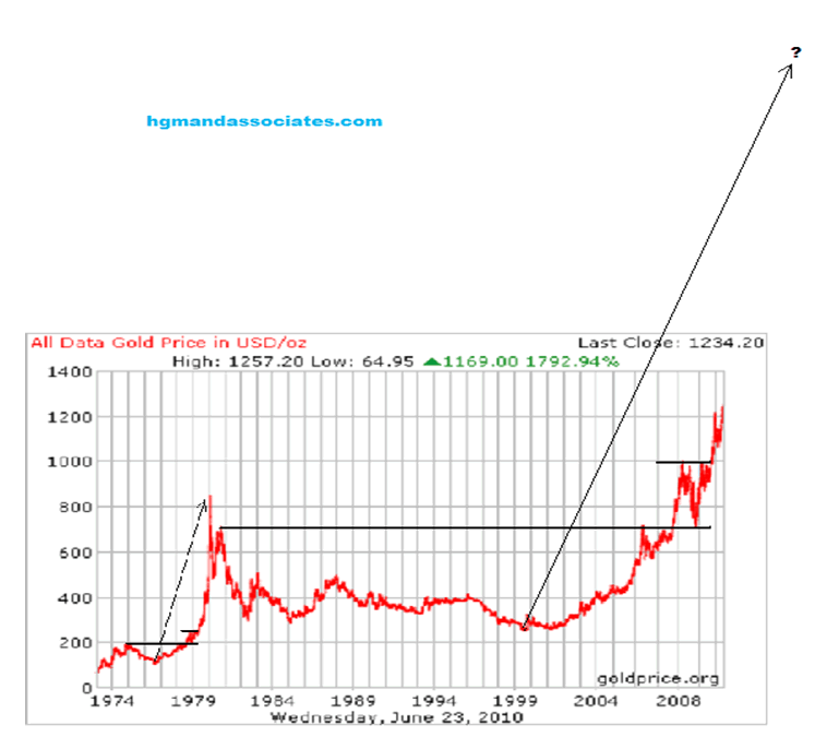
What is the big picture for gold?

The chart above is a long-term gold chart (thanks to goldprice.org). This chart is the big picture for gold, as far as I am concerned. If you look at the chart, like I do, then it should tell you that the gold price is going to explode upwards very soon. It should also tell you why looking at the big picture is so important, and why focussing on gold’s day to day movement might cost you a fortune. For more information about this gold chart and its analysis, you can purchase my Long Term Gold Fractal Analysis Report (email me for details).
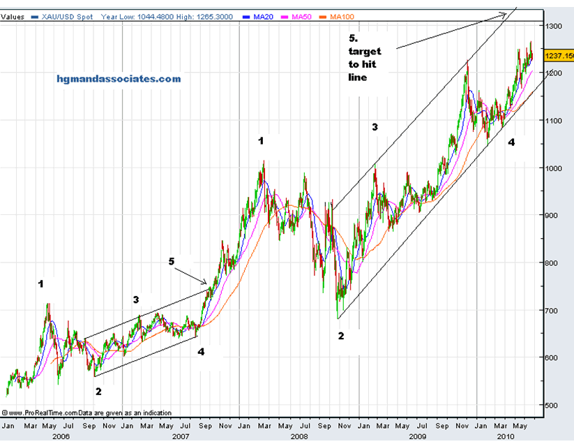
What is the short-term gold picture?

I have marked the two patterns that I feel are similar. I have marked the patterns by highlighting 5 points on each. If the second pattern resolves in a similar manner to the first, then the gold price should hit point 5 on the upper resistance (trend) line indicated on the chart. For these fractals (patterns) to really be similar, there should be a measurable relationship between the two patterns, measurable in terms of time as well as price movement. So, for the second pattern to resolve like the first and still be a valid fractal of the first, it has a certain amount of time to do it, and a certain price movement to cover.
I can tell you that time has been moving, whereas price has not been moving as fast as should be expected (based on the time movement). What does this mean? If these two patterns are actually fractals, then price has to catch up with time, and that should mean strong rallies (shorter time periods) could be coming up. As I am writing this, gold is up $20 the last couple of hours. It is going to be interesting.
Is the big picture in gold, as shown above, consistent with what is going on in the world economy today and with what is expected going forward? Consider the following:
- Debt levels world-wide are at historically high levels
- These debts are holding back the world’s economy, and will continue to do so for a significant number of years. (see here for more on this)
- These debt levels are probably going to bring down the current world monetary system.
- All fiat currencies are depreciating, as measured against gold, and this will increase as more countries struggle to meet their debt obligations
- Tangible assets like gold and silver are under-valued as compared to intangible assets like equities and bonds. This is illustrated by the Dow/gold ratio. (see here for more on this)
When one takes into account the points above, then it is hard not to agree that the big picture in gold, illustrated above, is probably accurate.
If the world’s debt levels are at all-time high levels and are likely to hold back the world’s economy, then this should affect the economics of listed companies and the real values of companies listed on the great stock exchanges of the world.
This does not bode well for Dow and other listed stocks. They will very likely lose real value (as measured in terms of gold, silver and other commodities) over the next couple of years and beyond.
Nominal value (the value as listed on the exchanges in terms of fiat currency), is an altogether different matter. This matter is often referred to under the inflation vs. deflation debate. It makes things easier when one distinguishes between nominal and real values, when trying to understand this inflation/deflation debate, or where the stock markets are going over the next couple of years. One could still have higher nominal values for general stocks, notwithstanding bad economic conditions. Will we have higher or lower nominal values for general stocks over the next couple of years and beyond?
For more on this and gold commentary, you can subscribe to my free newsletter at http://hgmandassociates.com.
There are also some great signals that I like to use when forecasting where the stock market is likely to go in the future. One such signal or proxy is the value of the South African rand compared to other currencies. The South African rand has been a fairly reliable measure or proxy for risk aversion. When the general markets take a hit and everyone is running for safety, the Rand usually gets hit hard.
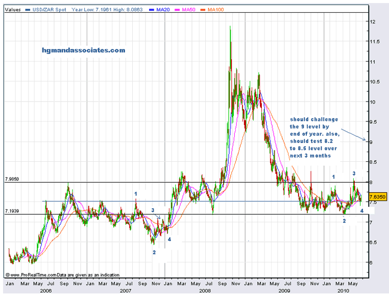
Below are two South African rand charts that I have been tracking. I have done some proprietary fractal analysis, which I would like to share with you.
The first is a 5 year US dollar/SA rand chart (generated on fxstreet.com). In a previous article, I have used this chart and more to show why I think the Dow has topped for now. On this chart, I have indicated two black lines as a possible trading range. I have also indicated two possible fractals. I have marked 4 points on each fractal pattern to indicate how they are similar. If the second pattern resolves like the first pattern, then price should break out of that top line of the trading range and make its way towards the 9 price level. This will likely mean that the Dow will visit the 9000 level. This appears to be consistent with fractal analysis I have done on the Dow.

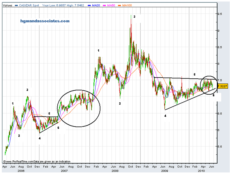
The second is a 5 year Canadian dollar/SA rand (generated on fxstreet.com). Again, I have applied my proprietary fractal analysis to his chart. I really like this chart, since it clearly illustrates (in textbook fashion) how effective fractal analysis can be. This chart gives a clear signal when fractal analysis is applied. It is probably due to the fact that both South Africa and Canada are resource based economies (just a guess).
Again, I have indicated two possible fractals. I have marked 6 points on each fractal to indicate how they are similar. If the second pattern resolves like the first pattern, then price should break out of that top black line, and make its way towards the 8.5 price level. This will likely mean that the Dow will break down. The similarity of the sections indicated by the circles gives me added confidence that the second pattern will resolve like the first.

You can find my older educational gold and silver commentary here: http://blogs.24.com/hubertmooolman
You can find me here for current and educational gold & silver commentary: http://hgmandassociates.com/
***
If you find this information useful, please forward it to friends or family so that I can continue to reach people that would not normally read informative sites such as this one. You can subscribe to my newsletter at http://hgmandassociates.com/. My newsletter is free and I send it out whenever I feel I have relevant information to share. I do gratefully accept donations, though, so that I can continue to research and write. Send me an email for details.
May God bless you.
Hubert Moolman
You can email any comments to hubert@hgmandassociates.co.za
© 2010 Copyright Hubert Moolman - All Rights Reserved
Disclaimer: The above is a matter of opinion provided for general information purposes only and is not intended as investment advice. Information and analysis above are derived from sources and utilising methods believed to be reliable, but we cannot accept responsibility for any losses you may incur as a result of this analysis. Individuals should consult with their personal financial advisors.
© 2005-2022 http://www.MarketOracle.co.uk - The Market Oracle is a FREE Daily Financial Markets Analysis & Forecasting online publication.


