Stock Market Technical Tipping Point Critical Bear Signal
Stock-Markets / Stocks Bear Market Jun 25, 2010 - 03:07 AM GMTBy: Brian_Bloom
 History will remember this day. Whether or not the equity market cracks tomorrow or the next day or in a few weeks time, today is the day that it gave off a critically important signal.
Today is the day that it showed that the 200 day moving average represents resistance to further rises as opposed to support against further falls.
If we look carefully at the chart of the Standard & Poor 500 Industrial Index below (courtesy DecisionPoint.com) we see an array of interesting signals:
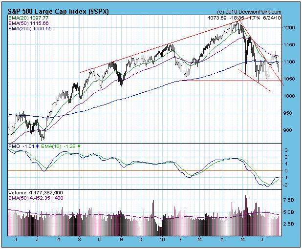
- Having failed to rise above the downward pointing 50 day moving average three days ago, and having broken below the 200 day MA two days ago, yesterday it tried to rally above it again and today it “confirmed” that the bulls did not have the required level of optimistic energy to achieve that objective.
- The fall occurred on rising volume – selling pressure
- The PMO (blue line) began to roll over
Taking a step back, we can look at the weekly chart of the $SPX (also courtesy BigCharts.com)
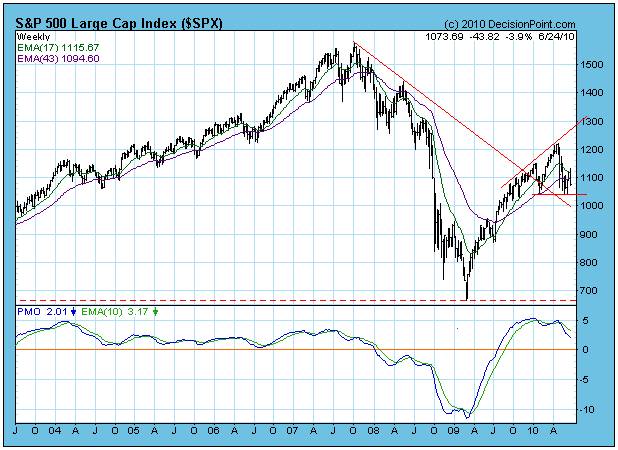
Here we see a PMO that gave a sell signal when the blue line crossed below descending green line for the second time a few weeks ago (the first time was in January). In the process, the PMO showed a non confirmation when it’s most recent top was below that of the January top, even as the index itself rose to a higher high.
In the top half of the chart we see the makings of what some are arguing is a Head & Shoulders Reversal Pattern. If the index breaks below the red horizontal “neckline”, they argue, we could see a fall to around 900 in short order. Of course, it might take another few weeks for that pattern to complete. But, because of this uncertainty as to timing, what we really should be doing is checking to see whether it is a genuine potential H&S pattern. We need to check what volume has been doing.
The image below has been reproduced from Technical Analysis of Stock Trends, fifth edition, by Edwards and Magee. It shows what the volume patterns of a genuine Head and Shoulders pattern should look like
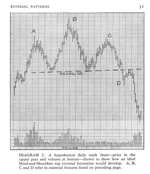
Note that there should be buying pressure on the left shoulder, buying pressure on the head and the emergence of insecurity on the right shoulder which, following a downside penetration of the neckline, should turn into full blown selling pressure after an anaemic attempt to rise back above the neckline.
Let’s have a look at the Dow Jones with volume (Chart below courtesy BigCharts.com)
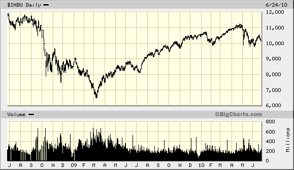
Hmm? Nope. If we focus on the period from November 2009, we see that volume was erratic on the left shoulder and flat on the so-called head. If anything, it has risen on the supposed right shoulder.
So what can we deduce from this?
From this analyst’s perspective, we have not been witnessing a Head and Shoulders reversal pattern at all. We already knew that the market was changing its Primary Direction because, when you draw in the relevant trend lines (as has been done on the chart below) you see a breakdown from a rising wedge (which manifested on falling volume) followed by an attempt to recover, followed by the confirmed failure to recover. The dominant pattern, therefore, is that rising wedge.
The reader is requested to have patience. This is not some theoretical treatise. There are two very compelling reasons why this is relevant.
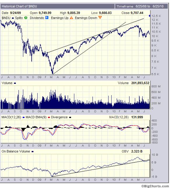
What the above chart shows is a breakdown from the wedge in January 2010 and some backing and filling that followed. i.e. We knew as far back as January that it was time to get out of the market. This analyst wrote an unequivocal article to this affect at that time.
Now, if you look at the On Balance Volume Chart at the bottom of the above chart, you see a breakdown from the rising trend line in early June.
So what? What does it matter if the so-called Head & Shoulders pattern is not genuine; if the end result is the same?
It matters because:
- If it was a genuine head and shoulders, traders might be arguing that there is still time – because the right hand shoulder might take a few more weeks to complete and there is still an opportunity to trade this market. The fact that it is not a genuine H&S points to the conclusion that the market could break down at any time from now.
- If the dominant pattern is a Head and Shoulders, then the measured down move target is 9,000. If the dominant pattern is a rising wedge, then the down move target is 6,500
In particular, if you look at the MACD on the chart of the Dow Jones Industrial Index below (courtesy stockcharts.com) you will see that the histograms are contracting towards the zero line
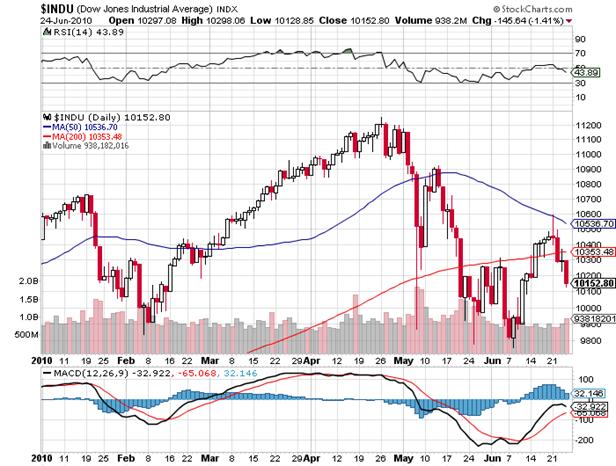
From this it becomes apparent that the breakdown might be imminent and, in earlier articles, this analyst has alluded to the probability that (in his view) any such breakdown would likely be accompanied by panic.
Why panic?
Have a look at the chart of the Baltic Dry Goods Index below (Source: http://www.bloomberg.com/apps/quote?ticker=bdiy:ind )
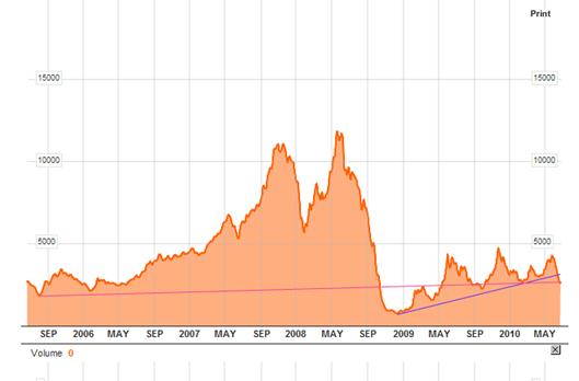
The price of shipping such things as iron ore and coal and grain has broken below a trend line which has been rising since governments started their stimulus programs. This indicates that the stimulus has worked its way through the system. It is now history.
The index is now sitting on support that dates back to September 2005. But here’s the thing: In September 2008 the index fell below that support – which is why the stimulus became necessary. Now, if the stimulus has worked its way through and all we have to show for it is more debt and essentially the same level of unemployment, then why should business activity (and shipping prices) rise from here?
Conclusion
Unless you are a congenital optimist and you can see objective reasons why the world economy should grow from this point, sell all non-strategic listed equity investments. This is no time for rationalizing your investment position based on “hope”.
By Brian Bloom
Once in a while a book comes along that ‘nails’ the issues of our times. Brian Bloom has demonstrated an uncanny ability to predict world events, sometimes even before they are on the media radar. First he predicted the world financial crisis and its timing, then the increasing controversies regarding the causes of climate change. Next will be a dawning understanding that humanity must embrace radically new thought paradigms with regard to energy, or face extinction.
Via the medium of its lighthearted and entertaining storyline, Beyond Neanderthal highlights the common links between Christianity, Judaism, Islam, Hinduism and Taoism and draws attention to an alternative energy source known to the Ancients. How was this common knowledge lost? Have ego and testosterone befuddled our thought processes? The Muslim population is now approaching 1.6 billion across the planet. The clash of civilizations between Judeo-Christians and Muslims is heightening. Is there a peaceful way to diffuse this situation or will ego and testosterone get in the way of that too? Beyond Neanderthal makes the case for a possible way forward on both the energy and the clash of civilizations fronts.
Copies of Beyond Neanderthal may be ordered via www.beyondneanderthal.com or from Amazon
Copyright © 2010 Brian Bloom - All Rights Reserved
Disclaimer: The above is a matter of opinion provided for general information purposes only and is not intended as investment advice. Information and analysis above are derived from sources and utilising methods believed to be reliable, but we cannot accept responsibility for any losses you may incur as a result of this analysis. Individuals should consult with their personal financial advisors.
Brian Bloom Archive |
© 2005-2022 http://www.MarketOracle.co.uk - The Market Oracle is a FREE Daily Financial Markets Analysis & Forecasting online publication.


