


GOLD:CRB The Most Important Chart
Stock-Markets / Financial Markets 2010 Jun 02, 2010 - 02:01 AM GMTBy: Brian_Bloom

 Right now, in my view, the chart below is the most important chart in the book. It is a distilled proxy for investor confidence, world-wide, in the integrity of the financial system.
The ratio of the gold price to the commodities index can be found at http://stockcharts.com/h-sc/ui , courtesy stockcharts.com. When the chart comes up on your screen, enter the following in the space marked “symbol” $GOLD:$CRB
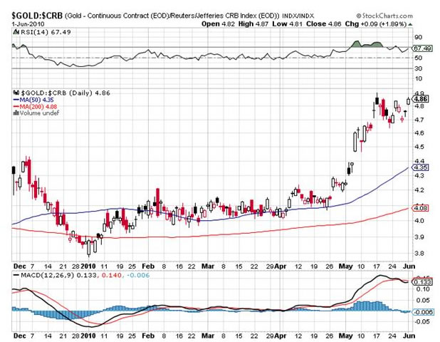
If this chart breaks to new highs (above 5) then it will be evidence of a vote of confidence in gold versus commodities – i.e. that the investment world is no longer viewing gold primarily as a commodity.
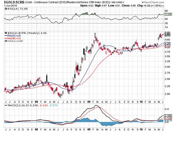
Personally, I prefer to view the market from a distance – by making use of weekly and monthly charts. The weekly chart below shows a 3 year view.
One should not try to second guess whether it will or will not break to new highs. Clearly, there is more at stake now than at any time since the World Depression and the world’s Central Bankers will do everything in their power to prevent such a break out.
But one should also recognize that if there is a breakout to new highs in the above chart, then this will likely be accompanied by a breakdown of the Dow Jones Industrial Chart, which is a proxy for underlying expectations of “future” direction of the US economy.
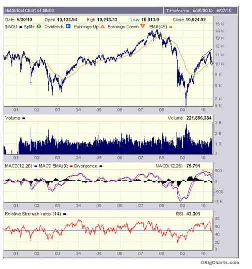
The chart below, of the $INDU (DJ Industrial Index) shows a severely oversold position and the “possibility” that the market may bounce up from here.
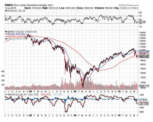
The “hopeful” technical indicators on the above chart are:
The RSI oscillator is standing at 36.24 (the market usually experiences support at this level)
The 45 day moving average is above the 200 day MA
The MACD oscillator appears to be wanting to “tick” up
Unfortunately, when one takes a step back and one looks at the weekly chart (see below), one sees a weekly oscillator that is not yet oversold, and one sees an MACD chart which is evidencing a non confirmation of “falling tops” relative to the rising tops in the Index Chart itself.
What this means, (on a balance of probabilities) is that if there is a bounce it will likely be temporary.
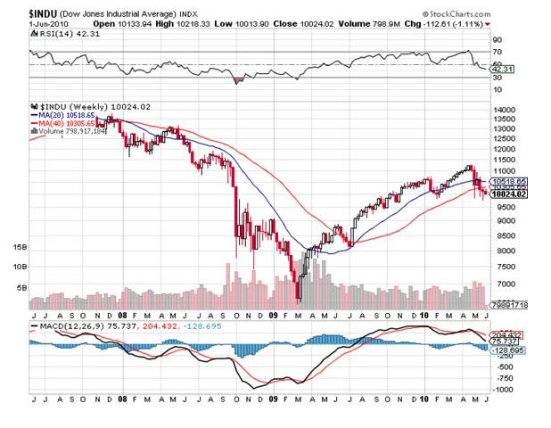
On the daily chart of the DJIA, the thing to watch for is a cross over of the 45 day Moving Average below the 200 day MA. If that happens it will probably represent the last “sell” signal before the emergence of the Primary Bear Market.
Once again, one should not try to second guess the outcome here. There is too much at stake. If that sell signal manifests, it will likely represent evidence of the commencement of an unwinding of the entire financial system – for which there is no historical precedent.
In years gone by we could hope for the economy to heal itself in time. Now, because of the humungous amounts of debt and derivatives in the system, there will be no self healing. It will be necessary to tear the old building down and build a new one, from the foundations up and starting with a new energy paradigm/s to replace fossil fuels, the internal combustion engine and coal fired power stations.
The chart below, courtesy Bigcharts.com, shows the same picture as above, but from the perspective of a decade of history and on logarithmic (percentage movement) scale
Explanation:
I have highlighted the relevant non confirmation of rising tops in the Index Chart and falling tops on the MACD oscillators (MACD = Moving Average Cumulative Differential – which reflects the distance between the 12 week and 26 week Moving Averages, in this case). When the blue line is pointing down, it shows that the 12 week MA is approaching the 26 week MA (bearish). By contrast, if the blue line is pointing up then it shows that the 12 week MA is approaching the 26 week MA on the upside (bullish).
When the blue line crosses over the red line (the 9 week MA of the Blue line) it reflects a technical sell signal if this happens from an overbought situation – which, in this case, it did a few weeks ago – AND FOR ONLY THE THIRD TIME IN TEN YEARS. (I drew the reader’s attention to this when it happened at that time). The previous times were:
In 2004. This was followed by two years of sideways movement on the Index itself
In mid 2007. This was later followed by the market crash of 2008
A few weeks ago.
Arguably, to use a baseball analogy, a few weeks ago we witnessed “strike three”.
The reader’s attention is now drawn to the red line of the RSI oscillator. This oscillator is more meaningful when one looks at its peaks and troughs (a peak is typically followed by a pullback and a trough is typically followed by a rise in the mother indicator – in this case the Industrial Index). In this case I want to draw the reader’s attention to the fact that the index recently penetrated below the horizontal halfway line between the peak of 80 and the trough of 20. Of course, it might bounce up from here (because it is oversold) or it might continue going (because a downside penetration shows relative weakness). There are no rules as to what will happen but, because of “strike 3”, in my view, the odds favour a continuation to the downside.
Having said all this, it cannot be stressed sufficiently strongly that one should not try to second guess the outcome here. There is too much at stake. It is probably more sensible to think in these terms: Based on fundamentals, the market is overvalued. Investors should not be invested in anything other than special situations where the entry price represents value for money in terms of anticipated underlying earnings, regardless of the state of the economy.
Now, just by way of a reality check, one should bear in mind that all of the above is in respect of investor expectations of the future.
The chart of the Baltic Dry Index below (courtesy http://investmenttools.com/futures/bdi_baltic_dry_index.htm ) reflects what is actually happening regarding the tempo of world economic activity. The Baltic Dry Index is a proxy for this and it appears to be encountering some resistance at the first yellow line (the June 2009 top). It also still needs to overcome the resistance of the second yellow line (the November 2009 top) before anyone can claim that the tempo of “actual” business activity is in a confirmed rising trend.
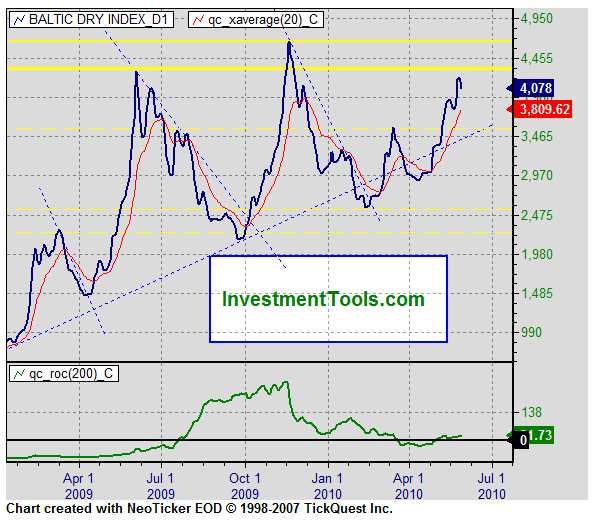
In clear language, if the Baltic Dry Index rises above the second yellow line then this will represent confirmation that the “green shoots” flowing from Central Government stimulation following the September 2008 crash have taken root. By contrast, if the Index falls below the rising dotted trend line, it will very likely indicate that the central governments’ attempts at stimulation have failed.
Based on my understanding of economic theory, there was never any question: The attempts at stimulation were never going to succeed. They were implemented against a background mindset of politicians attempting to protect their entrenched power positions and the positions of the financial and industrial backers. In conceptual economic terms, they represented “mal-investment”.
Conclusion
Whilst the fat lady has yet to sing, the party is over. If, in your cups, you insist on hanging around to hear the fat lady sing then you may still find some dregs in the punch bowl. Typically, there is no fun in that. It’s better to go home and sober up. There will be a lot of repair and reconstruction work to be done before we can start thinking about our next party.
By Brian Bloom
Once in a while a book comes along that ‘nails’ the issues of our times. Brian Bloom has demonstrated an uncanny ability to predict world events, sometimes even before they are on the media radar. First he predicted the world financial crisis and its timing, then the increasing controversies regarding the causes of climate change. Next will be a dawning understanding that humanity must embrace radically new thought paradigms with regard to energy, or face extinction.
Via the medium of its lighthearted and entertaining storyline, Beyond Neanderthal highlights the common links between Christianity, Judaism, Islam, Hinduism and Taoism and draws attention to an alternative energy source known to the Ancients. How was this common knowledge lost? Have ego and testosterone befuddled our thought processes? The Muslim population is now approaching 1.6 billion across the planet. The clash of civilizations between Judeo-Christians and Muslims is heightening. Is there a peaceful way to diffuse this situation or will ego and testosterone get in the way of that too? Beyond Neanderthal makes the case for a possible way forward on both the energy and the clash of civilizations fronts.
Copies of Beyond Neanderthal may be ordered via www.beyondneanderthal.com or from Amazon
Copyright © 2010 Brian Bloom - All Rights Reserved
Disclaimer: The above is a matter of opinion provided for general information purposes only and is not intended as investment advice. Information and analysis above are derived from sources and utilising methods believed to be reliable, but we cannot accept responsibility for any losses you may incur as a result of this analysis. Individuals should consult with their personal financial advisors.
Brian Bloom Archive |
© 2005-2022 http://www.MarketOracle.co.uk - The Market Oracle is a FREE Daily Financial Markets Analysis & Forecasting online publication.