Stock Market Overbought, and at Resistance!
Stock-Markets / Stock Markets 2010 Apr 05, 2010 - 04:03 AM GMTBy: Piazzi
 S&P has been hanging in there near resistance. That should be quite frustrating to bears and out-of-position bulls.
This is a weekly chart
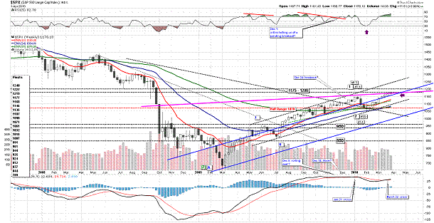
No dramatic change from last week. Last Friday, we had talks of crash and stuff like that, some made comparisons between now and 1987. Well, no such thing as a crash – not yet!
Index has been hitting some significant resistance as you can clearly see from the chart above. The weekly picture has not changed much. The supports of rising MAs are closer in levels than a week before but not by much.
There is not much to do based on the weekly chart – just wait and see if it breaks above resistance towards the 1200 area or pulls back for the ever-so-elusive correction.
There are not a lot of changes on the daily chart either
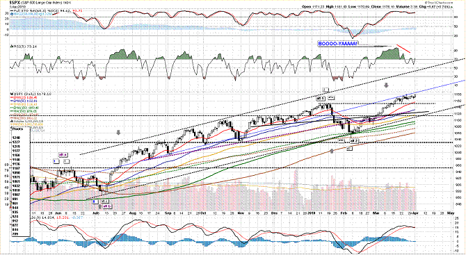
Index is overbought and hugging the mid line of the channel of the daily chart. Divergences are in place, and we have a MACD cross. We have had some distribution days, but no real price correction yet. There is a lot of support from MAs. 1140-1150 looks like a good first area of support.
Breadth has been showing some signs of internal correction. NYSE McClellan Oscillator has been correcting with lower highs and lower lows, but, on Friday, it turned up and got neutral
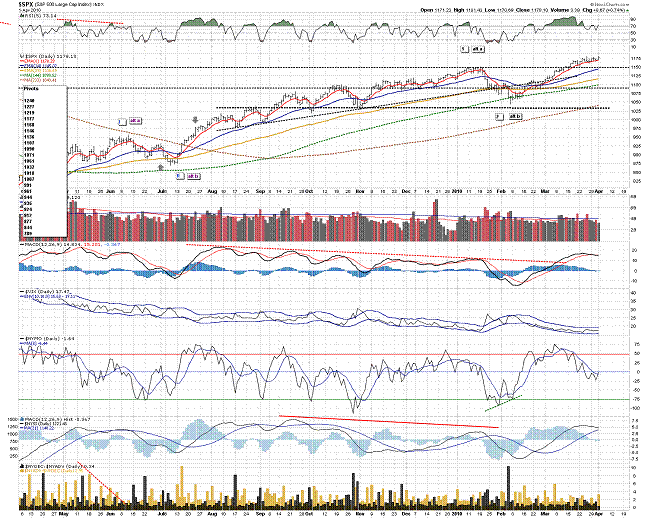
S&P’s McClellan Oscillator shows the same thing as NYSE as well
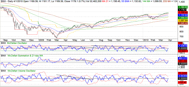
A move back to neutral. It might be that index has another push in it to another high at least. We’ll see on Monday.
There is no denying the fact that index is overbought
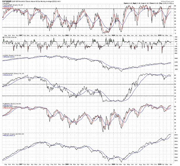
But, being overbought in a strong uptrend does not mean an automatic short. It may mean that existing positions should be reviewed for risk mitigation measures. A new long position is out of question for me at this point.
This is a 60-min chart of the index
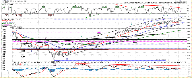
Don’t get caught in the details of the waves, they can be counted in different ways. Instead, pay attention to what price is doing at important levels.
We have series of divergences on the chart. Notice the channel that we have had as a road map for long time now, price has moved to the lower half of the channel and has been vacillating up and down the 34 EMA. A move below 1160 would be a small first step for the bears and a first warning that we may finally have ended the wave from Feb 5 low.
Further below 1140-1150 area looks likes strong support. I am going to raise my levels and say that as long as index is above 1140-1150, it is either consolidating or rallying.
After that, 1110 area is a must hold for the bulls.
Support pivots are at 1177 and 1168. Resistance pivots are at 1219 and 1277
Long term trend is up. Mid-term trend is up. Short term trend is up (a move below 1160 may change that).
------------------------------------------------------------------
NDX had an overall good week as well, but Friday’s action was somewhat rough and disconcerting.
This is a 60-min chart of NDX
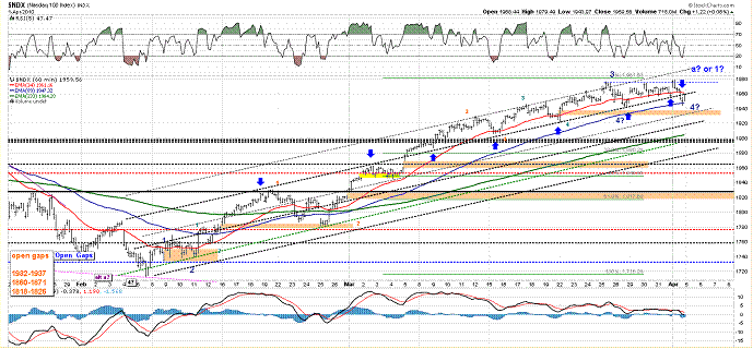
Notice the line that I have punctuated with blue arrows. We have discussed this line before (and the parallels I have drawn against it). On Friday, NDX moved below the line and dipped to 89 EMA before another end-of-day bout of tape attack by buyers (whoever they might be) rescued it from sinking further.
We now have a potential range, 1940-1980, and the resolution of that range will set the next course of action for NDX.
In a sharp contrast to S&P, NDX breadth, as measured by McClellan group of oscillators, had a very poor showing on Friday
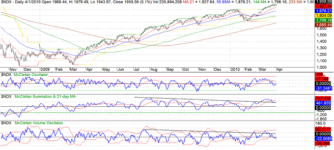
This might be some sort of a washout selloff before a burst to a higher high from the range I mentioned above. Or it might be the beginning of a move out of techies. We can’t really say for sure. Looking at the chart above, we see that every flat top after a rally since March 2009 low has been followed by a correction, so, I would wait for this range to resolve one way or the other. If it is going to break out to the upside, I would like it to go sideways for a while and relieve some overbought conditions. If it’s going to break below and correct, I would like it to rush down in a hurry and scare as many as possible.
This is a comprehensive view of flat tops since March 2009
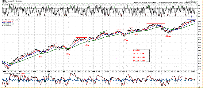
I am not predicting a repetition is either pattern or point correction – just a simple study, that’s all, and, hence, the question mark at the end.
One more thing about the chart above and past correction:
Notice that every 4+% correction has either reached or cut 233 EMA on the 60-min chart.
This is a daily chart of NDX I have been using for NDX posts
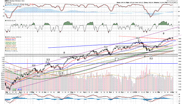
In a recent post, I pointed to the area between the red and blue lines and said that I liked that area to offer a buffer zone and absorb any possible selling bouts.
So far, NDX has stayed above the red line. Notice how 21 EMA is catching up with the index right around the red line. That is like technical fortification for that area as a first zone of support.
In the previous post on NDX, I said:
“I am personally wary of new long positions unless I get a better entry after some sort of correction/consolidation. For existing positions, not much to do other than evaluating for stops/hedge/insurance/profit taking based on personal risk parameters.”
That still is the case, but, now, we have a potential sideways range (1940-1980) that may offer an entry. I just need to see how it plays out.
I also said:
“A somewhat sideways consolidation that would allow all, or some, of the MAs to tighten up, or catch up is always the best sign of a healthy trend unwinding its excesses, and energizing before another run. The key would be to wait the start of the run, like we did in the period prior to Dec 2009 takeoff.
If we are going to get a range breakout to the upside, I would like NDX to ideally do a few more chops in the range and relieve some overbought conditions.
And then I said:
“On the other hand, a sharp correction that scares the pants off headline pushers and babble-heads, and gets bears into a shorting mode can potentially offer the best entries. Potentially is, of course, the defining phrase. The key is to get the index nicely oversold in lower time frames without damaging the technical profile of higher time frames. Best would be daily oversold while weekly stays positive, flattens or holds support. The period of the correction of Jan-Feb 2010 can give you an example of that.”
That would be a break below 1940 area, and we’ll see how things unfold after that.
Let’s take a quick look at the weekly chart
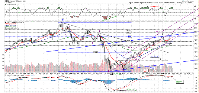
At resistance and overbought!
We just need this situation to resolve.
Long term trend is up. Mid-term trend is up. Short term trend is rather lateral (a move below 1940 may turn the short term trend down).
Happy Easter!
By Piazzi
http://markettime.blogspot.com/
I am a self taught market participant with more than 12 years of managing my own money. My main approach is to study macro level conditions affecting the markets, and then use technical analysis to either find opportunities or stay out of trouble. Staying out of trouble (a.k.a Loss) is more important to me than making profits. In addition to my self studies of the markets, I have studied Objective Elliott Wave (OEW) under tutorship of Tony Caldaro.
© 2010 Copyright Piazzi - All Rights Reserved Disclaimer: The above is a matter of opinion provided for general information purposes only and is not intended as investment advice. Information and analysis above are derived from sources and utilising methods believed to be reliable, but we cannot accept responsibility for any losses you may incur as a result of this analysis. Individuals should consult with their personal financial advisors.
© 2005-2022 http://www.MarketOracle.co.uk - The Market Oracle is a FREE Daily Financial Markets Analysis & Forecasting online publication.


