Technical Analysis Report on 68 Gold Stocks
Commodities / Gold & Silver Stocks Aug 10, 2007 - 12:23 AM GMTBy: Jordan_Roy_Byrne
As per the title, I completed a 71 page report on 68 gold stocks. If you go to my home page, http://www.trendsman.com you can buy this report for the economical sum of $40. Each stock has a chart and a paragraph analysis of its six to 18 month technical outlook. With that shameless promotion out of the way let's get to some analysis of gold and the gold stocks.
This lengthy update gives a lengthier look at gold and the gold stocks. Say a one to two year outlook.
To help predict future price action, one thing I do is look at previous bull markets. While the precious metals differ greatly from other markets, price action between various bull markets always maintains similarities. Before we get to the gold stocks I want us to look at the Nasdaq and specifically the Bollinger Band pattern.
As you may or may not know, most large moves begin with a low point in volatility. One way to measure volatility is by the width of the Bollinger Bands. As you can see from the chart, after each low point in volatility, the 18 month rate of change hit a high about 12 to 18 months later.
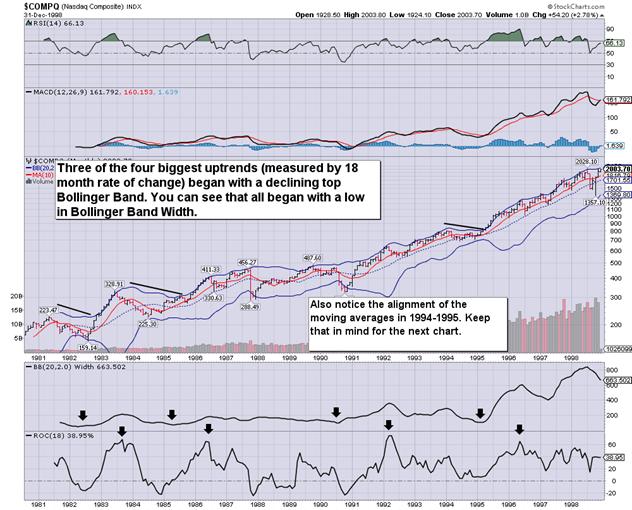
Another thing we can look at is the direction of both bands. Three of the four biggest moves (measured by 18 month ROC), commenced when the upper band was declining and when the lower band was rising. That occurred in 1982, 1984, and in 1994. Lastly, note the position of the moving averages in 1994 before this market advanced in unabated fashion. From 1991 to 1994, the moving averages indicated a strong rising trend. At the turn of 1995, the 10 month average barely undercut the 20 month average before both began rising as the market took off. Now zooming in as I write this, the 20 month average never declined, while the 10 month average declined slightly for eight months before it resumed up.
Now let's take a look at the XAU:
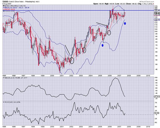
Now at the current point, the 20 month moving average (since this consolidation began) has yet to decline, while the 10 month moving average declined for eight months. It has turned up again. So these current averages are sitting in the same precise setting they were on the Nsadaq chart in early 1995. The Bollinger Bands are also squeezing in, as they did for those three periods in the aforementioned Nasdaq chart.
What Nasdaq period could this next bull move follow? The pace at which the bands are squeezing in, is similar to 1982 and 1984. Though the current corrective price action within the bands as well as the moving averages, strongly resemble 1995. I tend to think it is going to be either 1984 or 1995. The best indication may be the XAU in late 2001. See how the bands squeezed in then? Overall, the answer to this question is not terribly significant, it just provides another question for us technician geeks to try and figure out.
Keep in mind that the above chart is a monthly chart. Daily signals may take a few days to play out while monthly signals may take a few months to play out. Further consolidation for several more months does not necessarily invalidate the current signals.
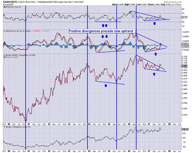
Next up is a weekly line chart showing the XAU/S&P 500. While many technicians look to the gold stock/ gold ratio for guidance, I look at this ratio first. Gold stocks can trend with the market but they will never have an impulsive move up without outperforming the stock market.
As you can see, the XAU follows the XAU/SPX ratio. The current picture looks much the way it did in mid 2005. The positive divergences in RSI and MACD preceded the end of that consolidation. Again we have divergences preceding a recent breakout. Carefully watch this ratio. We have a short to near term buy signal. A move up to 0.105 would give an intermediate to long term buy signal.
How about gold?
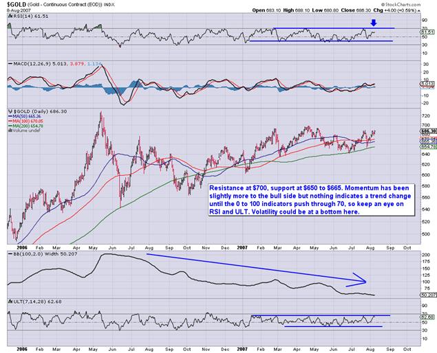
Gold continues to be trapped in a consolidation range from $640 to $700 with an upside bias. It looks like in the next week or so we may get another test of the high of that range. Confirming a breakout over $700 would be a 70+ reading on RSI. The indicators and moving averages are in beautiful position for gold to stage a very large breakout. That being said, be aware that the yellow metal has struggled to break past $700.
Are there any other charts that might help us predict the direction of gold and gold stocks? Of course. I will show you two.
Next is gold against the industrial or base metals. As we can see from this chart, most of the gains in both gold and the gold stocks occurred while gold was outperforming the base metals. Since the end of 2003 when the base metals have outperformed gold, there has been only one impulsive advance in both gold and the gold stocks. Gold has now made a double bottom and over the next few months could stage a nice breakout against the base metals.
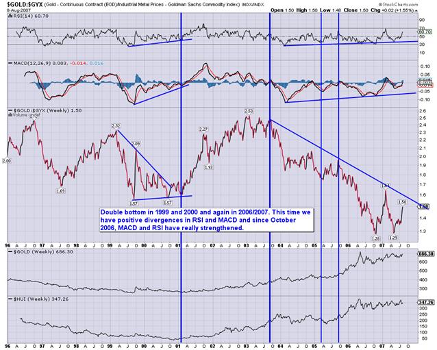
Why is it important to the gold companies, to see gold outperforming the industrial commodities (base metals)? Mining is a costly and intensive business. Rising industrial prices impact the cost of exploring for, developing and ultimately producing gold and silver. Thus, it hurts the PM companies to see industrial prices rising ahead of gold and silver.
Next we have Gold against Oil.
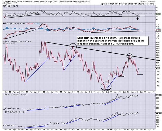
While gold and oil generally trend in the same direction, we can see from this chart that during three of the impulsive phases in gold and gold stocks, gold was outperforming oil. Oil has been outperforming gold for six years but we could see a reversal. There is a long term inverse head and shoulders pattern (see the circles). In the near term this ratio is oversold and should continue to rise. Also, this ratio has made a nice rally at the end of the year during five of the past seven years. If the ratio can break the six year downtrend, the new target would be roughly $19.
Conclusion
The last few quarters have been difficult for investors holding gold shares. Each rally has given hope to the beginning of a new major uptrend, only to consistently fail. Rest assured, despite this seemingly terminal consolidation, the technical and fundamentals have grown stronger. It is true that manipulation and intervention can distort signals but this is mostly true in a short term sense. How else would gold and gold stocks have risen so significantly since 2001? It's called a bull market.
To get my report on 68 gold stocks, go to http://www.trendsman.com . To sign up for my free newsletter, go here: http://trendsman.com/?page_id=17
By Jordan Roy-Byrne
trendsman@trendsman.com
Editor of Trendsman Newsletter
http://trendsman.com
Trendsman” is an affiliate member of the Market Technicians Association (MTA) and is enrolled in their CMT Program, which certifies professionals in the field of technical analysis. He will be taking the final exam in Spring 07. Trendsman focuses on technical analysis but analyzes fundamentals and investor psychology in tandem with the charts. He credits his success to an immense love of the markets and an insatiable thirst for knowledge and profits.
Jordan Roy-Byrne Archive |
© 2005-2022 http://www.MarketOracle.co.uk - The Market Oracle is a FREE Daily Financial Markets Analysis & Forecasting online publication.


