


Gold in High Risk Period, Could Test Support at $970
Commodities / Gold & Silver 2009 Dec 07, 2009 - 04:37 PM GMTBy: Ned_W_Schmidt

 Chairman Bernanke is in the process of being reconfirmed in his role as Chairman of the Federal Reserve. While some criticism of the Federal Reserve was forthcoming at the Senate hearings, why were not true alternative candidates considered? Henny Penny, for one, comes to mind. One of the Three Blind Mice would also seem to be a good candidate. How about an ostrich that each time an asset price bubble seems possible, it puts its head in the sand?
Much talk is being made in the U.S. Congress that the Federal Reserve needs to be more transparent. But note, no one ever really wants to see how they make sausage. The same might be true for U.S. monetary policy. We might truly have a dollar rout if the world discovered how U.S. monetary policy is actually established. For example, do they use one dart, or best of three?
Congress could indeed improve the Federal Reserve. It could do so by passing a law giving the Federal Reserve one simple mandate. That mandate could be very easily stated: First, do no harm! From the economic results of the last decade a reasonable observer would conclude that the Federal Reserve has done more harm than good. They appear to be in the business of fixing windows that they themselves broke.
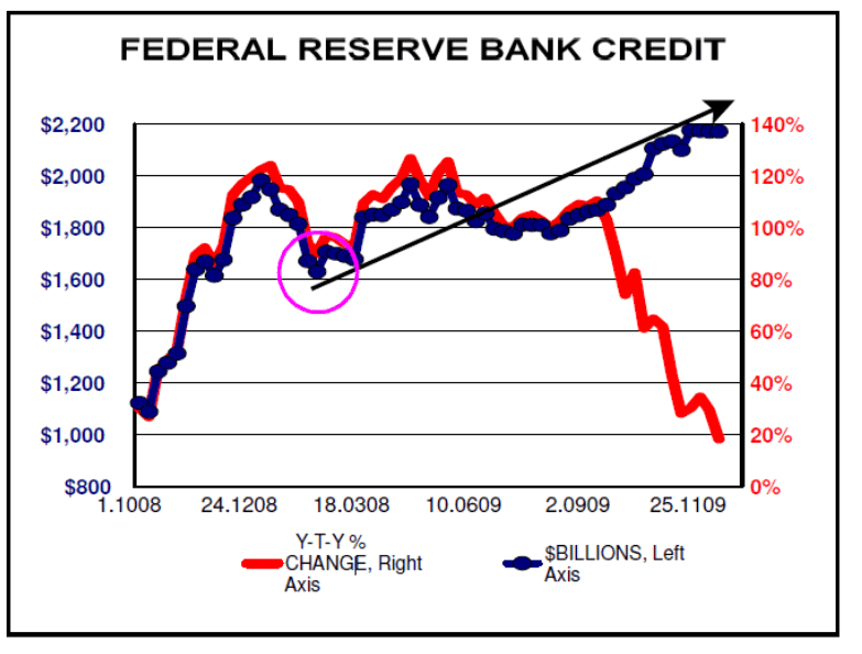
Many are mired in a near hopeless effort to assess the consequences of U.S. monetary policy. To be successful at that forecasting task one needs to understand what the Federal Reserve is actually doing, often a difficult task. What is their policy? Does the Federal Reserve truly have a policy? Consider out first chart for this week, above. What is the dominant policy evident in that chart? Viewing that chart is the equivalent of the three blind men attempting to describe an elephant.
The solid blue line in that chart, using the left axis, is of Federal Reserve Credit. That simply is the size of the Fed’s balance sheet. That red line, using the right axis, is the year-to-year percentage change in Federal Reserve Credit.
In the early part of the graph is the massive liquidity injection brought on by the collapse of the financial bubble created, bu not observed, by the Federal Reserve. A reasonable forecast built on that activity would have been for higher U.S. inflation. That inflation did not develop due to the deflationary impact of the financial collapse.
Second possible policy identifiable is that relatively flat period for Federal Reserve Credit. We assume that the Federal Reserve was resting during this period. Or, perhaps they were waiting to see what would happen as a consequence of their previous activities. They do seem clueless as to the consequences of their actions.
But note that low, or bottom, in Federal Reserve Credit that occurred in March of this year. We put a circle around it. From then, as marked by the arrow, the Fed embarked on an irregular pattern of injecting reserves into the U.S. banking system. Measuring from that low, about $600 billion of reserves were pumped into the U.S. financial system. Not surprising is that the action in both the equity markets and Gold seem to closely parallel this monetary activity.
Turn now to the final period in the graph. There we find a marked divergence between the absolute size of Federal Reserve Credit and the percentage change in that measure. The absolute size of Federal Reserve Credit continued, until recent weeks, to expand. However, at the same time the percentage change has been plunging. That dramatic slowing of the growth rate of Federal Reserve Credit, regardless of the words issued by the Chairman, is an indication of a tightening of policy. Should that red line continue slowing, some rather negative short-term consequences for U.S. equity markets and the price of US$Gold would develop.
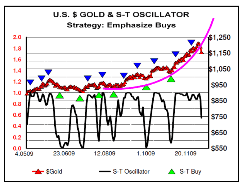
Our second chart, above, plots $Gold along with our overbought/oversold oscillator. The first important observation in that chart is the mini parabolic curve that has been fitted to the pricing. Such patterns are always a warning because they are almost universally resolved in a negative manner. The combination of U.S. monetary policy that is effectively tightening in nature and $Gold slipping through the parabolic curve suggests a high risk period for $Gold. The important area of support at US$970 could be tested.
In closing we note two indicators, of the many that exist. One is reliable and the other might be. Option traders reported this weekend that option sentiment had shifted on Gold and GLD away from calls and toward put options. Those trading the dollar index related derivatives also noted a shift to the bullish side of the dollar. Finally, a minor explosion of email suggested that this author is mentally deranged for not understanding that Gold was going straight up to $5,000. Will leave it to you to decide which is the reliable indicator.
By Ned W Schmidt CFA, CEBS
Copyright © 2009 Ned W. Schmidt - All Rights Reserved
GOLD THOUGHTS come from Ned W. Schmidt,CFA,CEBS, publisher of The Value View Gold Report , monthly, and Trading Thoughts , weekly. To receive copies of recent reports, go to http://home.att.net/~nwschmidt/Order_Gold_GETVVGR.html
Ned W Schmidt Archive |
© 2005-2022 http://www.MarketOracle.co.uk - The Market Oracle is a FREE Daily Financial Markets Analysis & Forecasting online publication.