


Financial Assets Classes Quantitative Chart Analysis Comparisons
Stock-Markets / Investing 2009 Jun 11, 2009 - 04:35 AM GMTBy: Richard_Shaw

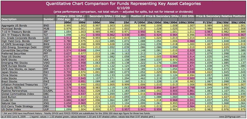
 This table presents 336 data points that quantitatively compare 12 attributes of the price charts for 28 key asset categories that may be found in many portfolios. The categories include representation for domestic and foreign bonds, hybrid securities, domestic and foreign stocks, real assets, commodities and currencies.
The data provides a compact way to help develop an overall perspective on market performance and trends.
Data in the table first shows the ratio of the current 200-day simple moving average to its level 20 days ago and 200 days ago, as an indication of the short-term and long-term direction of the primary trend.
The data then shows the ratio of the current 100-day, 50-day, 25-day simple moving averages to their value 20 days ago, as an indication of the short-term direction of secondary trend indicators.
Next, the data shows the ratio of the price and the secondary trend indicators to the current primary trend.
Lastly, it shows the relative position of the price and the secondary trend levels to each other by showing the ratio of the price to the 25-day average, the ratio of the 25-day average to the 50-day average, and the ratio of the 50-day average to the 100-day average.
Those ratios that fall within 3% (1.03 to 0.97) are shaded yellow to indicate relative stability or flatness. Those with variation greater than 3% are shaded pink or green.
Pink shading is for ratios less than 0.97, indicating a downward movement (or for relative positions indicating an adverse relationship).
Green shading is for ratios greater than 1.03, indicating an upward movement (or for relative positions indicating a favorable relationship).
By Richard Shaw
http://www.qvmgroup.com
Richard Shaw leads the QVM team as President of QVM Group. Richard has extensive investment industry experience including serving on the board of directors of two large investment management companies, including Aberdeen Asset Management (listed London Stock Exchange) and as a charter investor and director of Lending Tree ( download short professional profile ). He provides portfolio design and management services to individual and corporate clients. He also edits the QVM investment blog. His writings are generally republished by SeekingAlpha and Reuters and are linked to sites such as Kiplinger and Yahoo Finance and other sites. He is a 1970 graduate of Dartmouth College.
Copyright 2006-2009 by QVM Group LLC All rights reserved.
Disclaimer: The above is a matter of opinion and is not intended as investment advice. Information and analysis above are derived from sources and utilizing methods believed reliable, but we cannot accept responsibility for any trading losses you may incur as a result of this analysis. Do your own due diligence.
Richard Shaw Archive |
© 2005-2022 http://www.MarketOracle.co.uk - The Market Oracle is a FREE Daily Financial Markets Analysis & Forecasting online publication.