Stock Market Rally, Focusing on the Facts
Stock-Markets / Stocks Bear Market Jun 04, 2009 - 02:51 AM GMTBy: Brian_Bloom
 There is no doubt that the equity markets have been rising in recent weeks. It would be foolish to argue with that fact. There is also no doubt that those who have “played” the rise will have made significant profits during the past few weeks. Indeed, according to the chart below – courtesy Bigcharts.com – the Dow Jones Industrials Index has risen by over 30%. To those who caught that particular wave: Well done!
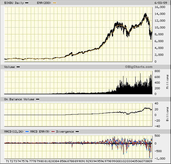
Of course, there is a reason this analyst has chosen to reflect a 38 year chart as opposed to (say) a one year chart: As with all things in life, it is important to maintain a perspective.
There are four facts which stand out in the above chart:
- Volume of shares traded began to explode upwards from around 1998.
- Subsequent to 1998, there have been three lower bottoms and 2 higher tops in the index. i.e. The past decade has been a highly emotionally charged period.
- The Index is currently below its falling 200 day moving average (as it was at the end of 2002)
- The On-Balance-Volume line was bouncing up from a cumulative zero level at the end of 2002, whilst it is currently around the cumulative 20 billion mark.
Let’s focus on 4 above. What is this telling us?
At the end of 2002, the OBV level of zero indicates that the “accumulation” that had been creeping into the market since 1988 had been washed out. On balance, in 2002, those who had bought in the previous 14 years had sold out and, if there had been any further selling, on balance, subsequent to 2002, this would have been an indication that shareholders who had bought prior to 1988 would have had to have been exiting the market. Of course, given the IPOs that were made subsequent to 1988, this is not a strictly correct argument, but the existence of the IPO’s serves to reinforce the argument rather than negate it. From 2003 the market began rising from a low base of buying accumulation.
Interim Conclusion #1
Today, around 20 billion shares, cumulatively, are being held by people and institutions who acquired them in the past 6 years or so.
Author comment: If the market falls from here, there will be a lot of egos damaged – to say nothing of the damage that will be done to personal balance sheets. Clearly, there is a strong vested interest on the part of those currently invested to see this market continue to rise from this point.
The above interim conclusion begs the question as to what caused the market to rise from 2003 onwards? What was it that investors were anticipating with such enthusiasm?
Well, here’s a cross section of what happened immediately following 2003:
For example, it can be seen from the chart below that new home sales rose from around 800,000 units in 2003 to around 1.4 million units in 2005.
![[NHSApril09.jpg]](/images/2009/June/stocks-rally-4_image003.jpg)
Source: http://www.calculatedriskblog.com.. / http://4.bp.blogspot.com/..
By way of another example, at the end of 2002, investment in hotel accommodation bottomed out at around 0.1% of GDP and subsequently rose to a peak of over triple that number. (Double the average of the preceding 30 years)
![[LodgingQ1.jpg]](/images/2009/June/stocks-rally-4_image005.jpg)
Source: http://www.calculatedriskblog.com/
There was certainly an unusually powerful force of optimism prevailing between 2003 and 2006 in the residential sector of the real estate market and this optimism seems to have flowed into the non residential sector of real estate investment – as can be seen from the chart below:
![[ConstructionSpendingApr09.jpg]](/images/2009/June/stocks-rally-4_image007.jpg)
Source: http://1.bp.blogspot.com/..
Interim Conclusion #2
The optimism in the residential real estate market peaked out in early 2007 (at the same time as the stock market peaked) but optimism in the non residential real estate markets only really peaked out recently.
Now, all this begs the question as to what might have caused this surge in optimism?
The chart below – courtesy DecisionPoint.com – offers an important clue.
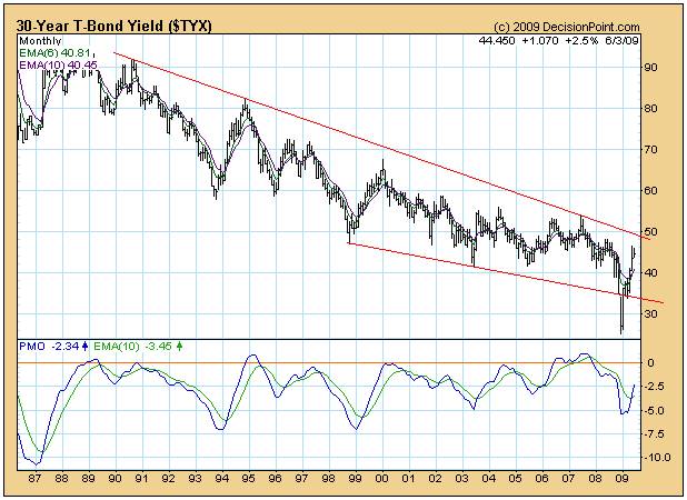
It can be seen from this chart that the long bond yield bottomed out at around 4% in 2003 and remained at historically low levels until around 2006 – at which point it started to rise.
Interim Conclusion #3
For three years – from early 2003 to late 2006 – the price of money was at the lowest level it had been during at least the previous 15 years. By implication, it appears that low interest rates and freely available credit “drove” the optimism which, in turn, drove the investment boom in the real estate market and the stock market.
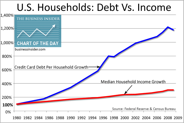
Well, if low interest rates and excessive optimism caused people to borrow money, surely this would have showed up as escalating levels of personal borrowing?
In fact – as the following chart shows – this is precisely what happened. But what this chart also shows is that the rising debt levels did not commence in 2003, they merely continued to rise.
http://www.businessinsider.com/..
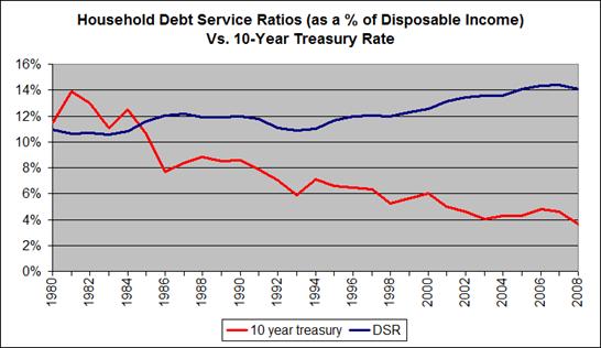
The really important issue was not so much the level of debt, but the ratio of debt service obligations as a percentage of disposable incomes. As the chart below shows, from 2003 onwards this ratio continued to rise notwithstanding the historically low level of the ten year bond yield (which is a proxy for interest rates)
Source: http://chartingtheeconomy.com/
Of course, all this begs the question regarding the levels of optimism/pessimism that will likely prevail if yields (interest rates) begin to rise again.
The chart below is a 3% X 3 box reversal chart of the 30 year Treasury Bond yield.
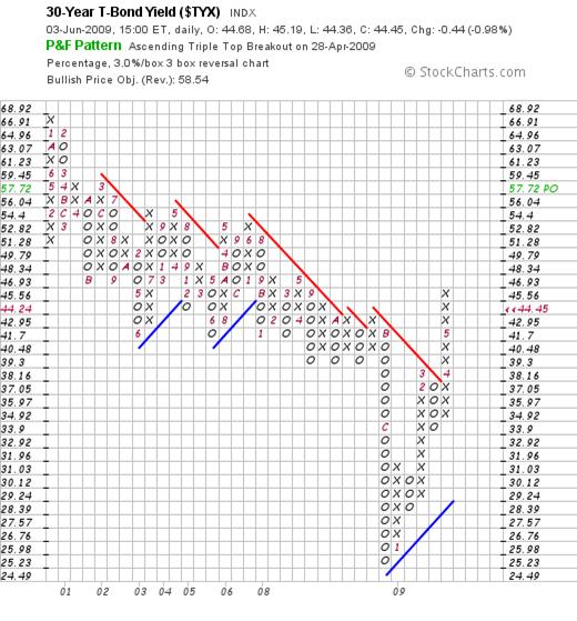
It is probably important to give a brief explanation of how this chart is constructed and what it means.
Point and Figure charts are constructed in a manner which ignores time. If the price of any item is rising, this will be reflected in a perpendicular column of rising “x”s and if the price begins to fall, this will be recorded in a perpendicular column of falling “o”s. The chartist chooses the scale of the chart to filter out noise that arises from day-to-day trading. In the above chart, only a 3% change in the 30 year yield is recorded and, if the preceding column of “x”s or “o”s is to give way to a subsequent change in direction, no “o” or “x” will be plotted until there has been a 3 X 3% = 9% move in the opposite direction. Thus, for example, unless the 30 year yield falls to below 4.17%, no “o” will be reflected in the subsequent column.
This type of chart allows the chartist to make some broad brush predictions based on a set of loose rules which have emerged over many years of watching investor behaviour. In this case, it would appear that the 30 year yield might be expected to rise to at least 5.77% but without reference to time. It might take weeks, months or years to get there but it seems likely that, eventually, it will get there based on a particular set of loose rules. (The reader is cautioned that technical analysis is not a science and cannot be reduced to mechanical interpretation. It should merely be used as one of an arsenal of weapons in the investment war).
Interim Conclusion #4
There appears to be some upside pressure on interest rates that is creeping, quietly and without fanfare, into the market place.
If this is true, then surely it will be having an impact on consumer optimism/pessimism.
The chart below demonstrates clearly that consumers have become significantly more cautious in their attitudes in the recent past.
![[SavingApril09.jpg]](/images/2009/June/stocks-rally-4_image016.jpg)
What is of particular interest in the above chart is not so much that personal savings rates have jumped from around zero at end 2006 to around 5% of disposable income at present, but that this jump has caused a falling trend line to be penetrated on the upside. The trend in question – that has been in place since January 1985 – has been broken!
Conclusion
The evidence (the facts) strongly suggests that the boom in asset prices which began to manifest in the early 1990s was probably driven by a pervasive feeling of optimism which, in turn, was facilitated by an era of low priced money and easy access to credit.
There is tentative evidence emerging that this era of easy money may be drawing to a close (regardless of what the politicians and/or Federal Reserve Board may be attempting to achieve to the contrary) and that this bottoming of interest rates – and concomitant tightening of credit – is forcing a change in borrower attitudes.
This change of attitude is manifesting as a swing to conservatism, as consumers have been moving to save a higher proportion of their incomes. This change in attitude may well be the beginning of a new trend towards a heightened level of conservatism.
Finally, it will be constructive to pose the question as to why the financial authorities chose to loosen money and credit availability in the first place.
In this analyst’s view, the answer to this particular question lies at the root of all our economic problems – which problems can be summarized pictorially by the following chart:
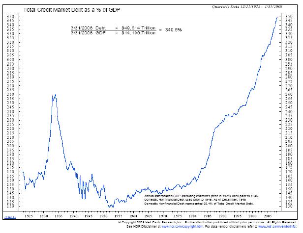
Source: http://uselectionatlas.org/FORUM/index.php?topic=91933.0
The ultimate problem revolves around the decline in genuine “wealth creation” activities in the Western World in general and in the USA in particular. For example, wealth is not created by money and credit. It is created by energy input and work which adds value to that which is being worked upon. For example, the Information Technology Industry is not per se a wealth creating industry. It is a wealth creation facilitation industry. I.T. smoothes the path towards wealth creation activities in that it allows for minimization of energy input to achieve a given work output.
At the end of the day, the source of all wealth is the horsepower that is applied in conjunction with human ingenuity to achieve value-add. At the end of the day, because the energy output across the planet (as measured in barrels of oil equivalent) has been flat since the 1970s, the quantum of real wealth creation per capita across the planet has been flat since the late 1970s.
Overall Conclusion
The current financial “crisis” was caused by the fact that our political and financial authorities thought they could manage the wealth creation process by printing ever increasing amounts of money and extending ever increasing amounts of credit.
Signs are now emerging – evidencing a sobering of irrational optimism – that the public is beginning to understand that monetary and fiscal policy does not drive wealth creation.
Author’s comment
From one perspective, this sobering attitude may be a positive development as people come to understand that there is a natural correlation between effort input and value output; and that there is really no such thing as a free lunch. From another perspective, we still have to address the issue of Peak Oil. Where will the energy horsepower come from that will drive the world economy going forward? That, ultimately, is the core question.
In my recently published novel, Beyond Neanderthal, I have attempted to point an alternative direction of investigation regarding the answer to that question. From where I am sitting, the combined energy availability from all “mainstream” alternative energy sources added together will be insufficient to replace fossil fuels in the foreseeable future. In simple English, the sun doesn’t shine at night, the wind doesn’t blow every day, and the electricity storage technologies currently extant are inadequate to the task. It would be sensible to recognize and face this fact and to do everything in our power to address it – whilst we still have time.
Brian Bloom
Author, Beyond Neanderthal
June 4, 2009.
Post Script
The Chart below of JP Morgan (courtesy Bigcharts.com) is not inspiring confidence in the longevity of the current upward technical reaction of share prices within the Primary Bear Trend. Note how the On-Balance-Volume chart has been rolling over since the beginning of May.
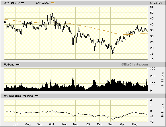
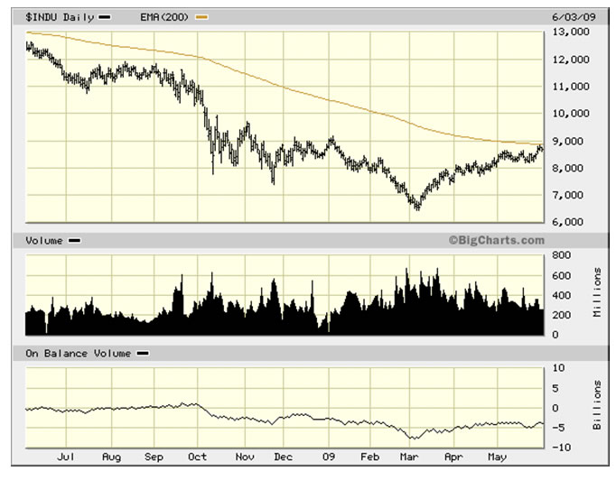
Relative to the Dow Jones Industrial Index (chart below) the above chart might possibly be viewed as a leading indicator.
By Brian Bloom
Beyond Neanderthal is a novel with a light hearted and entertaining fictional storyline; and with carefully researched, fact based themes. In Chapter 1 (written over a year ago) the current financial turmoil is anticipated. The rest of the 430 page novel focuses on the probable causes of this turmoil and what we might do to dig ourselves out of the quagmire we now find ourselves in. The core issue is “energy”, and the story leads the reader step-by-step on one possible path which might point a way forward. Gold plays a pivotal role in our future – not as a currency, but as a commodity with unique physical characteristics that can be harnessed to humanity's benefit. Until the current market collapse, there would have been many who questioned the validity of the arguments in Beyond Neanderthal. Now the evidence is too stark to ignore. This is a book that needs to be read by large numbers of people to make a difference. It can be ordered over the internet via www.beyondneanderthal.com
Copyright © 2009 Brian Bloom - All Rights Reserved
Disclaimer: The above is a matter of opinion provided for general information purposes only and is not intended as investment advice. Information and analysis above are derived from sources and utilising methods believed to be reliable, but we cannot accept responsibility for any losses you may incur as a result of this analysis. Individuals should consult with their personal financial advisors.
Brian Bloom Archive |
© 2005-2022 http://www.MarketOracle.co.uk - The Market Oracle is a FREE Daily Financial Markets Analysis & Forecasting online publication.


