Misleading Jobless Claims Economic Data and Recessions
Economics / Market Manipulation May 06, 2009 - 04:56 PM GMTBy: Tim_Iacono
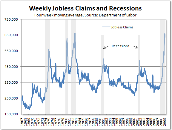
 One of the many "green shoots" that has popped up recently for the U.S. economy is the possible peaking of weekly jobless claims, what has been increasingly referred to as a "reliable" indicator for the end of recessions since 1967 when this data was first collected. The chart below, similar to the one published by CR in this item from a couple weeks ago shows the correlation.

That certainly looks promising.
With the four week moving average having dropped from almost 660,000 per week in early-April to just under 640,000 per week in last week's report, many now think that everything is falling into place for a speedy conclusion to this recession.
The stock market certainly thinks the recession is over...
This item at Voxeu by Robert J. Gordon, an economist at Northwestern who also happens to be a member of the National Bureau of Economic Research committee (i.e., the group responsible for determining the official start and end of recessions), provides an update on this relationship, going so far as to examine "false peaks" before concluding that "it is highly probable that the new claims peak has now occurred".
Naturally, that would mean that the recession, if not already over, will soon be over.
Looking at the chart above, it all makes sense - you'd think that we've reached a peak similar to that seen in previous recessions, just shy of the 1982 mark of 670,000, and that things are sure to improve from here on out.
But, that may not be the case because that chart is very misleading.
And, interestingly, it is misleading for reasons that were touched on very briefly in the Voxeu piece, but not examined further before arriving at the optimistic conclusion that the end of the recession is nigh.
How is it misleading?
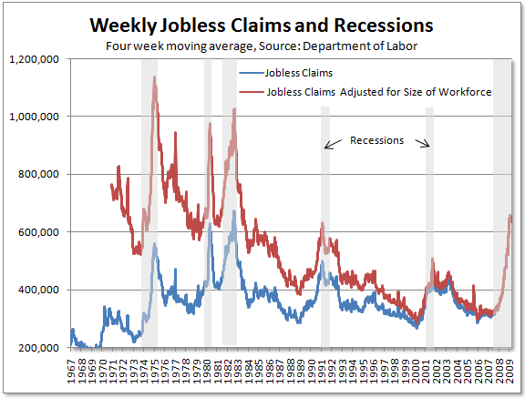
The data is not adjusted for the size of the workforce.
When making that adjustment, the menacing blue line at the 2009 mark in the chart above transforms into the red line below, something that, all of a sudden, looks quite tame when compared to the same red line back during the recessions of the 1970s and 1980s.

Now, granted, the composition of the workforce has changed quite a bit over the last 30 years and we may never reach the population-adjusted peaks that were seen back then, but surely we have to come a bit closer to those peaks now that the great credit and debt orgy of the late-20th century has come to its painful conclusion.
For example, to reach the 674,000 October 1982 peak for new unemployment insurance claims, we'd have to see a figure of over a million today. To equal the February 1975 peak of 561,000 would require over 1.1 million.
That's almost double the recent peak!
Having blown past comparisons to the 1991 and 2001 recessions for virtually every other economic statistic months ago, it could be that whether jobless claims reached a peak last month isn't the most important question out there today.
Perhaps the most important questions to ask are how close we'll get to the population-adjusted highs of the 1970s and 1980s and how long it might take to get there.
By Tim Iacono
Email : mailto:tim@iaconoresearch.com
http://www.iaconoresearch.com
http://themessthatgreenspanmade.blogspot.com/
Tim Iacano is an engineer by profession, with a keen understanding of human nature, his study of economics and financial markets began in earnest in the late 1990s - this is where it has led. he is self taught and self sufficient - analyst, writer, webmaster, marketer, bill-collector, and bill-payer. This is intended to be a long-term operation where the only items that will ever be offered for sale to the public are subscriptions to his service and books that he plans to write in the years ahead.
Copyright © 2009 Iacono Research, LLC - All Rights Reserved
Tim Iacono Archive |
© 2005-2022 http://www.MarketOracle.co.uk - The Market Oracle is a FREE Daily Financial Markets Analysis & Forecasting online publication.


