


Will the Historic Imbalance in Gold Stocks to Gold Price Resolve ?
Commodities / Gold and Silver Stocks 2019 Mar 25, 2019 - 08:43 AM GMT

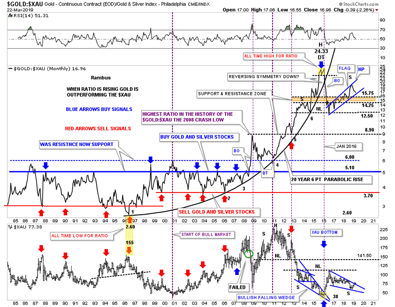
 There is a ratio chart, $Gold:$XAU, we haven’t looked at in quite awhile that has helped us in the past to locate some important turning points for the PM stocks. I’m not going to get into all the details tonight but this ratio chart shows you just how undervalued the $XAU or precious metals stocks in general are to gold itself. From the mid 1980’s to the 2008 GFC crash the horizontal blue line was a good place to buy your gold and silver stocks and when the ratio fell to the red line it was a good place to sell those stocks.
Everything changed dramatically between gold and the gold stocks during that 2008 crash period. The green circle on the XAU shows where the failure occurred. Instead of the ratio dropping down to the red line like it had always done before the ratio broke out above the blue horizontal line in a way it had never done previously. At the time I labeled that initial high as the highest the ratio had ever been in history thinking the price action would decline back into the old trading range between the blue and red lines. As you can see that wasn’t the case at all. Instead of getting back to normal the ratio began to go parabolic to the upside and finally topped out in January of 2016 as shown by the small double top, yellow shaded area. That also marked the bottom for the XAU.
Once the small double top broke down below the 20 year parabolic arc I suggested we could see some reverse symmetry to the downside because the rally into the small double top was so vertical. We did get the reverse symmetry which also showed up on the 2016 rally phase for the XAU and other precious metals stocks. As you can see the ratio lost almost half of its gains in its vertical drop form 24.33 to the initial low at 12.50. The brown shaded area is where I was initially looking for support but the price action fell a little lower before coming to an end.
The ratio threw me a curveball as I was looking for the right shoulder to match the left shoulder in time and price, but it built a bigger 2016 blue rising flag as the XAU has been building out its 2016 bullish falling wedge. We could call the price action above the 12.50 neckline an unbalanced H&S top but I’m looking at the blue rising flag as more of a halfway pattern to the downside which would measure down to the 8.90 area which would be the initial 2008 high on the ratio chart.
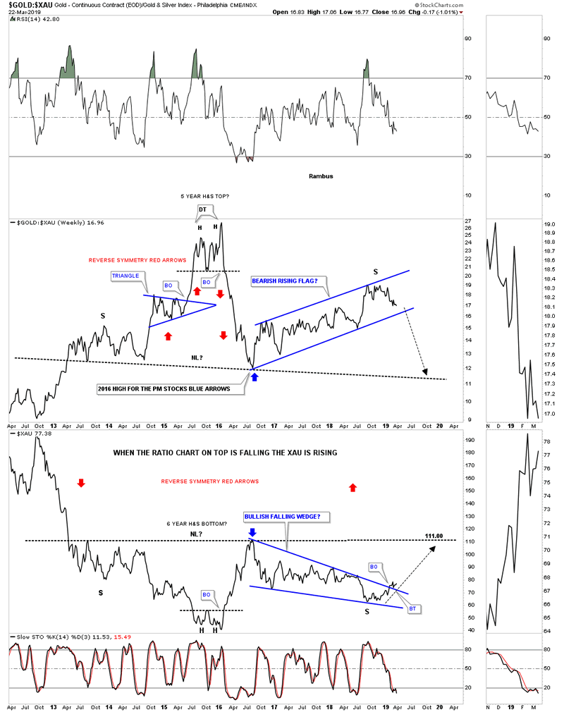
Below is a close up weekly chart which shows you more details of the ratio combo chart above. As you can see from the 2016 low on the ratio chart, which was the 2016 high on the XAU, both have been consolidating their previous moves with the ratio building out the rising flag and the XAU building out its 2016 bullish falling wedge. It also looks like the XAU is giving us an early heads up as it has already broken out above the top rail of its 2016 bullish falling wedge and has completed a backtest. The ratio chart on top is approaching the bottom rail of its 2016 rising flag but hasn’t broken through yet. It will be interesting to watch the price action when they both trade to their respective necklines as those necklines are the same necklines we’ve been following on gold’s six year H&S bottom.
The way the ratio chart is setup with the first leg down out of its January 2016 double top all time high being so vertical, it’s very possible we could see a similar move to the downside when the bottom rail of its 2016 bear flag gives way. That also means that the XAU should also see a near vertical move to the upside similar to its 2016 thrust.
Sir Plunger will be doing the Weekend Report so stay tuned for his always fascinating and provocative post. Have a great weekend , happy spring and all the best…Rambus
All the best
By Rambus Chartology
FREE TRIAL - http://rambus1.com/?page_id=10
© 2019 Copyright Rambus- All Rights Reserved
Disclaimer: The above is a matter of opinion provided for general information purposes only and is not intended as investment advice. Information and analysis above are derived from sources and utilising methods believed to be reliable, but we cannot accept responsibility for any losses you may incur as a result of this analysis. Individuals should consult with their personal financial advisors.
© 2005-2022 http://www.MarketOracle.co.uk - The Market Oracle is a FREE Daily Financial Markets Analysis & Forecasting online publication.