


Gold and Stock Markets Inflection Points Galore
Commodities / Gold and Silver Stocks 2016 Feb 04, 2016 - 02:07 PM GMT

 There is alot of action going on this week in all the different areas of the markets. The PM complex has been rallying, the US dollar tanking today and the stock markets trying to make up their mind which way they want to go in the short term. I have a ton of work to do on the side bar where all the trades are listed so I'm going to show you what I would like to see happen in regards to the HUI, gold and silver.
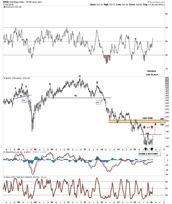
If the PM complex is bottoming in here it has to show us its hand. There is no way around it. Usually when a bottom or top is formed the first move out of the reversal pattern, after a possible backtest, should be very strong or impulsive in nature. The bigger and stronger the move is the better. Below is a weekly chart for the HUI with few annotations on it so you can see the clean picture. Most of the time you will either see some type of H&S reversal pattern or double top or bottom reversal pattern.
The best reversal pattern for the HUI at this point is the double bottom with the first bottom forming last August and the second one 2 1/2 weeks ago. If this possible double bottom is going to play out I want to see the double bottom hump or double bottom trendline broken to the upside. Then after a possible backtest to the double bottom hump at 140 or so we need to see a strong impulse move up to the brown shaded support and resistance zone between 190 and 205. We may see some reverse symmetry as shown by the red arrows. If the HUI can make it up to the brown shaded S&R zone it will be due a breather and some type of consolidation pattern will build out. We should also see a fib retrace of 38%, 50% or 62% of the rally out of the second bottom at 100 or so. This would be the perfect setup.
HUI Weekly Chart
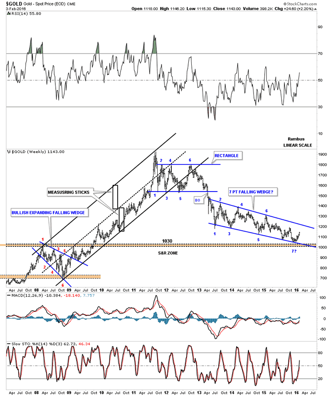
Below is a weekly chart for gold which shows the price action out of the 2008 crash low. The top of that trading range came in around the 1030 area as shown by the brown shaded S&R zone. On the right hand side of the chart you can see the blue falling wedge, the pattern from hell, with the possible 7th reversal point forming just above the brown shaded S&R zone. With seven reversal points in play, and if gold can breakout above the top rail, then the almost three year falling wedge would be a reversal pattern to the upside. That big falling wedge reversal pattern should give gold a lot of energy to rally. So if gold is bottoming in here then it has to show us the way by taking it one step at a time.
Weekly Gold Chart
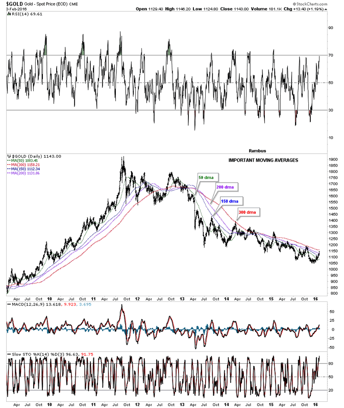
This next chart for gold I've been showing you is the important moving averages chart. Today gold closed above the very important 200 day ma with only the 300 day ma left above. It's going to take some time to turn all these moving averages around like after the 2008 crash low but once they're all nicely aligned to the upside they will show us the major trend.
Daily Gold Chart
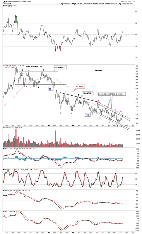
This next chart of GLD is one I showed you last week which shows the one year double trendline downtrend channel with the pink numbers on it. Gold closed right on the outside dashed trendline today completing the seventh reversal point with the 65 week moving average just above at 111.20.
SPDR Gold Trust Shares Weekly Chart
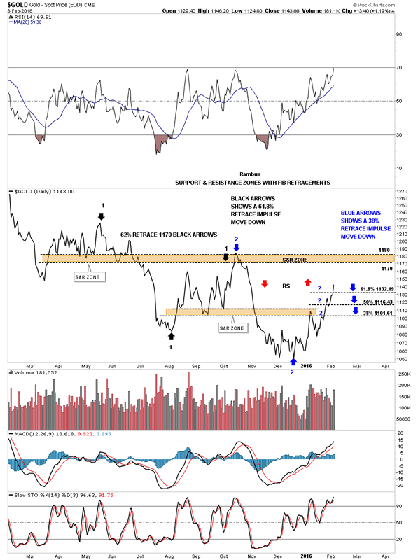
This next chart is another one I showed you last week which has the fib retracements on it. The previous decline labeled with black arrows retraced 62% of that move before gold fell lower. The blue arrows shows the fib retrace of the last down move. As you can see today gold close above the 62% retrace which is a positive. Also notice how its reversing symmetry back up as shown by the red arrows. It looks like the brown shaded S&R zone between 1170 and 1180 should be the next place to look for some resistance to show up.
Daily Gold Chart 2
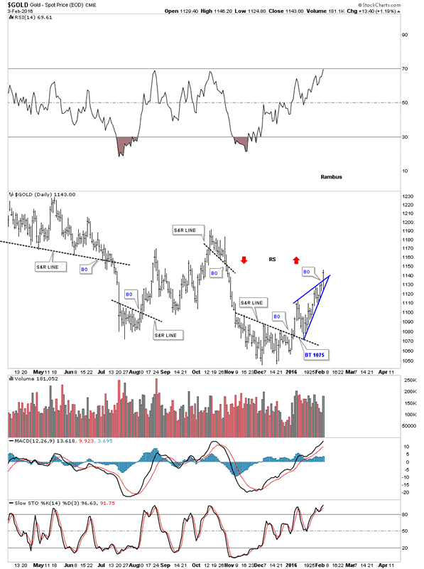
Here is the other chart for gold I showed you last week that just has the black dashed support and resistance lines on it. The blue bullish rising wedge just became apparent today when the price action took out the top rail.
Daily Gold Chart 3
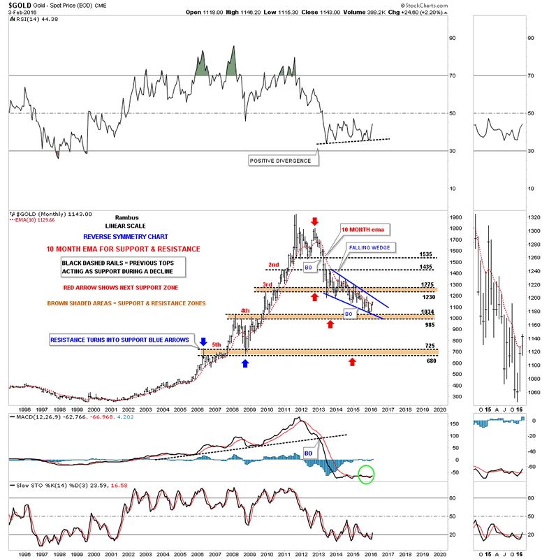
This last chart for gold is a long term monthly chart we've been following for several years which shows the brown shaded S&R zones with the 10 month ema. When I first built this chart I labeled it as a reverse symmetry chart as I was expecting the bear market to resemble the bull market to a certain degree. It did when gold initially bottomed at the brown S&R zone labeled #3. From that point the reverse symmetry went out the window as the blue falling wedge took over. These same numbers have been on the chart since the first day I built it. The 4th S&R zone is between 985 and 1034 which is taken from the top in 2008 and 2009. This month is still very young yet but gold is trading above the 10 month ema which has done a good job of holding support during the bull market years and resistance during the bear market years. The only change I've made on this chart, and that was just now, is I've adjusted the bottom rail of the blue falling wedge to fit the bottoms better. Is 1034 going to be the actual low?
Monthly Gold Chart
Now lets take a quick look at silver which looks like it broke out of a nice base today. You can call the price action anything you want below the S&R line but the S&R line is now our line in the sand, above is bullish and below is bearish. There was a nice increase in volume today also.
Daily Silver Chart

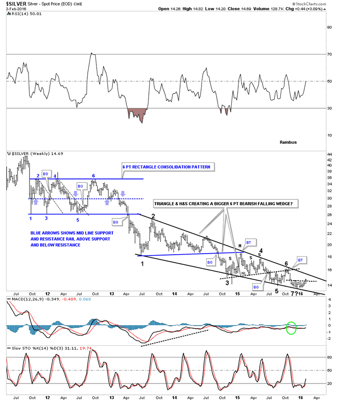
Below is an old chart I just dug up which shows the old blue rectangle which broke down in April of 2011. At the time the blue rectangle was forming I showed how the center dashed line works as support and resistance. Notice the last two blue arrows inside the rectangle just before silver broke below the bottom rail. First silver got a little pop off of the dashed center line, and then the drop through the center line with one last backtest. That was the start if the major impulse move down. Now lets look at the price action which has made up the black falling wedge. As I've mentioned many times in the past a chart pattern can be made up of several smaller consolidation patterns before it finishes building out. The first consolidation pattern that formed inside the black falling wedge was the blue triangle that broke down to reversal point #3. Some of you may remember the H&S consolidation pattern that formed next with several backtests to the neckline. Silver has completed 6 reversal points so far with the seventh underway right now. If this is the start of a new bull market for silver it needs to complete the 7th reversal point and then take out the top rail of the falling wedge.
Weekly Silver Chart
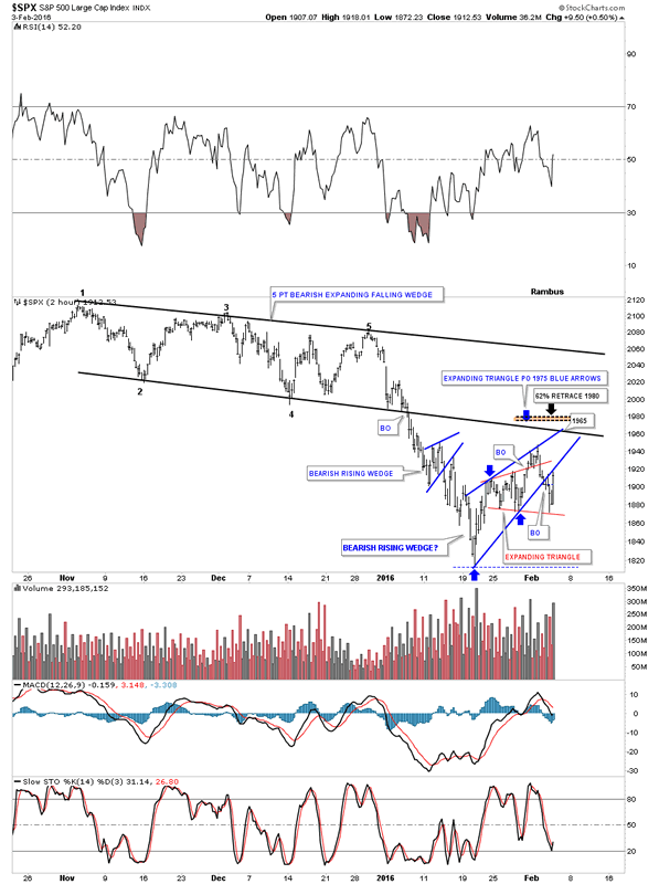
Today was a bit frustrating in regards to the stock markets as there are many rising wedges and flags that have formed over the last three weeks or so. Below is the 2 hour chart we've been following lately that shows the red expanding triangle inside the blue rising wedge. As you can see the SPX found support again today on the bottom rail of the expanding triangle and then bounced all the way up to the bottom rail of the blue rising wedge where it closed the day. Normally with these types of patterns don't waste much time in fulfilling their expected move. Tomorrow is going to be critical, on the short term, to see if the bottom rail of the blue rising wedge holds resistance or fails.
SPX 2-Hour Chart
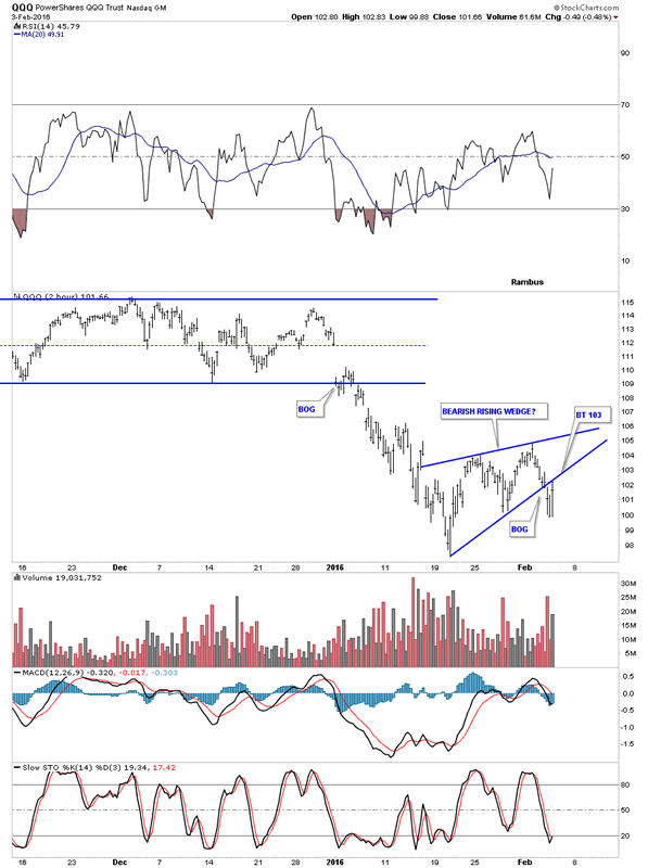
Below is a 2 hour chart for the QQQ which shows the blue rising wedge up close and personal.
QQQ 2-Hour Chart
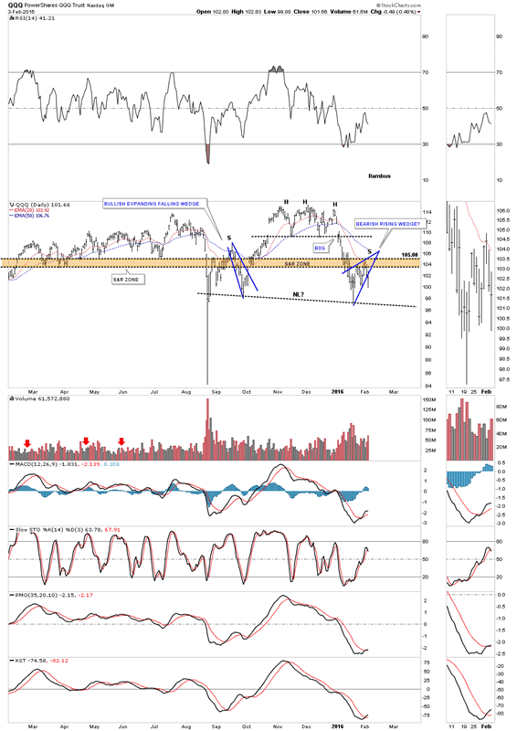
The last chart for tonight shows the importance of the little blue rising wedge as it could very well be the right shoulder of a H&S top. To say the moment of truth has arrived for the stock markets is an understatement. The same can be said for the PM complex as well. Are we witnessing a major inflection point where the stock markets enter into a bear market and the PM complex a bull market. As they say, we'll know in the fullness of time. All the best...Rambus
QQQ Daily Chart
All the best
Gary (for Rambus Chartology)
FREE TRIAL - http://rambus1.com/?page_id=10
© 2016 Copyright Rambus- All Rights Reserved
Disclaimer: The above is a matter of opinion provided for general information purposes only and is not intended as investment advice. Information and analysis above are derived from sources and utilising methods believed to be reliable, but we cannot accept responsibility for any losses you may incur as a result of this analysis. Individuals should consult with their personal financial advisors.
© 2005-2022 http://www.MarketOracle.co.uk - The Market Oracle is a FREE Daily Financial Markets Analysis & Forecasting online publication.