Peak Silver Revisited: Impacts of a Global Depression, Declining Ore Grades & a Falling EROI
Commodities / Gold and Silver 2011 Oct 11, 2011 - 03:26 AM GMTBy: Steve_St_Angelo
 The world is about to peak in global silver production. This will not occur due to a lack of silver to mine, but rather as a result of the peaking of world energy resources, declining ore grades, and a falling Energy Returned On Invested – EROI. The information below will describe a future world that very few have forecasted and even less are prepared. This is an update to my previous article Peak Silver and Mining by a Falling EROI. In my first article I stated that global silver production may peak in 2009 if we were to enter a worldwide depression. We did not have the global depression as massive central bank printing and bailouts have thus far postponed the inevitable.
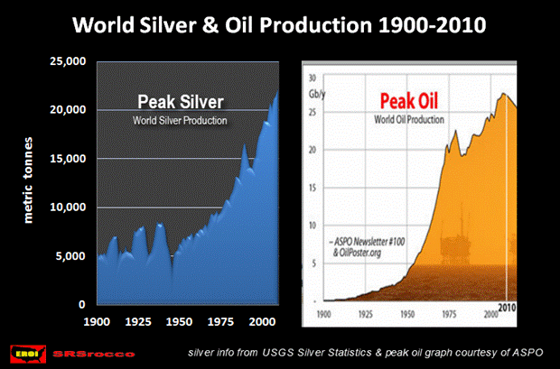
The world has entered a plateau of global oil production over the past 5-6 years. A higher oil price has not brought on more supply to offset depletion rates from existing fields. From the graphs above we see a correlation between global silver supply and oil production, especially in the latter part of the 20th century. Up until the late 1800’s and early 1900’s the majority of energy used in mining silver came from human and animal labor. It is truly amazing just how much silver was produced in the United States at this time without the use of oil and modern mining practices (information provided later in the article). This all changed as global oil production as well as the technique of open-pit mining increased.
The 3 Big Energy Game Changers for Silver Mining
There are a number of some very large open-pit mining projects supplying silver that are forecasted to go into production within the next several years as well as others by the end of the decade. It is astounding to see these 25-45 year extended forecasts by these mining companies without any consideration of what the energy environment will be like in 2015-2020 or later. It seems like everyone in the sector assumes there will be ample supplies of energy at commercially viable prices.
This is where the trouble begins. There are three negative energy game changers that will impact the mining industry going forward. They are: (1) the Peaking of global oil production, (2) the Land Export Model and (3) the falling EROI – Energy Returned On Invested. Of the three, I believe the falling EROI will be the most devastating. Before explaining why this is the case, let’s take a look at each.
Peak Global Oil Production
According to JODI’s global oil production figures represented HERE in a post on theOilDrum.com, it looks like the global peak of convention crude/condensate and natural gas liquids took place in 2006:
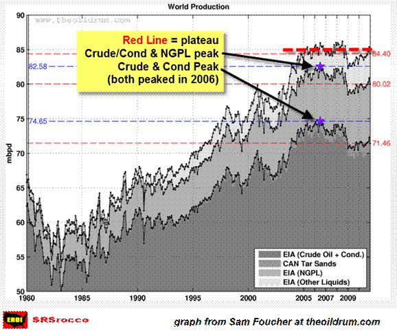
Global oil production has increased steadily since the early 1980’s and has now been in a bumpy plateau for the past 5-6 years even with much higher oil prices. It is true that there are more projects and oil fields slated to come online in the next several years, but much of the increase will be offset by depletion in existing fields. To add insult to injury, the majority of oil that is exported throughout the world is being supplied by countries that are also increasing their own domestic oil consumption. This is a double-edged sword for dependent oil importing nations— which leads us to the Export Land Model.
Export Land Model
The Export Land Model developed by geologist Jeffery Brown and others shows how oil- exporting countries suffer higher declines of exports due to increased domestic consumption. As the nation increases its own oil consumption for their expanding economy, this causes exports to fall even greater than declines in oil production alone. This becomes apparent when we look at what is taking place in Saudi Arabia.
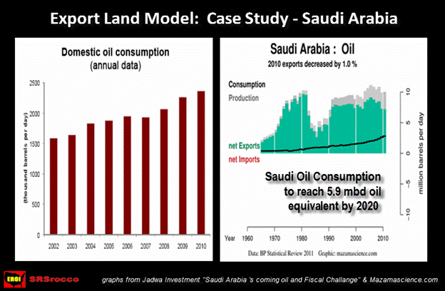
In 1980, Saudi Arabia produced approximately the same amount of oil it is presently. However the kingdom is exporting 2+ mbd (million barrels a day) less oil. The right side graph above reveals that as domestic consumption has increased (black line), exports have declined. By 2020, Saudi Arabia’s domestic consumption is forecasted to reach 5.9 mbd of oil equivalent, including natural gas, which will decrease the country’s exports even further (Jadwa Investment’s “Saudi Arabia’s coming oil and Fiscal Challenge”).
If we add up all the other exporting oil countries and consider what the future percentage loss from this model might be, the drop in oil exports will be significant indeed. Here we can see that the peaking of global oil production, plus the declining oil exports described above by the Export Land Model, puts a serious dent in the ability for future growth in the world economies. If the world economies are unable to grow, neither will the supply of base metals and silver.
These two energy constraints are in themselves bad enough news for the global economy and the mining industry. Unfortunately the third is by far the most devastating. The falling EROI measures what amount of that oil will be available for market. It is also described as the net energy that remains after production costs are considered.
The Falling EROI: Energy Returned on Invested
In my opinion, the EROI —Energy Returned On Invested— is by far the most important aspect confronting our economy, society and world at large. Ironically, the EROI of oil and natural gas has been falling ever since man drilled his first well.
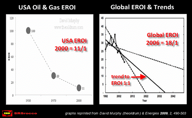
According to work done by Cutler Cleveland of Boston University, the EROI of U.S. oil and gas was 100/1 in 1930. It fell to 30/1 by 1970, and hit 11/1 by 2000. Oil was so abundant during the 30’s in the States that it only took the cost of 1 barrel of oil to produce 100 barrels for market. By 2000, it has declined nearly tenfold.
The graph on the right side shows the falling Global oil and gas EROI (by Gagnon, Hall & Brinker) to be 18/1 in 2006. They plot with a solid black line that a possible 1:1 EROI projection may be by the mid 2030 decade. As this EROI ratio continues to decline, it puts a huge stress on the world economies by increased energy costs while providing less net energy for the market.
There has been so much misinformation put out by different organizations as to the amount of oil and natural gas reserves that it is has totally confused the investing community and the public. Whenever I get into a debate about peak oil or oil reserves there is always someone who brings up the notion that the United States is sitting on trillions of barrels of shale oil. This is the subject of a whole other article, but to get to the point, shale oil as a savior of the inevitable United States (or World) Energy Crisis is a pipe dream. Here are the three biggest lies propagated in the U.S. energy industry:
- 1950’s - Nuclear energy…..too cheap to meter.
- 2000’s – Shale Oil trillion+ barrels of U.S. reserves
- 2000’s - Shale Gas 100 years worth of U.S. supply
To explain why there is a great deal of hype in shale oil and gas, take a look at the graph below.
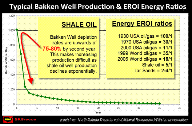
Shale oil is much more expensive to extract than light sweet crude in Saudi Arabia. Many say that increased technology will bring more oil to the market, but it does so at a lower EROI. The lower the EROI, the less net energy is available for market. With less net energy, there is less growth.
Furthermore the depletion rates of a typical shale well in the North Dakota Bakken Field are 75-80% by the second year. Shale gas depletion is even worse, with fields reported from the Texas Barnett Field declining 60% in the first year. The notion that the U.S. will be able to increase oil production significantly with shale oil turns out to be a red herring when you figure that these severe depletion rates make it impossible to do so.
Another nail in the coffin for shale oil is its low EROI. The figures on the right side of the graph above show the different EROI ratios for conventional and nonconventional energy sources. The only thing worse on the EROI scale than shale oil (5:1) is tar sands (2-4:1). Why are these EROI ratios so important and ultimately devastating to the world economy and silver mining? The next graph provides the answer.
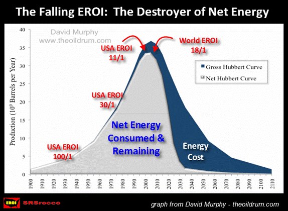
As we can see from the left side of the global oil peak, everything is rosy; high EROI ratios with a majority of net energy already consumed by the world economies. Once we slide over to the other side, the picture gets downright scary. Even though there is a great deal of oil on the downward side of the peak, the majority of it gets consumed in the production of the energy itself. Once it costs more to produce a barrel than you get in return, the game is over.
Unfortunately, there is more to it than that. There is a minimum EROI that a modern society needs to sustain itself. All the EROI ratios listed above are figured from the point the oil & gas comes out of the well. We have to remember the oil & gas has to be transported and refined and the interstate-highway system and infrastructure has to been maintained. All of these are costs that are subtracted out of that EROI ratio. This is explained in detail by Charles Hall & David Murphy HERE. The bare minimum a modern society needs is an EROI of 3:1….but if you want the luxuries of art, entertainment, medicine, education or etc; the ratio has to be higher still.
The graph above is one possible forecast of net energy. The creator of the graph has produced another showing a more gradual slope of net energy. I have had several conversations and email exchanges with other geologists and engineers who believe the graph presented above is a more realistic representation than the second. I agree.
Peak Oil is Here Whether You Believe it or Not
Before we get into the silver part of the article, there is one more topic on energy that needs to be discussed. There is continued debate about the Abiotic Theory of Oil as well as the blocking of oil drilling in certain areas of the United States by environmentalists. The Abiotic Oil Theory states that oil fields are continuously being refilled, so there will be no peak oil. Even though this might be true in some small cases as it pertains to methane, the amount is infinitesimal.
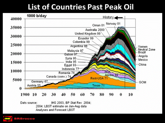
The list of countries presently past peak is long. If we consider a good portion of these countries are in areas of the world that do not have much in the way of regulations or environmentalists, peak oil still took place. It is true that there is still some oil in the U.S. being kept from the market by environmentalists and the government, but in the end….it doesn’t change the overall picture all that much.
Lastly, for those of you who believe the information above is controlled by the Illuminati, Bilderbergs or whomever and there is still plenty of oil in wells capped all over the country, there is nothing that can be written or said to change your mind. As illustrated by the data, peak oil is here whether you believe it or not.
As the world is currently peaking in oil production, the United States passed its peak forty years ago in 1971. The same can be said for overall silver production. The U.S. extracted the majority of its high grade silver by the middle of the 20th century. Today, the U.S. has to resort to mining a great deal more total ore to produce the same or less silver than it did years ago. This process is occurring throughout the world. In my first article (link provided at the top of this article) most of the information on ore grades came from Gavin Mudd and his work on the Australian mining industry as well as data on declining global gold ore grades. To continue to understand this ongoing process, I choose to focus on the United States as the USGS – U.S. Geological Survey – has kept some very detailed records of historical mining activity in the States.
CASE STUDY: United States Past Silver Production and Falling Ore Grades
In the early days, miners and investors sought out the best quality and highest ore grades they could find. The higher the ore grade, the higher the profit. Today, there is a great deal of excitement when mining companies release drill results with higher ore grades than expected. Yet, these same ore grades would have been embarrassing to the prospector and investor just 100 years ago. How the passage of time makes us forget what life was like just a short while ago…
The majority of the top eight silver ore-producing states in the country peaked in annual silver production before the 1940’s. Only Idaho and Nevada had higher peaks after 1950.
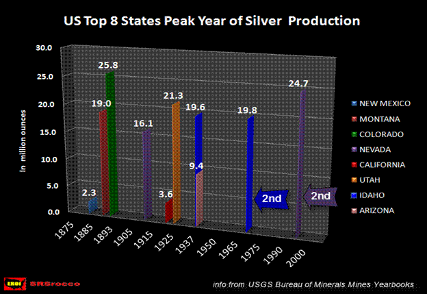
Colorado had the highest annual silver production of all 50 states with 25.8 million ounces produced in 1893, almost 120 years ago. New Mexico peaked in 1885, Montana in 1892, California in 1921, Utah in 1925, and Arizona in 1937. Even though Idaho had its true peak in 1966 at 19.8 million ounces, it surpassed its previous record by only 200,000 ounces, which occurred in 1937. Nevada peaked late in the game due to two factors: 1) it has recently become the largest gold producer in the country currently, providing nearly 75% of nation’s gold. (with gold mining comes by-product silver), and 2) due to the McCoy/Cove Mine, which single-handedly mined 11 of the 27.4 million ounces Nevada produced at its all time peak in 1997.
Not only did the McCoy/Cove Mine help Nevada to become the second-highest silver producer in U.S. history, it also accounted for 35% of all silver extracted from the state between 1987 and 2003.
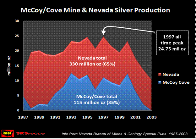
The record silver production in Nevada as well as the McCoy/Cove mine are now gone. In its last recorded year of production, the McCoy/Cove Mine produced 596 oz of silver in 2006. That’s correct, a mere 596 oz (that year it was still producing some gold). According to the Major Mines of Nevada 2010 publication just released, Nevada only produced 7.3 million ounces of silver in 2010…a 70% decline in just 13 years from its peak.
From the late 1800’s to 1950’s the same eight states listed above produced the lion’s share of silver in the country. Very few people who are asked will know which state was the largest producer at this time. Most when asked will say Idaho, Utah or Colorado. I was quite surprised to find out that Montana outperformed them all by producing 775 million ounces by 1950
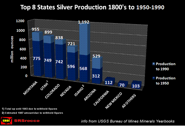
Montana produced the most silver in the country at this time due to the richness of copper in the state, where silver was a by-product. According to the MONTANA MINING NEWS MINING JOURNAL dated 8/30/1930:
Anaconda Copper Mining Company is confining work at the Flathead Mine, near Kalispell, Montana, to development, because of the present metal prices, according to a reported statement by Jack Dugan, superintendent. Thirty men are employed in extracting 40 tons daily, of ore, said to average 50 ounces of silver, per ton.
This is an example of the kind of high grade ores they were pulling out of Montana back in 1930. Impressive as it was, this was not the average. To give you an idea of the difference of 75 years, Montana produced 9.3 million ounces of silver in 1935 at an average ore grade of 3.45 oz/ton. In 2010 there were only two mines producing silver as a by-product of copper. The larger producer is the only publicly traded company in Montana and it produced a little more than 1 million ounces of silver at an average ore grade of 0.87 oz/ton or a 75% decline.
The USGS provides Mineral Yearbooks for the states back until 1932. One can imagine what the ore grades must have been in 1892 when Montana produced its most silver in one year at 19 million ounces.
Idaho: the Largest Silver Producer in the Country’s History
The one state that sticks out like a sore thumb in the graph above is Idaho. It is the only state that has produced over a billion ounces silver by 1990 with the majority of it after 1950. Even with this significant production, Idaho wasn’t able to escape the negative aspects of falling ore grades.
In the late 1800’s and early 1900’s a larger percentage of silver came from a grade called “Dry and Siliceous Ore”. During this time, between 40-50% of silver produced in the country came from this type of ore. To give you an example in 1922, 46.8% of silver in the U.S. came from dry and siliceous ore. The percentage dropped over the next decade— falling some years into the teens (especially during the 1930’s depression). By 1935, it climbed back to 40%.
This is the sort of ore that primary silver mines are made of as it contains the most silver per ton. Idaho had some of the richest dry and siliceous ore grades in the country. The graph below represents how much this sort of ore grade has declined since the 1940’s.
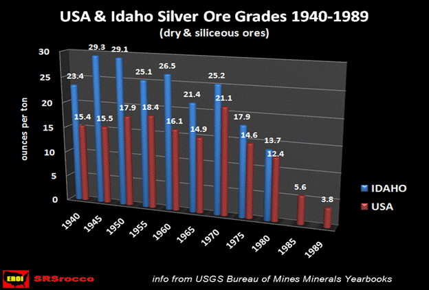
The reason why this graph only shows data up until 1980 for Idaho and 1989 for the U.S. is due to the fact that information was withheld from the USGS due to proprietary reasons by the mining companies. Furthermore, this is also true for individual state reporting of detailed silver statistics after 1990. In the early days the states provided the USGS with so much information on gold and silver that many of the gold-silver reports were over 200-300 pages. Today the Silver Yearbooks barely fill 15 pages.
To bridge the gap to the present day, we can look at what has taken place in the largest publicly traded mining company in the state. Hecla’s Lucky Friday Mine in Idaho produced 3.3 million ounces in 2010 at an average ore grade of 10.25 oz per ton. The chart below compares the difference from the same mine in 1965.
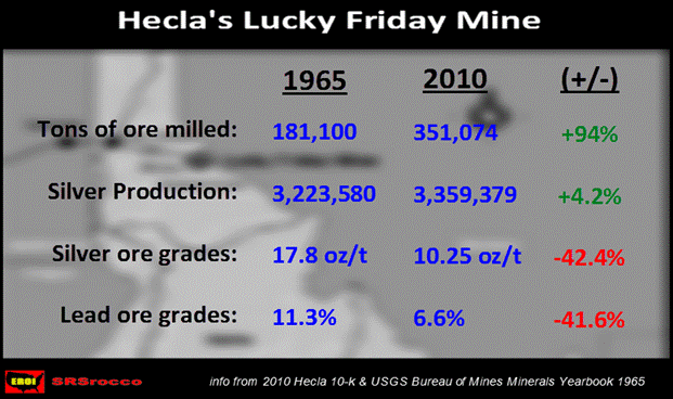
Here we can see that Hecla has only produced a little more than 100,000 ounces of silver than it did in 1965 but has to process almost double the amount of total ore. This insidious decline of silver ore grades over the years seems subtle to the mining industry that is focused on quarterly results, but becomes an increasingly difficult problem now that the world suffers from peak oil and a falling EROI.
The United States: Produced 25% of all Global Silver 1900-1950
When the U.S. was the Saudi Arabia of the world in oil production at the early and middle part of the 20th century, it was also the second-largest silver producer in the world behind Mexico. Of the 10.5 billion ounces of silver produced by the world from 1900-1950, the United States accounted for 2.7 billion (or 26%) of the total amount.
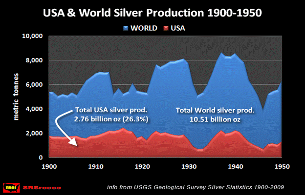
This historical graph is relevant due to the fact that in next 60 years from 1951-2010 the U.S. only produced 2.58 billion ounces of silver… with significantly falling ore grades shown below.
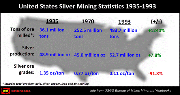
The chart above represents total ore from mining gold, silver, copper, lead and zinc. The majority of silver comes from base metal mining in which zinc/lead provides the highest percentage compared to copper and gold. In 75 years, the total ore grade of silver has fallen nearly 92% while actual production has remained basically flat. This is due to the fact that all base metal ore grades in the U.S. are falling as well.
For example, copper has shown a huge decrease in ore grade since the early 1900’s. In 1906 the average ore grade for copper was 2.5%. By 1935 the average copper ore grade had fallen to 1.89% and in 2009 the United States produced copper at 0.43% a ton. This is a decline of 77%.
The Falling EROI and Declining Ore Grades
On top of declining ore grades and adding insult to injury, is the falling EROI of energy. When the U.S. and the world were tapping into high quality concentrated ore grades in the early years, they did so with the majority of human and animal labor. This kind of labor was not only very efficient but it also utilizing a higher EROI. The open-pit mining practices employed today are in fact quite the opposite….extracting metal at a much lower EROI.
For example, people today have this misguided opinion that modern farming is very efficient. They see one farmer on a huge tractor working hundreds or thousands of acres of agricultural land. They do not factor in all the energy it costs to plant, fertilize, harvest and process the crop. This does not include all the energy and technology it takes to develop hybrid seeds, the manufacturing of the tractor and equipment as well as many other aspects that go into modern farming. In reality, the pre-industrial farmer with horse and plow was extremely more efficient that his modern counterpart.
FOOD EROI’s
Hunter Gatherer = 10/1
Pre-Industrial farmer = 10/1
Modern high-tech farmer = 1/10
The pre-industrial farmer with horse and plow was able to produce 10 calories (of food) for market for every 1 calorie of energy (food) consumed by the operation. Today, the modern farmer needs to consume 10 calories of energy to provide only 1 calorie of food for market. If we consider this ratio, the modern farmer is 98.8% less efficient than the simple farmer with horse and plow.
The only reason why modern farming practices have been successful at this horrible rate of efficiency is due to the high EROI of energy over the past 100 years. Now that the EROI is falling considerably, it is putting severe pressure on the agricultural industry. This will also be true for the mining industry.
Base metals are extracted by either open-pit or underground mining. Of the two, open-pit mines account for the larger percentage of metal produced in the world. (Surface Mining Methods and Equipment) The technique of open-pit mining utilizes huge excavators and large haul trucks to move the ore from the mine. There is a great deal of energy consumed in the development, manufacturing, maintenance and operation of these huge earth moving machines in the mining industry.
It is difficult to estimate an EROI ratio for open pit mining as the end product is metal and not energy. That being said, a simple rule of thumb can be assumed if we take the negative EROI of modern farming as an example. The larger and more complex the machine used in industry, the more inefficient its production as it pertains to the EROI.
Now that we understand the past and present EROI ratios in the agricultural sector, we can see why the early miners and prospectors were much more efficient in producing silver than the huge open-pit mining operations of today when we consider all the energy involved. As the world’s energy sources start to decline in the future and the falling EROI destroys an ever increasing portion of the net energy available for market, the number of open-pit mines will decline as well. As this process takes place, the peak in global mining will occur due the fact that human or animal labor cannot equal the extraction rate of diesel powered earth-moving machines. What is taking place in the mining industry today is the WORST OF BOTH WORLDS… declining ore grades on top of a falling EROI of energy.
The Coming Global Depression: Another Nail in the Coffin for Peak Silver
The world hasn’t suffered an economic depression for almost 80 years. The Kondratieff-Wave analysts who study business cycles say we are now overdue for a depression. Even though this is true, they are correct for the wrong reasons. Business cycles have occurred because humans were able to constantly grow and expand their economies. It was due to the 10/1 EROI of the pre-industrial farmers that enabled the rest of the economy to grow and flourish. After several generations of booms, we had the busts.
As we moved into the modern-industrial economy cheap energy with a high EROI allowed the world economies to grow exponentially—allowing these business cycles to continue. Today we are at the top Boom part of the cycle. The big Bust and depression have been postponed due to the ability of central banks to print money and financial institutions to invent hundreds of trillions of dollars worth of derivatives to hedge overly inflated assets. When the global depression finally arrives, we will never return to anything like we enjoyed before. This bust will be the depression that ends all global depressions.
If we consider what took place during the last depression, base metal & silver mining activity fell off a cliff. The interesting thing to note in the next two graphs below as global silver production declined, gold production actually increased.
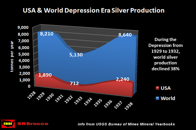
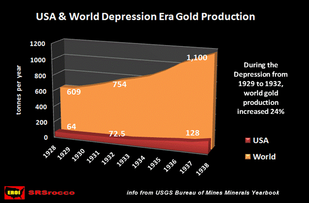
Global silver production declined 38% from 1929 to 1932, whereas gold production actually increased 24% in these three years. It took eight years before the world was able to increase silver production over its 1929 figure. Gold on the other hand, increased its global production a staggering 80% during the same time.
This time will truly be different. The world will not be able to increase its gold production anywhere near the percentage it did in the 1930’s. There is a good chance that actual global gold production will decline as the supply chains break down disrupting the highly technical method of refining and processing gold. Another reason may be due to its dependence on copper production as part of its supply. When economies collapse, so does the demand for base metals such as copper, zinc and lead. This is the reason why silver production suffers greater during a depression than gold.
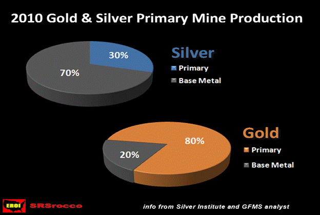
Here we see just how much difference there is in the base metal mining percentage between gold and silver. Zinc & Lead account for the larger portion of the base metal percentage of silver mining, whereas copper production provided 15% of all the gold produced in the world in 2010….or 75% of the base metal pie.
When the world’s central banks are unable to continue to prop up the global economies with money printing, economic growth will drop considerably. China is starting to show signs of an economy heading into a brick wall. Base metal production will decline significantly in the following years cutting back the production of silver as well. If history is a good reference, the future global supply of silver can decline between 20-40%.
A Brief look at World Silver Production
Over the past decade global silver production has increased on average between 2-3% per year. In 2010, according to the World Silver Survey, global silver production reached 735 million ounces of silver. In the first half of 2011 some of the top silver-producing countries have increased their production while others have seen declines. The top producing silver mine in the world, BHP Billiton’s Cannington, has seen its production decrease from 18.9 million oz in the first half of 2010 to only 15.5 million ounces in the first half of 2011 (an 18% decline). Cannington — like all mines— suffers from falling ore grades.
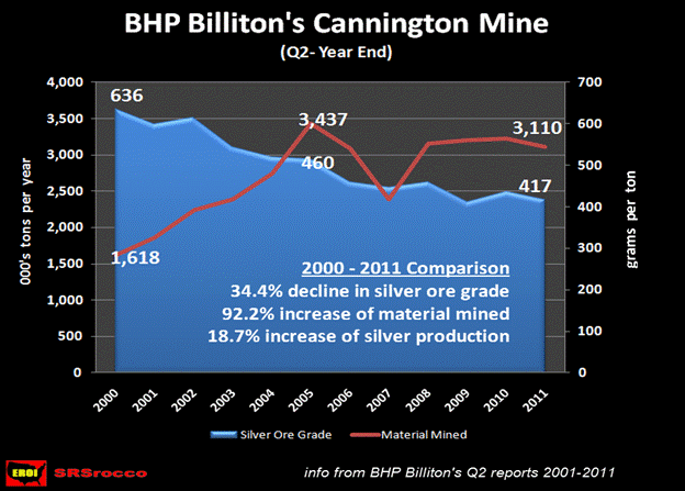
In 2000, Canningtion mined 1.6 million tons of ore and produced 30 million ounces of silver at an average ore grade of 636 g/t. By 2011, it mined 3.1 million tons of ore (or 92% more) just to produce an additional 5 million ounces than it did eleven years ago. What is occurring at Cannington is typical of mines throughout the world.
If we take a look at global silver supply, only a handful of countries have increased their production significantly over the past several decades. Out of all the countries listed in the graph below since 1985, China has had the largest percentage increase. China increased its estimated production from only 2.5 million ounces in 1985 to 99 million oz (or +3,850%) by 2010. The other countries that have increased their production in order of highest percentage are, Bolivia from 3.6 mil oz to 41 mil oz (+1,039%), Argentina from 2.1 mil oz to 20.6 mil oz (+880%), Chile from 16.6 mil oz to 41 mil oz (+147%), Peru from 58.2 mil oz to 116.1 mil oz (+100%), and finally Mexico from 73.2 mil oz to 128 mil oz (+75%), in the same time period. Even though Mexico is the number one silver producer in the world, it had the lowest percentage increase of all six countries. These countries account for 61% of all global silver supply.
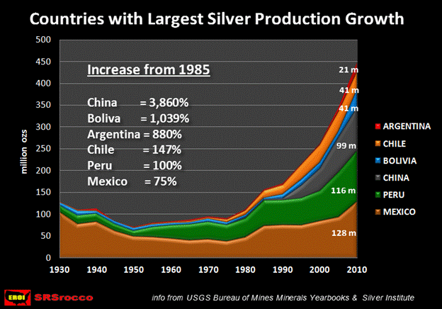
Australia was not included in the graph for two reasons. First, even though its production has increased 71% since 1985, its future growth is not forecasted to improve as much as the nations listed above. Secondly, because of Australia’s western form of capitalistic government, it is least likely to deal with issues of political instability, threats of nationalization or protectionist policies such as those in South America, Mexico and China.
Argentina, Bolivia, Chile and Peru— which are located in South America— may suffer from the same type of policies that have plagued the resource industry in Venezuela. Not only are Venezuela’s oil fields nationalized, in August of this year, President Hugo Chavez has also ordered the same for the gold mining industry.
In Mexico, billionaire Hugo Salinas Price has gained significant support in the country to reintroduce the Silver Libertad as legal tender to compete with the Peso for the Mexican people. If this policy were to pass, a large percentage of Mexico’s silver production would be consumed by its own people to protect them from continued inflation. Furthermore, the country suffers from a great deal of upheaval and violence from the drug wars which could lead to political instability possibly threatening the mining industry.
Lastly, over the past several years the world has felt the ramifications of China’s cutback of rare earth mineral exports. China currently produces between 95-97% of the 17 rare earth minerals in the world. Not only have prices of rare earth minerals increased substantially due to this monopolistic policy, it is also forcing foreign companies to move their facilities that manufacture end-user products in China. These companies are also being requested by China to transfer valuable technology to other domestic companies so they can benefit from the knowledge.
This may also occur in exports of Chinese silver. As global tensions increase due the continued disintegration of the world fiat currency system, China may decide to put a total ban on silver exports. Even though Chinese exports have declined substantially (from 3,000 metric tons in 2005 to only 1,575 metric tons in 2009), there is a good possibility that they may turn off the silver spigot completely.
The countries listed above are enjoying the best records of increased silver production, but at the same time are some of the worst candidates for dependable future global supply.
Final Remarks and Conclusion
The world produced a record amount of silver in 2010. Many analysts are forecasting a continued increase in global production for the next decade. There are several factors that show why this will not be possible.
As the world peaks in global oil production and the net energy available for market continues to shrink due to the falling EROI (Energy Returned On Invested), of oil and natural gas, global economic growth will come to a screeching halt. The falling EROI of energy is a one way street to the bottom. Unconventional energy sources such as shale oil, shale gas and tar sands will not be able to stop this decline.
As global economic growth disintegrates so will the demand for base metals – which 70% of silver is a by-product. On top of that, silver ore grades are relentlessly falling in mines throughout the world which takes an increasing amount of energy just to keep production flat. If the mining industry tries to incorporate more human and animal labor to offset declining oil based energy in the future, it will do so only at much lower rates of production than today. This is due to the fact that human or animal labor cannot match the extraction rate of diesel powered excavators or huge dump trucks when it comes to mining silver.
Then there is the negative effect of a global depression on the production of silver. Presently the world has entered into tremendous chaos and economic turmoil. Conditions are ripe for a complete disintegration of the financial markets, thus pushing the world over the edge into a new dark age of hyperinflationary depression. In this sort of atmosphere, countries may resort to the nationalization of mines as well as other protectionist’s policies.
When the nails of the peak silver coffin are added up, the death of increasing future supply is close at hand. The CEO’s and analysts in the mining industry are for the most part oblivious to these factors that will destroy their ability to make viable forecasts of future projects. It amazes me to see professionals plan a huge open-pit mine with a 25-45 year economic plan without any consideration of what the energy environment will be like at that time. For some strange reason, there is this false assumption that “If we build it, the energy will come.”
If the world enters a depression within the next year or two, this will certainly guarantee the global peak of silver production. Why? It won’t matter if the global economy recovers in the next decade, because the peaking of oil and the falling EROI of energy will have destroyed enough net energy to kill any attempt to bring global silver production back to the level it was before.
Lastly, anyone who is good at connecting the dots will realize the ramifications of this article go way beyond just the peaking of silver. The falling EROI of energy will not only be a destroyer of precious net energy, but will also help bring down the largest empire in the world. This will be the subject of a future article.
Author’s Note: The two public mining companies mentioned in this article were provided to give actual information of declining ore grades and not meant to put either a negative or positive view on the company or to offer any investment recommendation. They are just mere symbols of what is taking place throughout the world. Lastly, the information in this article is an interpretation and opinion of what the energy and silver market will look like in the future. Each reader should develop their own opinion, based on several sources, and not solely on this single article.
Steve St .Angelo Independent researcher residing in southwest Utah
Contact SRSrocco@gmail.com
© 2011 Copyright Steve St .Angelo - All Rights Reserved Disclaimer: The above is a matter of opinion provided for general information purposes only and is not intended as investment advice. Information and analysis above are derived from sources and utilising methods believed to be reliable, but we cannot accept responsibility for any losses you may incur as a result of this analysis. Individuals should consult with their personal financial advisors.
© 2005-2022 http://www.MarketOracle.co.uk - The Market Oracle is a FREE Daily Financial Markets Analysis & Forecasting online publication.


