


S&P 500: Dangerous Fragility Near Record High
Stock-Markets / Stock Market 2025 Feb 11, 2025 - 07:34 PM GMTBy: Submissions

Owen Williams writes: In one of the strongest bull markets in history, the S&P 500 hit 57 record closing highs in 2024 after a stunning initial move higher off the Q4 2023 lows. Many pundits have been skeptical of the equity bull market for some time. Initially, with the inverted Treasury yield curve, economists had been forecasting a recession in 2024. Then came the artificial intelligence (AI) euphoria, with a market carried higher by only a handful of stocks dubbed “the Magnificent Seven”. Most recently, the skeptics have pointed to the historically rich equity valuations. None of these concerns have mattered. Narratives derive markets, and the AI revolution and concomitant productivity gains, perhaps coupled with the prospects for a stronger U.S. economy under Trump, have seriously taken hold of investors’ spirits. When it seems that everyone is singing from the same song sheet, we plug our ears and look objectively at the evidence that we see. Yes, equity valuations are historically very stretched and fund manager positioning is very aggressive. But these are not useful timing indicators as both have been true for most of 2024. The fragility we see is in various market indicators that may be suggesting that the bull run, at least temporarily, is ready for some corrective price action. In this article we present the internal weaknesses that our models are detecting in the U.S. equity markets. While the past never repeats itself exactly, many of the setups in our market indicators today look eerily similar to those witnessed prior to other major equity sell-offs.
In this research note we first present a couple proprietary charts that give a great big picture look at the U.S. market and the extremes that we are currently experiencing. Then we drill down and look at some market indicators that could be offering early warning signs of corrective price action in the headline indexes (S&P 500 and Nasdaq-100). In retrospect, the absence of any meaningful pull-back in the headline indexes over the past 13 months should not have been surprising, if one watched our various breadth indicators. Equity prices don’t just start falling when market internals are strong. Today, however, we see the first real signs of fragility in equity breadth measures.
Most investors who follow the markets know that the mega cap tech stocks have led U.S. equity market gains over the past couple of years. These stocks, which include Apple, Microsoft and Nvidia, account for almost 40% of the S&P 500 index that everyone hears about in the news. Many pundits have been concerned about this narrow leadership in the markets. And historically, extreme concentration, in which a few stocks have a disproportionally high weighting in the indexes, often occur at market peaks. The year 2000 is a perfect example.
Our first chart illustrates this beautifully. We take the ratio of the S&P 500 Equal-Weight Index (same S&P 500 stocks, but with 0.20% weight for each component) to the ubiquitous capitalization-weighted S&P 500.
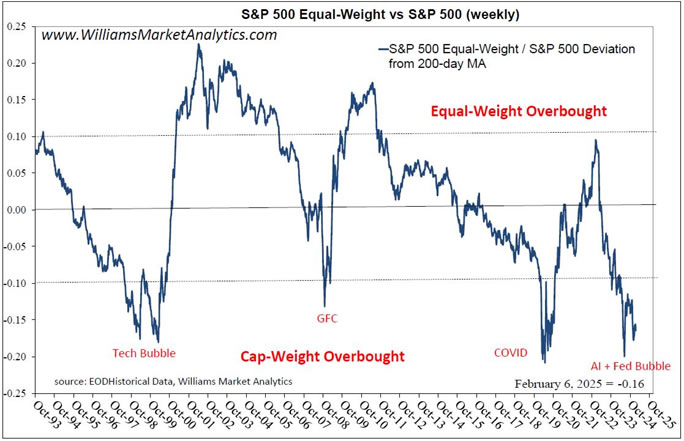
In this chart, we take the ratio’s deviation of the 200-day moving average to better see the cycles. The S&P 500 Equal-Weight-to-S&P 500 chart, which we post here, reveals that in healthy bull markets the majority of stocks advance together and the S&P 500 Equal Weight outperforms. Looking at the cycle version of the chart we posted above, we see first a clear mean reversion over long cycles. When the deviation from trend gets above 10%, the Equal-Weight version is extended (we’ll say “overbought”). Conversely, a deviation from trend less than -10% implies the S&P 500 cap-weighted index is over-extended. It is even more interesting to see WHEN the S&P 500 cap-weighted index has been over-extended over the past 30 years. We label the four occasions on the chart: the Tech Bubble, the Great Financial Crisis, Covid, and today (which we call the AI + Fed Bubble). Two of these occurrences were due to crises, the logic being that in times of panic investors rotate into the bluest of the blue chip stocks. The other two were due to market euphoria. The important take-away is that each time the indicator has gotten to beyond -10%, we have had a major inflection point in the markets.
As we have data for the Nasdaq-100 Equal-Weight Index, we repeated the experiment. The next chart takes the ratio of the Equal-Weight version to the classic Nasdaq-100 cap weighted, which many readers trade via the QQQ.
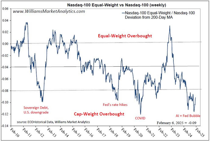
We get pretty much the same message, except that we observe a structural long-term uptrend for the cap-weighted Nasdaq (our mean version level is -4%). Nonetheless, the extreme outperformance of the Magnificent Seven versus peers has resulted in about +25% outperformance for the Nasdaq cap-weighted over the past 18-months or so, seen by the sharp drop in the indicator since 2023.
Our first message is that of positioning and not timing. The above indicators aren’t going to tell us when the headline indexes will begin to underperform, but that conditions are now present for a reversal in relative performance. The market indicators below give us a better idea of the “when”. The second point is that each time the relative equal-weight / market cap ratio reverses, the overall market has also had a major inflection point. Sitting at record highs, we can guess which way markets would inflect today.
Let’s look at some popular breadth indicators, as well as some WMA proprietary market indicators, to get more information on the potential fragility of of the U.S. equity market today. The next chart shows the advance/decline line for the New York Stock Exchange (NYSE).
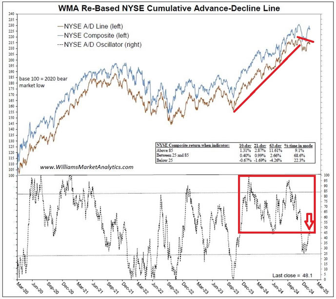
Since October 2023, the A/D line had not wavered until this past December, as shown by the red lines. Our proprietary A/D oscillator in the bottom clip had been gyrating above the 50 midpoint since the rally started in 2023. We recently saw the first breakdown in the oscillator. This does not mean a correction is imminent, but that market internals are shifting.
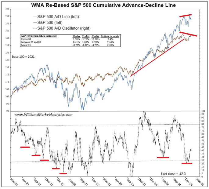
Next we show the same advance-decline indicator for the S&P 500. Again, we have a “bearish divergence” on the cumulative A/D line in the top clip. In the bottom clip, the red hash marks denote that a weakening oscillator typically precedes a market correction. We notably saw the same behavior in the oscillator in 2007 (not shown).
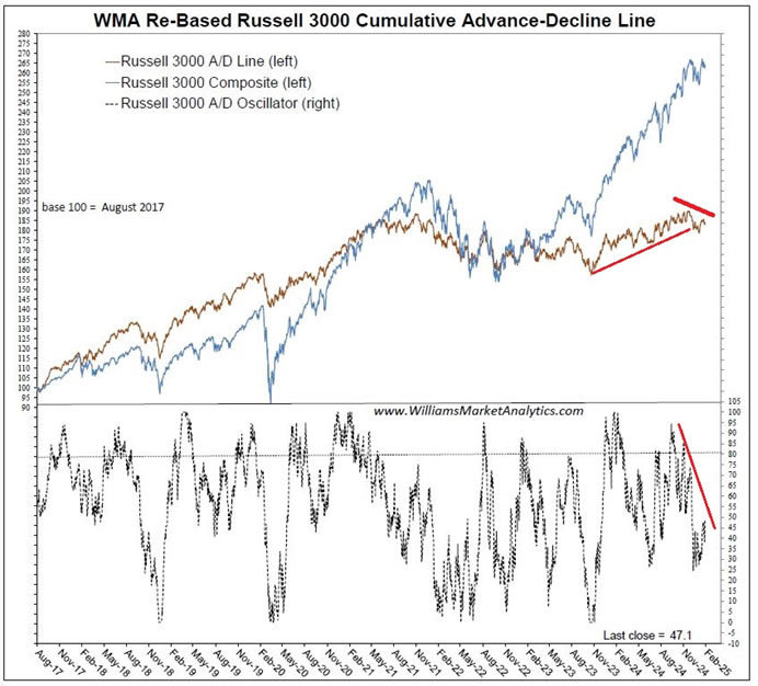
We do third version of the advance-decline indictors by importing all 3000 stocks in the broad Russell 3000 Index. In the top clip we see that the steady uptrend in the Russell A/D line was recently broken. We also notice the narrow participation during the Russell 3000 price gains since 2023, as the cumulative A/D line has been weighed down by a relatively high number of declining issues.
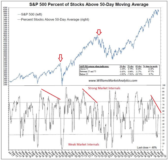
In addition to the uptick in declining issues across all three of the above indexes, we also observe deterioration in another widely followed breadth indicator, the percent above moving average. The next chart shows the percent of S&P 500 stocks above their 50-day moving average. What we look for here is fewer participating stocks during each successive leg higher in the index price. The annotations on the chart highlight these divergences which often precede market corrections. These divergences can take time to play out, however, so this is not a perfect timing indicator.
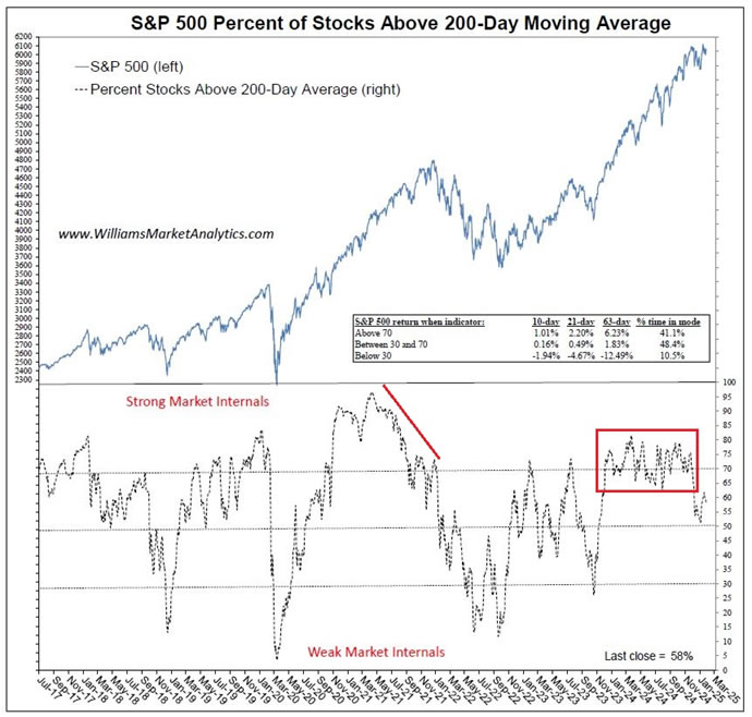
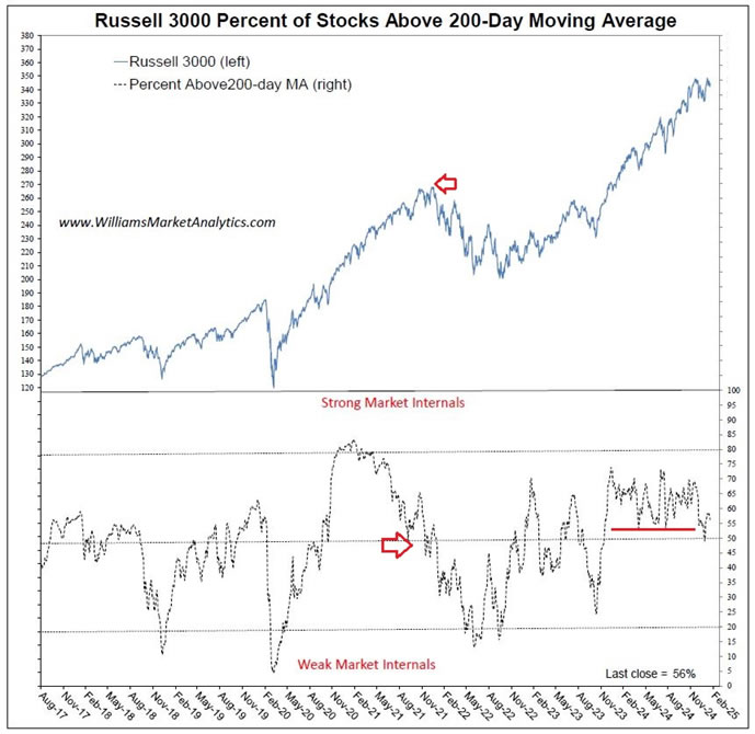
Next, looking at the longer-term 200-day moving average, a healthy market with strong internals is a market in which more than 50% of issues are trading above this key trend line. We saw this indicator trending down for several months in 2007 and in 2021 before the price index began falling. The indicator, which had been gyrating around 70% during the massive 2024 bull market (red box), recently broke down. This maybe an early indication that the S&P 500 is losing momentum. The subsequent chart with the percent of Russell 3000 stocks above the 200-day moving average also ticked down to a new one-year low just above 50%.
Finally we looked at the Nasdaq Composite and observe a percent above 200-day that is trending down, even as the Nasdaq price has been rising. This very same negative divergence, denoted with the red lines, preceded the Nasdaq top in 2022 (vertical black line).

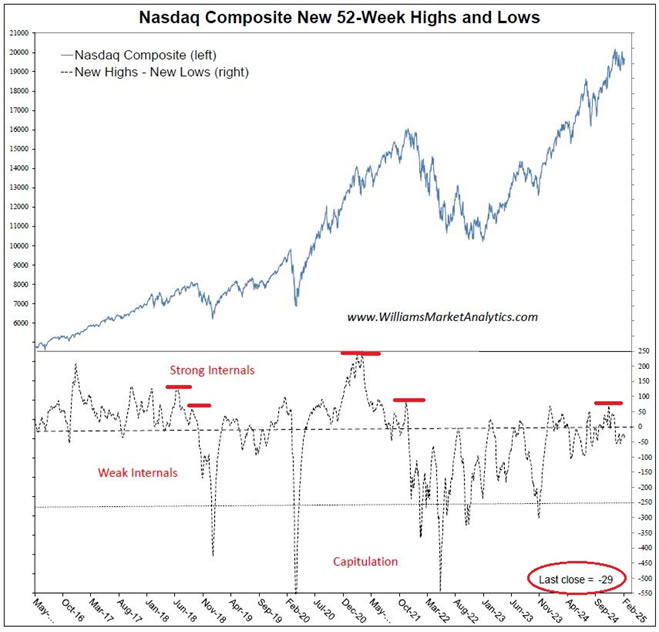
Idem for the net new highs on the Nasdaq in the next chart. As of the February 6 close, we registered 29 more 52-weeks lows than highs. We’ll need to wait to see the amplitude of the rebound in this indicator to confirm another negative divergence like seen in 2021 before the market top.
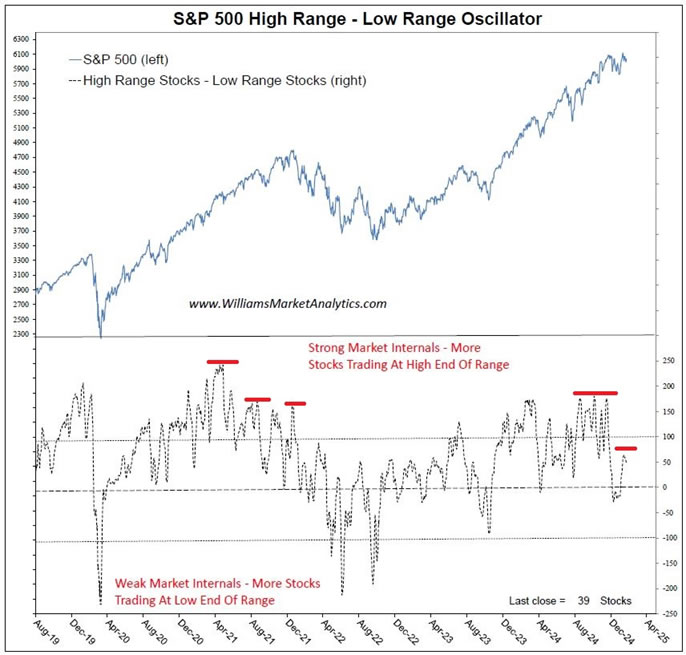
The next indicator is our propriety high range - low range indicator. Instead of using new 52-week highs and lows, we count the number of stocks using our close location value (CLV) measure. The CLV is a numeric representation of where a stock is trading relative to its past 52-week range. We create a diffusion index that runs from -100% to +100%, the former corresponding to a stock closing at its 52-week low and the latter a stock closing at its 52-week high. A 0% reading means that the stock is trading exactly halfway between its high and its low of the past year.
The CLV for an individual stock can be used as a momentum indicator. When the CLV is above 0%, the stock tends to be in an uptrend, and dips should be bought. Conversely, a CLV below 0% is usually associated with a stock in a downtrend.
Our proprietary breadth indicator looks collectively at all component CLVs and considers stocks trading above 90% for the “highs” metric and the number of stocks below -90% for the “lows” measure. The distinction between a stock closing at a 52-week high versus a few points below has little relevance for analytical purposes. The chart below shows our high range – low range metric for the S&P 500. Going back to 1990, we observed the same pattern of falling peaks and troughs in the indicator in 1999, 2007, and 2021, notably. Again, for the current case we need more confirmation to see if the recent breakdown results in a lower high versus the indicator’s highs in 2024 (red hashes).
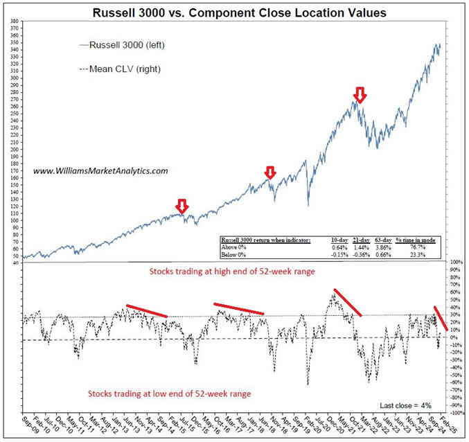
Our final chart looks at the mean CLV for all Russell 3000 components. We take the date range for the chart back to the GFC. What we see is very compelling evidence. Every significant market pull-back over this period, except the surprise Covid crash, was preceded by a deterioration in the Russell 3000’s mean CLV, as demonstrated by the annotations in red. While the current divergence between the index price and mean CLV is still playing out, we’ll be watching closely to see if the rebound in the indicator stalls out below 20%, forming a lower high.
Conclusion
As we have mentioned frequently in our commentaries, today’s equity market is being driven both by a market euphoria (AI craze) and ongoing monetary and fiscal stimulus. As such, the past relationships highlighted above may take longer to play out in this very resistant, bubble-like market. Depending on your risk aversion, exiting and/or hedging equity exposure may be appropriate. While it seems to be heresy to advise against holding the Magnificent Seven stocks (essential a proxy for the S&P 500 cap-weight index), our work suggests that relative outperformance in the major U.S. indexes has reached an extreme. Valuations are historically very rich, fund managers are all-in, and technical weakness in the broad indexes is now visible. At minimum we encourage U.S. equity investors to diversify into equal-weight indexes. Our client accounts are underweight U.S. equities and overweight emerging markets and developed non-U.S. equities.
By Owen WIlliams
Owen Williams is professor of finance at the EM Lyon Business School. He holds a PhD in finance from the Grenoble Ecole de Management and is a CFA charterholder. His research interests include asset pricing, currency markets, and portfolio theory.
© 2025 Copyright Owen WIlliams - All Rights Reserved
Disclaimer: The above is a matter of opinion provided for general information purposes only and is not intended as investment advice. Information and analysis above are derived from sources and utilising methods believed to be reliable, but we cannot accept responsibility for any losses you may incur as a result of this analysis. Individuals should consult with their personal financial advisors.
© 2005-2022 http://www.MarketOracle.co.uk - The Market Oracle is a FREE Daily Financial Markets Analysis & Forecasting online publication.