Coronavirus Lesson #1 for Investors: Beware Predictions of Stock Market Bottoms
Stock-Markets / Stock Markets 2020 Mar 25, 2020 - 05:45 PM GMTBy: Submissions
With hoops “out” and exponentials “in” (referring to March Madness, the 2020 pandemic definition), there’s a new, customary disclaimer on economics and financial sites. Mine says that I, too, knew nothing about infectious disease modeling only two months ago. But I’m catching up, just like everyone else. By now, I might have reached a “Dummies Guide” standard, and I’ll keep this article at about that level.
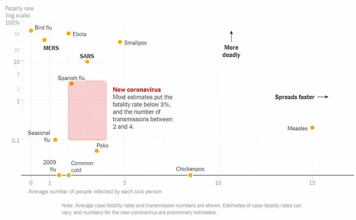
So with that preface out of the way, I’ll first offer a health warning of sorts about a type of COVID-19 chart that’s popular with market bulls. Here’s a version that appeared in the New York Times:
And here’s a second version that uses the same axes but with different data:
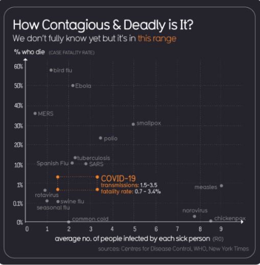
The second chart bounced around Twitter and then appeared on at least one financial site—to support a breezy message that people should stop panicking and start preparing for a surprise melt-up in stocks.
And why do the charts need a health warning? The problem is the horizontal axis—showing a statistic that epidemiologists call R0—which is presented as though it’s the only information you need to have to understand how widely a disease spreads.
In fact, modelers who actually use R0 stress that you can’t summarize the spread of an epidemic with that single input. They say that R0 changes with time and place—it’s not actually a constant. Also, it can approximate the spread of a disease only if the entire population is vulnerable. Critical factors such as prior immunities are handled through other model inputs, not R0.
More to the point, we already know how widely COVID-19 is spreading, and we can readily compare that information to every other disease that’s already come and gone. So let’s stop pretending that R0—an incomplete and imprecise contagion statistic—somehow does a better job than ripping off the blindfold and watching what’s really happening, in real time.
The reality-based approach tells us that SARS, to pick one comparable, peaked at about 8000 cases in 2003. By contrast, COVID-19 is rocketing through the hundreds of thousands, certain to hit millions and by some forecasts billions. That’s a stark difference that seems highly relevant, and yet you won’t find it on the R0 chart, no matter how many versions you conjure up.
The eyes-open approach also says to be wary of claims that “we’re very close to a melt-up” or “the bottom may be closer than you think” or “we’ve probably seen the worst.” (Those are just a few of the bullish stock market predictions we’ve been seeing lately.) To explain why, I’ll first extend the analysis I shared in my last article.
Case Trajectory Update
For background, my March 2 article showed how the confirmed case trajectory could evolve if the most bearish epidemiological forecasts prove accurate. This time, I’ll set the forecasts aside and examine how the trajectory has changed in recent weeks.
I’ll exclude both China and Iran, because their reported numbers fail to match the on-the-ground evidence. I’ll then divide everyone else into two groups:
- South Korea and Singapore, which I’ll call the “most prepared” group (MPG). These countries implemented a variety of effective disease-containment strategies after suffering from other epidemics in recent years.
- The rest of the world, which I’ll call the “least prepared” group (LPG). That naming might be unfair to a few other well-prepared countries, but further regrouping wouldn’t materially change the conclusions.
Here are the confirmed cases for each group through March 21:
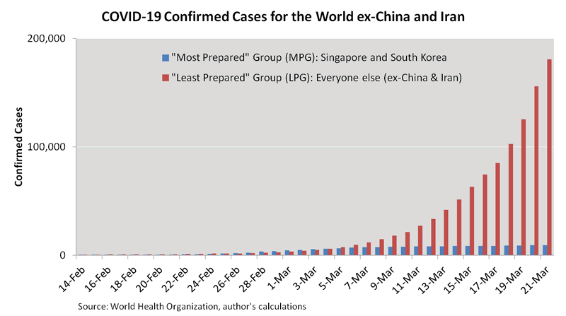
As of today, the MPG has successfully “flattened the curve,” whereas the LPG continues to see exponential growth. Here are the best-fit exponential curves for the LPG, calculated on a weekly basis from February 15 until March 21:
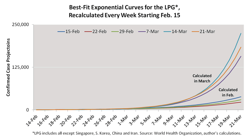
The curve steepened sharply in March, probably due to increased testing. But let’s take a closer look. The next chart shows the daily evolution for the “steepness statistic,” which is the part of the exponential function that determines the trajectory:
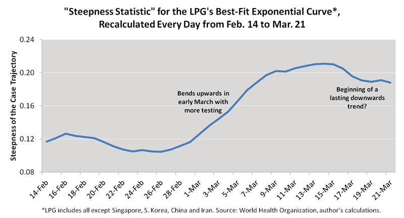
According to the chart, the case trajectory has passed through two stages since late February.
- It steepened almost continuously as testing activity increased.
- It then peaked on March 14 and started to flatten.
So that’s the past, but what about the future? How quickly, if at all, will the steepness statistic fall?
I doubt anyone can answer that with precision, especially with countries such as the U.S. only recently ramping their testing. But it sure seems as though the overall trend should continue downwards. With the extreme containment measures currently in place, it’s hard to imagine any other result. Or maybe I just don’t want to imagine a different result.
Either way, let’s be optimistic. Let’s agree that the March 14 peak delivers good news. It says the first derivative of the daily new case count is no longer rising day-after-day-after-day. That might be hard to conceptualize, but it’s exactly how these types of processes change direction. The first derivative turns downwards, and then the daily new case count turns downwards, and then the inflection point becomes apparent to all.
Implications for Stock Prices
Now for the bad news, which is that I’ve just exhausted my supply of good news, at least when it comes to stock prices. As the case trajectory flattens, we should see bursts of optimism that push prices higher, but probably not a market bottom. The problem is the two elephants that seem in no particular hurry to leave the room.
- Businesses have shut down more suddenly and completely than ever before.
- We have no idea when the business shutdowns will end.
Let’s say restaurants, bars, stores, factories, offices, schools, entertainment venues and transportation hubs reopen in about eight weeks. That seems possible, but it’s probably not sustainable. If political leaders remain consistent, any newfound infections would then send businesses right back out of work. In my county, for example, all nonessential businesses were told to close just as the confirmed case count climbed from 1 to 2.
In the meantime, we’re about to be bombarded with the worst economic data releases we’ve ever experienced. The economy is probably contracting even more sharply than it did during the 1933 national bank holiday, which is the only comparable I can think of. At a time when people withdrew cash from banks to make purchases, the bank closures brought much of the economy to a sudden halt. But the bank holiday only lasted seven days.
Others point to the 1980 and 2008-9 recessions, but in those instances the economy shrank organically. This time, it’s literally being locked down. I fail to see how those past recessions—or any past recessions, for that matter—can shed much light on the present one. And I can say the same thing about past pandemics, which have never before triggered worldwide, government-mandated business closures.
So instead of looking at, say, stock market returns in 1980, 2008-9 or during any other recession or major calamity, I expect the key to the market’s performance to lie in the answer to this straightforward question: At what point does our capacity to treat COVID-19 patients allow businesses to reopen?
Notably, at least one policy maker has pledged not to restart the economy until fatality risks reach zero. That approach might not be universal, but it doesn’t seem that far from consensus within the political class. Elsewhere, though, commentators are challenging that consensus, stressing connections between economic decline and public health. See, for example, this editorial by the Wall Street Journal and this commentary by a contributor to the CFA Institute’s Enterprising Investor blog.
Clearly, my question doesn’t have a single “correct” answer, and yet it might be the most important piece of the current policy mix. To stray briefly from financial to societal commentary, I hope policy makers develop their answers carefully. The WSJ might have summarized the predicament best when writing that “no society can safeguard public health for long at the cost of its economic health.”
Now bringing the discussion back to stock prices, the answer to my question determines when the cloud of uncertainty finally lifts. It determines when investors can resume normal financial analysis, and when commentators predicting the next bull market might finally be onto something.
Bottom Line
No doubt, market volatility brings opportunities. Long-term investors are finding value as the market falls, and even short-term traders are finding buying opportunities as prices bounce wildly up and down.
But risk tolerance is paramount. For those unable to stomach losses on new holdings, my nickel’s worth of advice is to be cautious. I’ve shared my most optimistic chart—showing a declining case trajectory—but I don’t expect it to turn the tide in the stock market. For that, we’ll need more clarity about when we can once again claim “the business of America is business.” That’s at least weeks and possibly many months away.
By Daniel Nevins, CFA
Copyright 2020 © Daniel Nevins - All Rights Reserved
Disclaimer: The above is a matter of opinion provided for general information purposes only and is not intended as investment advice. Information and analysis above are derived from sources and utilising methods believed to be reliable, but we cannot accept responsibility for any losses you may incur as a result of this analysis. Individuals should consult with their personal financial advisors.
© 2005-2022 http://www.MarketOracle.co.uk - The Market Oracle is a FREE Daily Financial Markets Analysis & Forecasting online publication.


