


Energy Complex Deflation Was All in the Charts
Commodities / Energy Resources Mar 09, 2020 - 03:33 PM GMT

I promised you on Friday that I would take an in-depth look at the energy complex in the Weekend Report. If there is one sector to define the possible deflationary event we’ve been discussing for the last several months or so oil is probably the most important commodity of all. Eventually we’ll know the cause in no uncertain terms, but the charts have been suggesting for a long time now that something is afoot and we need to pay attention.
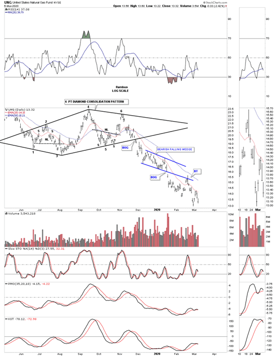
Lets start by looking at the UNG, natural gas fund, as it has been leading the way lower. This first chart is a 10 month daily look which shows a 6 point diamond consolidation pattern which at the time of its development I thought would probably be a reversal pattern to the upside as the price for natural gas was already so low. As you know I usually try to take one position on the initial breakout and a second position on the backtest. I missed the initial breakout and the backtest failed to reach the bottom rail of the diamond so I never got positioned. The other important feature on this chart is the blue bearish falling wedge which we know shows up in fast moving impulse moves.
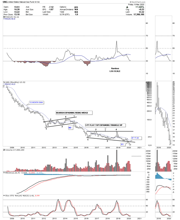
This 6 year weekly chart for UNG is the chart that really got my attention for the energy complex. Once the 6 point diamond gave way to the downside that strongly suggested that the bottom rail of the 2016 flat top expanding triangle was also going to break to the downside as well. The breakout came on December 9th of 2019. If you look real close you can see a ping pong move that took place between the bottom rail of the 6 point diamond and the bottom rail of the 2016 flat top triangle before the actual breakout as shown by the blue circle.
![]()
It is always important to tie everything together by looking at a long term monthly chart. Below is a 12 year monthly chart which shows the previous consolidation pattern that formed between 2012 to 2015 which was a bearish expanding rising wedge. The importance of that pattern is that it gives us a way to measure for a price objective using the 2016 bearish flat top triangle as a halfway pattern. I haven’t put the price objectives on this chart but the two methods I use measures out between roughly 5 and 8 dollars.
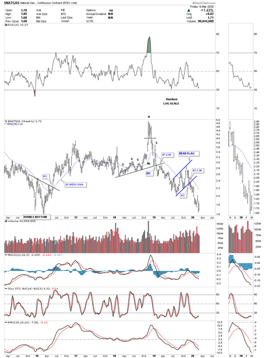
I also look at the $NATGAS, which is showing a bear flag on this 5 year weekly chart.
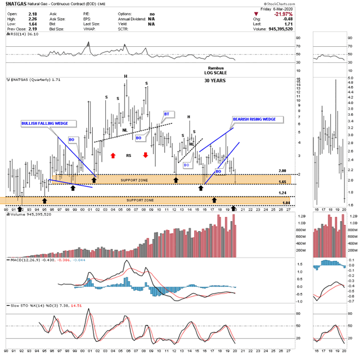
This 30 year monthly chart for $NATGAS shows it has been in a bear market since July of 2008 when it completed the head of its massive H&S top. Currently the price action is sitting on the massive support and resistance line that goes all the way back to September of 1995 as shown by the black arrows.
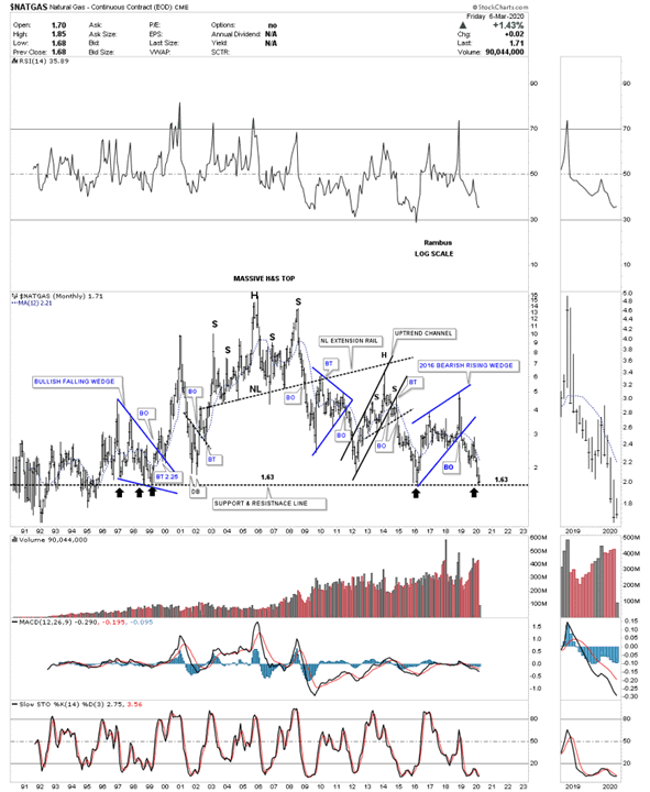
Back in 2014 when I originally built out this quarterly chart I had 2 possible price objectives based on the 2 brown shaded S&R zones. As you can see natural gas finally found support at the bottom of the upper brown shaded S&R zone at 1.65 where it has been consolidating that impulse move. The absolute low for this natural gas index came in 1992 at the 1.04 area which would not surprise me if we see that low hit again during our current selloff.
Next lets look at some charts for the USO, oil fund, which we were able to get positioned Short with DWT. This daily chart shows a perfect one year triangle consolidation pattern with a breakout and a perfect backtest to the bottom rail.
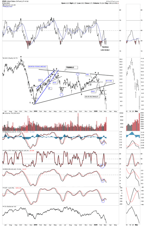
At the beginning of this report we looked at the weekly chart for the UNG which showed its 2016 flat top expanding triangle which gave me a very big clue, when it broke below the bottom rail, that it was going to lead the energy sector lower. Below is the weekly chart for the USO which broke below the bottom rail of its 2016 bearish expanding rising wedge 2 weeks ago. There was also a ping pong move between the bottom rail of the 2019 blue triangle and the bottom rail of the 2016 expanding rising wedge. Early last week USO backtested the bottom rail of the 2016 bearish rising wedge which has now cleared the way for the impulse move to take hold. The bottom line is that we have a very clean line in the sand at the 10.20 area.
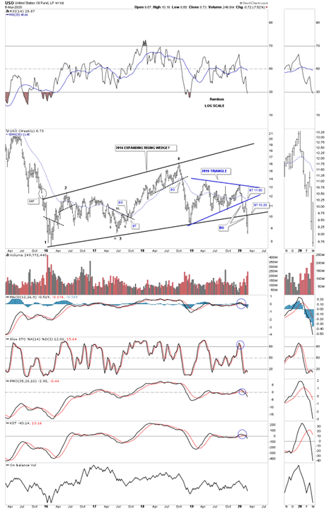
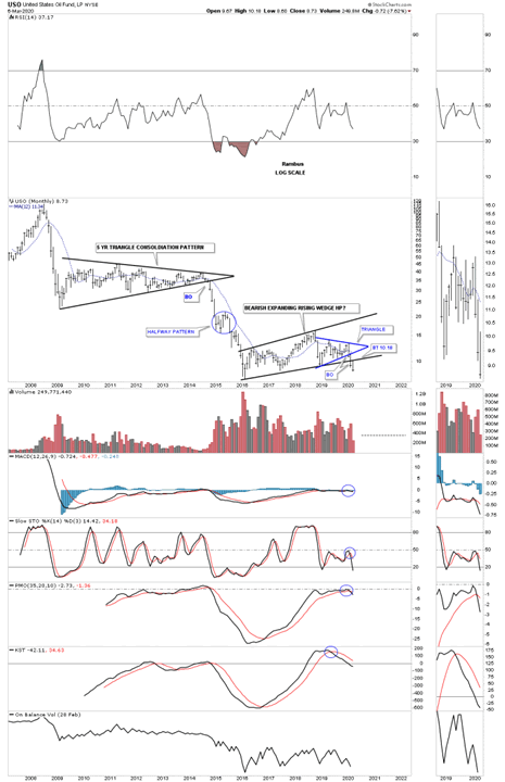
Similar to the long term monthly chart we looked at for the UNG, USO has formed a similar halfway pattern. The impulse move down from the 5 year triangle took almost 18 months to complete starting at the breakout point. The blue circle shows a halfway pattern that formed which was actually an expanding triangle.
Lets take a look at a weekly chart for the $WTIC, light crude oil, which is showing it has formed a 2016 H&S top with the neckline being broken to the downside last week.
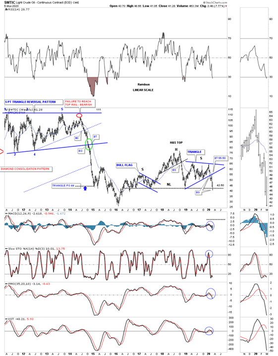
Below is a long term 20 year monthly chart which puts the 2016 H&S top in perspective. I won’t be surprised if the WTIC reaches the bottom rail of the 2008 falling wedge.
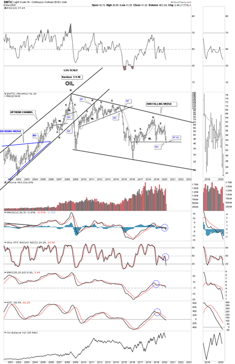
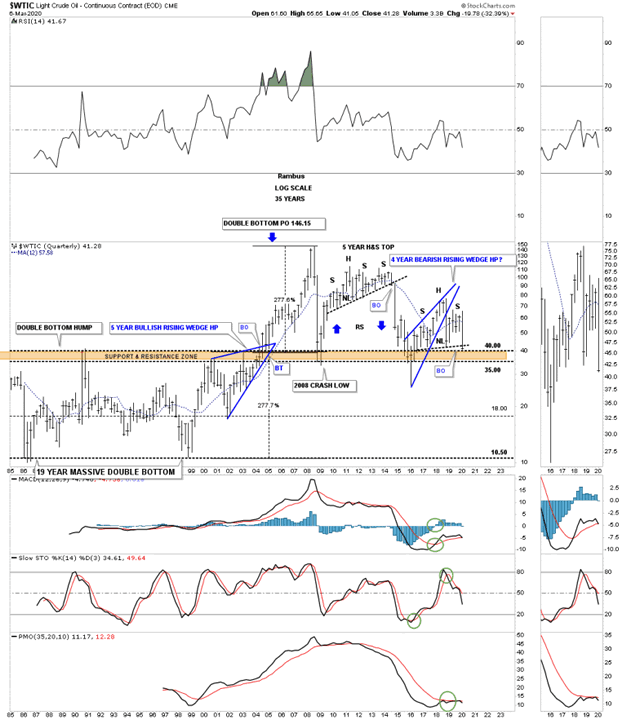
I originally built out this 35 year quarterly chart at the same time I built the long term quarterly chart for UNG. Back in the middle of 2014 UNG was beginning to breakdown from its 5 year H&S top just like many other commodities. Since the move up was so vertical after the 2008 crash I was looking for some reverse symmetry to the downside over the same area on the way up as shown by the blue arrows. The brown shaded support and resistance zone is formed from the previous highs made between 1985 and 2004 when oil finally broke out above that massive resistance zone and ran straight to 147. Note how the current price action has formed a classic H&S top with the left shoulder and head forming inside of the blue rising wedge and the right shoulder high forming towards the backtest point.
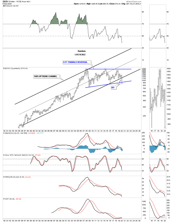
The $XOI, oil index, I follow which is breaking down from 2 important trendlines, the bottom rail of the 1985 uptrend channel and the bottom rail of the 5 point triangle reversal pattern.
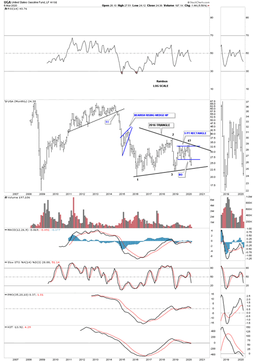
This last chart for tonight is a long term monthly chart for the UGA, US gasoline fund, which is beginning to breakdown from a 5 point blue rectangle that is forming toward the apex of its 2016 triangle. The blue rectangle is strongly suggesting the bottom rail of the 2016 triangle is going to give way.
The last time we had a deflationary event was form the middle of 2014 to March of 2015 when many of these long term charts were made. I’m still amazed how these long term chart patterns could see way back then that deflation would be the issue and not inflation.
Time to get this posted. All the best…Rambus
PS:
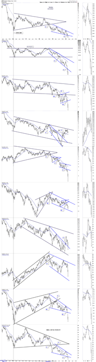
I don’t know if I’ve ever showed you this combo chart for some of the smaller cap energy stocks. You can see how bearish many of these stocks look as they are breaking down from bearish falling wedges and bearish rising flags and wedges which show up in strong impulse moves.
All the best
By Rambus Chartology
FREE TRIAL - http://rambus1.com/?page_id=10
© 2020 Copyright Rambus- All Rights Reserved
Disclaimer: The above is a matter of opinion provided for general information purposes only and is not intended as investment advice. Information and analysis above are derived from sources and utilising methods believed to be reliable, but we cannot accept responsibility for any losses you may incur as a result of this analysis. Individuals should consult with their personal financial advisors.
© 2005-2022 http://www.MarketOracle.co.uk - The Market Oracle is a FREE Daily Financial Markets Analysis & Forecasting online publication.