


Testing the Fed’s Narrative with the Fed’s Data: QT Edition
Interest-Rates / US Federal Reserve Bank Jun 25, 2019 - 02:42 PM GMTBy: F_F_Wiley

“The fact that financial markets responded in very similar ways … lends credence to the view that these actions had the expected effects on markets and are thereby providing significant support to job creation and the economy.” —Ben Bernanke defends the idea that markets and the economy respond significantly to quantitative easing
“… it will be like watching paint dry, that this will just be something that runs quietly in the background.” —Janet Yellen refutes the idea that markets and the economy respond significantly to quantitative tightening
It doesn’t take much calculation to see that the Fed’s position on quantitative tightening (QT) is blatantly inconsistent with its position on quantitative easing (QE). You only need to notice that the excerpts above, taken together, violate the following pair of postulates:
- When A and B are opposites, the effects of A should be opposite to the effects of B.
- QT is the opposite of QE.
So financial markets and the economy should respond significantly to both QE and QT—although in opposite directions—or they should respond to neither QE nor QT. To claim otherwise, as in the excerpts above as well as other similar communications, is like arguing that one of the two postulates is wrong in the context of the Fed’s bond portfolio. That seems unlikely, but not impossible. In particular, the first postulate falls short of being an absolute truth, reality sometimes being more complicated than we’d like it to be. Consider that Newtonian physics seemed absolute enough until Einstein came along.
But former Fed chairs Bernanke and Yellen aren’t relativity theorists and haven’t framed it like that. In public comments and speeches that I’m aware of, they haven’t acknowledged the postulates in the first place let alone explained why they reject the logic of opposite actions yielding opposite effects. In fact, they don’t have to acknowledge or explain, because major media outlets—those with invites to FOMC press conferences and “sources” close to the key decision makers—rarely challenge the Fed’s narrative. If you’re established in the mainstream, there’s no upside to investigating inconsistencies, only the downside of being seen as impolite while jeopardizing your coveted invites and sources.
Awkwardness Alert: Here Comes a Chart that Really Excites Me
So let’s agree that the Fed’s positions on QE and QT are incompatible, at least on the surface, and it’s only decorum and incentives that prevent, say, the Wall Street Journal from calling bullshit. Since I’m only stating the obvious, you agree so far, right? Yes? Good. Now let’s see what the data say. And by “data,” I mean the Fed’s own Z.1 report. Regular readers might recall that I used the Z.1 to test claims about QE, posing two questions that seemed reasonable to ask:
- How rapidly do banks and broker–dealers (BDs) expand credit during QE periods (QE1, QE2 and QE3) compared to QE pauses (all other times)?
- How does bank and BD credit expansion compare to the Fed’s credit expansion during the same periods?
Here are the answers in chart form:
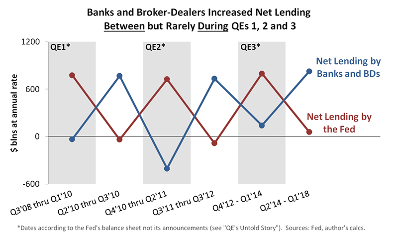
Call it TMI, but the chart still excites me five years after I first produced it. (You can find the latest iteration here and then follow links to earlier versions.) Two of the most obvious questions yield the cleanest imaginable outcome—the private financial sector and the Fed almost perfectly offset each other! The Fed grabbed the credit-growth baton for QE laps and then passed it back for QE pauses, but whoever didn’t have it more or less stood still.
In other words, whereas the Fed expected to increase the amount of credit supplied to the nonfinancial sector, the Z.1 suggests it only substituted one source of credit for another. That’s not to say QE had no effects at all—it clearly jolted market psychology, and therefore, influenced market prices. But the Z.1 refutes the primary mechanism claimed by Bernanke, which required QE to increase total credit supply. The hypothetical chart that fits Bernanke’s expectations would have been less argyle and more Charlie Brown zigzag, with total credit creation rising to new highs during QE periods and then falling back during pauses.
All of which brings us from QE to QT. As of this month, the Z.1 shows four consecutive quarters of the Fed reducing its net lending, thanks to QT. So the argyle effect is necessarily over, because the Fed no longer alternates between only two options—QE and not-QE. The pattern has to change, but to what? Well, here’s the answer:
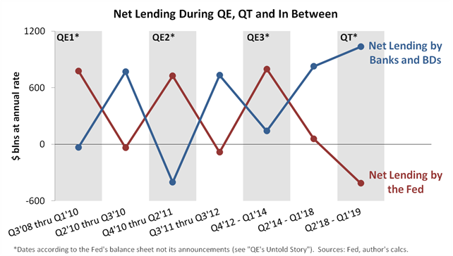
Not as clean this time, right?
On one hand, the private financial sector appears to have neutralized some portion of QT by increasing its net lending after the Fed’s lending began to shrink. On the other hand, the financial sector’s increased lending didn’t exactly offset the Fed’s decrease. The change in the first is about half the magnitude of the change in the second.
Three Possibilities
So what exactly does the new QE–QT pattern tell us? I’ll suggest three possibilities, ordered from my least likely to my most likely:
- QT might have caused the total amount of credit supplied to the nonfinancial sector to fall, a result that would be intriguing largely because of what it would say about the central bank’s expectations. If the private financial sector fully offset QE’s credit creation but not QT’s credit contraction, which is the conclusion you might reach if relying on nothing but the chart, then Bernanke and Yellen got it completely backwards. You’ll never see that conclusion in the Wall Street Journal, for the reasons noted above, but it actually fits the data.
- We might not have enough QT data to reach a firm conclusion just yet. In other words, we might find that the picture changes with a few more QT quarters, especially as the volatility of these figures is quite high. That’s why I waited for four quarters of data before publishing my chart, but four still might not be enough.
- Total net lending might have declined over the last four quarters even without QT, such that any QT effects were negligible, notwithstanding my chart. Instead, debt-saturated borrowers might have decided to take a rest after nine years of expansion and independently of monetary policy. This view lines up nicely with the Fed’s loan officer survey, which shows weakening demand for most types of loans during the last four quarters. It’s also consistent with the idea that monetary policy makers neither manufacture nor extinguish creditworthy borrowers, who travel to loan and underwriting desks from all corners of the economy, just not from the front steps of the Eccles building as the Fed adjusts its bond holdings.
For what it’s worth, my last point above ties into what I believe to be one of the biggest flaws in the Fed’s make-up. That is, scholars like Bernanke and Yellen reason from theories that require people to respond slavishly and robotically to every adjustment in public policy, however odd, circular or obscure the adjustment might be. In Bernanke and Yellen’s world, it’s no exaggeration to say that central banks really do manufacture creditworthy borrowers, as if the term open market account describes a freakish assembly line, not a simple bond portfolio.
Bottom Line
You’ll form your own views on all of the above, but my advice is to filter the Fed’s narrative with a healthy skepticism, however deferentially the media chooses to endorse it. I’m not saying the narrative is always wrong, just that monetary policy is notoriously difficult to evaluate. But not impossible—the Fed’s data can help separate fact from fallacy. Dig into the Z.1, and you might find that the best reality-check is a single chart—call it the Burberry truth—modest in ambition but scintillating nonetheless.
F.F. Wiley
F.F. Wiley is a professional name for an experienced asset manager whose work has been included in the CFA program and featured in academic journals and other industry publications. He has advised and managed money for large institutions, sovereigns, wealthy individuals and financial advisors.
© 2019 Copyright F.F. Wiley - All Rights Reserved
Disclaimer: The above is a matter of opinion provided for general information purposes only and is not intended as investment advice. Information and analysis above are derived from sources and utilising methods believed to be reliable, but we cannot accept responsibility for any losses you may incur as a result of this analysis. Individuals should consult with their personal financial advisors.
© 2005-2022 http://www.MarketOracle.co.uk - The Market Oracle is a FREE Daily Financial Markets Analysis & Forecasting online publication.