


Inflation or Deflation ? Market Drama and Suspense !
Stock-Markets / Financial Markets 2018 Jul 25, 2018 - 01:51 PM GMT

 The big question I’ve been grappling with recently is the inflation or deflation theme. Last Friday’s price action felt like a counterpunch to the deflation scenario as the US dollar fell pretty hard and interest rate reversed. It was almost exactly a year ago around at this time that we started to take some positions related to the inflationary scenario by buying some of the different commodities stocks like BHP, COPX, KOL, UWT, SCCO, SCHN and STLD. Many had broken out of large trading ranges and H&S bottoms. In January of this year when the US stock markets began our recent correction I went to 100% cash as I wanted to be safe than sorry. That was also about the time the US dollar began to find a possible bottom which had pretty much been in a free fall.
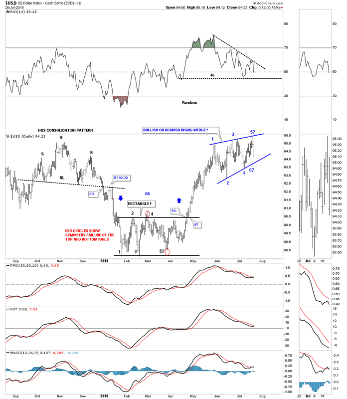
Lets start by looking at some US dollar charts as it will most likely be our guide in the inflation or deflation theme going forward. This first daily chart shows the US dollar initially bottoming in late January and then building out the five point rectangle reversal pattern that reversed the downtrend. After a strong impulse move up the US dollar began to correct that impulse leg by building out a rising wedge formation seven weeks ago. IMHO that seven week rising wedge is probably the most important chart pattern on the planet right now. Whichever way it breaks out will affect a lot of markets.
One of the hallmarks of a bullish rising wedge or flag is that they almost always have a negative divergence on the RSI. If you think about it a consolidation pattern that slopes up in the direction of the trend is like a running correction. Even though the price action is still going higher the RSI has a chance to correct its overbought condition. In strong moves the RSI often finds support around the 45 area before reversing back up. With the move up last week the US dollar completed its fourth reversal point which puts it into the consolidation pattern category. Since the top rail held resistance the price action is now declining in a possible fifth reversal point which won’t be complete until the bottom rail is reached. Even if the bottom rail is touched we could still see a sixth reversal point back to the upside. The bottom line is, whatever direction this rising wedge breaks a pretty big move should follow.
Below is a two year daily chart which shows the year and a half downtrend channel with the rising wedge forming just above the top rail. It’s easy to see how the rising wedge will most likely be a consolation pattern to the upside or a top. The thin black rectangles at the top of the chart show how the original downtrend channel doubled in size when the center dashed midline was broken to the downside. Before the break to the downside the center dashed midline was the bottom of the downtrend channel.
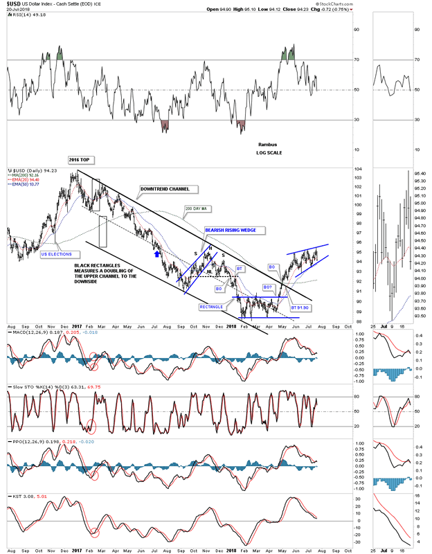
There was a possible bigger reversal pattern we discussed shortly after the breakout above the year and a half downtrend channel which was a possible inverse H&S bottom. We were looking at the 95 area for a possible neckline and symmetry would suggest the low for the right should could come at the left shoulder low around the 91 area. The 200 day simple moving average comes in at 92.16.
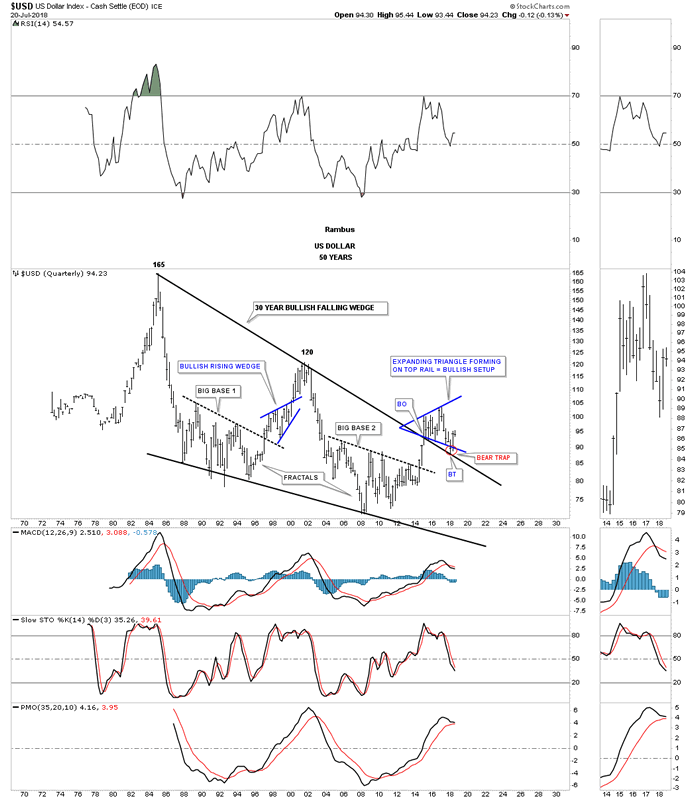
This next chart is a long term monthly look which shows the US dollar’s uptrend channel that actually began in 2011 at reversal point #4 in the fractal big base #2. Until the bottom rail of the nearly seven year bull market uptrend channel is broken to the downside I have to remain a bull regardless of all the reasons the US dollar should crash and burn.
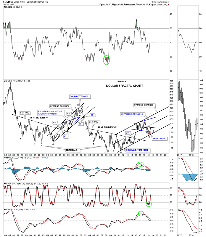
Below is another monthly chart which uses candlesticks. When the US dollar is in a strong impulse move up you will see a string of white candlesticks all in a row and when the US dollar is in a strong impulse leg down you will see a string of black candlesticks all in a row. Up until last week the US dollar had made four white candlesticks all in a row. We still have seven more days of trading so it will be important to see what the monthly bar will look like. In a strong impulse leg up we may see one black candlestick that will generally show up as a small consolidation pattern between all the white candlesticks. You can see that the 2014 – 2105 impulse leg up didn’t have one black candlestick. It’s just something we can watch.
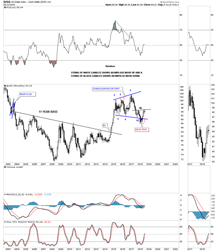
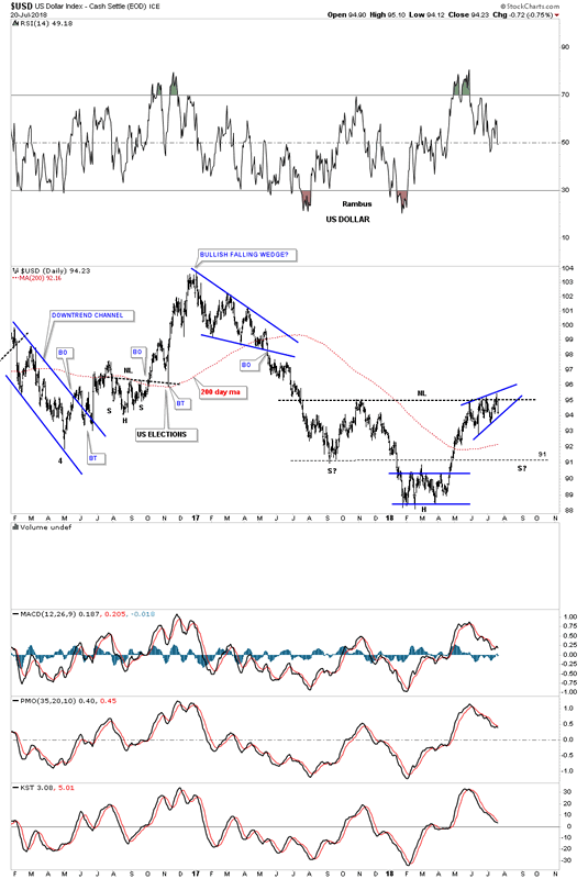
When that strong impulse move out of big base #2 broke out that impulse leg was strong enough to take out that 30 year top rail of the falling wedge. As you can see the price action initially backtested the top rail right after the breakout which is what we would expect but the markets never make it easy on you. The breakout above the top rail of the 30 year trendline took place in January of 2015, that same trendline was backtested three years later in January of 2018, which held once more so we know it’s important.
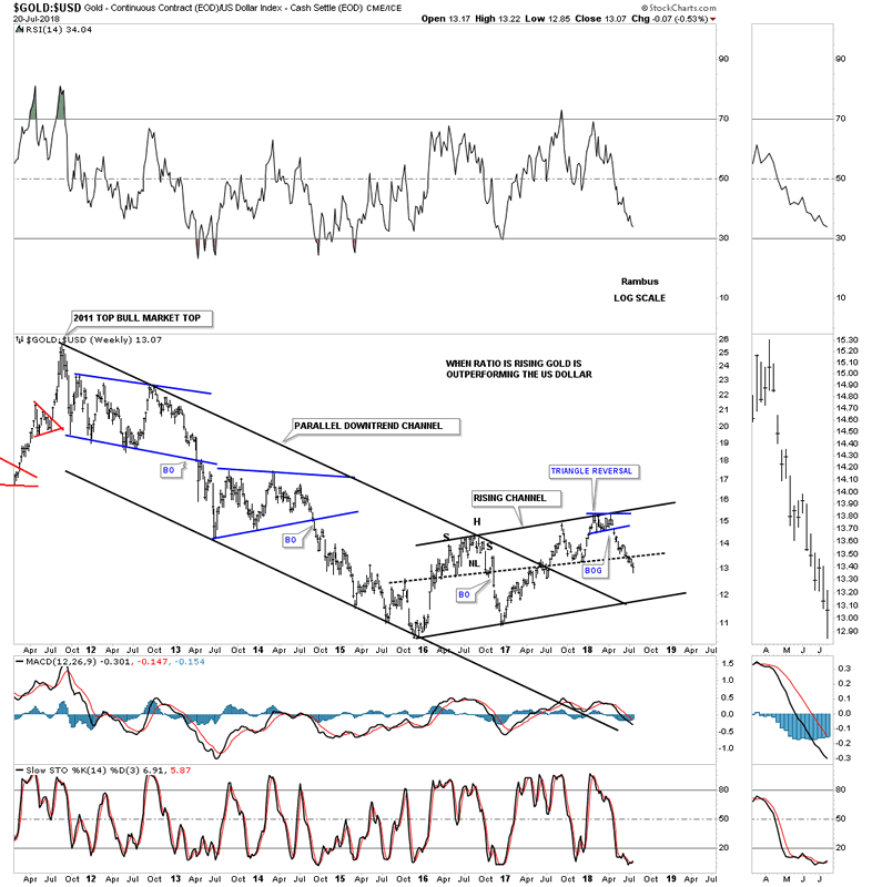
Lets now look at several ratio charts to see how the US dollar is behaving vs gold. This first ratio chart compares gold to the US dollar. The last time we looked at this chart the price action was just starting to breakdown from that small blue 5 point triangle reversal pattern. When this ratio is rising that means that gold is outperforming the US dollar. As you can see the ratio has been falling since January of this year which means the US dollar has been outperforming gold.
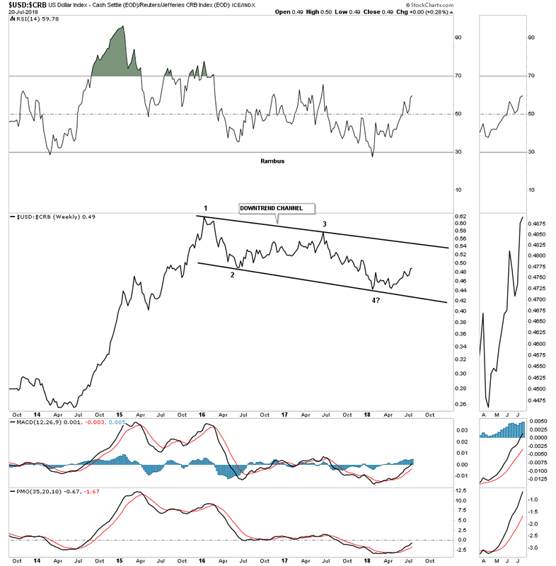
This next ratio chart compares the US dollar to the CRB index. Since 2016 the US dollar has been under performing the CRB commodities index forming a falling channel. Since January of this year the ratio has been rising which means the US dollar has been outperforming the CRB index. Note that strong impulse move up that started in mid 2014 and how the US dollar really outperformed the CRB commodities index. It still has a way to go yet, but if the price action breaks out above the top rail that 2 1/2 falling channel will most likely be a halfway pattern to the upside with the impulse leg showing similar characteristics to the 2014 – 2015 impulse leg. Again we can’t get too excited until the top rail is broken, but the possibility exists.
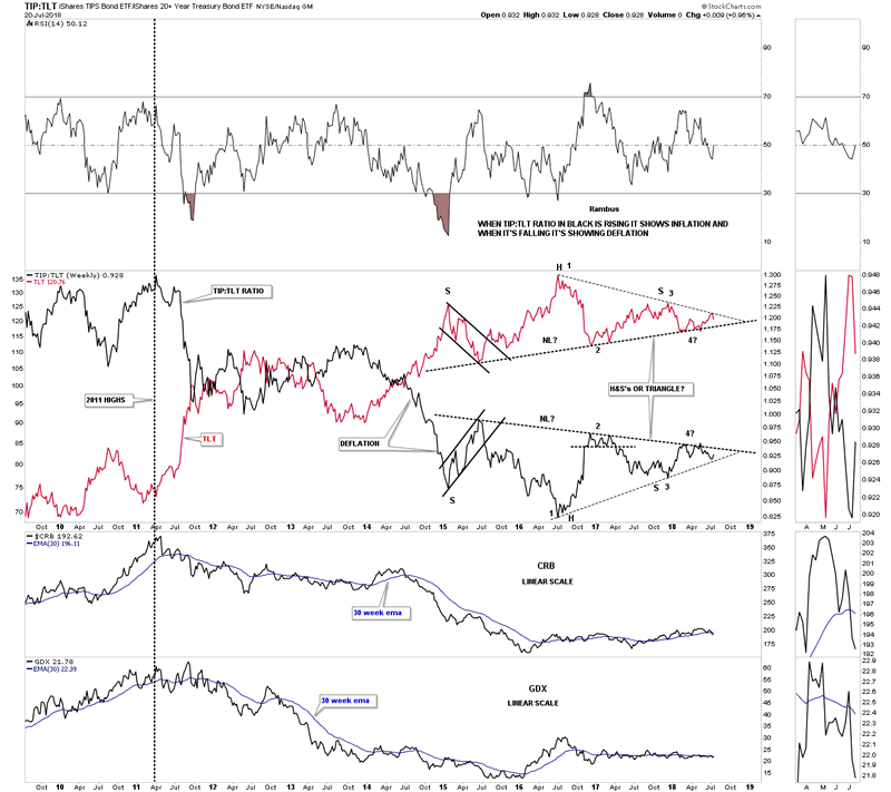
This last chart for tonight is a ratio combo chart which has the TIP:TLT ratio on top with the TLT overlaid in red with the CRB and GDX on the bottom. When the ratio in black is rising it shows inflation and deflation when it’s falling. This chart really sums up the debate on whether we are going to see some inflation or deflation. For three and a half years now the price action has been building out what appears to be a H&S top on the TLT in red and a H&S bottom on the ratio in black. The last time we looked at this chart I drew in the thin black dashed trendline which is showing a possible triangle. As you can see the TLT in red bounced off the top dashed trendline last week while the ratio in black bounced off of its bottom trendline last week as well. Even though the ratio in black rose a little bit last week the CRB and the GDX indexes both declined. If you like drama and suspense then this ratio combo chart is for you.
All the best
Gary (for Rambus Chartology)
FREE TRIAL - http://rambus1.com/?page_id=10
© 2018 Copyright Rambus- All Rights Reserved
Disclaimer: The above is a matter of opinion provided for general information purposes only and is not intended as investment advice. Information and analysis above are derived from sources and utilising methods believed to be reliable, but we cannot accept responsibility for any losses you may incur as a result of this analysis. Individuals should consult with their personal financial advisors.
© 2005-2022 http://www.MarketOracle.co.uk - The Market Oracle is a FREE Daily Financial Markets Analysis & Forecasting online publication.