


Stock Market 2018 - Four Calling Charts....
Stock-Markets / Stock Markets 2018 Dec 24, 2017 - 02:15 PM GMTBy: Submissions

 Chad Champion writes:
It’s a good time to look at the big picture as 2017 comes to an end.
Chad Champion writes:
It’s a good time to look at the big picture as 2017 comes to an end.
In other words, what are the indicators telling us?
Today, I’m going to talk about four charts. The bottom line is this… Investors need to be more cautious and more selective in what they buy.
Like I explained a couple of weeks ago, it’s time to sell expensive and buy cheap.
Here’s why…
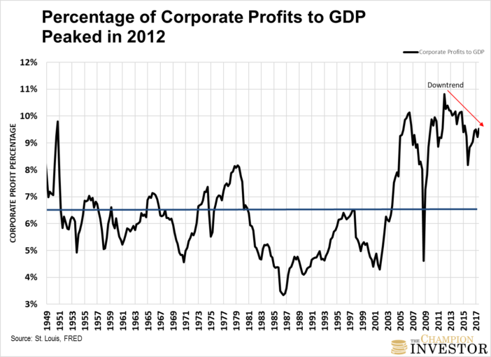
Corporate profits as a percentage of gross domestic product (GDP is the total value of everything produced within a country’s borders) have been declining since 2012.
Back then, corporate profits were close to 11% of GDP.
You can see the downtrend here…
As Nobel Prize Winning Economist Milton Friedman said this week in Fortune Magazine,
“When earnings are exceptionally high, they don’t just keep booming… Profits must move back down to their traditional share of GDP. They can’t break loose from economic gravity.”
Profits today are 9.5% of GDP. The blue line above is the historical average of corporate profits to GDP since 1949. It’s 6.5%.
They have been “loose from economic gravity” for several years. So far, they’ve declined 12% (as a percentage of GDP) from their peak.
Yet, as you’ll see in the next chart, stock values continue making record highs.
Corporate profits and stock values can’t go in opposite directions for too long. It’s a signal that a correction in the stock market looms.
This second chart I’m referring to is known as the “Warren Buffett Indicator.” It’s near all-time highs.
He says, “It is probably the best single measure of where valuations stand at any given moment.”
This indicator measures total stock market capitalization as a percentage of GDP.
A common way to measure it is by using the Wilshire 5000 Full Cap Market Index as a proxy for stock market cap. (The Wilshire 5000 Index tracks all stocks actively traded in the U.S. Market cap is just the value of all a company’s shares times the company’s stock price. An index like the Wilshire 5000 shows all company market caps combined.)
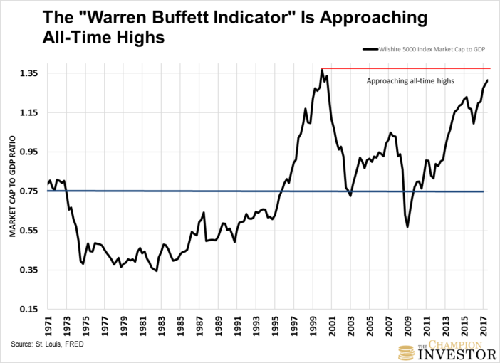
The blue line is the historical average since 1971. It’s 75%. Today, the stock market cap to GDP is 131%.
Even if you use the high point in 2007 before the global financial crisis as “normal”, the ratio would need to correct by 20%.
As you can see from both charts, profits and stock values as a percentage of GDP are going in opposite directions.
Yet based on the final two charts, no one seems to be worrying about it.
The St. Louis Federal Reserve measures the degree of financial stress in the markets using an indicator called the St. Louis Fed Financial Stress Index. It’s a mix of 18 different weekly data series.
As you can see below, the index is at an all-time low since its inception.
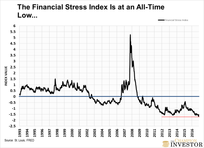
Zero (the blue line) means “normal financial market conditions.” Above zero is above-average financial market stress.
Below zero is below-average financial market stress. Which is what it is telling us today.
Even though profits and stock values are going in opposite directions.
The TED Spread is telling us banks aren’t worried either…
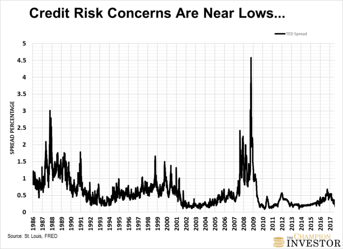
The TED Spread is the difference between the 3-month LIBOR rate and the 3-month Treasury Bill rate. (LIBOR is the rate banks charge each other for lending.)
It’s generally used to measure economic risk. Most would consider the U.S. 3-month Treasuries the safest assets on the market. Which is why it’s used for the spread.
The larger the spread between the two, the larger the economic risk in the economy. It generally means banks think there’s a chance that some banks could default.
So, banks charge a higher rate to borrowers because of the higher risk.
You can see it spiked when the market crashed in 1987, during the dot-com bust and the financial crisis.
Right now, it’s telling us economic risk is low. Again, even though corporate profits and stock market values are diverging.
Look, no one can’t predict what’s going to happen next. Stocks could run a lot higher from here.
But it’s time to think about the risk versus the reward. Like I explained earlier, the bottom line is that it’s time for investors to be more cautious and more selective in what they buy.
Remember, the price you pay for an asset is the single biggest driver of future returns. Sell what’s expensive, buy what’s cheap.
By Chad Champion
http://thechampioninvestor.com
Chad is the Founder and Chief Investment Strategist at The Champion Investor. He’s focused on giving the individual investor the good, the bad and the ugly on stocks, the markets and the economy.
You can sign up for his free investment letter, Cut to the Chase, to learn how to make money in any market, create a second income stream, make more money and be a better investor.
He has a Finance and Investment Management background with a Master’s Degree focused in Investment Management and Financial Analysis and a Masters of Business Administration focused in Financial Management.
He spent the past couple of years working as the lead analyst at The Casey Report and as a research analyst for Bill Bonner at Bonner and Partners.
© 2017 Copyright Chad Champion - All Rights Reserved
Disclaimer: The above is a matter of opinion provided for general information purposes only and is not intended as investment advice. Information and analysis above are derived from sources and utilising methods believed to be reliable, but we cannot accept responsibility for any losses you may incur as a result of this analysis. Individuals should consult with their personal financial advisors.
© 2005-2022 http://www.MarketOracle.co.uk - The Market Oracle is a FREE Daily Financial Markets Analysis & Forecasting online publication.