


The Chartology of the Dow Jones Industrial Average ..A Case for Optimism
Stock-Markets / Stock Markets 2016 Aug 11, 2016 - 09:45 AM GMT

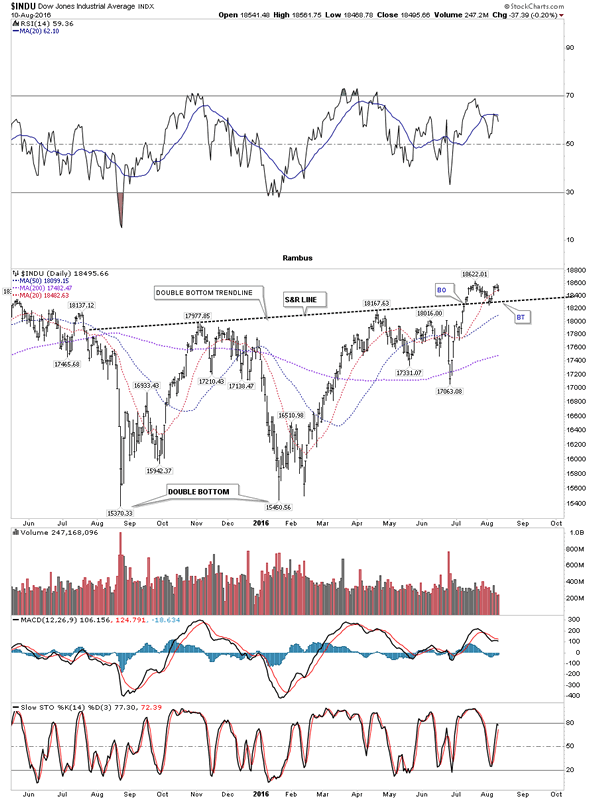
 Lets start off by taking an indepth look at the INDU as a proxy for the other US stock markets. A year ago this month the INDU put in an important low which has held support. A very strong rally ensued which took the INDU up to the 17,975 area where it topped out and began another strong decline. This next decline ended in the same area as the August 2015 low and formed a double bottom which is a reversal pattern.
The next rally phase took out the previous high by 200 points up to 18,167 where the next decline began, but this time the bears could only push the price action down to the 17,330 area which looked like it might be an important low. Then came the infamous BREXIT vote which made a slightly lower low with the INDU closing that day below the 200 day moving average. If you recall markets from all over the world were tanking hard but that decline ended just as fast as it began.
This first daily chart is just a simple look at the price action I described above, with one trendline which I’m calling a support and resistance line, above is bullish and below is bearish. That simple S&R line could also be called a double bottom trendline, which would be a five month double bottom reversal pattern.
This first daily chart is just a simple look at the price action I described above, with one trendline which I’m calling a support and resistance line, above is bullish and below is bearish. That simple S&R line could also be called a double bottom trendline, which would be a five month double bottom reversal pattern.
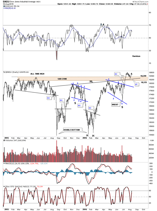
Next lets put some Chartology on the daily chart to see what chart patterns are building out. First notice the brown shaded S&R zone at the top of the chart, which is the all time high. Looking to the upper left hand corner of the chart you can see the INDU broke out above the brown shaded S&R zone and backtested from above.
Next there are two double bottoms. There is the big five month double bottom and then there is the smaller double bottom which formed earlier this year. The double bottom that formed earlier this year formed a double head of a H&S bottom formation.
The left shoulder formed a seven point bearish falling flag reversal pattern while the right shoulder formed the blue bullish expanding falling wedge consolidation pattern. We can connect the highs for each pattern which gives us a neckline. A month ago the INDU broke out above the top rail of the blue expanding falling wedge and then took out the neckline and the brown shaded S&R zone. Last week we got a backtest to the neckline which held initial support and we got a pop. As you can see there were three important resistance lines that were all broken to the upside as shown by the BO symbol with one complete backtest. It’s possible we could see a second backtest which may form a small consolidation pattern on top of the neckline. So far nothing is broken.
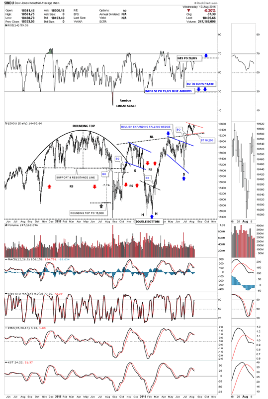
This next daily chart shows three separate price objectives based on the Chartology. First without using the neckline and just using the blue expanding falling wedge as a halfway pattern, the price objective would be to the 19,725 area as shown by the blue arrows, which is called the impulse method. The second price objective is called the breakout to breakout method, which measures the distance from the breakout point of the small double bottom to the first reversal point in the blue expanding falling wedge. The measurement is then added to the breakout point of the blue expanding falling wedge which gives us a price objective in the same general area as the impulse method, which is not that unusual.
The third price objective is based on the height of the H&S bottom which is up to the 20,875 area. I know at this point in time it seems impossible, but when we look at the longer term charts it doesn’t seem so far fetched.
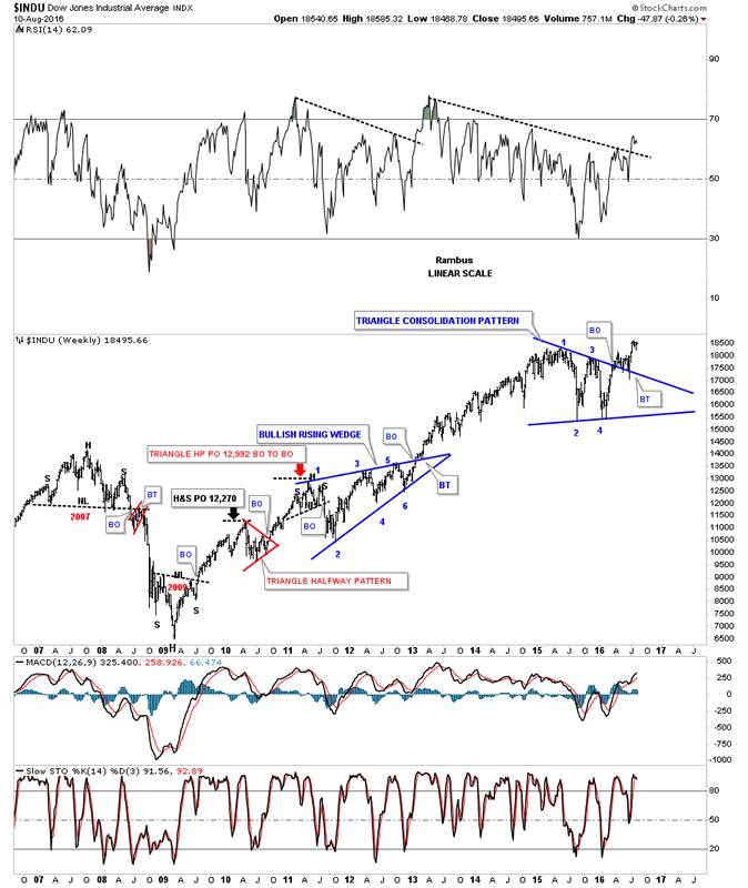
This next chart is a five year weekly look at the INDU which puts the price action on the daily charts above in perspective. There is a bigger chart pattern which is a one year black triangle consolidation pattern. If it wasn’t for the BREXIT vote the backtest to the top rail of the black triangle would have been dead on the money. So again nothing is broken at this point as long as the neckline holds support if it gets backtested again. Most are looking at this one year trading range as a reversal area for the bull market that began in the spring of 2009. It may very well be, but to get things started to the downside the neckline will have to be broken first.
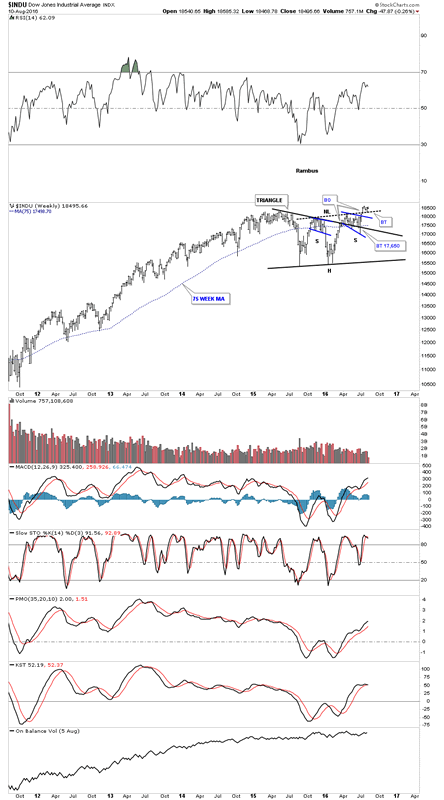
This next long term weekly chart for the INDU goes all the way back to the 2007 bull market high and the inverse H&S bottom that formed during the 2009 crash low, and the bull market that followed. From a Chartology perspective our current blue one year triangle looks more like a consolidation pattern than a reversal pattern. Time will tell.
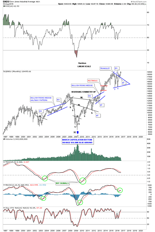
This next chart is a 20 year monthly chart which shows how the bull market that began in 2009 reversed symmetry back up until the price action traded above the old bull market high made in 2007. How many could have imagined during the 2009 crash that the INDU would be trading above 18,000 in 2015?
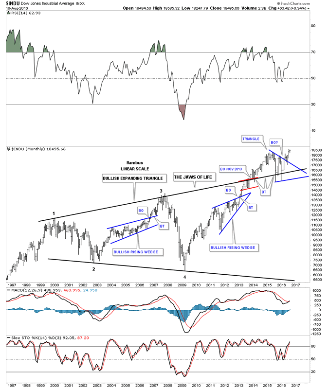
Below is another 20 year look at the INDU which shows the one year triangle forming on the top rail of the Jaws of Life consolidation pattern.
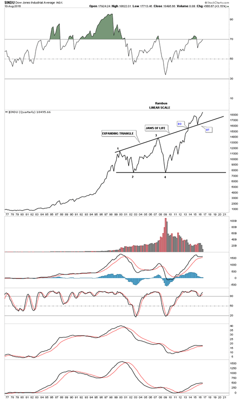
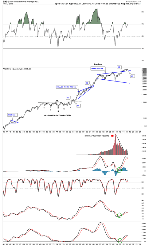
The 40 year quarterly line chart shows a beautiful breakout and backtest to the top rail of 13 year bullish expanding Jaws of Life consolidation pattern.
I would like to leave you to ponder this last chart for tonight which is a 75 year quarterly chart for the INDU. Many who study and invest in the stock markets live in a negative world. All they can see is the world is a mess and we are about to go into a black hole at any time . This attitude seems especially prevalent amongst those most interested in the Gold Markets.
But for those that can think outside of the box these charts are suggesting the future looks bright. Technology is going to change our world in more ways than one could ever imagine. It’s never going to be a perfect world, but we’re living in the best of times regardless of all the naysayers IMHO.
All the best…Rambus
All the best
Gary (for Rambus Chartology)
FREE TRIAL - http://rambus1.com/?page_id=10
© 2016 Copyright Rambus- All Rights Reserved
Disclaimer: The above is a matter of opinion provided for general information purposes only and is not intended as investment advice. Information and analysis above are derived from sources and utilising methods believed to be reliable, but we cannot accept responsibility for any losses you may incur as a result of this analysis. Individuals should consult with their personal financial advisors.
© 2005-2022 http://www.MarketOracle.co.uk - The Market Oracle is a FREE Daily Financial Markets Analysis & Forecasting online publication.