


A Cold Hard Look at The Big Cap Precious Metals Stock Charts
Commodities / Gold and Silver Stocks 2014 Jun 26, 2014 - 01:17 PM GMT

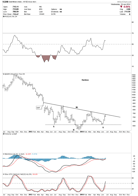
 In today’s report I would like to take a good hard unbiased look at some of the big cap precious metals stocks that have been in rally mode since the first of June. This rally has been pretty impressive so far but is it the real thing? Last night I showed you some charts on the GDM going from the 60 minute short term look to a year and a half look that showed the two big patterns we have in place right now, the falling flag and the inverse H&S bottom. Tonight I would like to follow up with some big cap PM stocks, on the 60 minute chart and the bigger long term chart charts, that have their own respective year long trading ranges.
First lets look at the 60 minute chart of the GDM that I showed you last night that had a H&S top forming. Today GDM did some more work on the right shoulder that is making the H&S top a little more symmetrical now. Keep this H&S top in your mind when we look at some of the other big cap PM stocks in a bit.
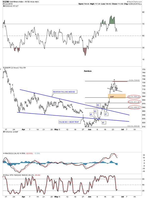
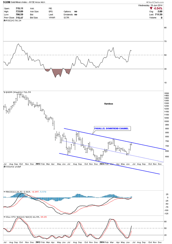
Below is the 2 year weekly chart that shows the blue parallel downtrend channel that we’ve been following for some time now. These are the two chart patterns I’m going to show you tonight, the little H&S top on the 60 minute charts and this year long blue trading range on the longer term big cap PM charts. The combination of where these little H&S tops lie in regards to the top rail of these big one year trading ranges maybe be giving us a big clue that we are just at the top of this one year trading range that may continue for who knows how much longer. I do know everyone is super bullish right now on the precious metals complex so maybe now might be a good time to go against the crowd. After we look at some of the more important big cap precious stocks you can make up your own mind.
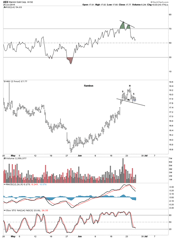
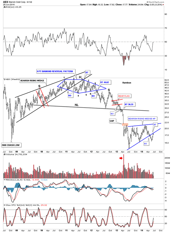
First lets look at biggest of the big cap PM stocks ABX. This 2 hour chart shows a potential H&S top that has yet to break below the neckline. Keep in mind where this potential H&S top resides on the longer term chart following this short term look.
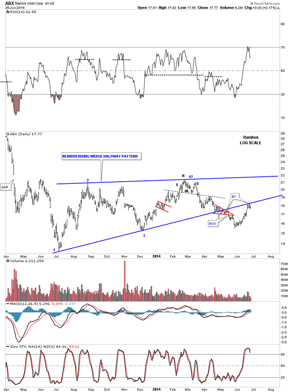
Below is the daily chart for ABX that shows our little H&S top has formed just below the bottom rail of the big blue bearish rising wedge as a backtest so far.
Now the weekly chart that shows our little H&S top forming at the bottom rail of the bearish rising wedge as the backtest. You can see how critical this area is right here on the biggest PM stock there is.
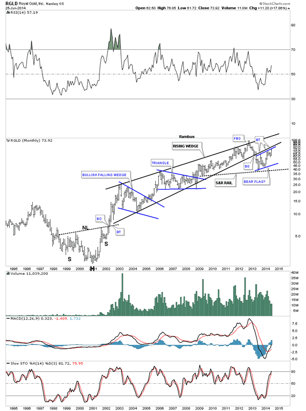
Lets now look at the star performer for this rally off the June low, RGLD.
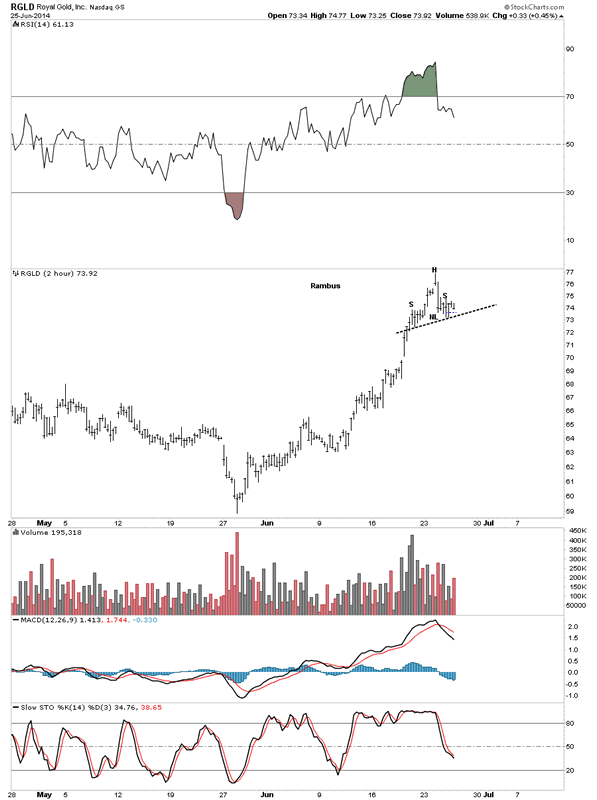
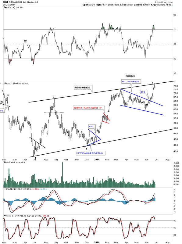
Below is a daily look at RGLD that shows it’s big one year trading range is a rising wedge formation. You can’t really see the small H&S top but it’s there just below the top rail at reversal point #4.
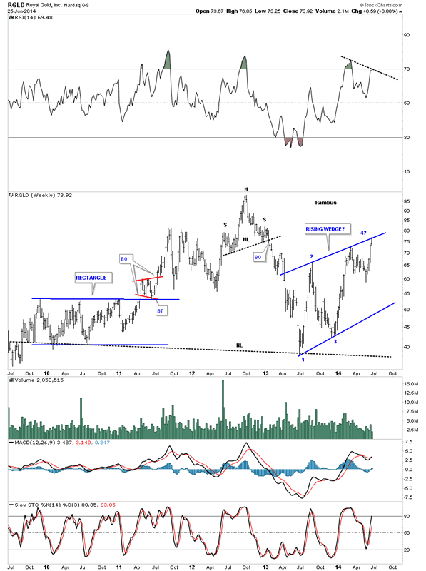
Below is a weekly chart that shows the rising wedge with our little H&S top forming just below the top blue rail at reversal point #4.
I have to show you the monthly chart for RGLD as it ties all the time frames together. As you can see this is the third backtest to the bottom rail of the long term black rising wedge. How critical is this backtest?
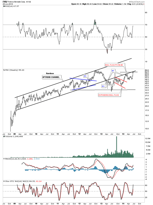
FNV has been another high flyer during this June rally.
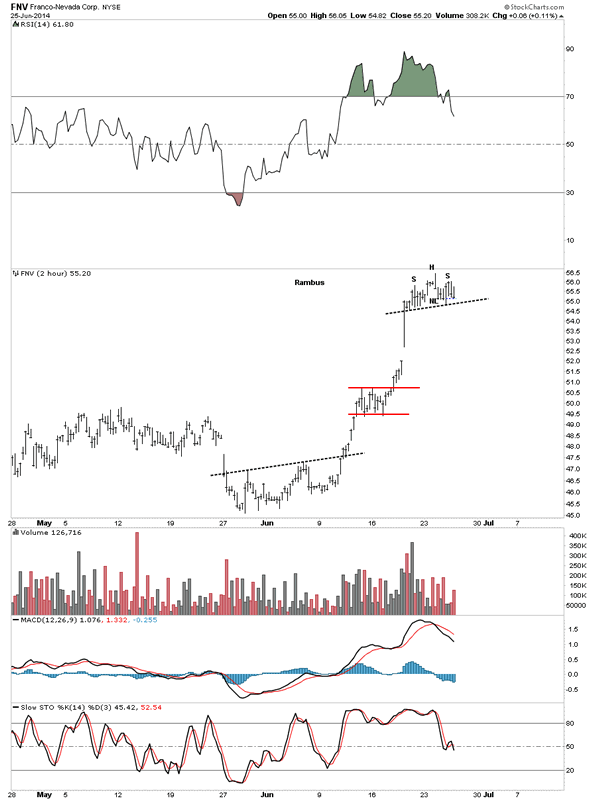
The weekly chart of FNV looks a lot like RGLD that shows a very long term black uptrend channel and now another backtest from the underside making it the fourth now.
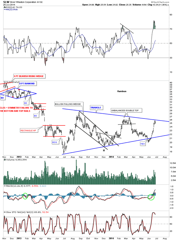
SLW has been another star performer during the June rally.
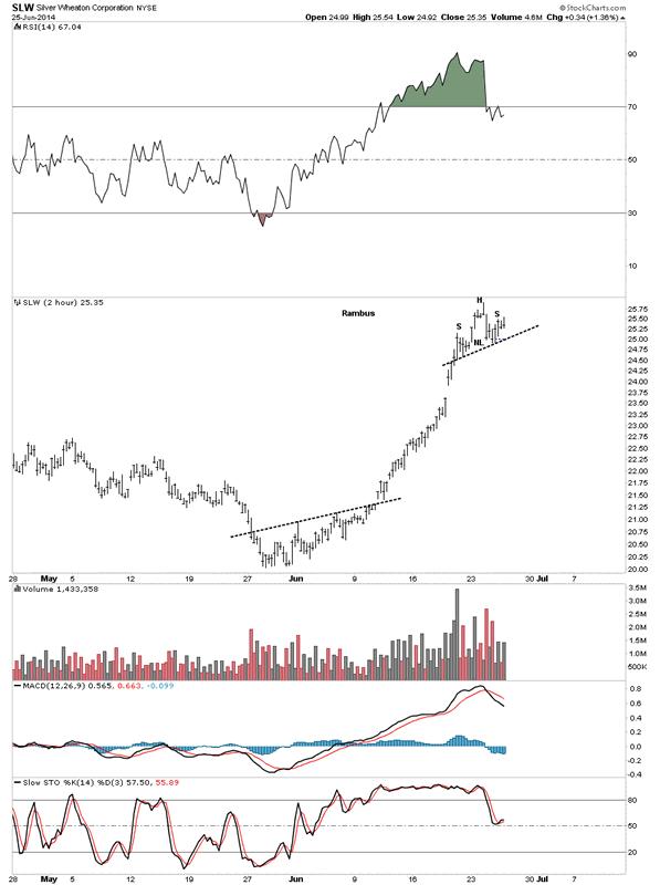
SLW’s trading range has been a triangle formation. As you can see it had a false breakout of the bottom rail and then reversed direction and rallied all the way backup to the top blue rail.
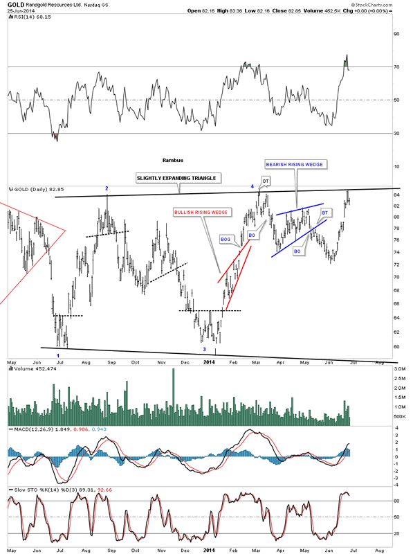
Below is the 2 hour chart for Randgold.

Below is the daily chart that shows Randgold’s expanding triangle and our little H&S top at reversal point #4.
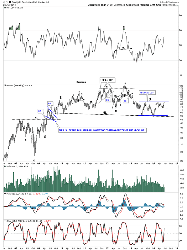
Randgold long term look.
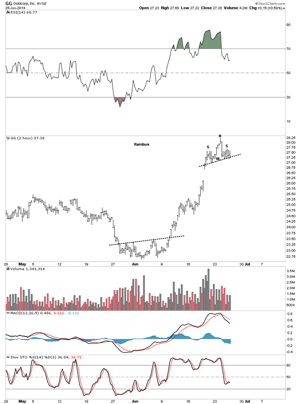
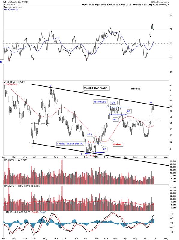
Lets look at one more big cap PM stock GG and its 2 hour bar chart.
Below is a daily chart for GG that shows its black falling flag as its one year trading range.
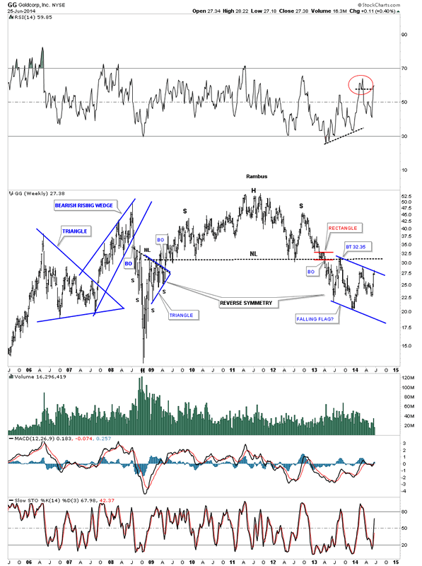
The weekly chart really puts the blue falling flag in perspective.
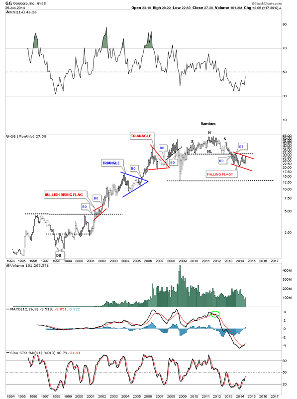
This last chart for GG shows its entire history going all the way back to 1994. You can see its classic bull market that ended with that massive H&S top.
This is where we stand tonight in regards to the big cap precious metals stocks. Keep in mind those little H&S tops, on the two hour charts, weren’t there two days ago. They started to show their self yesterday with some follow up work on the right shoulder today. They still haven’t broken down yet so they are still incomplete patterns. What I showed you tonight, on the bigger one year trading ranges, is the top rails are still hot and to be respected even though there were many different one year congestion zones. Nobody knows with 100% certain how things will evolve from here but there is a lot of evidence that this June rally could just be another reaction within the one year trading ranges exhibited by most of the PM stocks. We need to be prepared for whatever the markets throw our way. If these small H&S tops start to breakdown then we will need to act accordingly. The first thing will be to exit the Junior Portfolio stocks. The big cap precious metals stocks are truly at an inflection point right here and now in which we can take advantage of with just a little more information. Keep and open mind and lets see what kind of hand the markets deals us. All the best…Rambus
PS: Just so you know I’m not bias. Here is the possible inverse H&S bottom everyone and there brother is now seeing. May the best pattern win…
All the best
Gary (for Rambus Chartology)
FREE TRIAL - http://rambus1.com/?page_id=10
© 2014 Copyright Rambus- All Rights Reserved
Disclaimer: The above is a matter of opinion provided for general information purposes only and is not intended as investment advice. Information and analysis above are derived from sources and utilising methods believed to be reliable, but we cannot accept responsibility for any losses you may incur as a result of this analysis. Individuals should consult with their personal financial advisors.
© 2005-2022 http://www.MarketOracle.co.uk - The Market Oracle is a FREE Daily Financial Markets Analysis & Forecasting online publication.