


Micro to Macro Charts In Support of Silver Price
Commodities / Gold and Silver 2014 Mar 10, 2014 - 05:25 PM GMT

 In this report I want to take a good hard look at silver which has been the laggard in the precious metals complex to see if there is something technically wrong. If you been following the precious metals complex for any length of time you'll know that silver can be contrarian at times. It likes to start out slow and then once gold begins to pickup the pace then silver will play catchup. Once silver gets ready to move it can rally hard and fast catching up to gold and surpassing in on a percentage basis. So far since the December low silver is playing its game of Opossum by looking weak and not confirming the move in gold or the precious metals stocks. I think this is a deceptive look on silver right now. Lets see what the charts are telling us about silver and look for some clues that might help shed some light on what is really taking place right now.
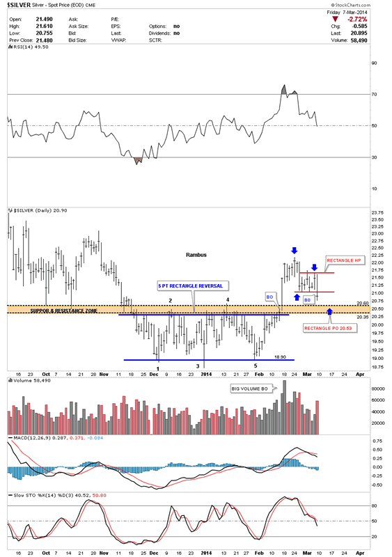
The first chart is a six month daily look that shows our five point rectangle reversal pattern that has reversed the downtrend. The breakout was accompanied buy some really heavy volume which is what you like to see. I've added a brown shaded support and resistance zone that gives us a place to look for support now that silver has broken above that area of resistance. That zone is roughly 20.35 to 20.60 which should offer good support. One last important note on the chart below. Since silver made its breakout high it has been in backtest mode which is to be expected. In doing so it has created a small red rectangle halfway pattern to the downside. Using the impulse measuring technique I've been showing you the little red rectangle halfway pattern has a price objective down to the 25.53 area which is in the brown shaded support and resistance zone.
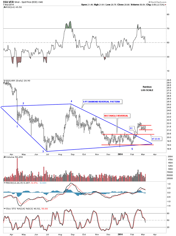
Lets now look back about one year that shows the two reversal patterns that are now in play. The first reversal pattern is the big blue five point Diamond reversal pattern. This Diamond has shown up on a lot of the PM stocks which has done a little morphing since we first started to recognize it last year. The other reversal pattern is the blue five point rectangle reversal pattern that we looked at on the chart above. We have two - five point reversal patterns in play right now that suggests a decent bottom should be in place right now.
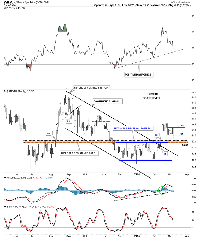
Lets look at another daily chart for silver that is about a year long that shows us another positive development. When silver broke above the brown shaded support and resistance zone it also took out the top rail of a six month downtrend channel along with the top rail of the 5 point blue rectangle. If you look real close you will see that silver backtested the top rail of the downtrend channel, around the 20.50 area, for just two days before it shot higher. It now looks like silver is going to backtest the brown shaded support and resistance zone, from the topside, just as it did back in October of last year. Note how fast silver moved up last August when it was ready to go. If you're not positioned before a move like that it's hard to get on because there is no pullback. You either plug your nose and jump in or you miss the move.
Lets look at one more longer term daily chart for silver that puts the downtrend channel and the blue five point rectangle reversal pattern in perspective. I would like to focus your attention to the bottom right hand side of the chart that shows our current price action. There are three possible areas of support that intersect right at the 20.50 area. The first one is the top of the blue rectangle. The second is the bottom rail of the red bull flag that is made up of the little red rectangle halfway pattern that I showed you on the first chart above. The third possible area of support is the 50 dma that comes in at 20.36.
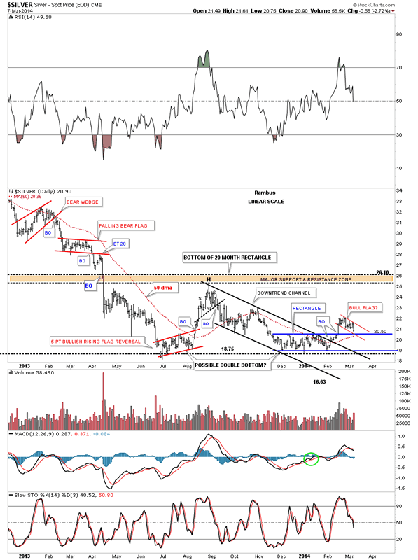
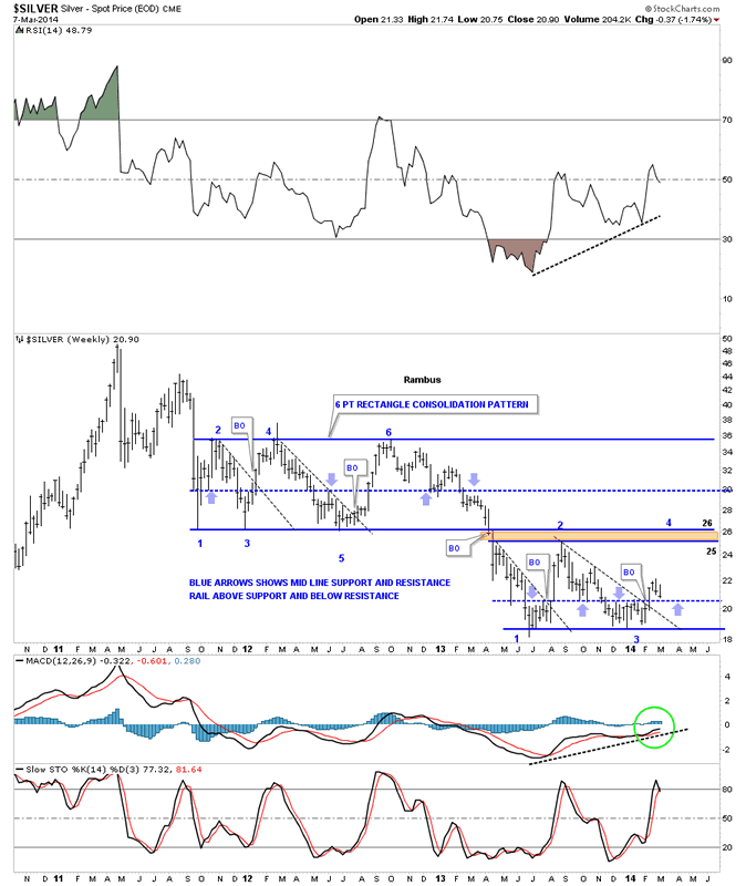
Now lets take a look at a weekly chart that starts putting the big picture into focus. This weekly chart shows the rally up to the 50 area and the bear market that has ensued. After breaking down from the unbalanced double top silver went right into a six point rectangle consolidation pattern that lasted almost two years. Whenever you have a horizontal trading range or rectangle I always look for a mid rail that forms in the center of the rectangle. Sometimes these mid rails will be exactly in the middle and sometimes they can be offset just a bit either up or down from the mid point. As you can see on the upper six point rectangle the center blue dashed rail is pretty close to the center as shown by the light colored blue arrows. What the blue arrows are showing is the tops and bottoms which you connect your center line to. Above is support and below is resistance. As you can see in our current horizontal trading range the mid line is a tad lower as shown by the thin blue arrows. It comes in at, you guessed it, 20.50. The black dashed down sloping trendlines shows what happens when they get broken to the upside. As you can see there is generally a very strong rally backup to the top of the trading range. So far silver is four weeks into its breakout move above its black dashed downtrend rail. Hopefully when the backtest gets finished it will waste little time rallying back up to the top of the trading range between 25 and 26.
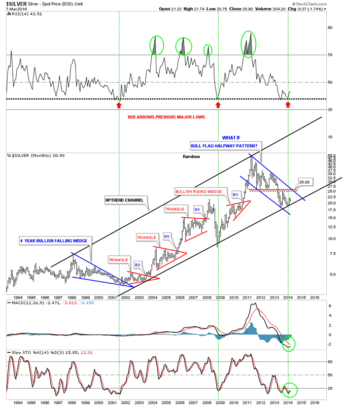
Lets look at the monthly chart that shows the very large uptrend channel that silver has built out over the last 12 years or so. The two big blue patterns make up the width of the uptrend channel with the smaller red secondary patterns making up the rest of the bull market in the move going into the April 2011 top. Whenever I see a chart like this, that has several smaller consolidation patterns that form in an uptrend, and then the stock makes a much bigger consolidation pattern, I always think of the bigger consolidation pattern as a halfway pattern. This can be on any time frame. This is one of those "WHAT IF" moments. What if this three year blue bull flag is a halfway pattern to the upside. What would the price objective for silver be if this is the case? If this three year bull flag is actually a halfway pattern in the secular bull market, that the precious metal complex has been in since the beginning 2000, then the price objective would be around the 200 area give or take 20 dollars. That's a long time from now but it's a possibility. Right now we have to worry about the 20.50 area holding support and take it one step at a time.
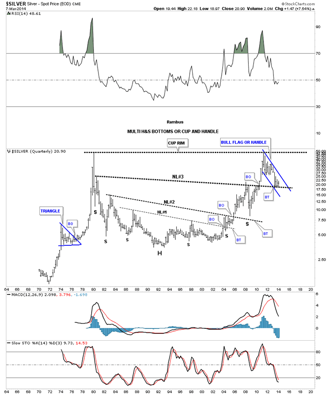
The last chart I would like to show you for silver is the quarterly chart that shows all the history going back to 1970. You can see why the possibility for 200 isn't out of the question. Silver has been reversing symmetry back up to how it went down after the 1980 all time high. Its been making a series of H&S bottoms with the third and largest H&S bottom working as support as silver is in backtest mode right now. Also silver could be forming a very large cup and handle with our blue bull flag being the handle. The first thing we need to see happen is for silver to breakout of its bull flag then takeout the all time high at 50. So there is a lot of work to do but the possibility is there in the long term picture. Note how big our current blue flag looks compared to any other consolidation pattern on this very long term chart.
In the very short term silver needs to hold support around the 20.50 area and then rally strongly up from there. If it can do that then our first price objective will be the 25 to 26 area which is the top of our recent high in this consolidation pattern and the bottom of the six point rectangle that formed after silver put in its major top in April of 2011. So we wait for silver to shows us her hand.
All the best
Gary (for Rambus Chartology)
FREE TRIAL - http://rambus1.com/?page_id=10
© 2014 Copyright Rambus- All Rights Reserved
Disclaimer: The above is a matter of opinion provided for general information purposes only and is not intended as investment advice. Information and analysis above are derived from sources and utilising methods believed to be reliable, but we cannot accept responsibility for any losses you may incur as a result of this analysis. Individuals should consult with their personal financial advisors.
© 2005-2022 http://www.MarketOracle.co.uk - The Market Oracle is a FREE Daily Financial Markets Analysis & Forecasting online publication.